Proverbs are sayings that convey popular wisdom in short and memorable ways, such as ‘a stitch in time saves nine’. While they refer to practical home truths, there’s often a hint of judgement. Proverbs are based on metaphors, something being like something else, the stitch in time is a metaphor for doing things in a timely manner. But it also suggests that if you don’t follow the advice, then you’re slovenly.
Choose a proverb to illustrate and produce two different versions, one implying the ‘good’ and the other the ‘bad’ meaning implied by the advice. Think about how you use the two images in relationship to one another. How do you create a comparison between the symbolism of the good with the bad? Think specifically about which elements in the illustration you need to tweak to make this work successfully.
Upon starting this exercise, I had hoped to find some examples of illustrations or art that were based on proverbial sayings, but it was quite a challenge. I do not doubt that there must be countless works, but most search terms I entered returned religious examples that were not really relevant.
Choosing a Proverb
To begin this exercise I found a website, The Phrase Finder, which lists over 600 proverbs. It was quite a task to narrow these down to a selection that most appealed to me. I noted these (not very legibly) on the exercise page.
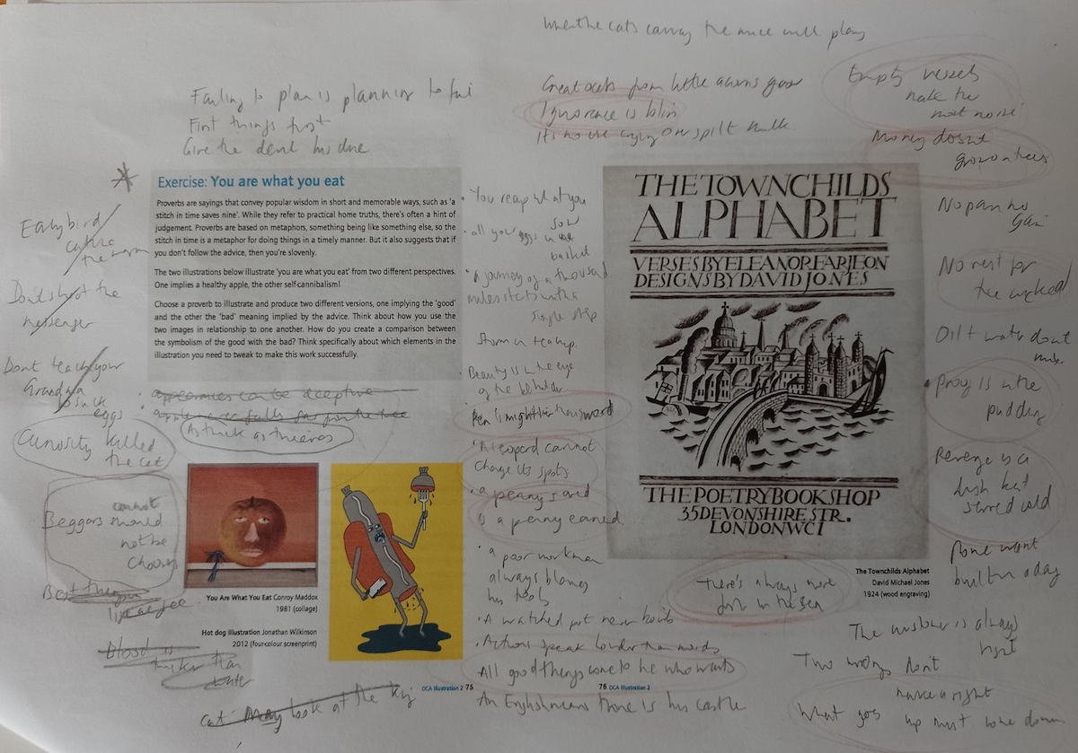
I picked a few of these that sparked potential ideas in my mind, before finally settling on the proverb ‘Plenty more fish in the sea‘.
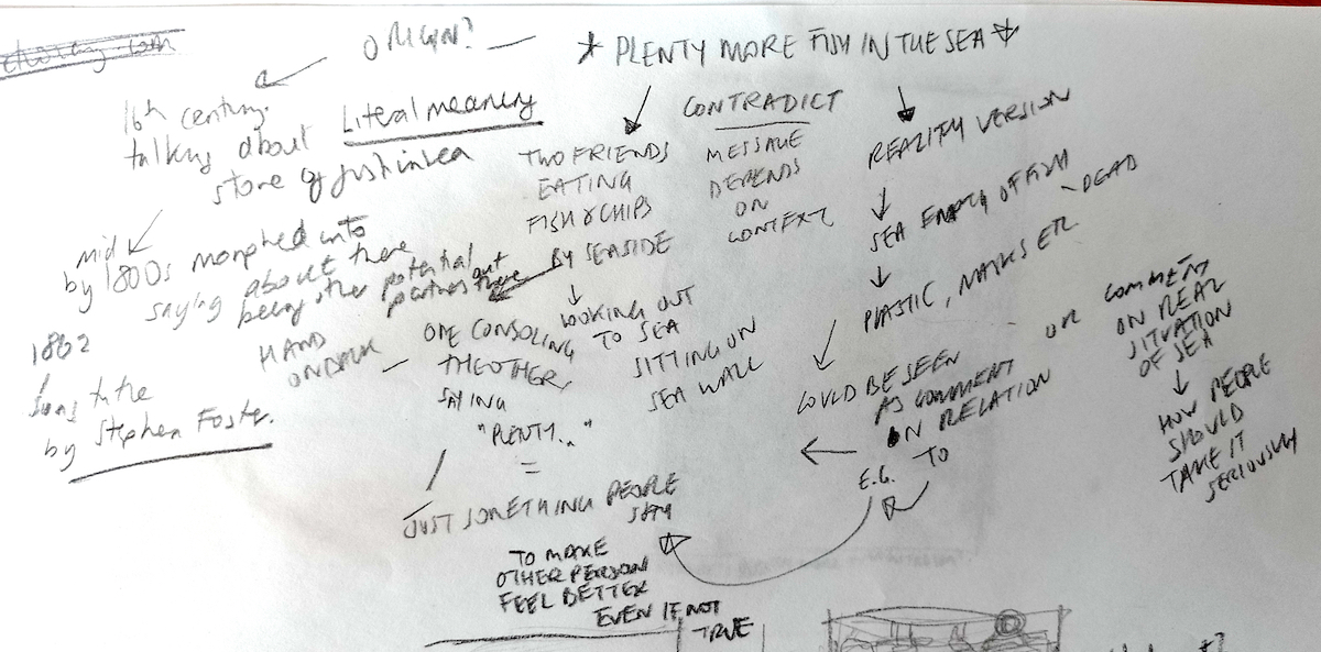
Mind Map
Next, I mind-mapped some thoughts that I had about the proverb and a few ideas for the illustration.
(click on image for larger version, opens in new tab)
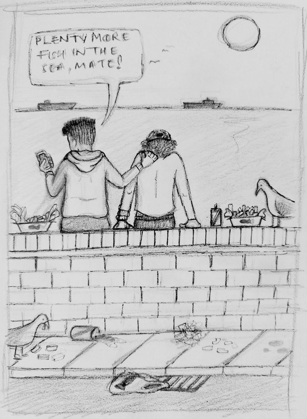
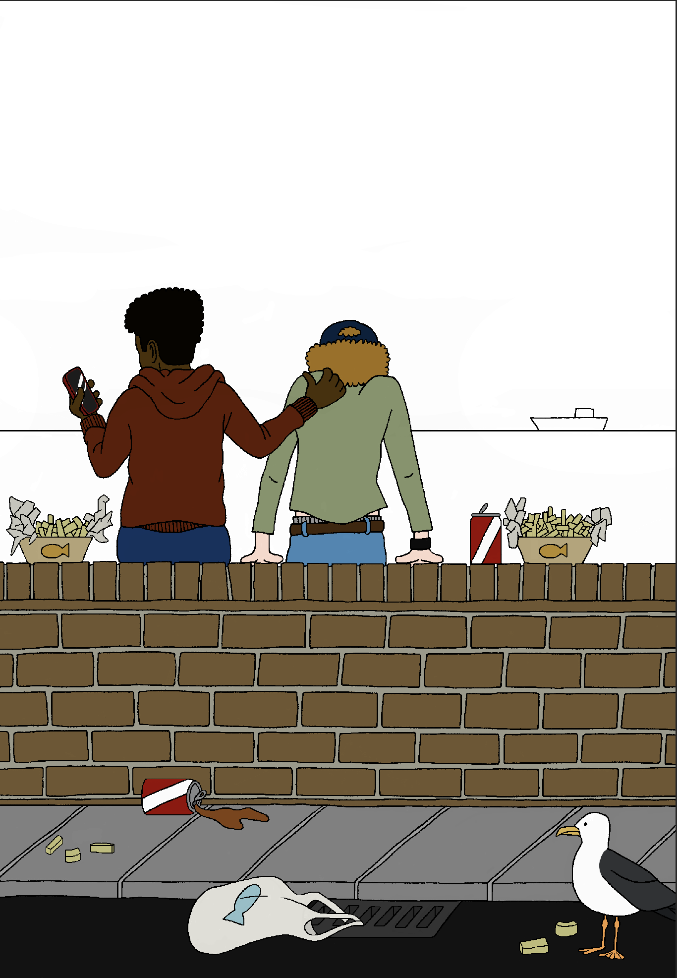
At this stage I formed a fairly clear concept for one of the illustrations, which would depict two young men eating fish and chips either by the sea or in a restaurant. One of them would be patting the other on the back and saying, “Plenty more fish in the sea”.
This first illustration would be more light-hearted, reflecting the use of the proverb as just something people say, but I wanted to link it in some way to a more serious second illustration, but my thoughts about this one were less defined at this point. I wanted to comment on the reality of the proverb, that is, are there really plenty more actual fish in the sea? I researched this with regards to the impact of overfishing, pollution and so on. It is quite sobering to learn about just how much damage humans have caused to the oceans (but not a surprise). This idea was emboldened when I researched the suspected origin of the phrase in literal terms, which is believed to have been in 1573, when there was indeed still a healthy amount of fish in the sea as numbers had not yet been decimated by humans.
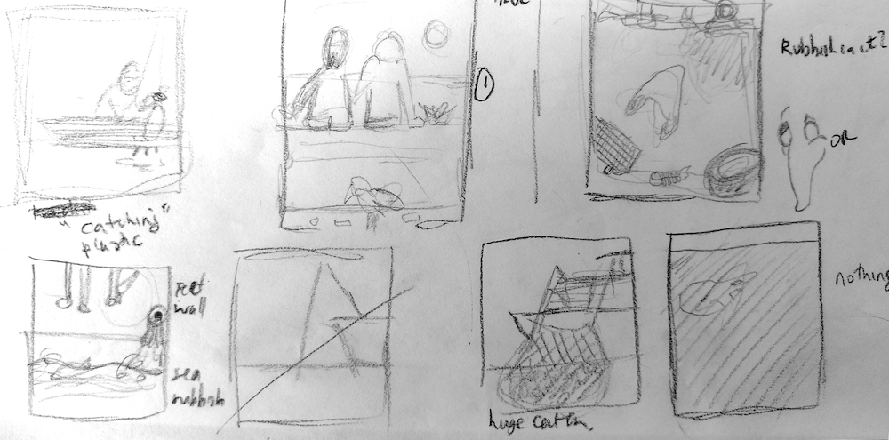
Ideas and Thumbnails
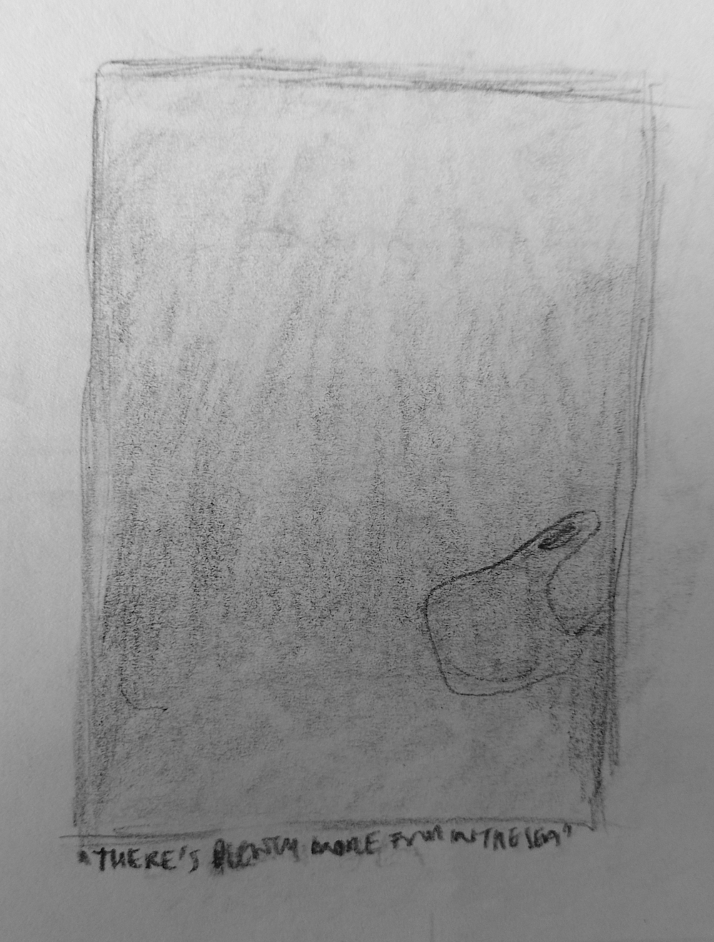
Based on my mind-map, thoughts and research, I sketched out a few thumbnail ideas. As previously stated, I felt much more confident about the first illustration, the concept of which began to take form in the middle, top-row thumbnail shown below. A few ideas for the second illustration surround this, but none of these really stood out to me at this point.
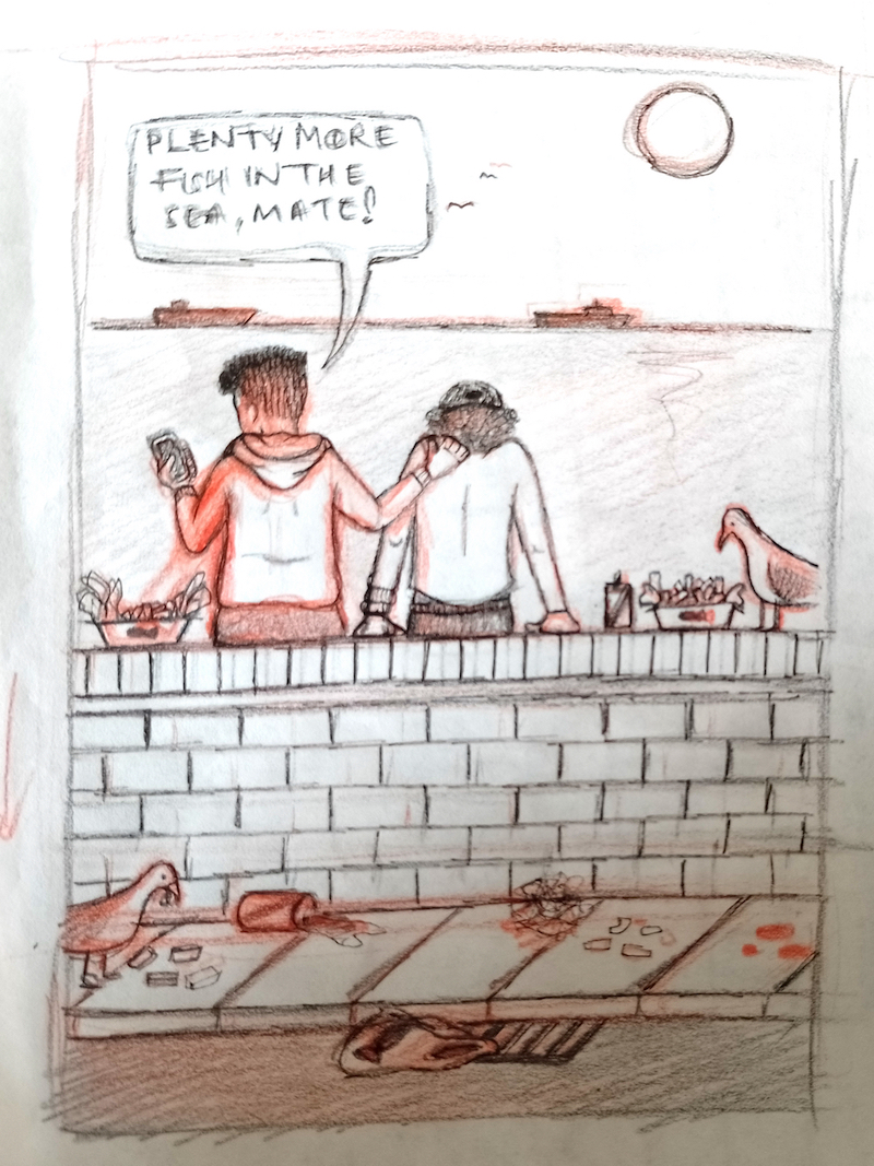
Focusing on Illustration 1, I drew a slightly larger thumbnail version of this. Initially I did this very roughly using a red pencil, which I then went over with a graphite pencil to add more clarity to the lines.
(click on image for larger version, opens in new tab)
I think I must have been subconsciously influenced by the work of Pete Mckee, whom I had discovered in Assignment 2 as I decided to show the backs of the characters in the composition, which would allow me to show the ‘back-patting’ gesture. I also had begun to consider linking the two illustrations by the plastic bag found in Illustration 1 as it lies precariously over the drain. I was quite pleased with how this idea was coming to fruition fairly easily, which is unusual!
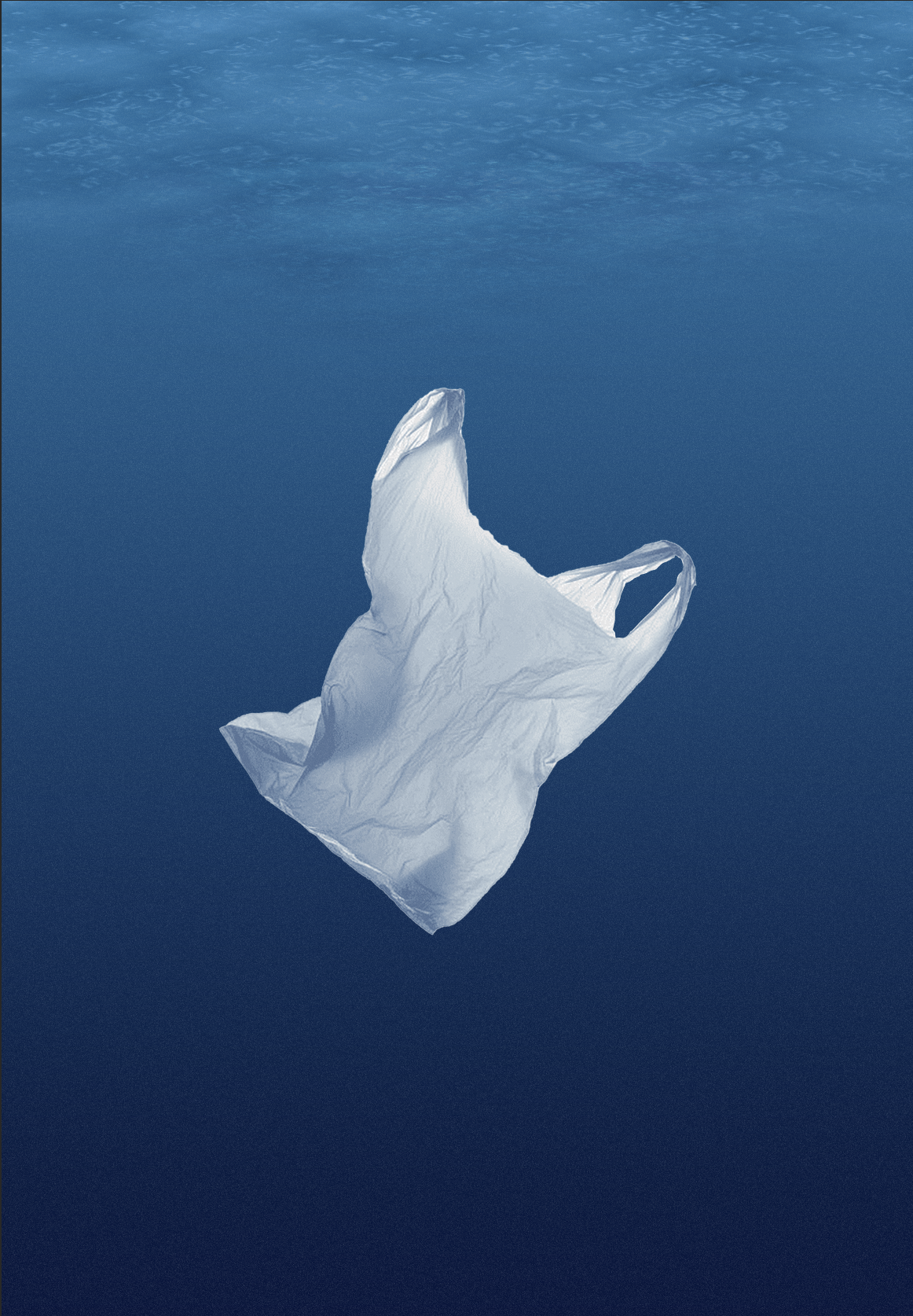
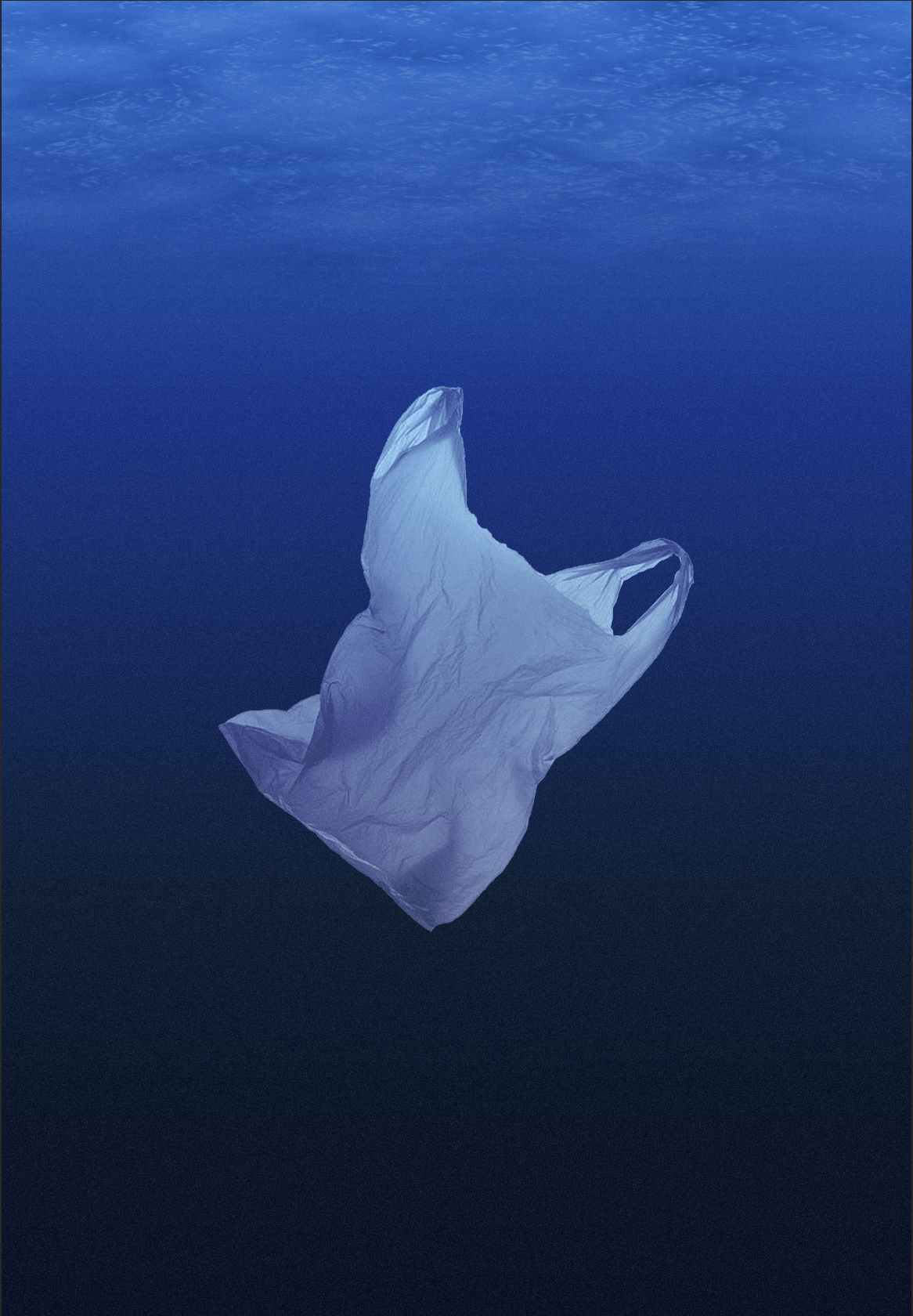
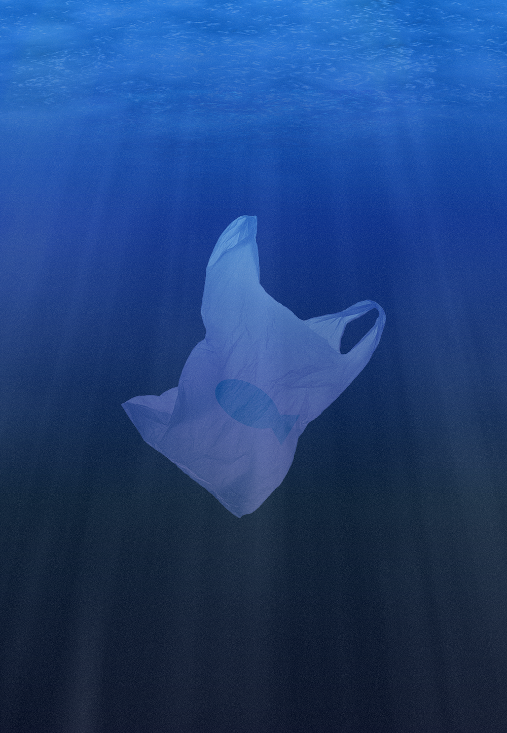
For Illustration 2, the one thing I was certain of was that I wanted it be quite simple so I could focus on the impact of message within the image. An idea that was taking shape involved showing the plastic bag floating in an empty underwater scene – there are no fish present.
(click on image for larger version, opens in new tab)
Another version of this idea that I considered, below, was to show rubbish and pollution entering the sea around the plastic bag, but I felt this was too obvious and cluttered (no pun intended). I preferred the first version.
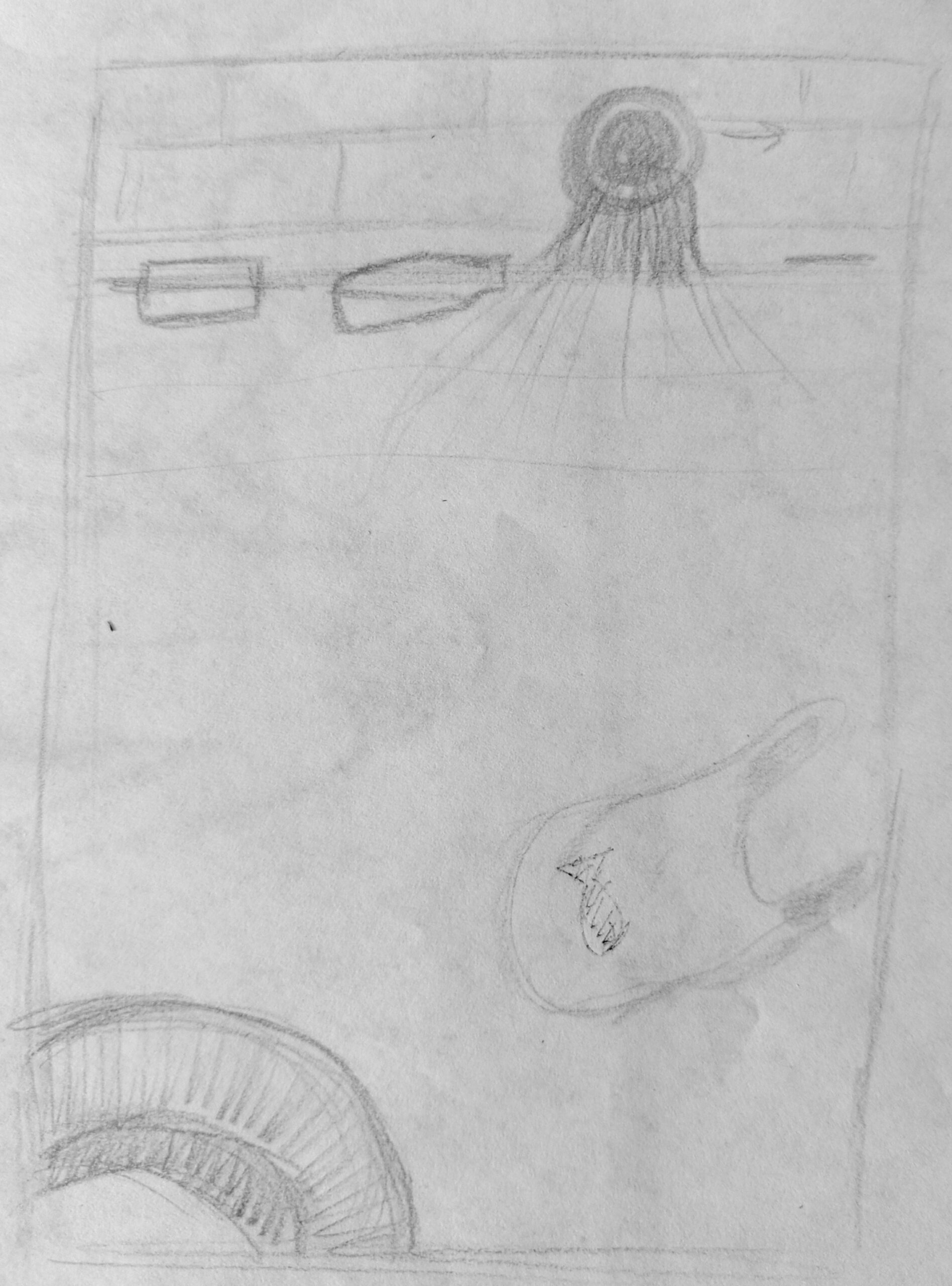
(click on image for larger version, opens in new tab)
Illustration 1
I still felt more confident with the Illustration 1, so therefore chose to concentrate on developing this one first. I hoped that my idea for Illustration 2 would solidify during the process.
Drafts
I scanned the thumbnail version of Illustration 1 into my computer, desaturated the image and scaled it up to A4 size.
(click on image for larger version, opens in new tab)
I then printed it.
I secured the printed version to my lightbox and attached a sheet of paper over the top. I then used the former as a guide for a pencil version.
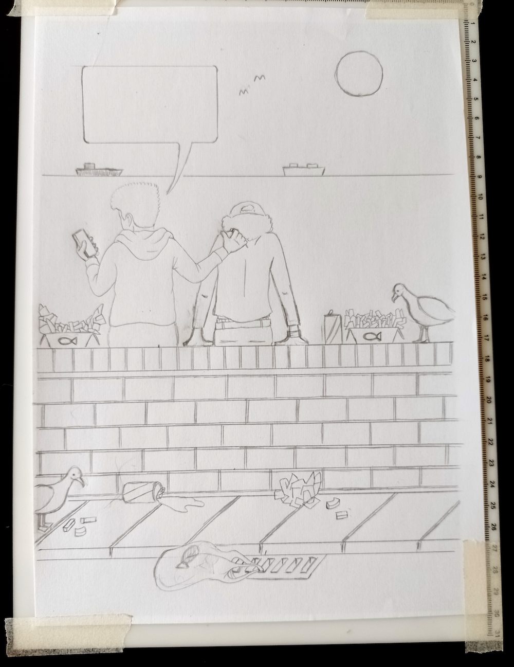
(click on image for larger version, opens in new tab)
Next, I used a 0.1 fineliner to outline the illustration. I went over these lines using a 0.5 fineliner, but I was not happy with the result (below). I preferred the thinner line.
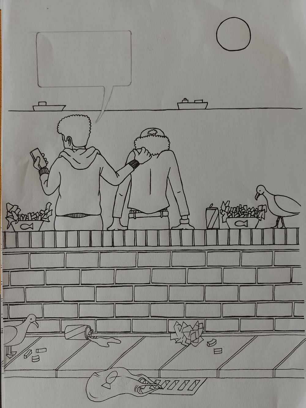
(click on image for larger version, opens in new tab)
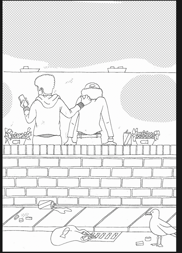
I decided to do the drawing again using the 0.1 fineliner, as although it was more work, I knew I would regret proceeding with the version above. It also presented me with the opportunity to redo the seagull drawing as the original ones looked more like pigeons. I was quite pleased with the seagull in the new version, as shown below.
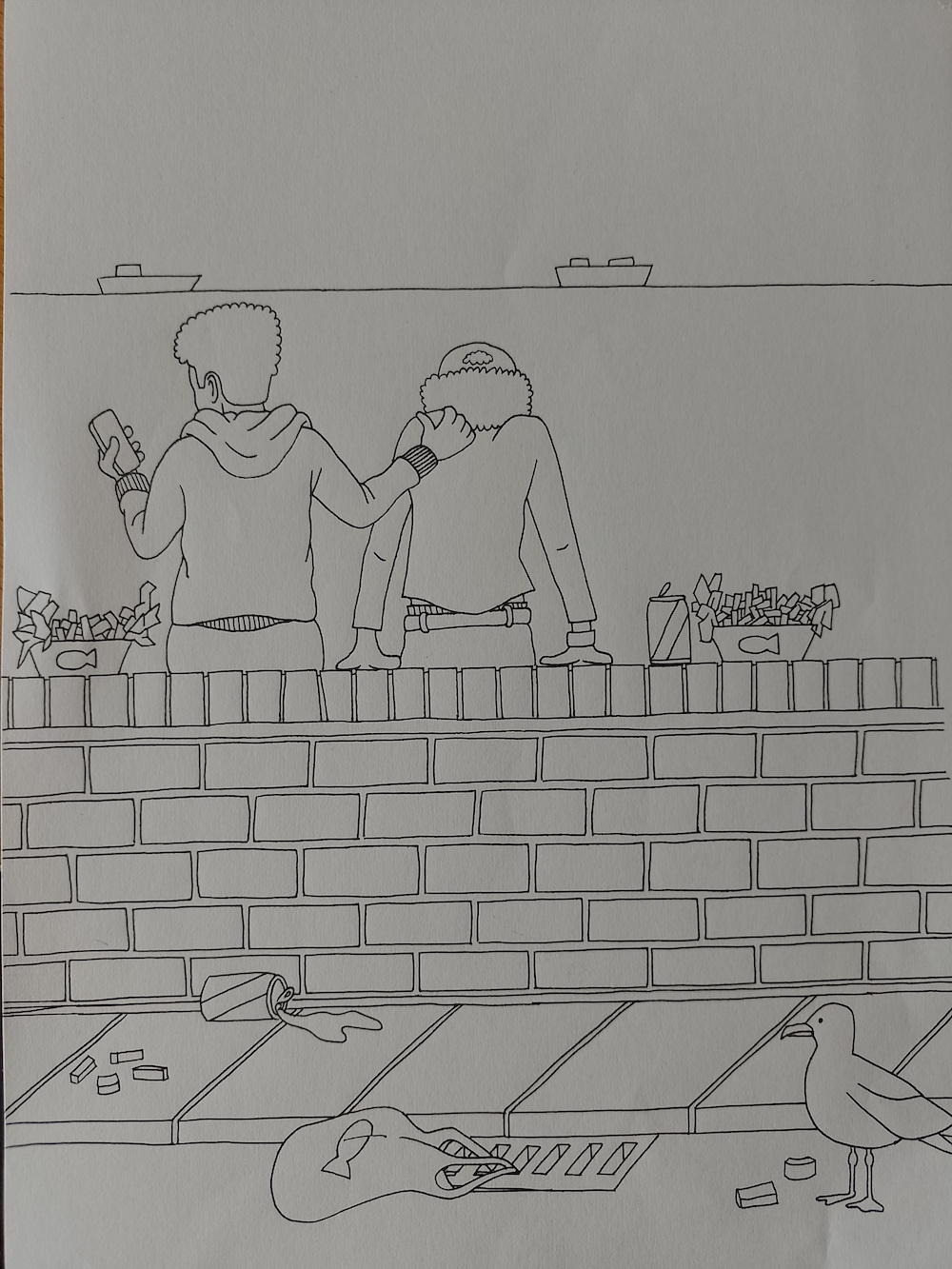
(click on image for larger version, opens in new tab)
Moving to Photoshop
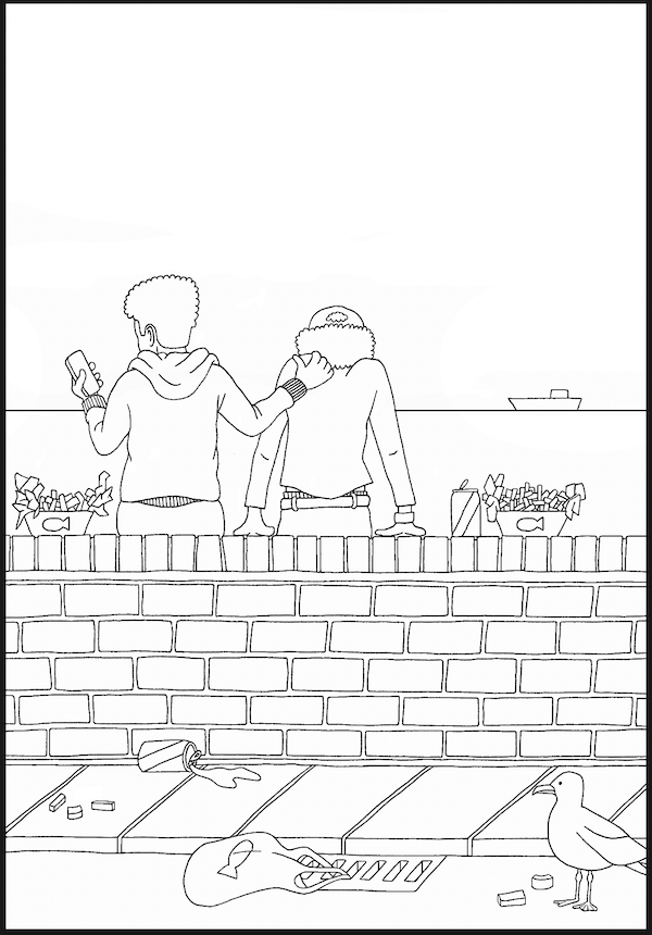
I am striving to become more skilled using Photoshop as I find it quite daunting, and so I chose to use it for this exercise. I scanned the pen version of Illustration 1 into my computer. My scanner always seems to have dust on it, no matter how much I clean it, so there were several black marks evident.
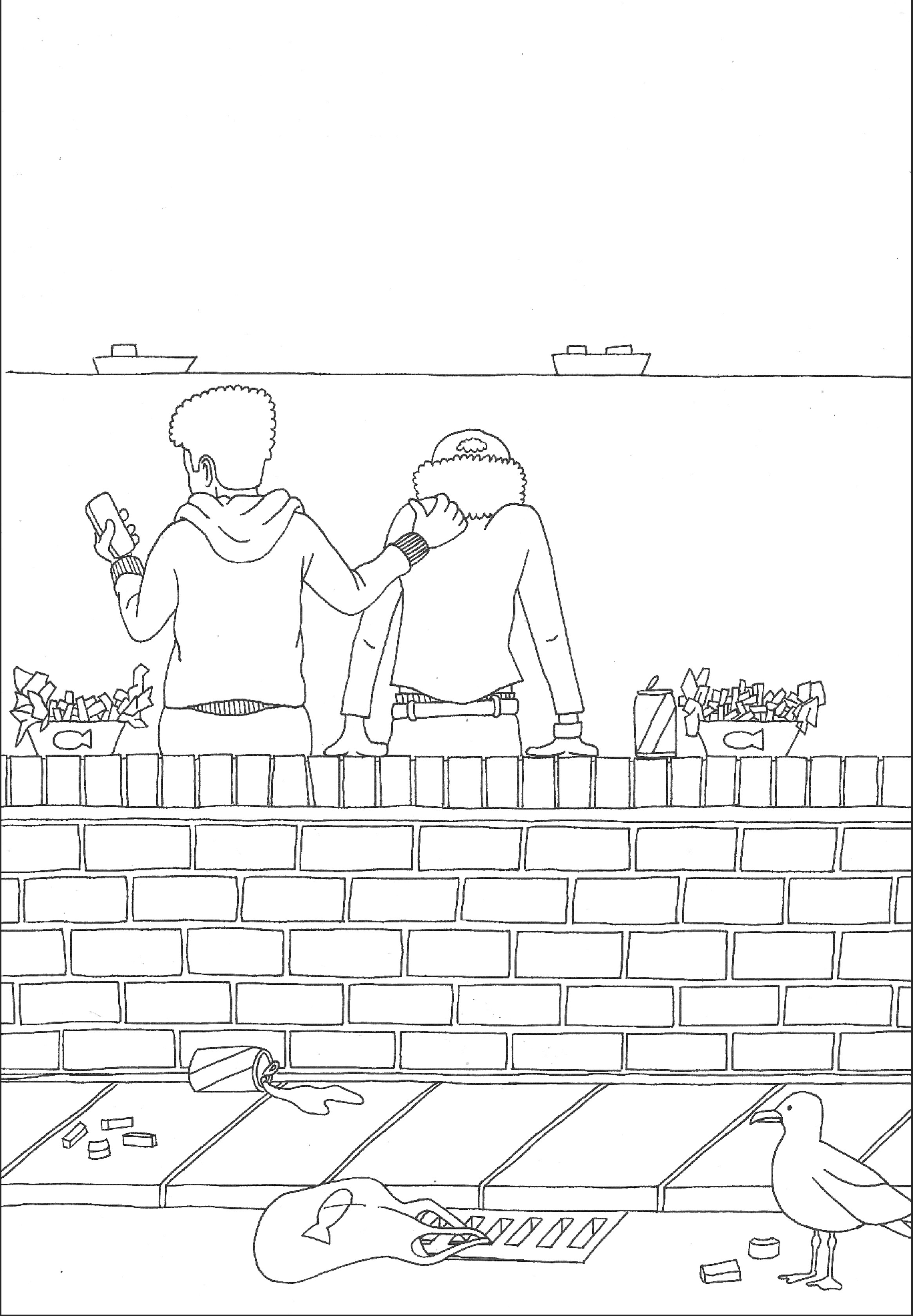
(click on image for larger version, opens in new tab)
I set to work removing these marks.
Once these had been removed, I added a layer below, which I filled with white. I then changed the artwork layers it had a Blend Mode of Multiply, which would allow me to add colour underneath.
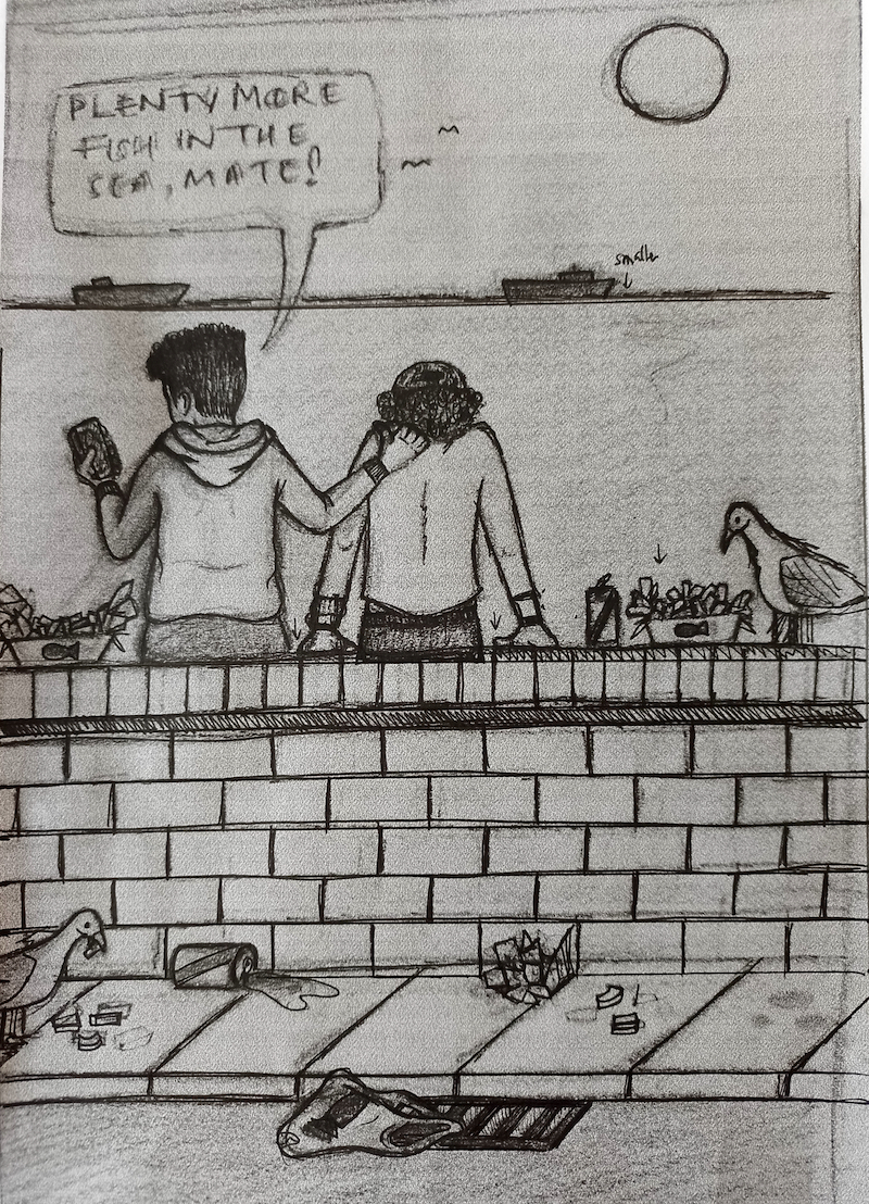
Adding Colour and Effects
Colour is another area that I am gradually trying to explore and develop as I find it quite overwhelming. I began the process of adding colour to this illustration. I did not want it to be too saturated, but rather opted for more subtle, muted colours such as those used by Pete McKee.
Once I was fairly happy with the colour choices, which took quite some time, I spent what seemed liked forever cleaning up the lines. I realised too late that using fineliners on standard printer paper causes a slight bleed of ink surrounding the line, which resulted in very untidy lines in the digital version. In the end I had to leave the most of the lines on the wall as I had spent so much time on this already. I definitely learnt my lesson for the future!

(click on image for larger version, opens in new tab)
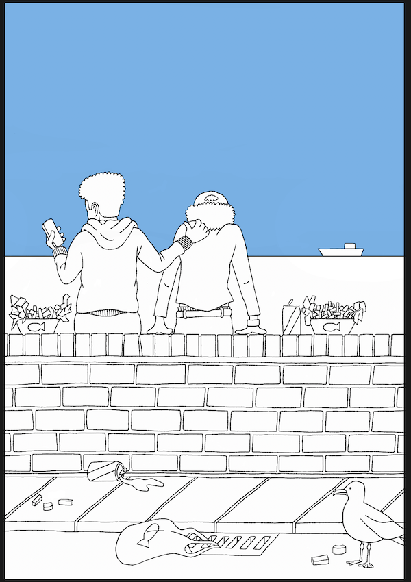
Next, I decided that I wanted to separate the foreground and background so I could distinguish between these more strongly.
(click on image for larger version, opens in new tab)
Another lesson was learnt during this process, as I am sure there must be a simpler way to do this than the performance I went through, which seemed quite long-winded and complicated! However, I did manage to separate the two in the end.
(click on image for larger version, opens in new tab)
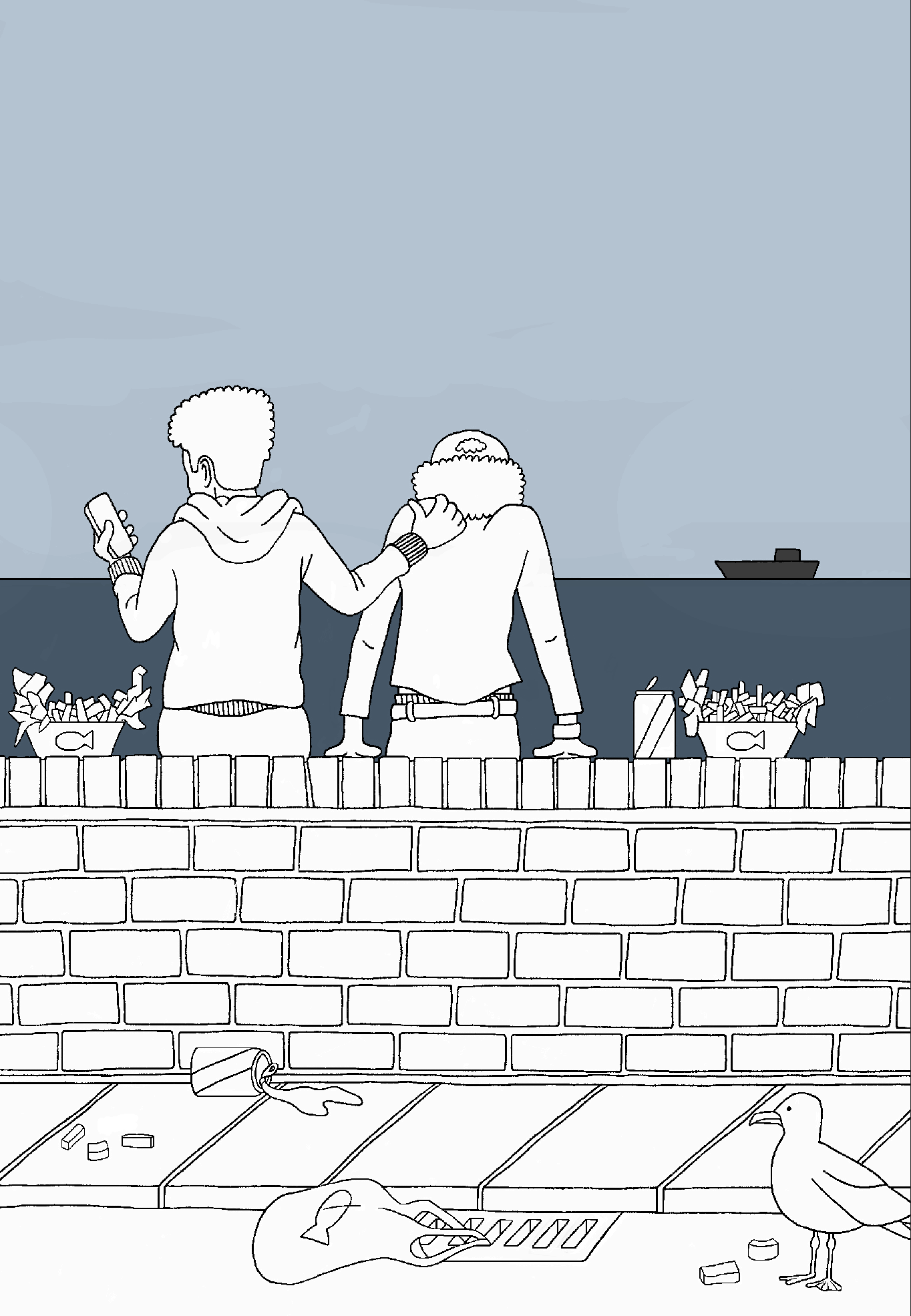
I wanted there to be more emphasis on the foreground so I added a rectangle of grey over the background, reduced the opacity and changed the blend mode.
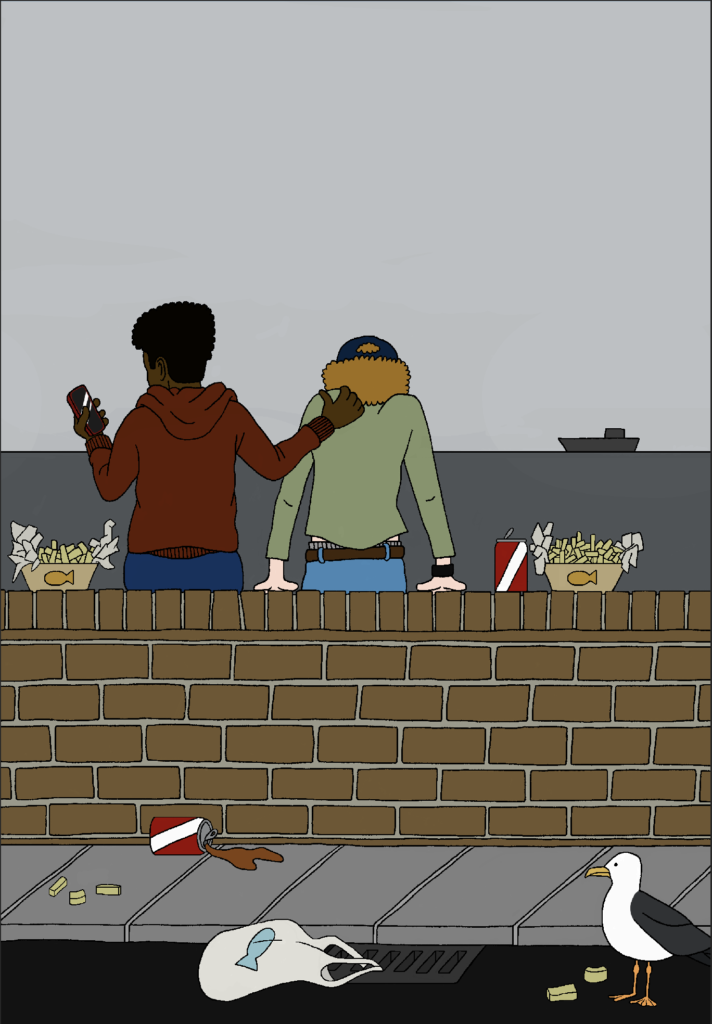
I thought that the background also needed to be greyer, so I desaturated it.

Finally, I added a ‘distressed’ texture over the composition.

Overall, I was quite pleased with the result so far and that I had persevered with Photoshop.
Finishing Touches in Illustrator
To finish the illustration, I imported a PNG version into Illustrator and added a speech bubble. I also found a graffiti style font on the DaFont website, which I used to add a ‘tag’ to the wall, which I think enhanced the overall feeling I was trying to project in the illustration. The only issue I had was trying to think of what to write in graffiti, which highlighted my total lack of ‘cool’!
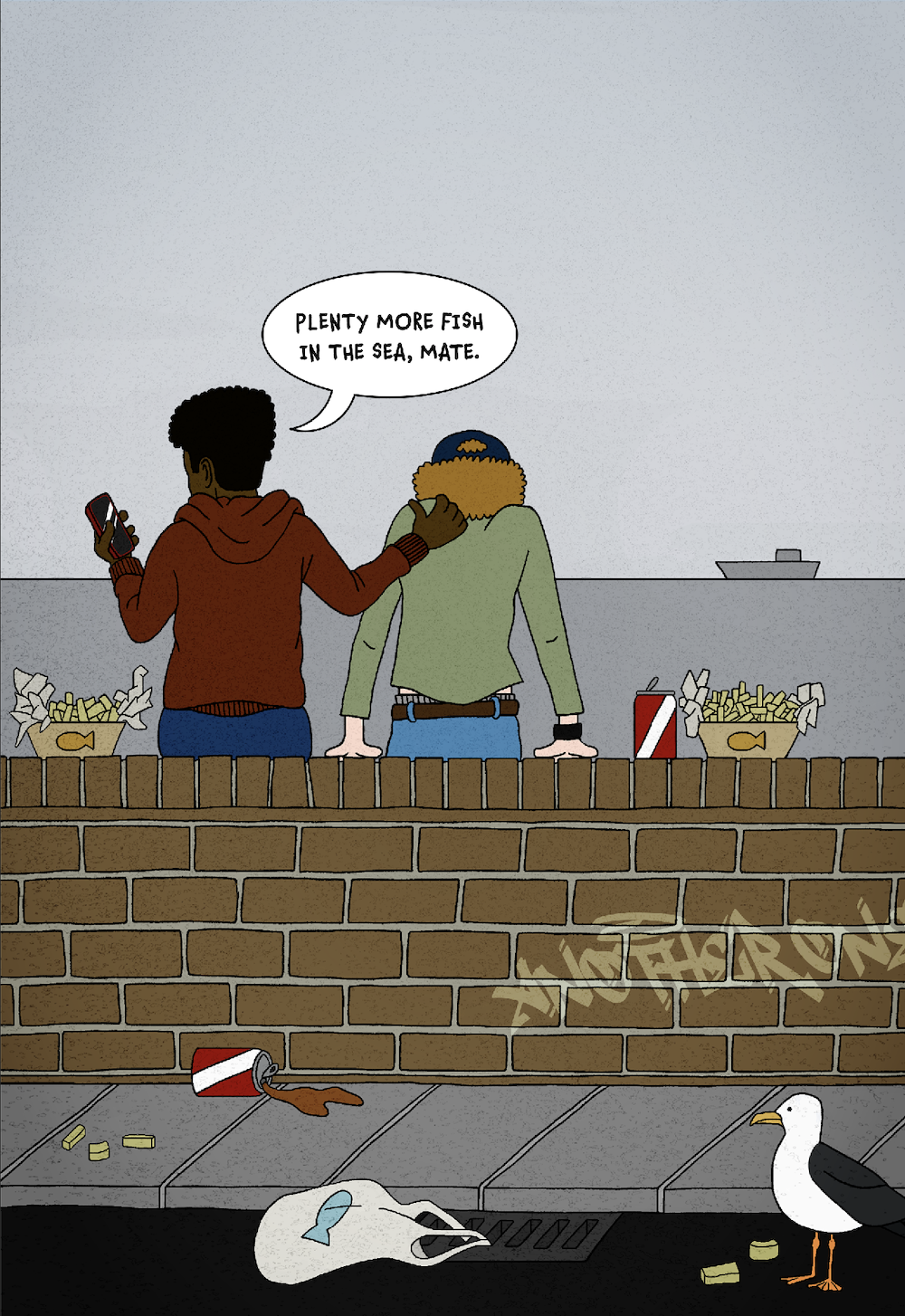
Illustration 1 had taken me a long time to complete, so I was hoping that the second one would be less complicated.
Illustration 2
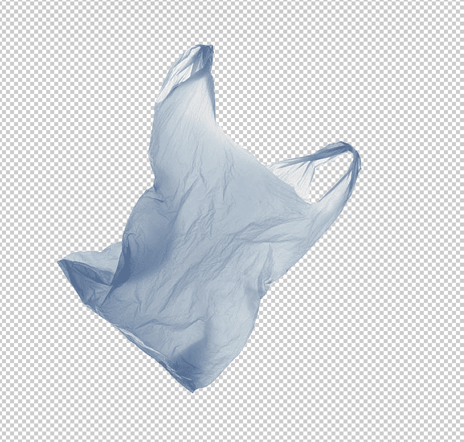
In contrast to Illustration 1, I was still not completely sure of what the second one would look like so I decided to just take it step by step. I knew that the plastic bag would be the link between the two, so my first task was to find an image of a bag that appeared to be floating or flying. Luckily, I did manage to find a PNG one via a Google Search.
Working in Photoshop
As I had managed to successfully navigate Photoshop for part one of this exercise, I chose to continue the theme and use the software for part two. This time, however, it would be less of a tool for drawing and rather one to build a composite. I found a tutorial to use as a guide for creating an underwater scene, but I deviated from this quite bit in my illustration.
I found a PNG image of a plastic bag at PNGwing and found that non-commercial use of this image is permitted. I imported this into Photoshop, which turned out to have a deceptive background, as it was not in fact transparent, but a genuine checkerboard!

It caused me some grief trying to remove this without destroying the edges of the bag. Somehow I worked out the process and was left with the truly transparent background version, below, although the edges of the bag were jagged in places, which I would need to fix at a later stage.
Following the tutorial, I created a gradient that would serve as the background.

I then drew two rectangles, which I distorted using Clouds and Plastic Wrap effects. These were used to create the illusion of the surface of the sea.


Next, I added the plastic bag to the composition and I was pleased with the outcome even at this stage.

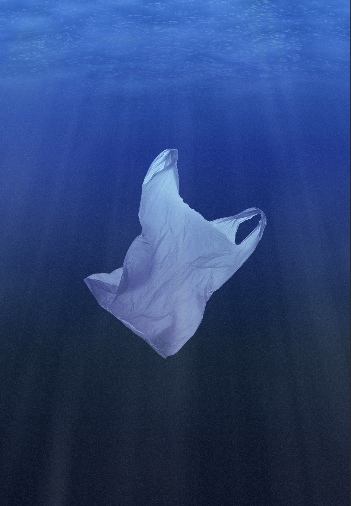
Reverting back to the tutorial, I added another rectangle of black as the top layer and added Noise, which resulted in the appearance of ‘particles’ floating in the water.
I then duplicated the gradient layer over the top of the composition. I reduced the opacity and changed the blend mode to Linear Light.
The final stage of the tutorial was to create sunlight pentrating through the surface. This was made using the Clouds Render effect and then manipulating the Threshold.
To finish the illustration, I added the fish logo, which would cement the link between the two illustrations. The process of producing the logo involved copying the original and then using the Marquee tool, filled with blue, to recreate it. I then reorientated the logo to fit in place and changed the blend mode so it looked like it was part of the bag.
I also used the Erase tool in the form of a Soft Brush with a low opacity to gently smooth the edges of the plastic bag.
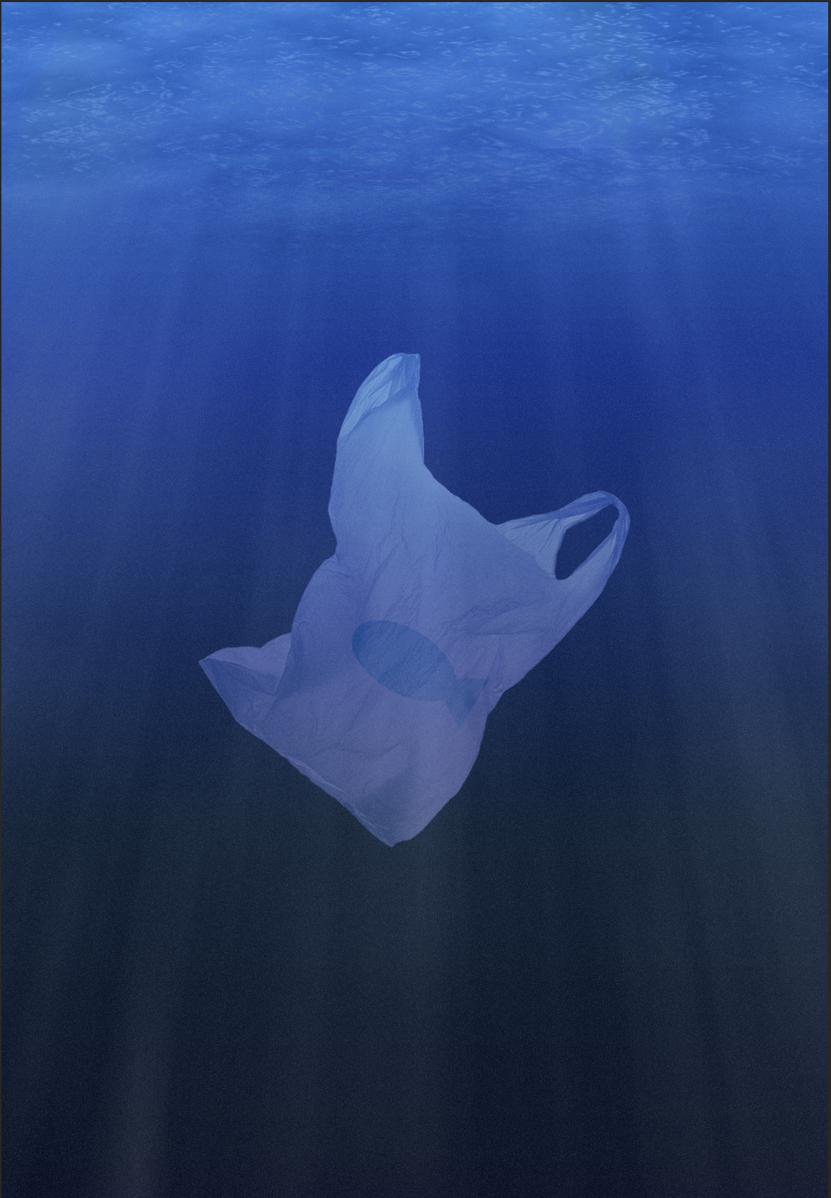
I was happy with the final result of Illustration 2, as I had managed to recreate what I had vaguely imagined in my mind.
Final Versions of Both Illustrations
The final two illustrations can be found below.

Final Thoughts
In hindsight I feel I may have deviated a bit from the requirements of the Brief in that I did not necessarily stick to creating illustrations of the ‘good’ and ‘bad’ meanings implied by the proverb. I found it quite tricky to think of my particular phrase in this simplified way and ended up going slightly deeper into the connotations. I contrasted the two illustrations more in terms comparing the colloquial use of the phrase, that is, to console someone who has just gone through a break up, with the more literal meaning of the phrase – ‘are there plenty more fish in the sea and, if not, why’? I further enhanced the difference between the two illustrations by making Illustration 1 quite cartoony in design compared to the, hopefully, more realistic visuals in Illustration 2.
Overall, I found this exercise fulfilling and I was completely engaged with it. As with most Exercises and Assignments, I was required to balance considerations of concept, design and technical aspects, which I felt was generally successful in this Exercise. It is always very heartening to manage to take a scribbled thumbnail and carry it forward to produce a finished artwork.
I was particularly pleased that I persevered using Photoshop and I am certainly becoming more confident exploring this software. The contrast in styles of the two illustrations meant that I had to switch from drawing to compositing mode, which kept me on my toes.
With reference to Illustration 2, although I was employing the use of a tutorial, I did deviate from this to suit my purposes, so it still required a high volume of my input. This way of working also opened my mind to discovering the different possibilities available through using Photoshop.
Lastly, I do feel that the illustrations I produced for this exercise reflected my ‘personal voice’ both in terms of visual style and the nature of the content.
N.B. – further to an important point raised in the Tutor Report for this exercise, I double checked that the image of the plastic bag was copyright free and can confirm it was listed as available for non-commercial use. I have since noted this in the write-up above.
Bibliography
Art UK (n.d.) Proverbs and sayings. Available at: https://artuk.org/discover/topics/proverbs-and-sayings (Accessed 13 April 2023).
Dictionary.com (n.d.) plenty of fish Meaning & Origin. Available at: https://www.dictionary.com/e/slang/plenty-of-fish (Accessed 13 April 2023).
Entheos (2012) Learn How To Create Realistic UnderWater Effect in Photoshop. Available at: https://blog.entheosweb.com/tutorials/learn-how-to-create-a-realistic-underwater-effect-in-photoshop/ (Accessed 15 April 2023).
Gray, S. (2023) 6 Most interesting paintings inspired by proverbs. Available at: https://www.readersdigest.co.uk/culture/art-theatre/interesting-paintings-inspired-by-proverbs (Accessed 13 April 2023).
Johnson, A. E. and Jacquet, J. (n.d.) Will the ocean ever run out of fish? Available at: https://www.ted.com/talks/ayana_elizabeth_johnson_and_jennifer_jacquet_will_the_ocean_ever_run_out_of_fish/transcript (Accessed 13 April 2023).
McKee, P. (2019) Home – McKee. Available at: https://www.petemckee.com (Accessed 14 April 2023).
National Oceanic and Atmospheric Administration (2020). Ocean pollution and marine debris. Available at: https://www.noaa.gov/education/resource-collections/ocean-coasts/ocean-pollution (Accessed 13 April 2023).
PNGwing (n.d.) Plastic bag Plastic shopping bag Recycling Paper, bag, blue, white, pin png Available at: https://www.pngwing.com/en/free-png-dtgbk (Accessed 15 April 2023).
Roach, J. (2006) Seafood May Be Gone by 2048, Study Says. Available at: https://www.nationalgeographic.com/animals/article/seafood-biodiversity (Accessed 13 April 2023).
Royal Academy (n.d.) Industry and Idleness, plate 1. Available at: https://www.royalacademy.org.uk/art-artists/work-of-art/industry-and-idleness-plate-1-1 (Accessed 13 April 2023).
Sample, I. (2003) Plenty more fish in the sea? Available at: https://www.theguardian.com/science/2003/may/15/science.highereducation (Accessed 13 April 2023).
Stewart, J. and Cole, M. (2022) 30 Dutch Proverbs Guaranteed to Surprise and Delight. Available at: https://mymodernmet.com/dutch-proverbs-pieter-bruegel/ (Accessed 13 April 2023).
The Phrase Finder (n.d.) A list of 680 English Proverbs, with their meanings explained. Available at: https://www.phrases.org.uk/meanings/proverbs.html (Accessed 13 April 2023).
Watts, S. (2010) Are there plenty more fish in the sea? Available at: https://www.bbc.co.uk/news/world-us-canada-11619320 (Accessed 13 April 2023).
Wikipedia (n.d.) Industry and Idleness. Available at: https://en.wikipedia.org/wiki/Industry_and_Idleness (Accessed 13 April 2023).
Wikipedia (n.d.) Proverb. Available at: https://en.wikipedia.org/wiki/Proverb (Accessed 13 April 2023).
Wintle, S. (2010) Jaque’s Illustrated Proverbs. Available at: https://www.wopc.co.uk/games/jaques-illustrated-proverbs (Accessed 13 April 2023).