Reflect on your illustrations, drawings and sketchbook work (this might be work you have done previously) and identify the pieces that best reflect a personal voice. Pick out the pieces you have most enjoyed, the ones that you feel are closest to what you are interested in doing or reflect your interests best. You might not select the most finished work or those pieces that other people have found successful. Focus on work that you connect to.
What do your choices say about your developing voice as an illustrator? How do you see yourself developing in the future? What sort of projects are you interested in exploring and what skills do you need to develop?
I decided to look back at the work I had created for each of the Level 1 units, some of which I had not seen for quite some time. This would enable me to see whether I had improved in terms of skills and ideas. I also hoped it would allow me to reflect on the work in a more balanced way as I found creating some of it was quite a stressful experience and when I am so involved in the process I can become extremely critical! I would also then think about my personal work and what type of projects I hope to improve and develop in the future.
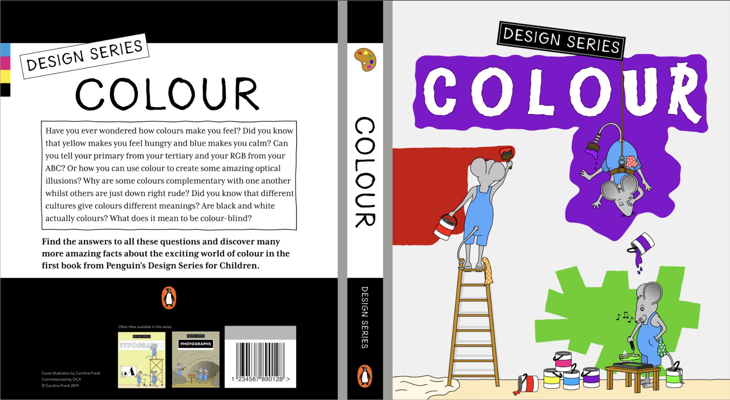
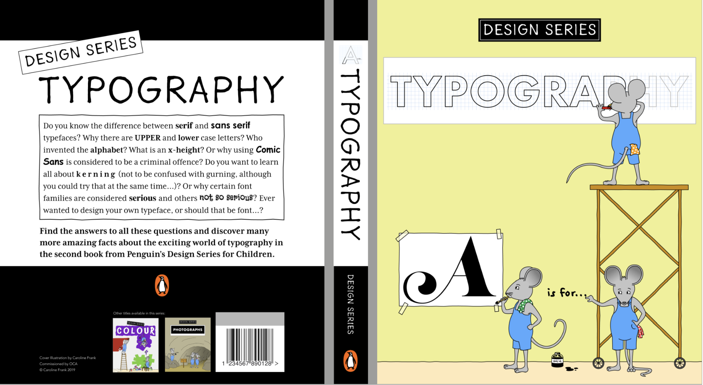
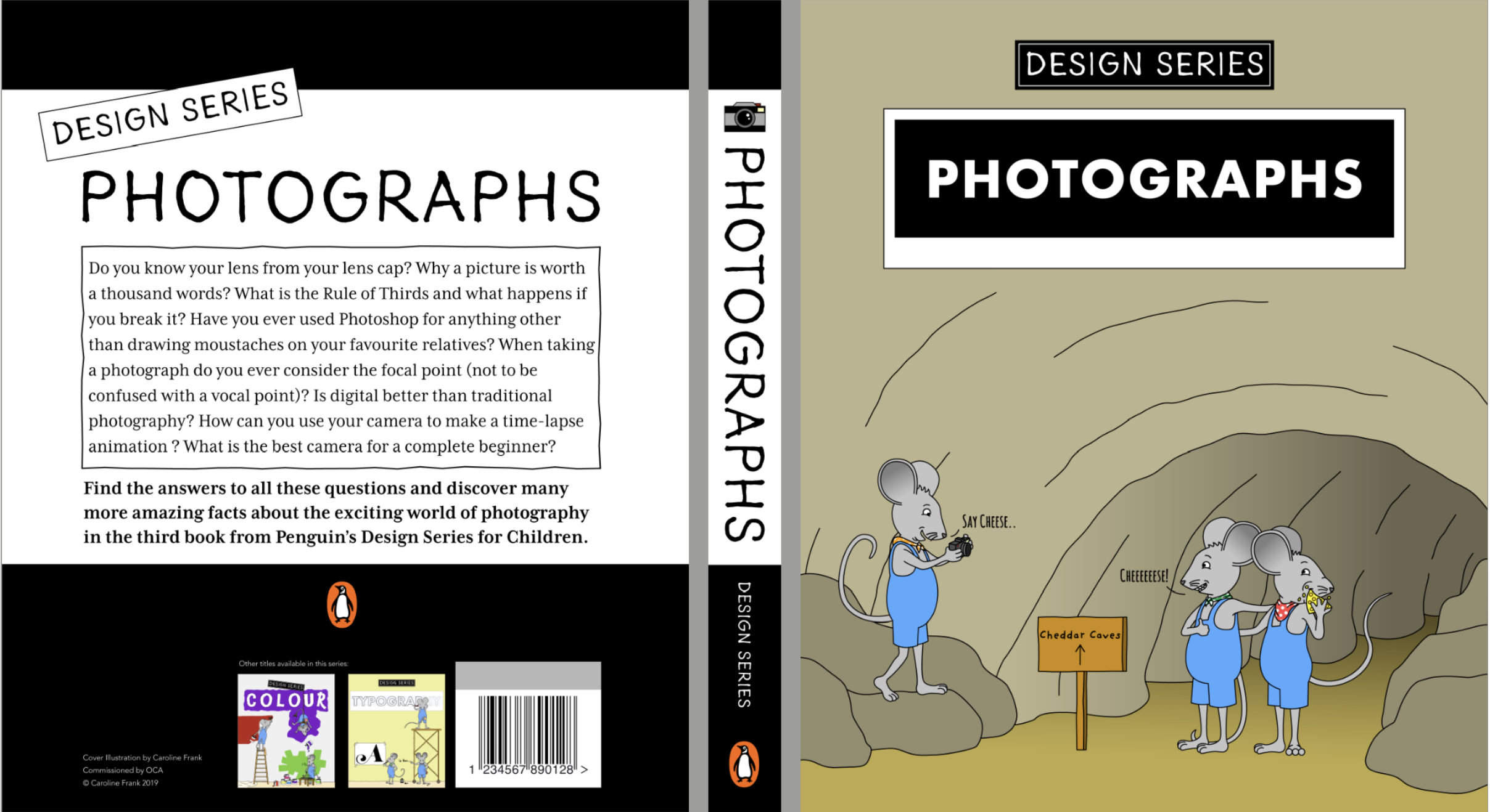
The first unit I completed was Graphic Design: Core Concepts. For this unit I worked almost entirely in a digital format. I had not done much artistic work prior to this for quite a while and I was not drawing regularly in my free time. I found this unit very challenging and thought about not continuing on the course once I completed it. On reflection, however, as a starting point, I feel I did produce some promising work that highlighted my interests and strengths, alongside plenty of weaknesses!
The three character designs below demonstrate my interest in character design and also that I try to include an element of humour whenever possible. I think my concept for the greeting cards was quite strong. I needed to develop my abilities in drawing, as they look a bit stiff, but the facial expressions did manage to capture the emotions I had envisioned for each of the characters.
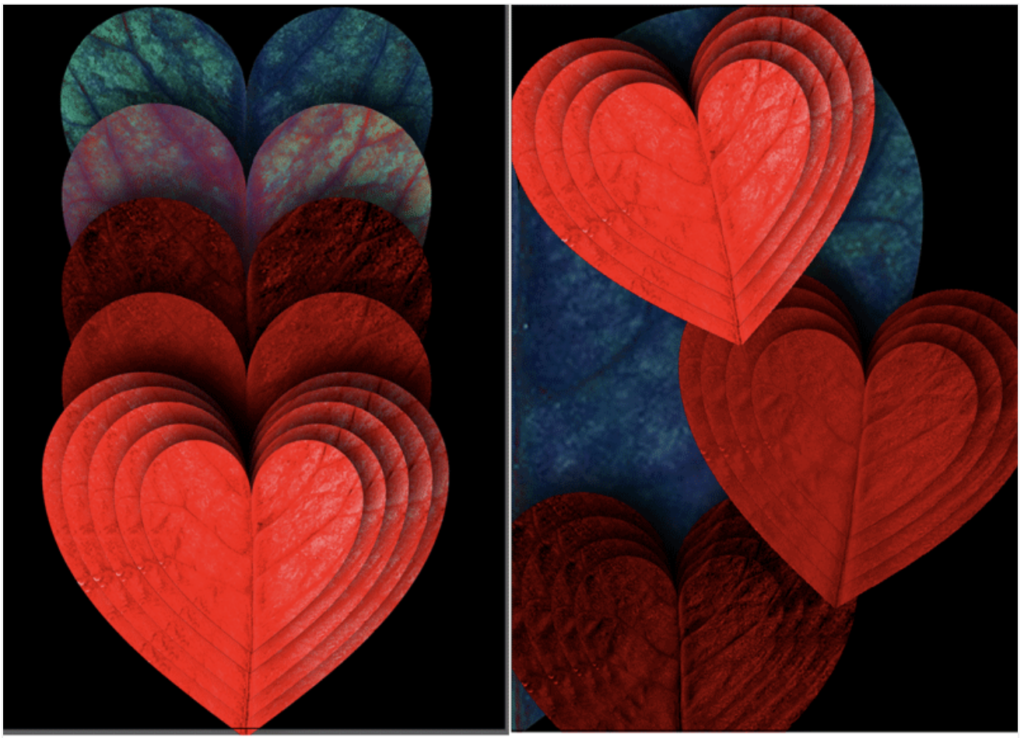
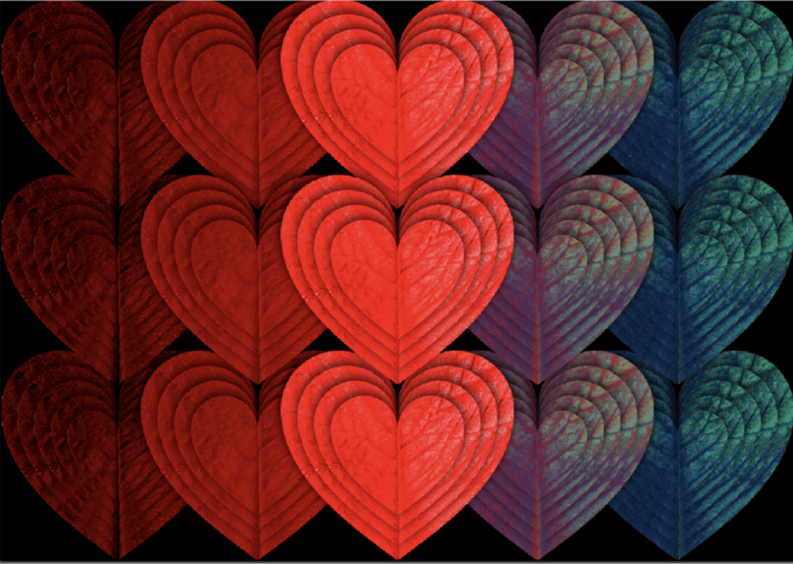
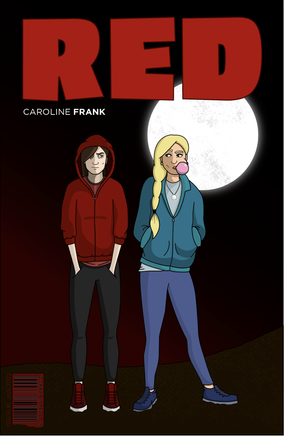
I have always struggled with more conceptual-based artwork, so to produce an image that demonstrated the colour ‘red’ was quite a task. I think the results where visually quite strong and I somehow managed to utilise Photoshop to create a sense of depth. I also took my first steps in incorporating texture and layering.
I felt more in my comfort zone when designing a variety of example covers for the book Dracula. I recall actually enjoying this exercise! The top one below actually reminds me of the style of Malika Favre as discussed in the previous Research Point, with the smooth vector graphics and bright red lips. As is becoming apparent, I do like the colour red, especially when combined with black and white. I also feel more confident using Illustrator than Photoshop to produce work.
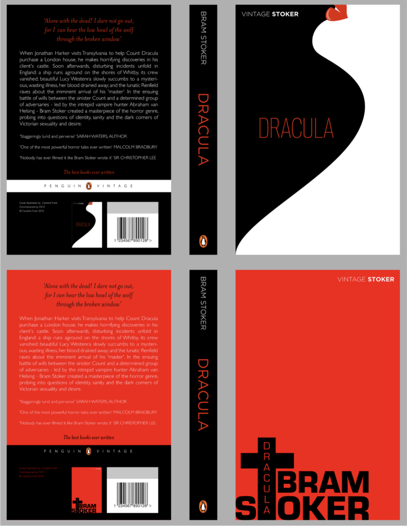
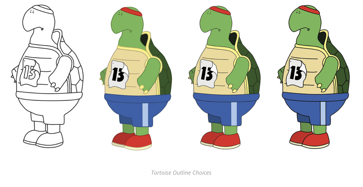
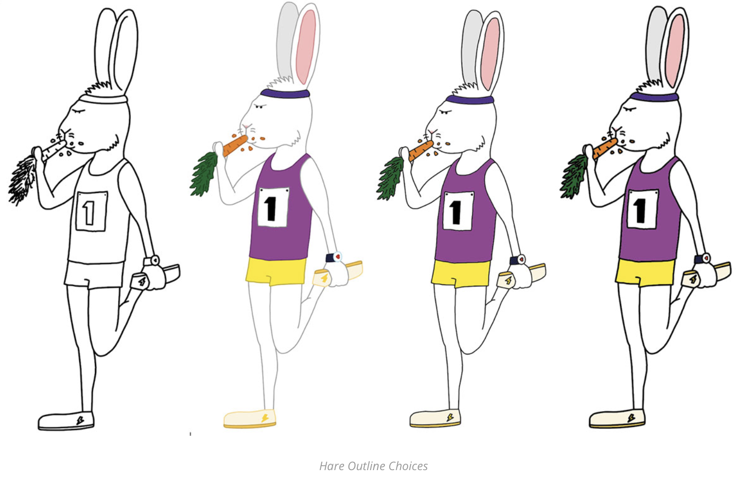
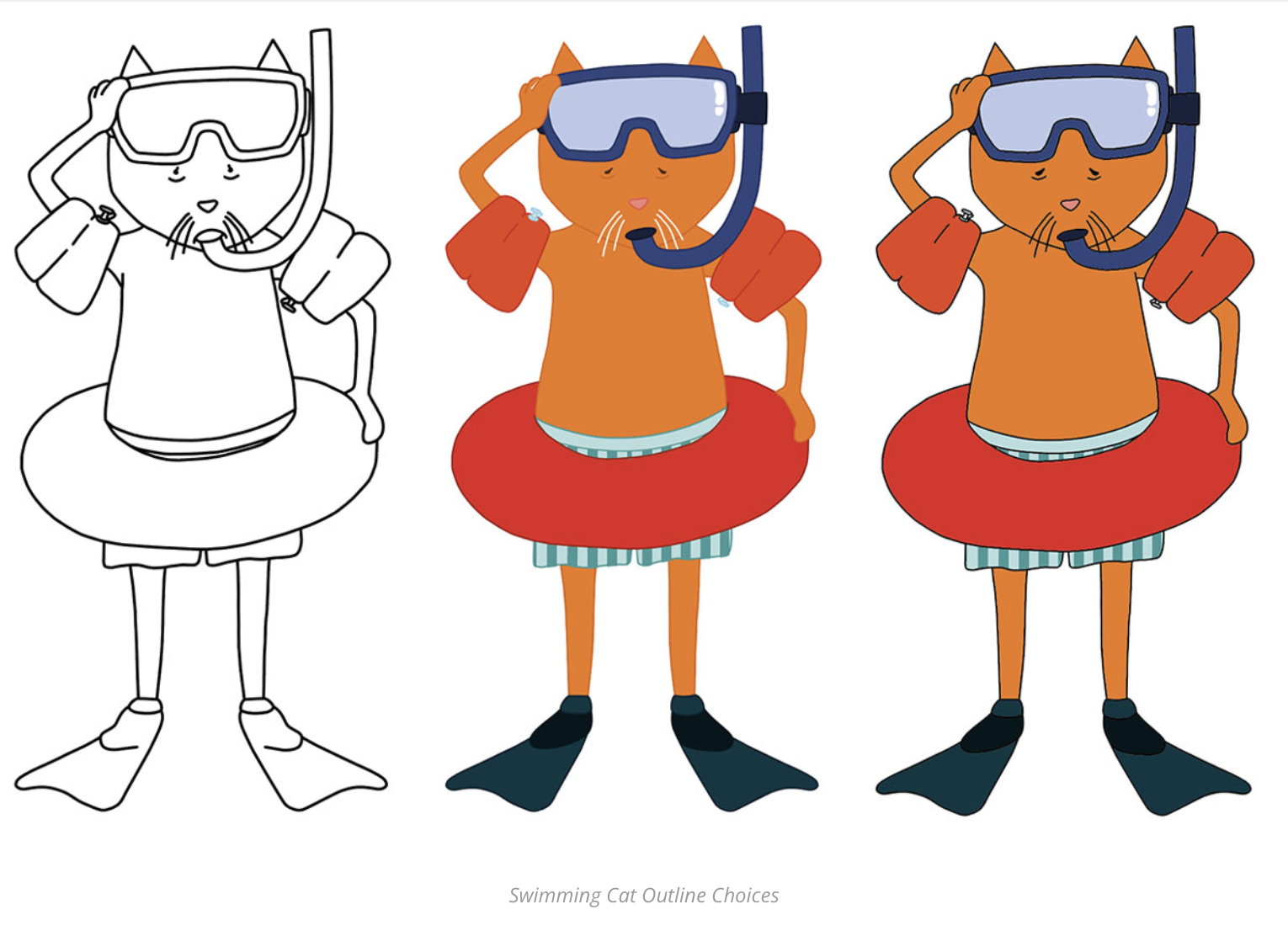
By the time I had reached Assignment 5 for this first unit, I was really unmotivated and I did not find my tutor’s feedback particularly encouraging or helpful. I would agree that the final three book covers could have been greatly improved on, but looking back I think they would serve as decent foundations. I liked the idea of the three characters, with their personalities on show, which is demonstrated across all three covers. Considering these were aimed at children, I feel they are quite strong conceptually and I used a lot of bright colours and bold elements.
Thankfully, I did decide to progress onto the next unit, Key Steps in Illustration. I started to incorporate more analogue work and there was a turning point about half way through the unit when something seemed to ‘click’ for me and I began producing work I considered to be of a much higher standard. I was very happy with the tutor I had for this unit and received a great deal of constructive, encouraging feedback, which was a real boost. Before I submitted my work for assessment I spent time improving several of the final pieces, based on my tutor’s feedback and I am very glad I did this.
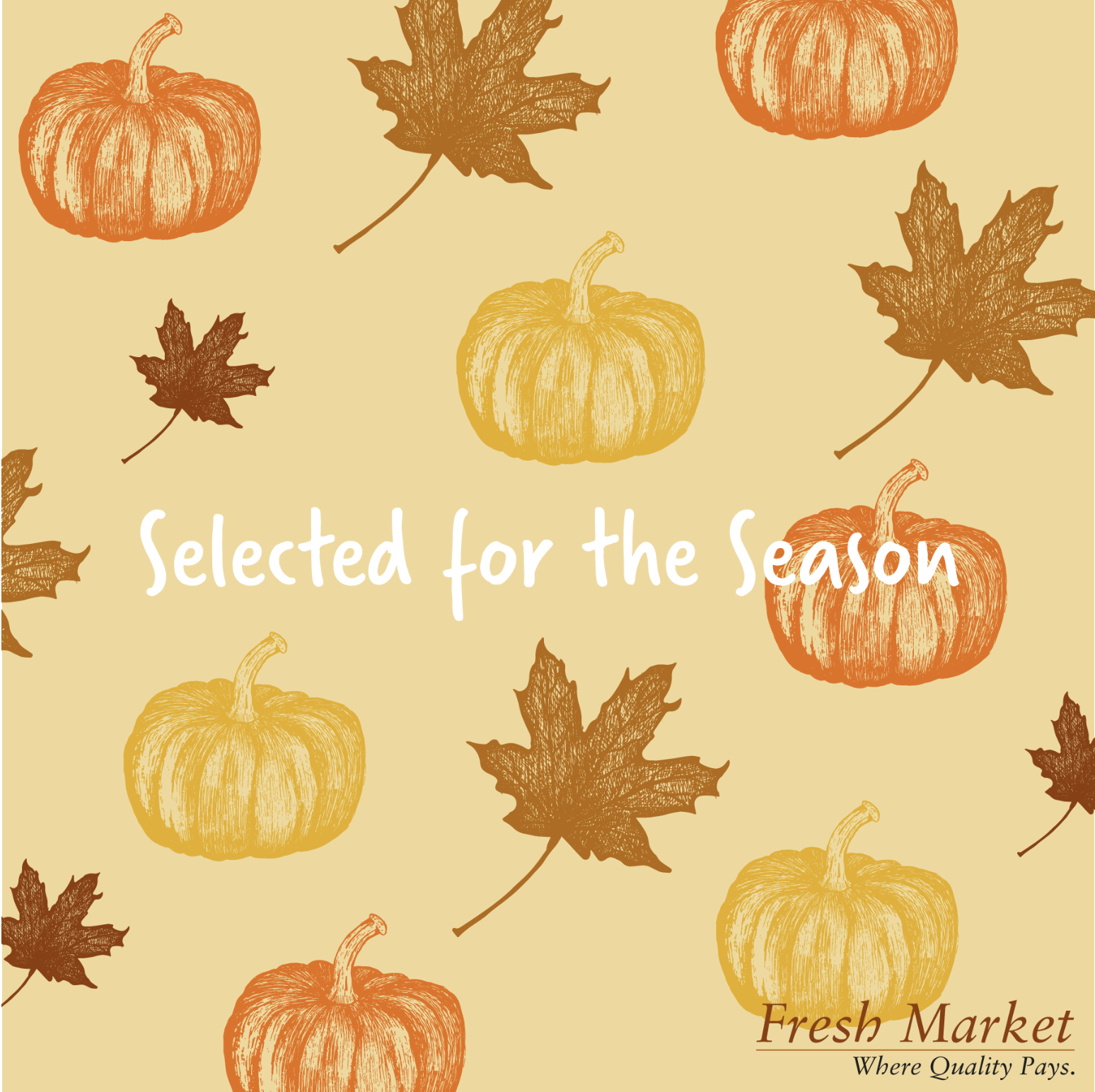
I was slightly unsure of how my attempts at designing illustrations for a Point of Sale display, but I was quite pleased that I decided to incorporate hand drawn elements and create a pattern design, which was a new style for me to try. I should have tried making it so that it could be used repetitively by lining up the corresponding parts of the elements at each edge. The below is the revised version which included some of my tutor suggestions. I particularly like the colour choices, which were meant to be representative of Autumn.
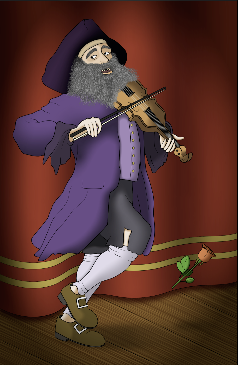
I spent ages trying to create a believable character for the Image Development exercise (‘taken’ from a William Hogarth painting). I was not entirely happy with the final result, particularly the blending of the colour and tone, but I was pleased that the figure was quite believable and his expression clear. I did thoroughly enjoy the process for this exercise and learnt a great deal from it.
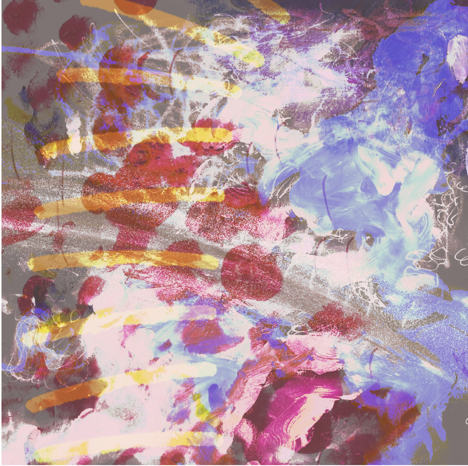
When I saw that there was an exercise that would require me to create an abstract work, inspired by a piece of music, my heart did drop slightly as I knew it would be completely out of my comfort zone. However, I genuinely surprised myself with the final piece as throughout the entire process it looked terrible! This exercise taught me to be more open-minded, experimental and not give up immediately. I am actively trying to maintain this mind-frame as I practice sketching, for example, and I often surprise myself with the final result, which is really encouraging.
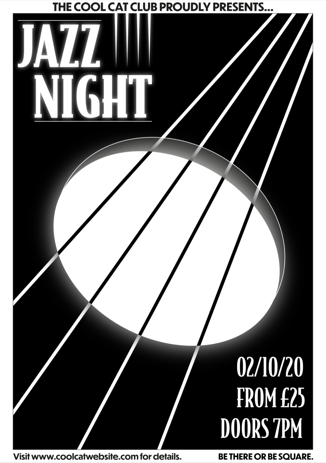
Another example of how my tutor’s feedback really helped to improve my level of work can be seen in the poster I designed for a Jazz Night. I was not satisfied with the original piece I had produced, but after my tutor’s suggestions I decided to return to this exercise and I ended up with a much stronger version of one of my initial concepts, which I felt was more representative of the brief’s requirements.
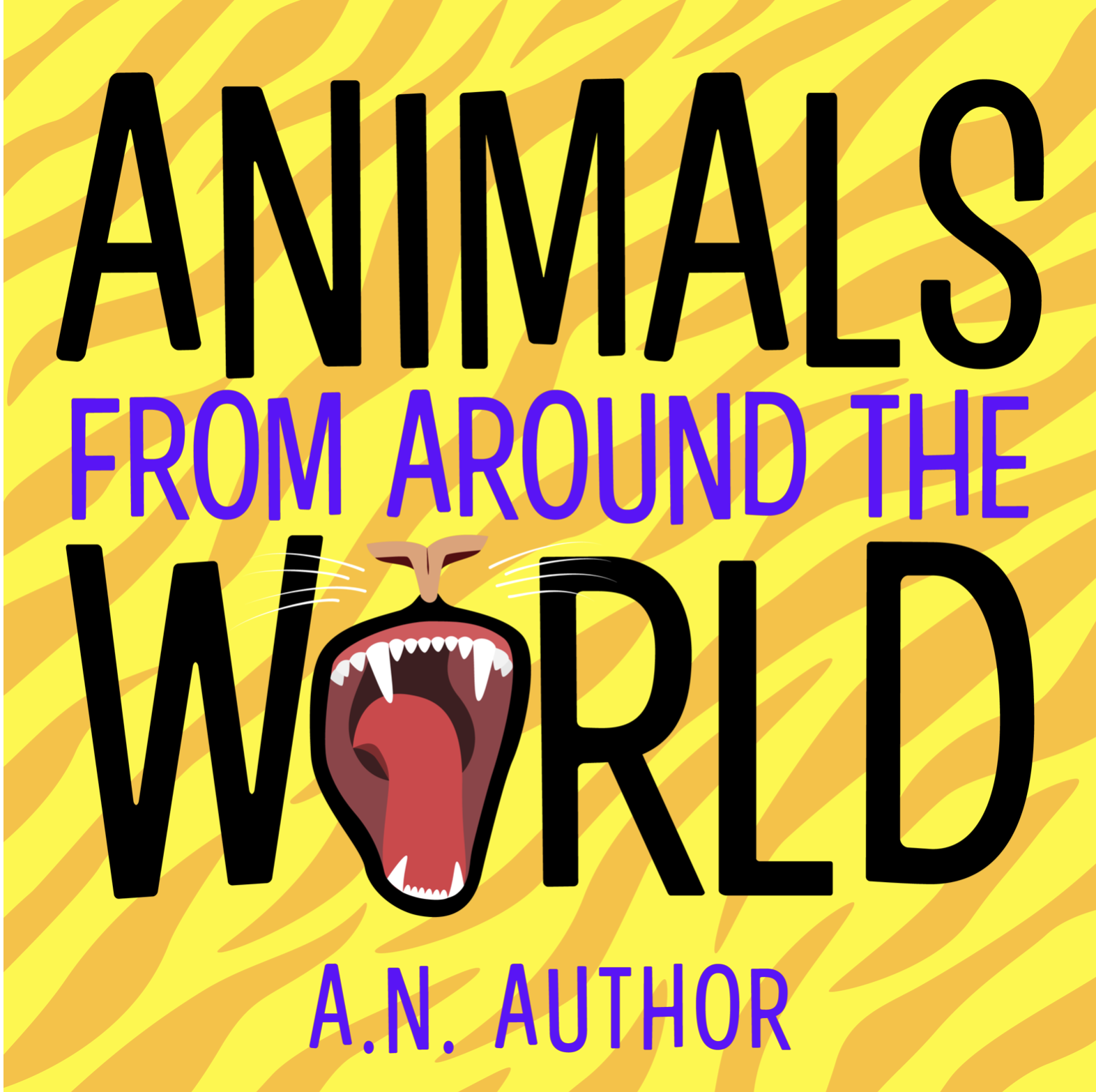
As with the previous example, another exercise with which I was not overwhelmed with the initial outcome was designing a cover for a children’s animal encyclopaedia. I felt my designs were lacking finesse, but, again, after tutor feedback I refined one of these and I was really pleased I had taken the time to do this. I specifically liked the addition of the animal print background to the cover, which I felt tied the whole design together.
I was really happy with the revised version of this logo for a menu card. I tried several different colour schemes and font choices as I developed the final piece. The positioning of the legs on the original version was completely wrong, so I am glad that I adjusted these. This exercise also required me to consider ethics of any projects I take on as designing a logo for a seafood restaurant did not sit well with my vegan values, even though I enjoyed the actual design process the destination of the card was not so pleasing!

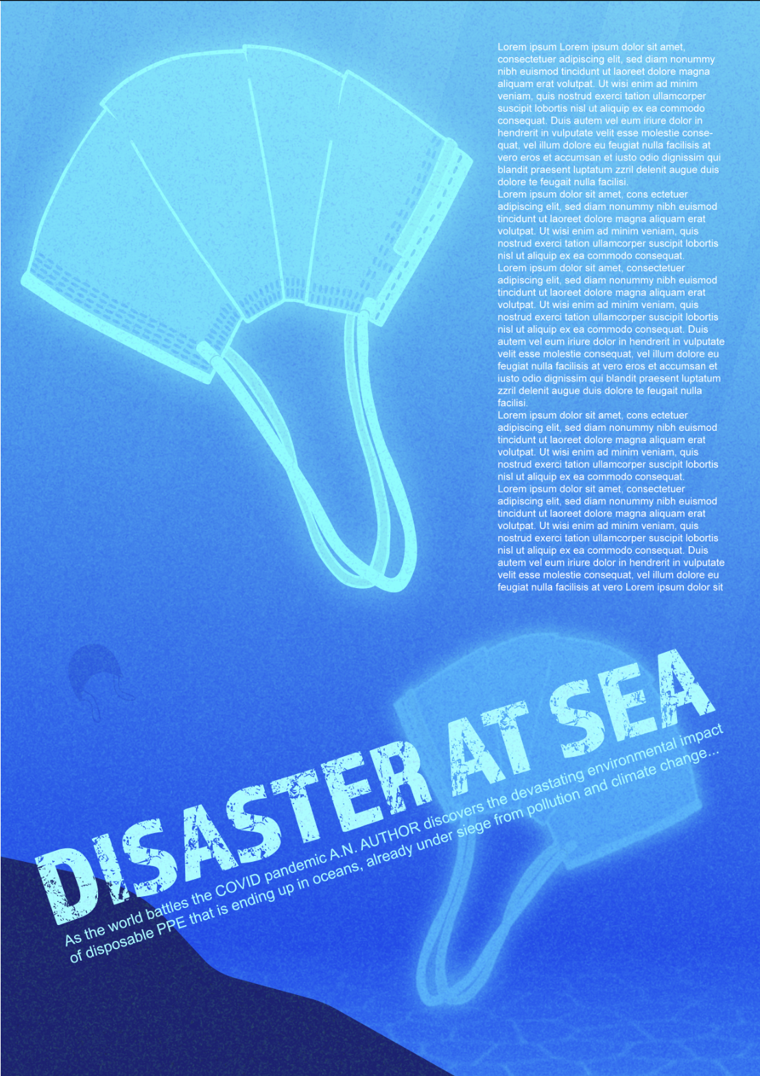
I had to incorporate graphic design skills when designing an illustration to accompany a magazine article. The topic I chose was ‘Disaster At Sea’ and I based this on the issue of disposable PPE ending up in the environment due to the Covid pandemic. I thought my revised final piece was quite impactful, although I wish I had made the middle mask different rather than an exact copy of the one in the foreground (this was due to time). I think that I did manage to create a certain sense of depth.
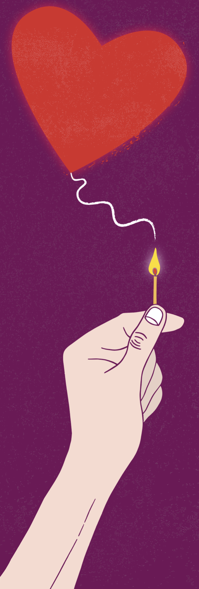
I was really pleased with the final design I devised for an editorial article based on the title ‘The object of my desire’. It was quite a challenging exercise, but I think I created an impactful image. I was also very happy with the hand that I drew for this exercise!
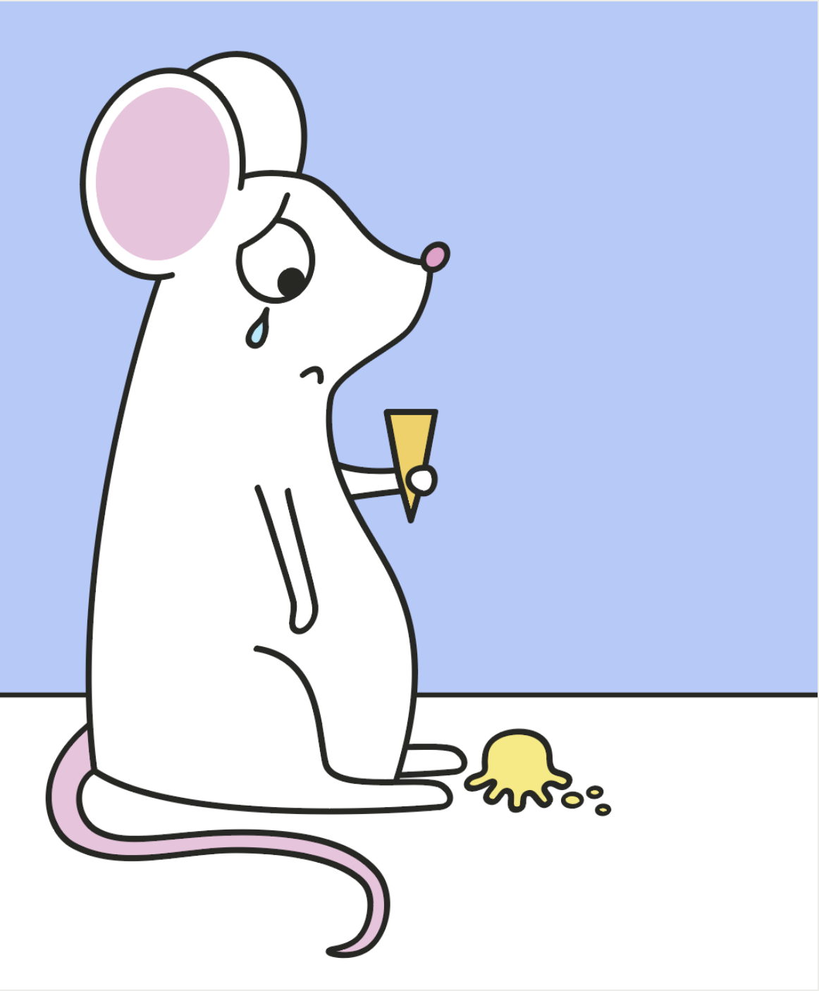
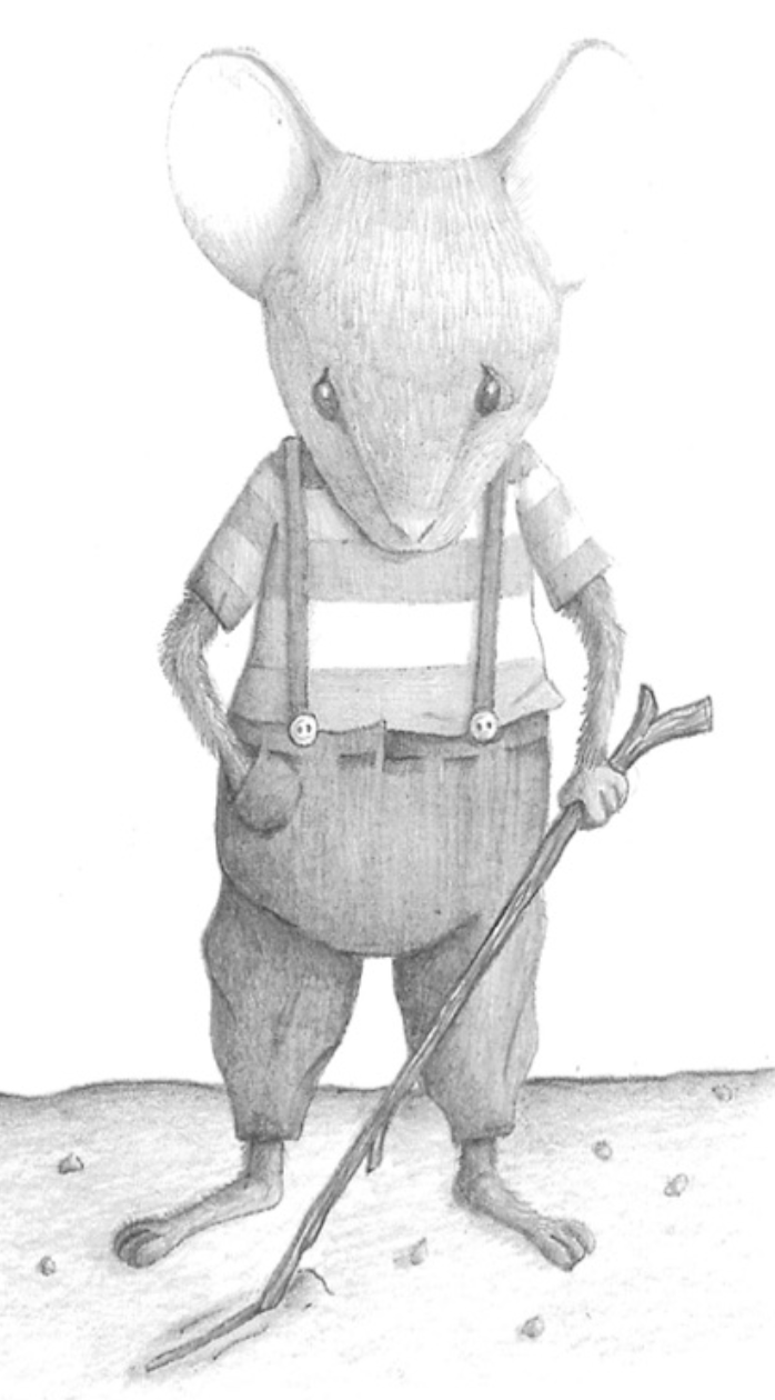
Having to draw the same subject in two completely different styles (aimed at two age ranges of children), was quite a challenge. I decided to choose the age ranges at the opposite ends of the scale with the aim of depicting a sad mouse. I was fairly happy with the outcome and I think the designs were suited for purpose. This was the exercise that introduced me to the illustrator/author Shaun Tan as my tutor noted that the older children design reminded him of Tan’s style, which really boosted my confidence. I just wish I had remembered to include the mouse’s tail.
I put a great deal of time and effort into the final assignment for KSI and I thoroughly enjoyed the entire process, even the most frustrating parts! Two of the final seven designs can be seen below. Although there were definitely improvements that could have been made, I felt these illustrations really demonstrated how I had increased my standard of work since beginning the first unit, Graphic Design, and I was quite proud of how far I had come.
The unit that I completed most recently, Graphic Fiction, was my favourite. I found it extremely challenging, but I learnt so much about all aspects of this genre of illustration. I think the most appealing factor was the combination of storytelling and pictures, both of which have always been important to me. I was introduced to so many talented practitioners and the range of work they produce was inspiring. I also had another excellent tutor for this unit who provided really helpful and informative feedback. Apart from the first assignment, I was required to focus mostly on producing analogue work, which greatly improved the digital work that I did create. I was genuinely disappointed when I reached the end of the unit, so I am hopeful that I will be able to explore this area of illustration more.
The first assignment was to create a self portrait. I am not a fan of introductory exercises and always try to get out of revealing too much of myself, so I decided to incorporate this into the final piece with me climbing out of the window in order to escape such a situation. Although the characters are quite stiff, I was pleased overall with my cartoon and I felt it summed me up pretty well! I tried to avoid really saturated colours and use a more ‘realistic’ colour palette. I also tried to consider the line of vision of a potential viewer and how they would read the image across the composition.
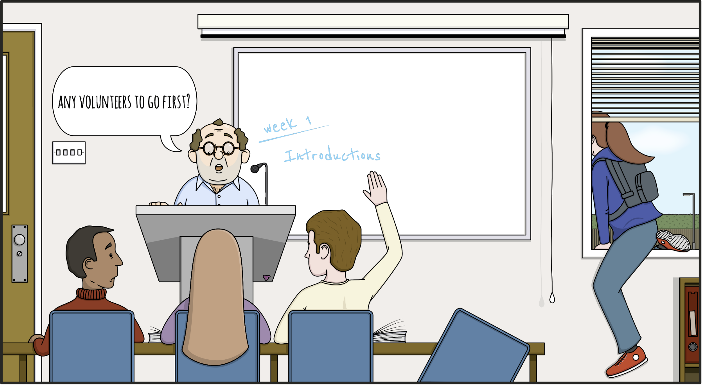
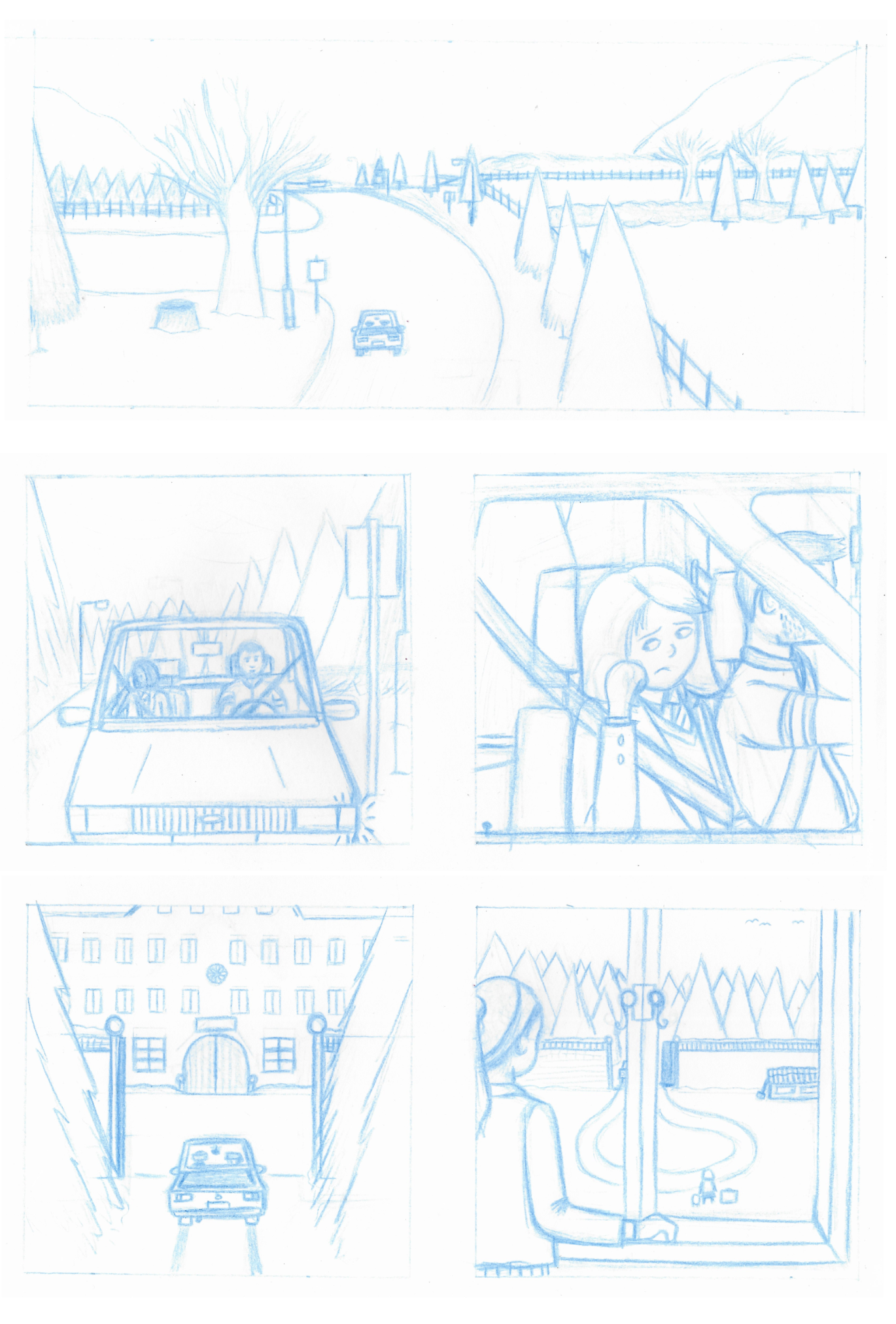
The exercise Introduce Your Character was my first attempt at filling a page with panels and threading together a series of images. I found this exercise difficult, but I learnt plenty about different viewpoints and paying attention to composition. I also was forced to draw background environments and a car, both of which are elements I need to develop skills in rendering. Also the characters were, again, quite stiff, but overall this was a very valuable exercise.
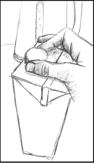
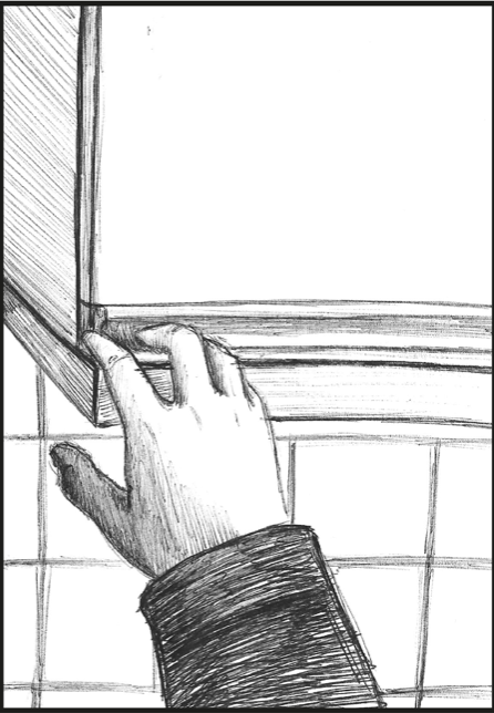
Drawing a series of illustrations to demonstrate the process of making a cup of tea certainly tested my analogue abilities! I must admit I cringed at the perspective and proportion in the majority of these, but on the positive side I was pleased with a couple of the panels and, in particular, that I managed to draw some relatively believable hands.
As with the KSI unit, I felt there was a turning point in the Graphic Fiction unit when I suddenly began producing better quality work and Assignment 3 was the key moment. I enjoyed every aspect of producing the nine-panel grid, from devising the storyline to experimenting with coloured pencils and watercolours.
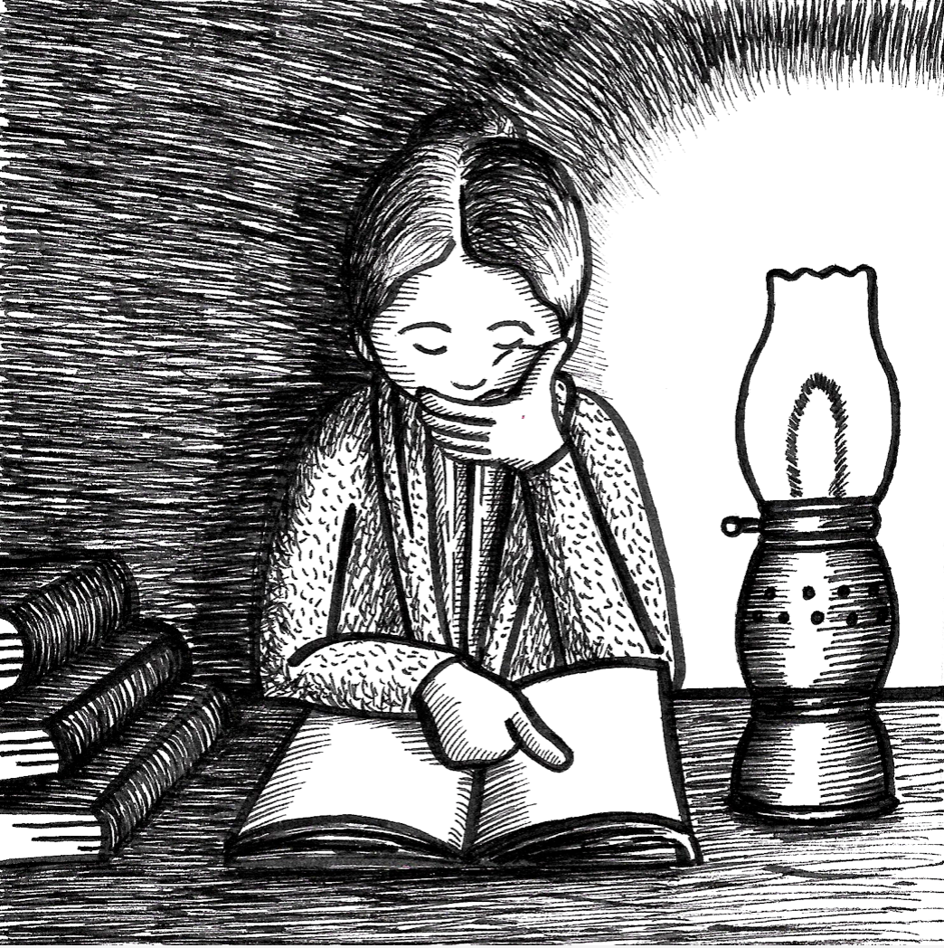
One of my favourite exercises was True Stories in which I was asked to produce a series of illustrations depicting the life of a notable figure. I selected Elizabeth Garrett Anderson and I found the research eye-opening and educational. I was not completely happy with my first submission, so following on from tutor feedback I reworked the original illustrations, adding lighting effects and texture, as well as adjusting/adding floor lines. I was much more satisfied with the results.

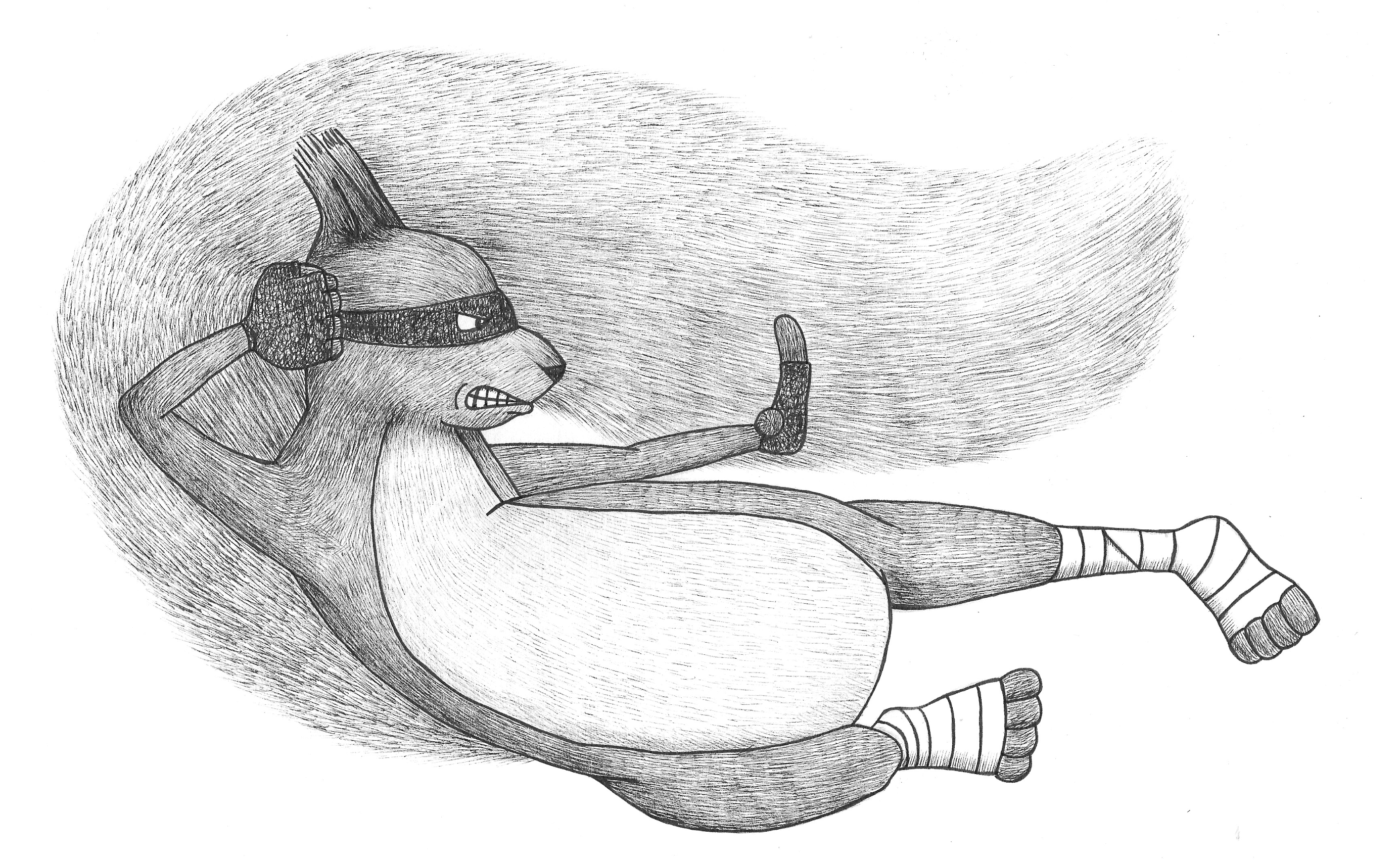
Another exercise I returned to after tutor feedback was Create a Children’s Comic Character as I was disappointed with my first attempt. I am keen to improve my character design skills so I spent time redrawing the ninja squirrel character and carefully using lines to depict the texture of the fur. I was really happy that I tried again and that the result was more representative of what I had initially intended.
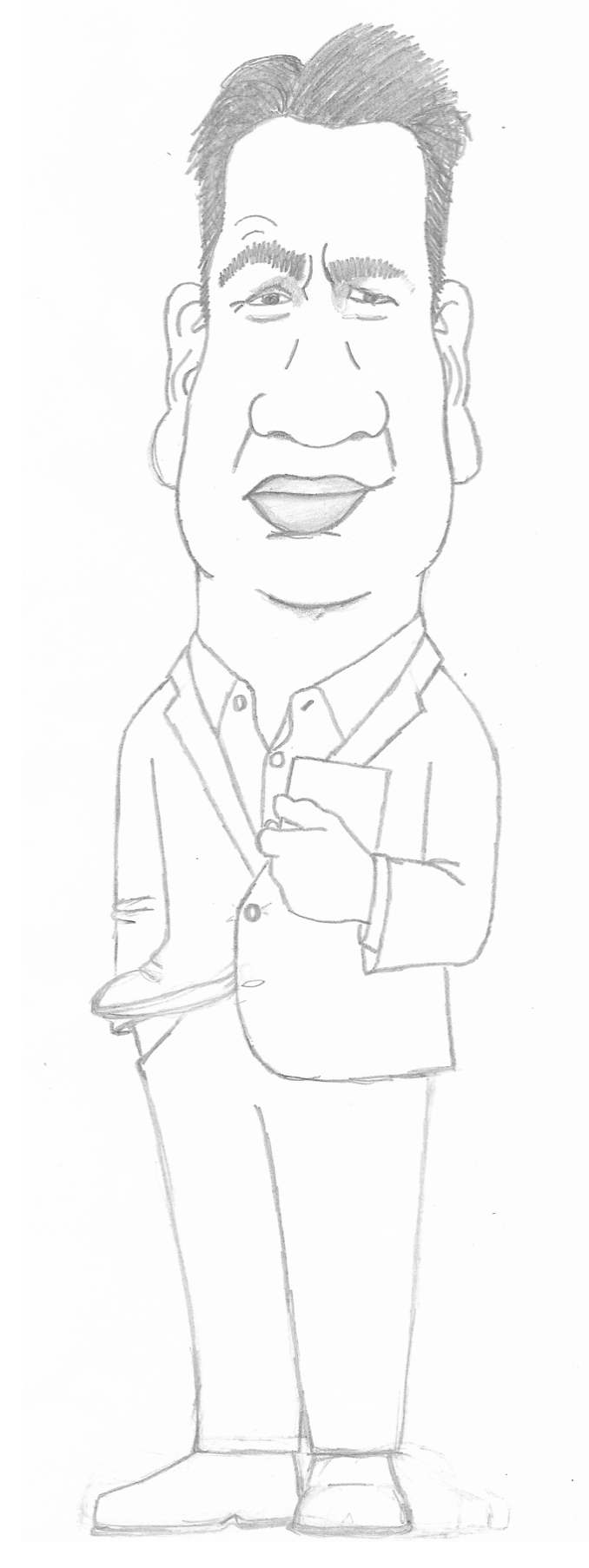
I had always admired those who are able to capture people’s personalities and appearance in caricatures so when I was required to attempt this I was really quite intimidated. I spent ages trying to produce this drawing of Michael Portillo and, on reflection, I think I was fairly successful at making a recognisable representation of him. This exercise increased my respect for caricaturists, that is for sure!
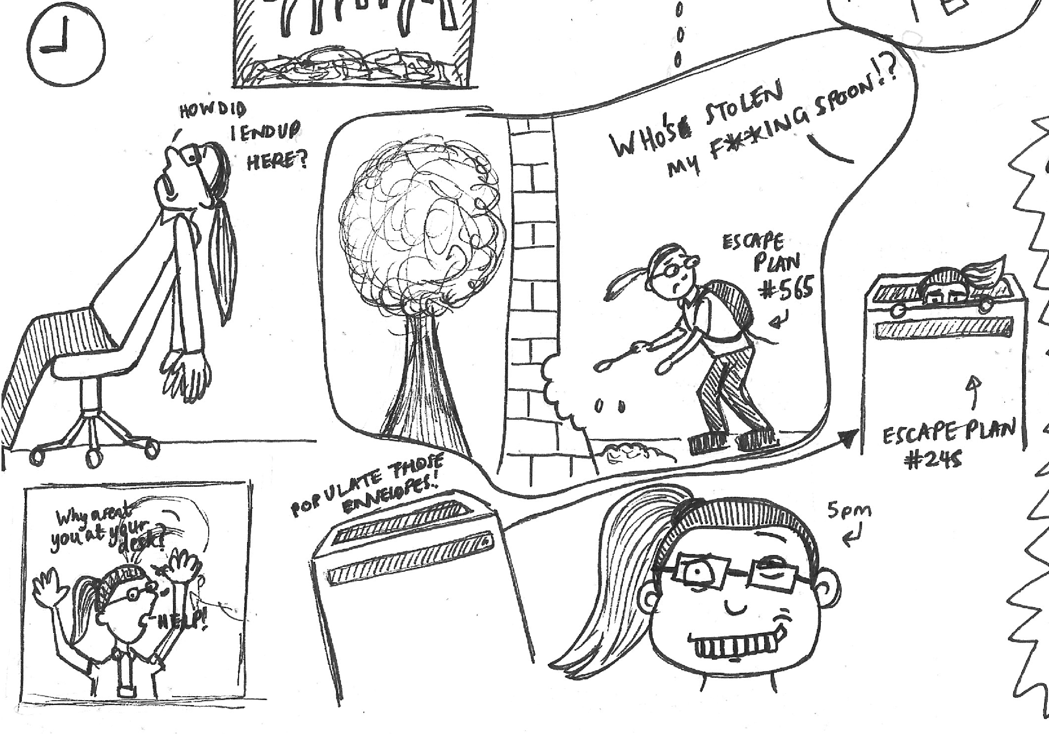
The number of exercises in Part 4 was slightly overwhelming so when I reached A Day In Your Life, I was able to take a breath and just doodle, which is something I find quite relaxing (and in this case fairly therapeutic). I had fun depicting my thoughts about working in an office and although most of it would not mean anything to another person, I found it highly entertaining.
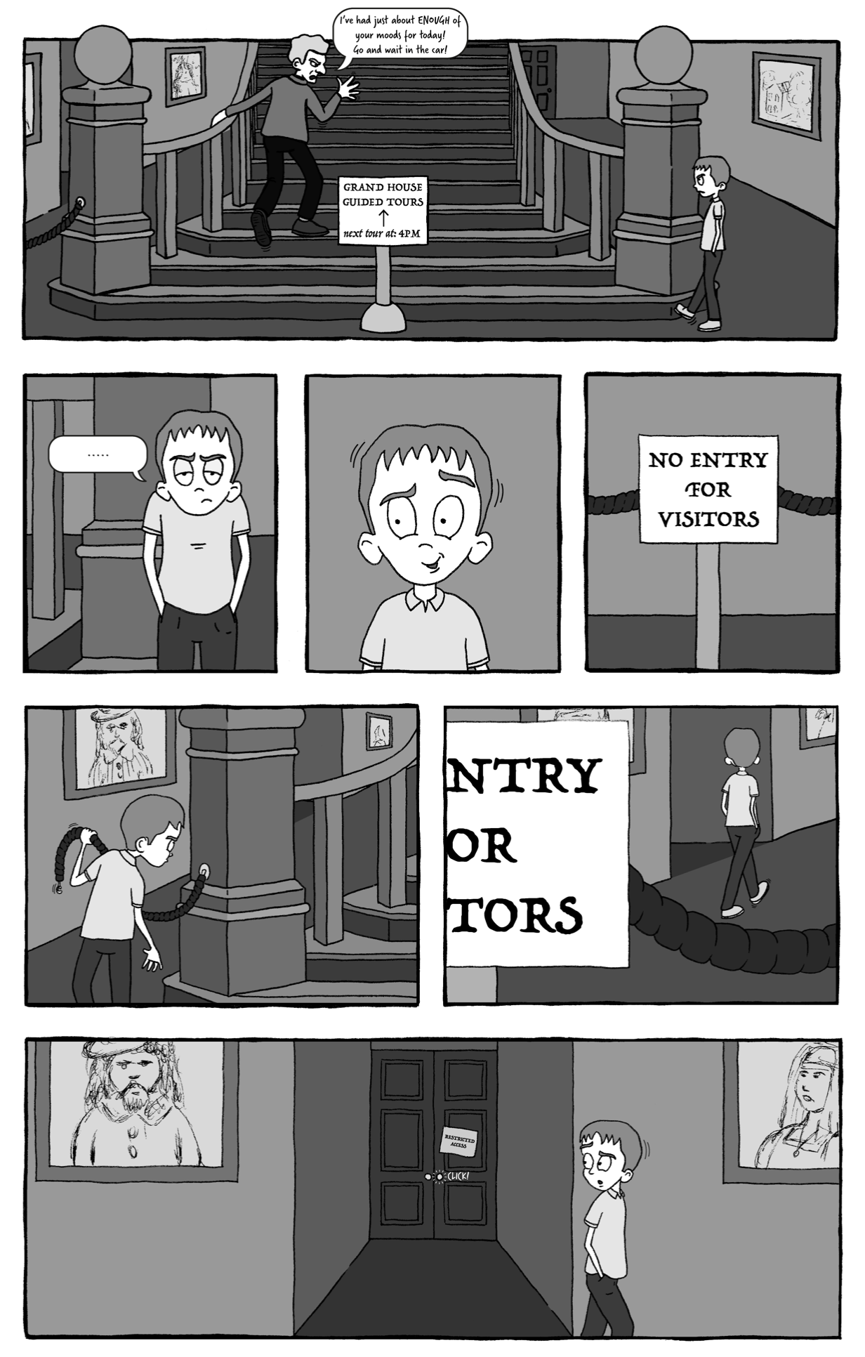
I was completely focused on Assignment 4, which required me to design a comic book cover, and I was determined to produce a high standard of work. I felt attached to the work as I had devised a storyline and the character back stories. I took time working on the characters, making many adjustments. I could have carried on working on this project for much longer, but I was restricted by my course deadline, so I had to reach a point where I could let it go. I was mostly satisfied with the final design, but as always there are improvements that could be made. I think this was evidence of how my abilities had improved.
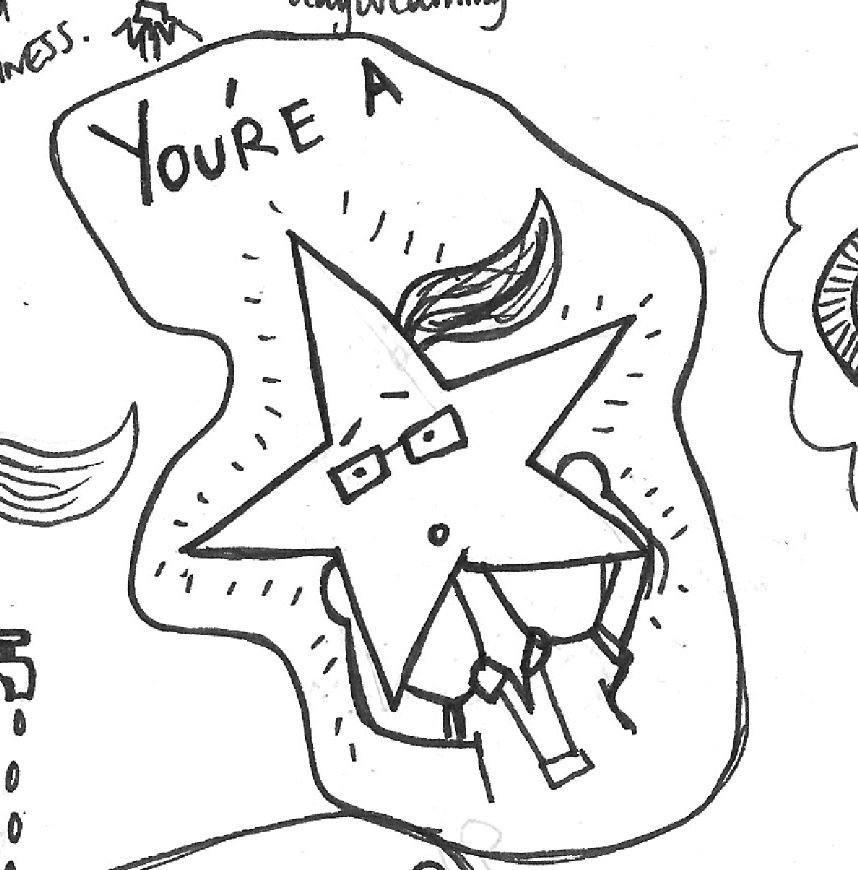
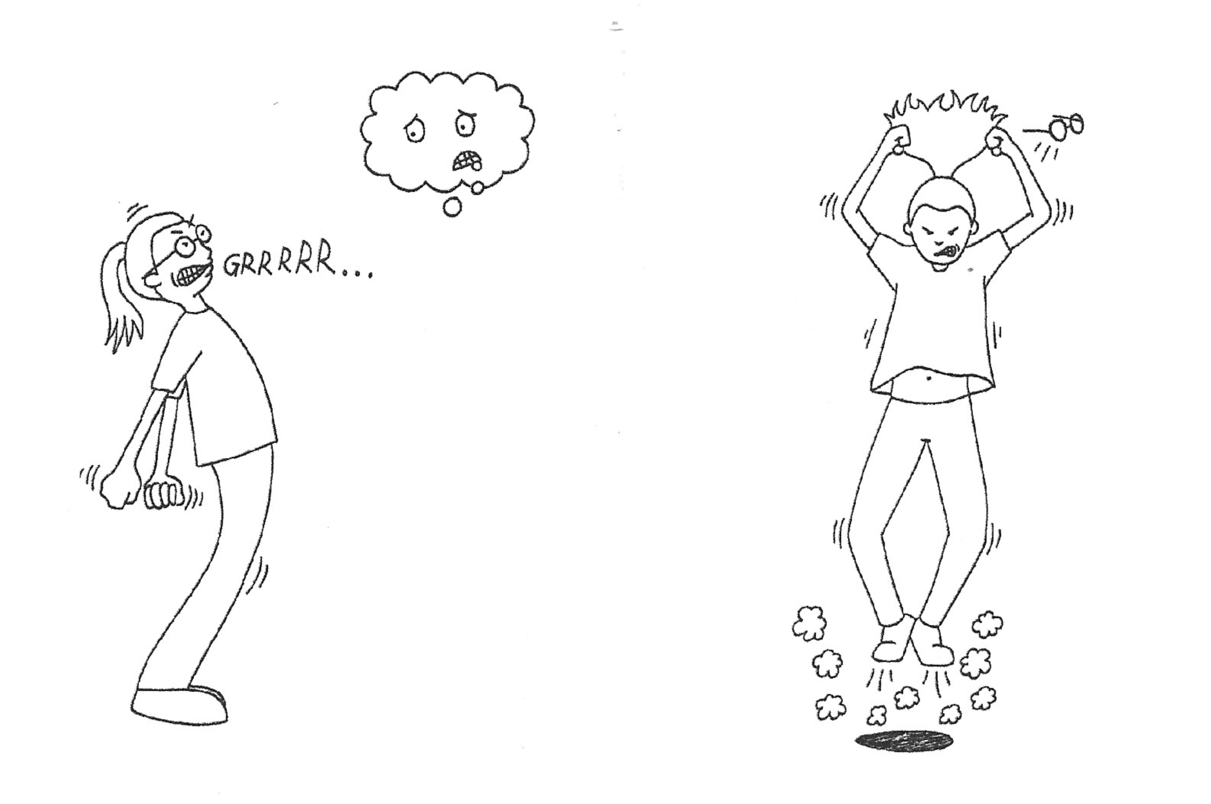
I was introduced mini-comics during this unit. When asked to produce my own, I really struggled to come up with a concept so I decided to use this frustrating mental block as the story. I had real fun creating depicting the interactions between the character and her ‘thought cloud’. Although some of the drawings were slightly skew-whiff, I think it could definitely be seen as a draft for a more refined version if I were to return to it.
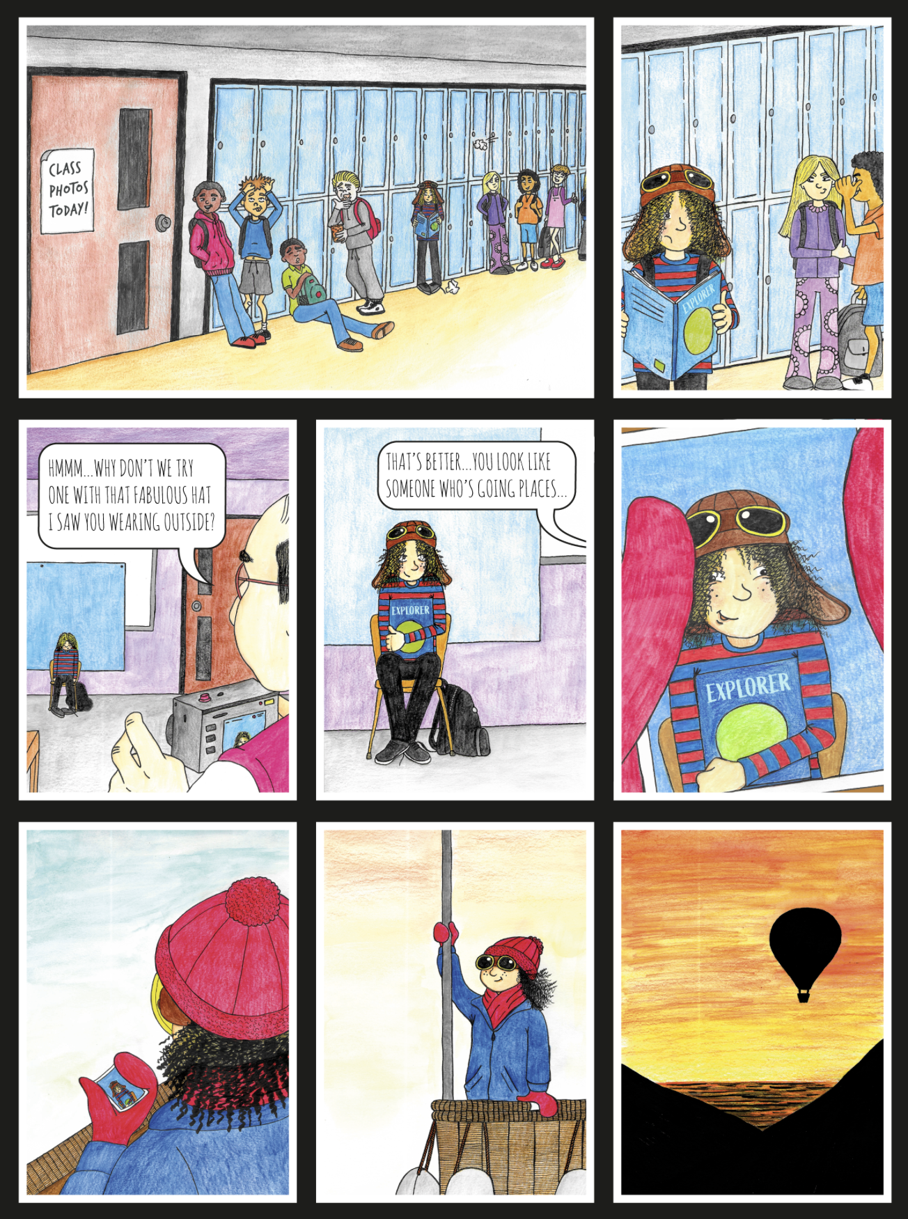
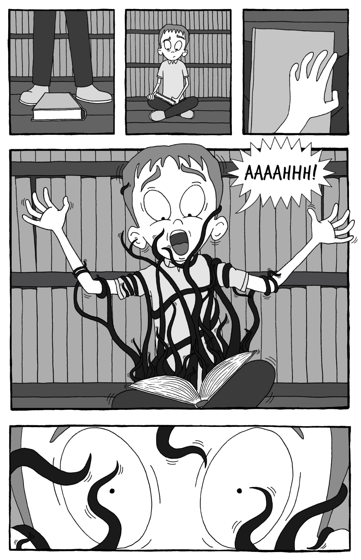
I was both looking forward to and apprehensive of Assignment 5 as it would allow me complete freedom. I decided to create a five-page comic story. Every part of this process was challenging, but I pushed myself to focus on producing what I had envisioned. I had to tackle perspective and backgrounds, both of which thoroughly tested me. I worked both analogue and digital, combining them effectively. One of the few aspects that I felt slightly disappointed with was the lack of detail in the backgrounds, particularly the library room, and I could have experimented with adding texture to the walls, floors, etc.
In terms of personal work, I have really been focusing on observational drawing trying to ensure I look at the object/subject and draw what I see not what I think I see. I have also been working on improving my mark-making skills, as I want to develop my pen and ink drawings. I also intend on attending life drawing classes, which I hope will be beneficial to my character designs.
I feel it is becoming clearer what areas of illustration interest and appeal to me the most, as well as where my strengths and weaknesses lie. Examples of the latter include colour, perspective and drawing backgrounds/environments.
In the future I hope to have the opportunity to focus on visual narratives and character designs, whilst incorporating what I have learnt along the way.