Produce three drawings depicting a room in your house using one-point, two-point and three-point perspective. This is an exercise to develop your understanding of the principles of perspective. Find places that can exaggerate these different viewpoints. For example, you might look up (or down) to show three point perspective. Produce a fourth drawing using isometric projection to represent the room.
Produce a fifth drawing of the room in which you deliberately break the rules and draw the space with its own visual logic and, finally, do a flat drawing. By definition these drawings will be less observed and more imagined, but try and use the same room and objects as in your perspective drawings.
The exercise should focus on how you visualise depth and what strategies you use. You do not need to produce finished illustrations for these pieces, though you can if you want to.
Write around 200 words analysing how these different approaches affect the ‘meaning’ of the visual space being represented. When you choose to draw with or without perspective what is this saying?
If there is one area of illustration that I find more confounding than colour it is perspective, as I discovered during the Graphic Fiction unit. Therefore, when I read through the brief for this exercise to say I was not looking forward to it is an understatement. I understand the basic ‘rules’ of perspective, but find it difficult to apply this in practice, so I avoid using it, which is certainly not ideal. I chose to see this exercise as the perfect opportunity to really try to learn how to use different perspectives effectively.
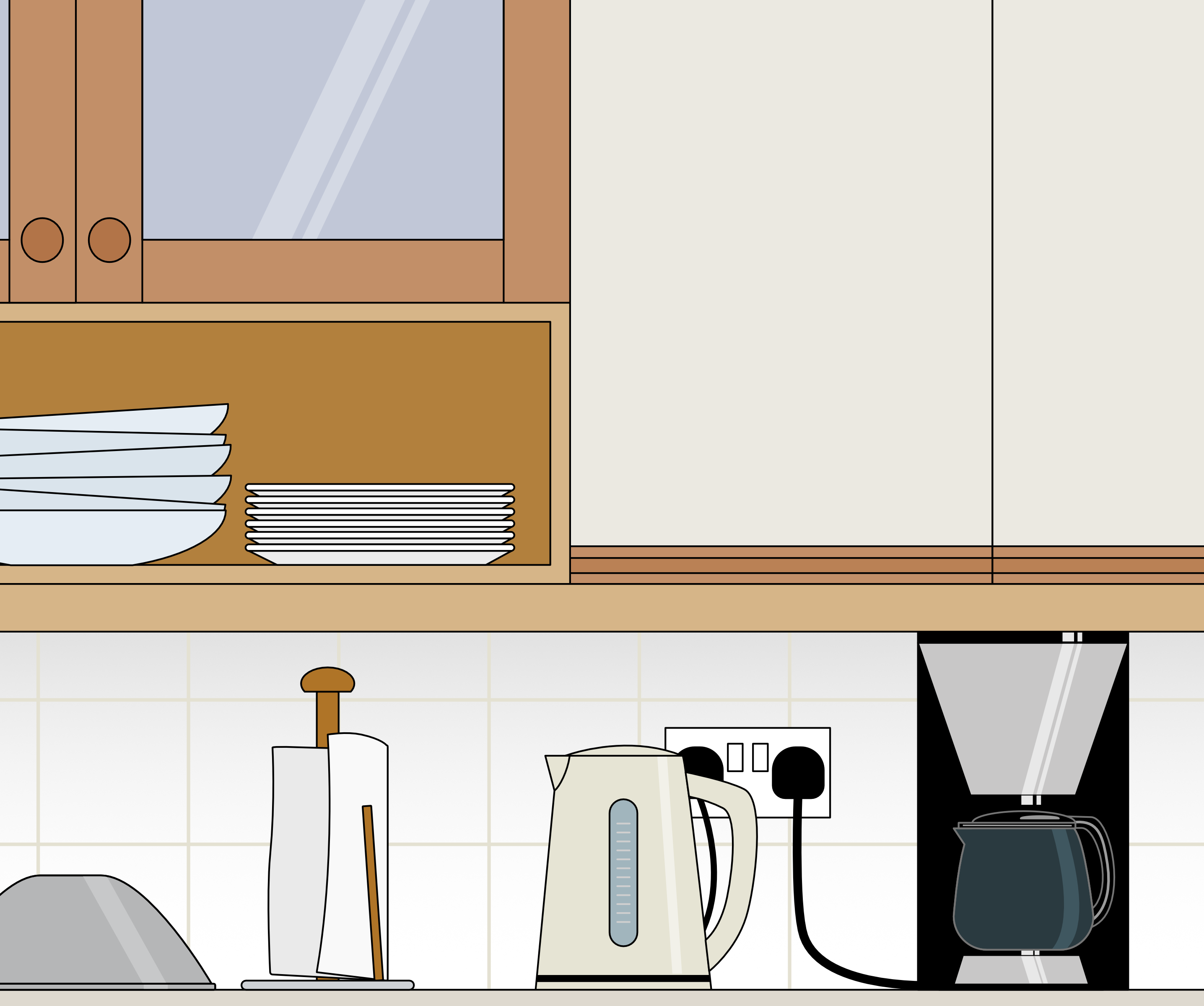
I decided to not fixate on creating finished illustrations and focus on the process instead. I picked an area in my kitchen for this exercise, mainly as it is the least cluttered and most straightforward room in terms of straight lines that I could use as guidelines.
One Point Perspective
One of the issues I had previously found when trying to use perspective was that I became obsessed with using a ruler to draw the horizon line, vanishing point and vanishing lines. This usually resulted in very mathematical, lifeless illustrations.
With the above in mind, I chose to do a freehand sketch of the kitchen for this first drawing of one point perspective, estimating the relationship between different objects in terms of distance and size. Only then did I add the aforementioned guides using a ruler and red pencil so I could then check my placements and make any necessary adjustments. I much preferred this way of working and I was quite pleased with the result as it had more character to it than any previous attempts I had undertaken.
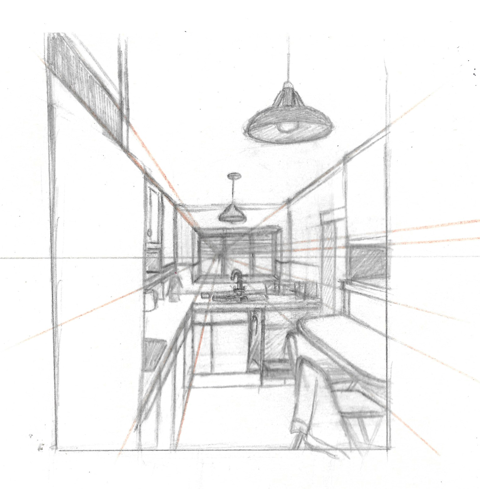
(click on image for larger version, opens in new tab)
Two Point Perspective
I found that drawing the guides out first was helpful when drawing out the two point perspective, but the result was a more ‘clinical’ illustration. However, I was starting to feel more confident and noticed that once I actually got on with drawing, the perspective aspect became much easier.
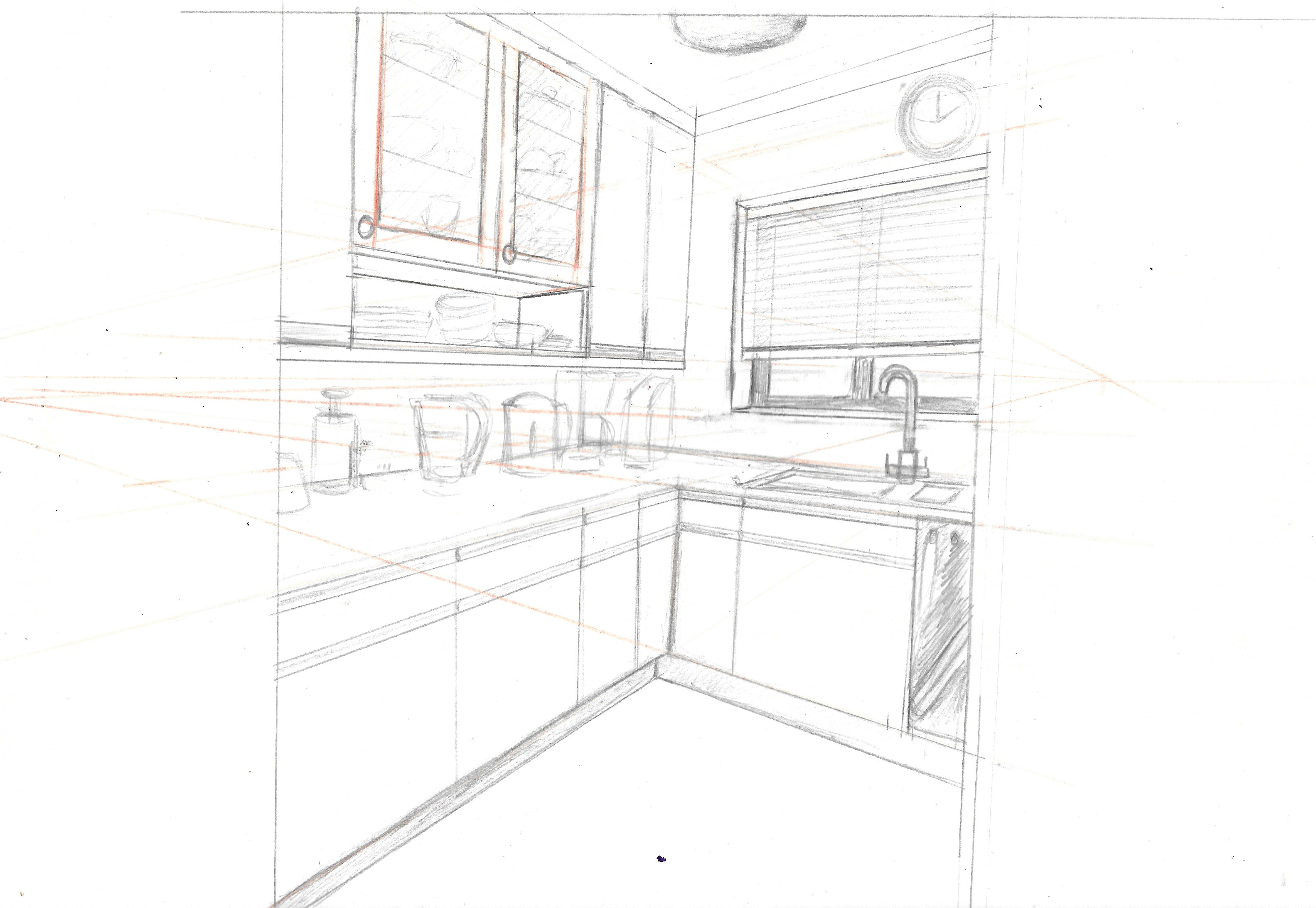
(click on image for larger version, opens in new tab)
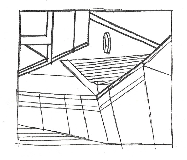
Three Point Perspective
As previously, I chose to draw out the guidelines first for the three point perspective illustration. I found this one to be more challenging as the lines of the drawing did not look ‘right’ as I drew them and I had to trust the guidelines. Not until most of the lines were in place did I fully comprehend the ‘magic’ that had occurred! I added very faint outlines of the items on the counter as my brain was too fatigued to try and work out how to apply three point perspective to them as well.
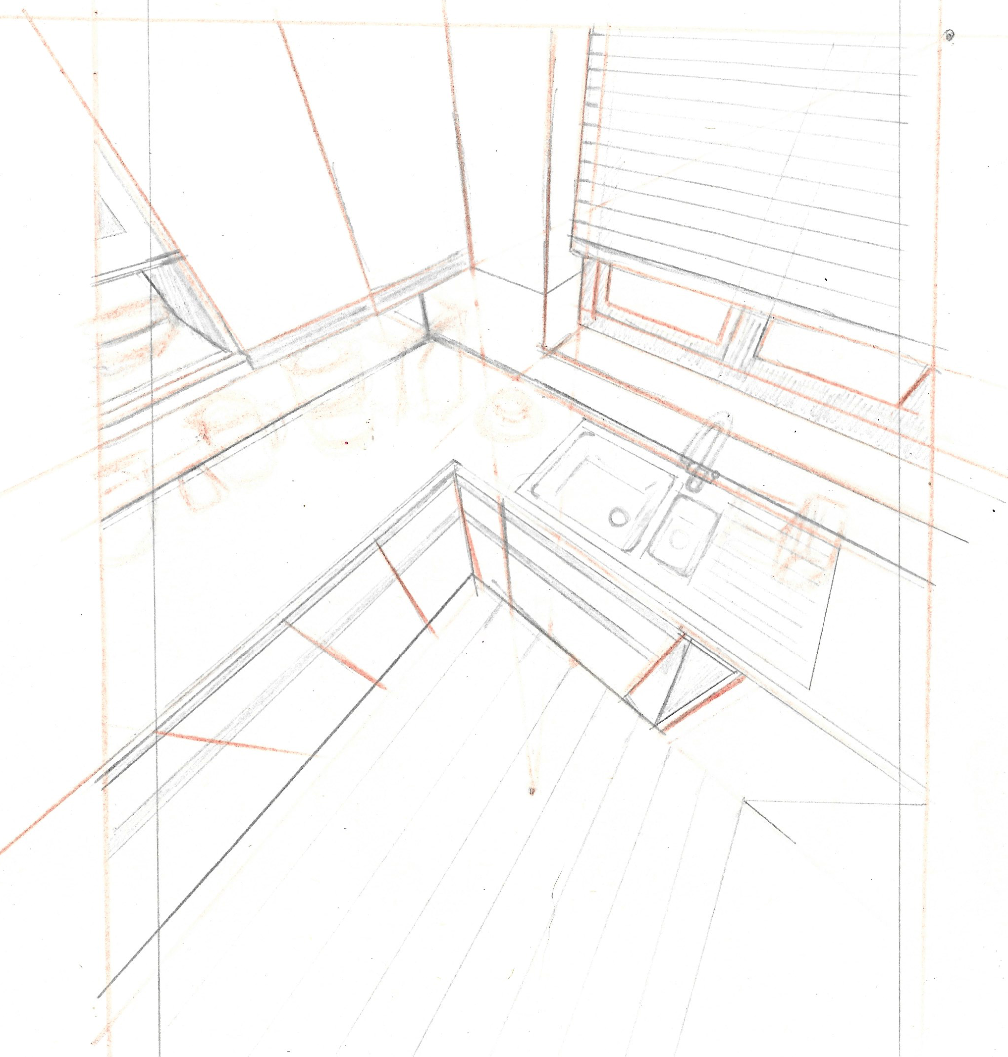
(click on image for larger version, opens in new tab)
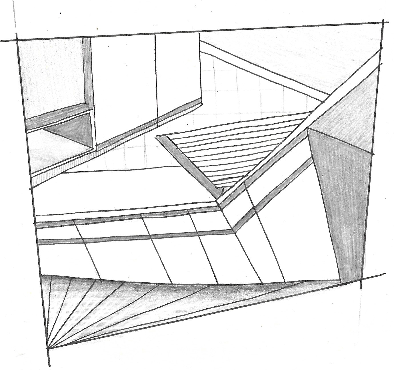
Isometric Projection
After three point perspective, I did not think anything else in this exercise could boggle my mind quite so much…until I found out about isometric projection. I had previously seen these types of illustrations in magazines and online. I had always thought of them as quite cartoony and ‘cute’ as they always seem to be so tiny and neat. I also realised that M.C. Escher used this technique for his geometric drawings. I found a helpful article online that outlined the basics of isometric projection and I drew an isometric cube using the included instructions. As suggested in the article, I found an isometric grid online, which I could print off and use as a guide. I managed to draw a very basic isometric projection drawing of the kitchen area. I really like the style of these illustrations and it is something I would definitely want to explore further.
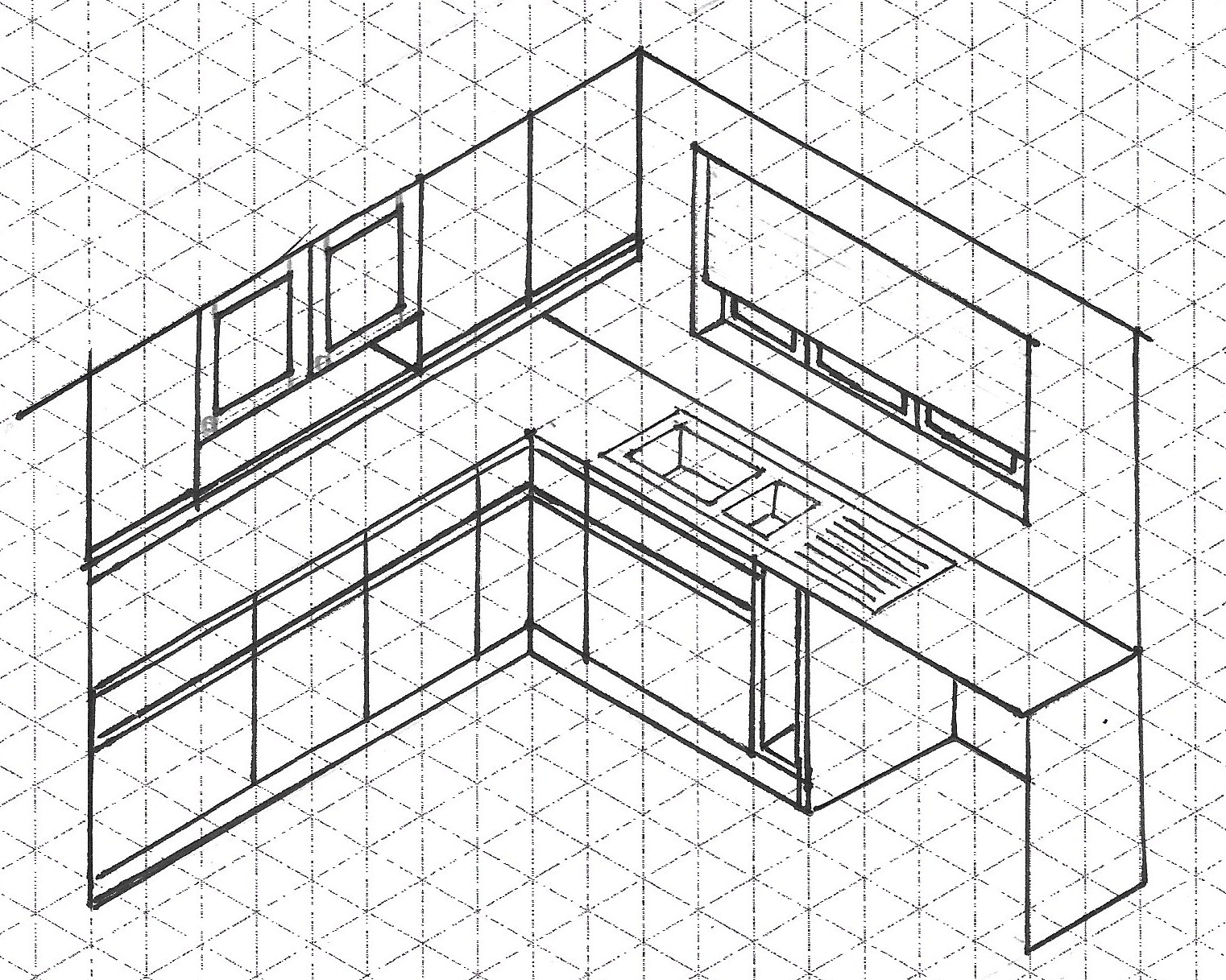
(click on image for larger version, opens in new tab)
‘Break The Rules’ Perspective
By this point of the exercise I had become so used to following rules and guidelines that to then be asked to do the complete opposite required extra thought. I decided to go completely abstract and focus on distorting the angles of lines. I drew a very small thumbnail to use as a guide.
(click on image for larger version, opens in new tab)
On the bigger version, below, I decided to warp the border to add further distortion. I kept the illustration quite simple and clean. I think the result is still recognisable as the kitchen area and I liked not having to follow rules.
(click on image for larger version, opens in new tab)
Flat Drawing
As I side note, I have been considering moving from Adobe products to Affinity as the former is quite expensive and most of the time causes me grief by crashing, etc. I decided to take the plunge and started a free trial of Affinity products. I used Affinity Designer for this final illustration.
It is not the most exciting view, but it was a welcome relief to not having to worry about perspective. Most of the flat drawings I found during the previous Research Point were patterns, but I could not see how to produce a pattern from what I was drawing. I liked the cartoon/graphic style that often results from this style of illustration. I did add a few highlights to suggest a 3D element of the objects.
(click on image for larger version, opens in new tab)
Perspective and the Meaning of Visual Space
Using perspective allows an illustrator depict ‘realistic’ representations of spaces that the viewer can relate to. Our eyes perceive distance through objects becoming smaller the further away they are and using one point, two point or three point perspective makes it possibly to recreate this effect on a 2D surface.
One point and two point perspective are perhaps the closest to reality as three point perspective can be used to create very extreme angles. This can be utilised, for example, to give the impression of a character looking up at something and feeling very small/insignificant or, conversely, looking down on something to imply height/power.
Isometric projection is often used in diagrammatic illustrations as it is allows all elements of the drawing to be the same size as they are not impacted by perspective. The illustrations can be very simple so complex subjects can be clearly communicated.
Breaking the rules of perspective gives an illustrator artistic freedom to create weird and wonderful or abstract environments. I think it is important for the rules of perspective to be properly understood before breaking them.
Flat drawings allow the illustrator to focus on more on the colour, shapes and/or patterns. It often results in a more cartoony/graphic style.
Final Thoughts
Although this exercise was challenging, I have benefited from taking the time to learn about each of the different ways of visualising depth. I feel more confident of how to implement perspective in my drawings – I just need to keep practicing and not be scared of ‘failing’ as I learn.
I discovered that it is not always necessary to be completely accurate through using rulers, etc and just focus on drawing what is in front of me. I can then fix any inaccuracies as needed afterwards. This method was much less stressful for me!
Bibliography
O’Higgins, S. (2022) Isometric drawing: A designer’s guide. Available at: https://www.creativebloq.com/features/isometric-drawing (Accessed 12 November 2022).