This part of the course has explored a wide range of different contemporary approaches to illustration, many of which question the role of illustration itself. Not all the approaches will suit everyone, so make a choice about how you decided to respond to this brief.
Creatively explore the statement ‘you are here’. Produce either a short self-published fanzine, graphic novel or artists book; an online interactive experience; a piece of street art; or an illustrative object.
This is a very open brief, so it allows you plenty of room for exploration and creativity. ‘You are here’ can suggest a site-specific approach, an historical perspective, or you could be philosophical or humorous or both! Remember it is an illustration project so, whatever you decide to do, make sure it focuses on developing your illustrative work in some way.
Initial Thoughts
My first impression of the outline for this assignment was slight dread as open briefs are not my favourite. I seem to generally work best with clear and structured instructions. In addition, I also felt the added pressure of being informed of the unit deadline.
I have found all of the exercises and research in this part of the course to be both interesting and challenging. Quite a range of the different areas of illustration were explored, but I felt my strongest efforts were in the caricature, mini-comic, pixel art and street art exercises. All of these included character design and some form of narrative, which matches up to my specific interests. I thought it would, therefore, be sensible to focus on one (or more) or these areas for the assignment.
Note: I have requested a short extension as I do not believe I will be able to complete the unit within the given timeframe (due to ongoing personal issues that have restricted the amount of time I can commit to the coursework, as well as affecting my focus), but as of yet I have not received confirmation of this request having been accepted.
Mind-mapping
I began, as usual, by mind-mapping my first thoughts regarding the term ‘You Are Here‘.
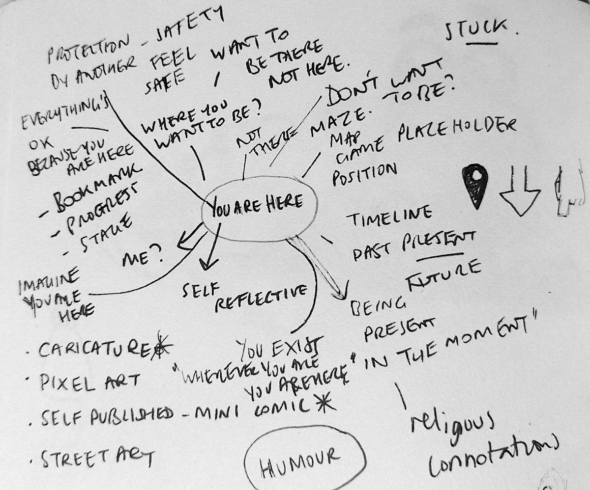
On a personal level, I was feeling particularly negative at this moment in time, so although I did note down some positive connotations I associated with the term, such as ‘protection’, ‘being in the moment’ or ‘safety’, I was more drawn to the less encouraging ones. These included ‘being stuck’, ‘not wanting to be there/here’ and ‘no escape’.
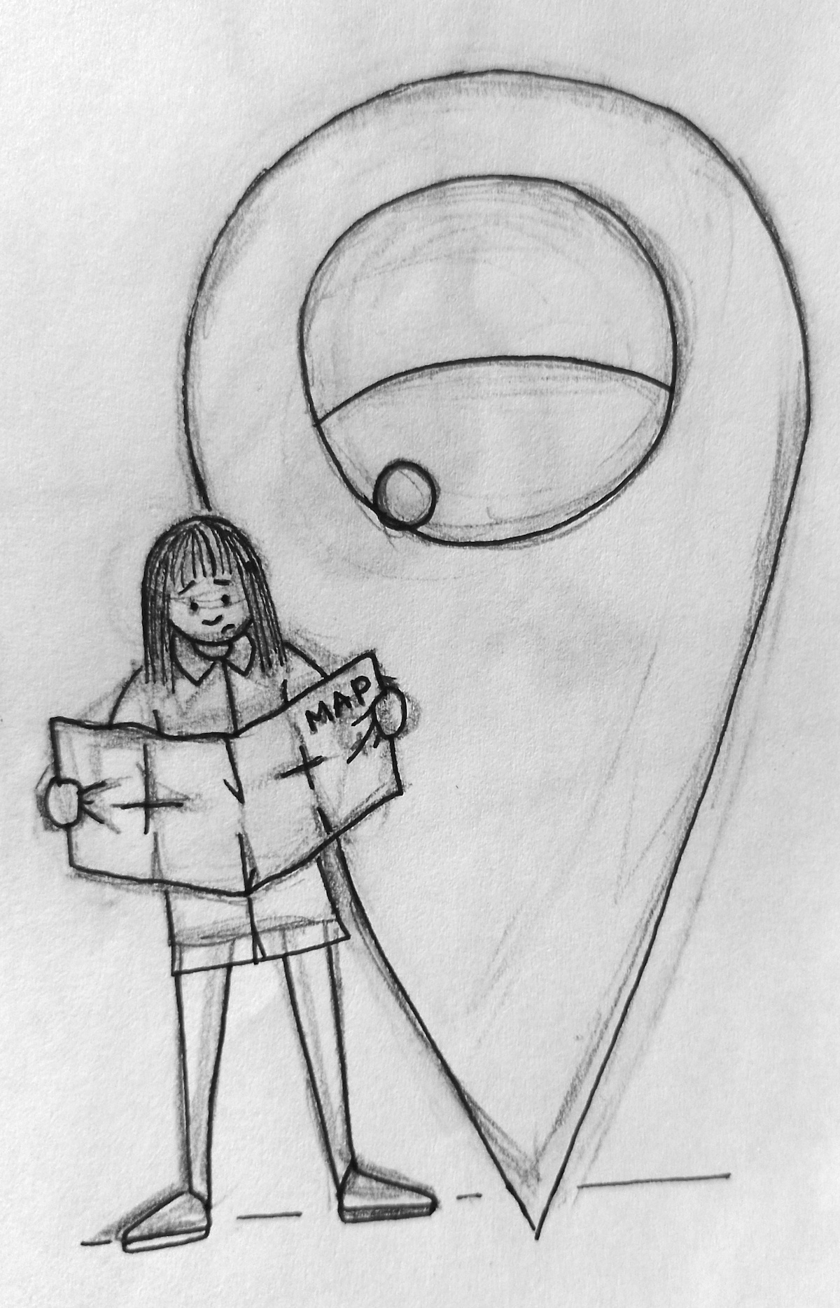
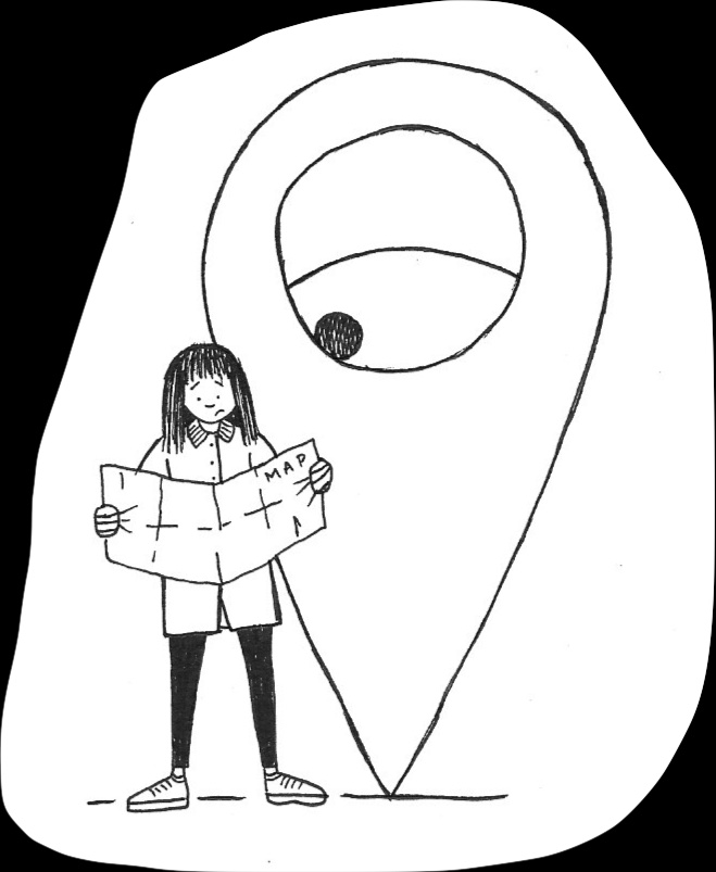
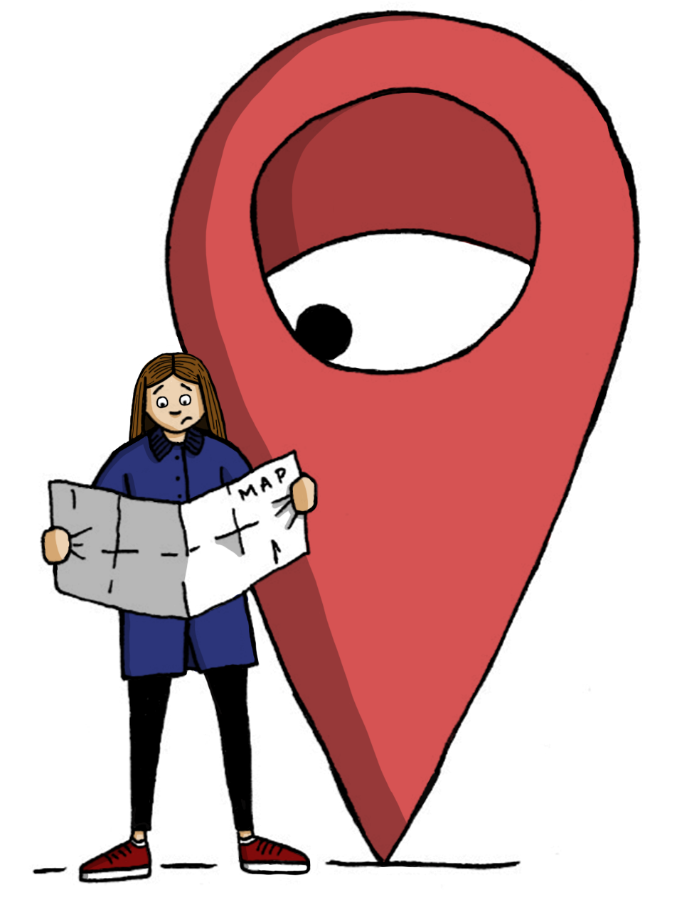
In visual terms, I was warming to the idea of using a location marker, such as the pink one used on Google Maps, to indicate a position – ‘You Are Here’.
In my peculiar mind it looked like it was missing two eyes and some teeth or a single large eye in the centre…
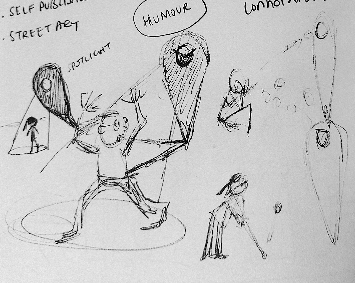
Sketching Ideas
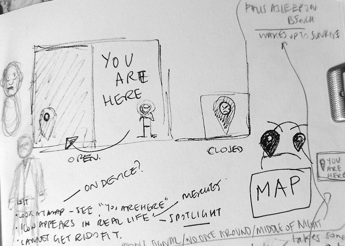
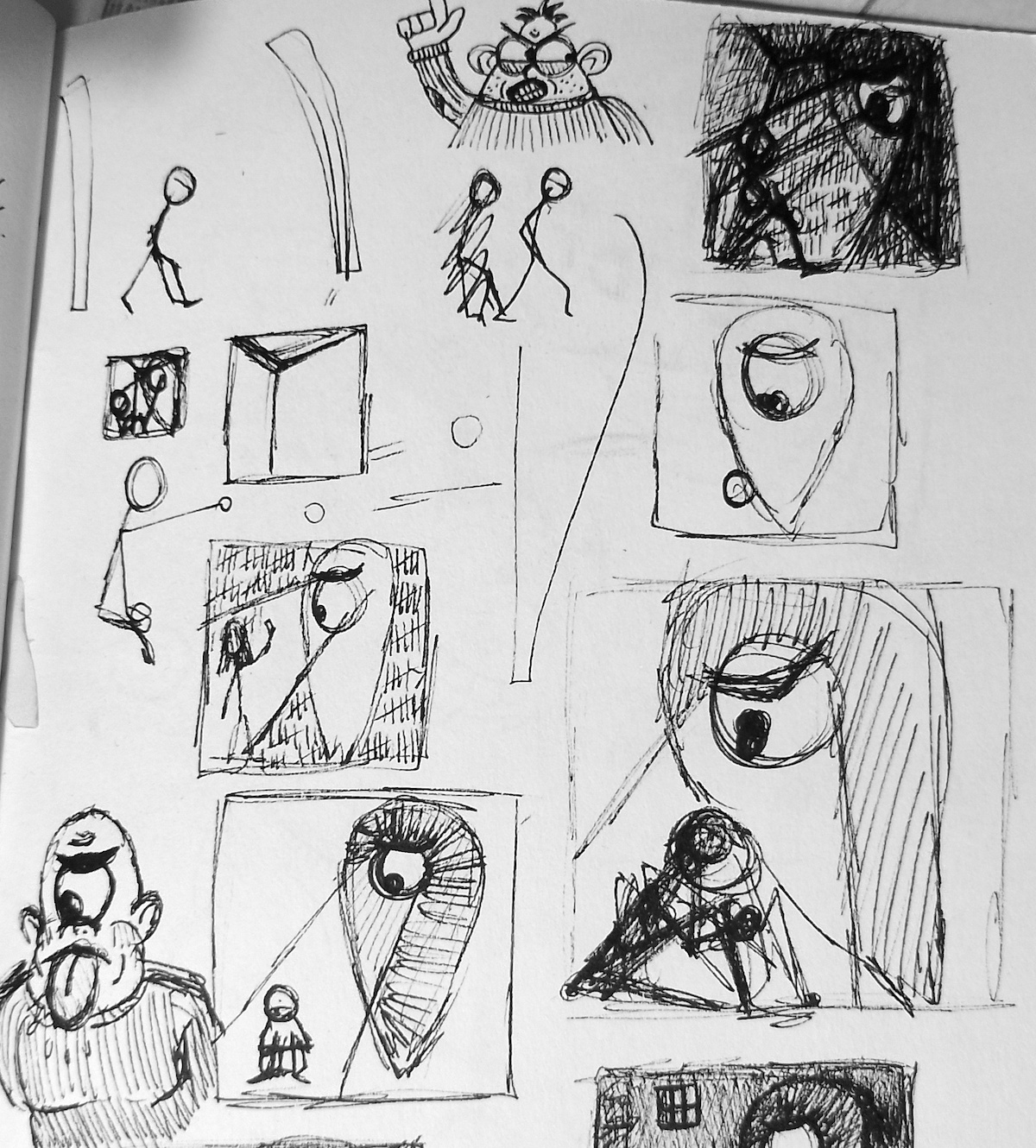
Next I moved onto sketching some ideas that came to mind, I tried to not think too much and let these ‘flow’ onto the pages, hence some of them make very little sense.
The drawings below were the early stages of an idea using a location marker (based on the Google one above) that is fixed to a character (loosely based on me). I tried to think of various ways of using the limitations of the shape of the marker, i.e. a combined circle/triangle with a circle in the top half.
(click on image for larger version, opens in new tab)
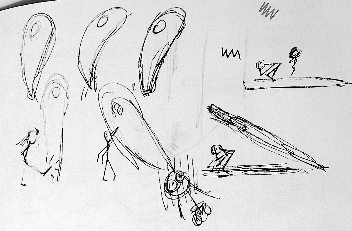
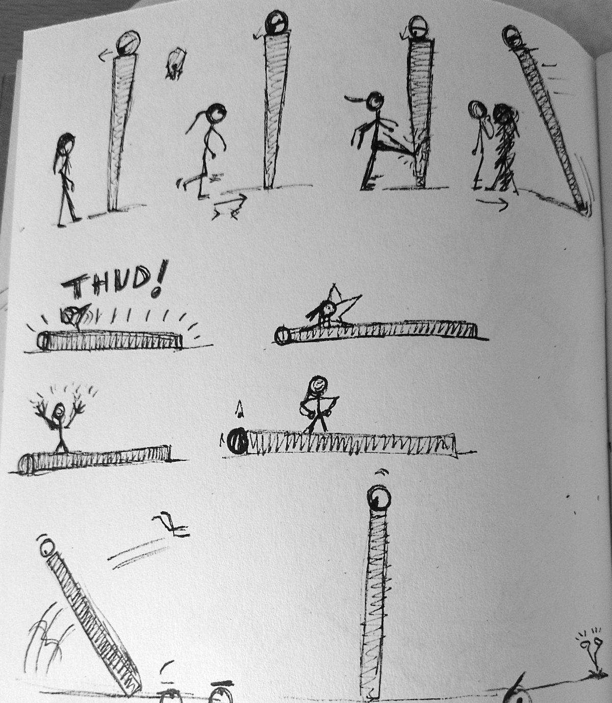
In the drawings below, I had the idea of becoming frustrated with being told ‘you are here’, so the character kicks the marker. It falls down on top of her, but because of the ‘hole’ in the marker, she remains unscathed….
(click on image for larger version, opens in new tab)
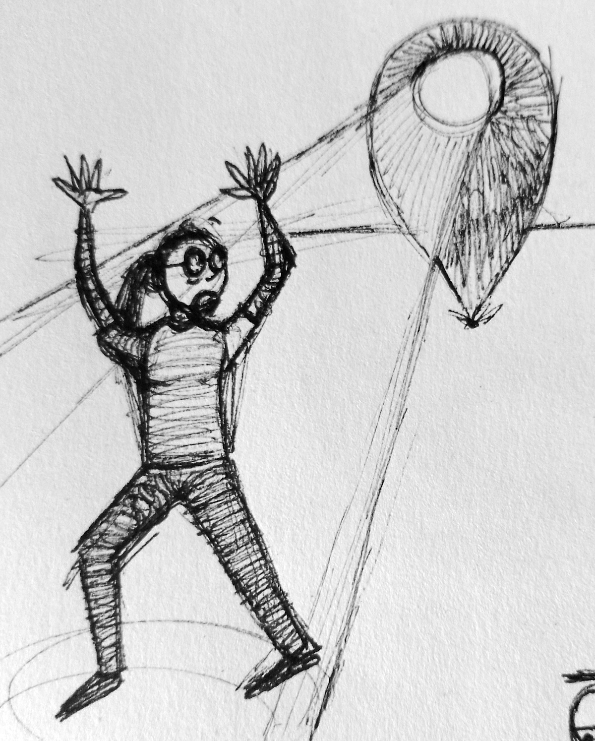
…which she is quite chuffed about, celebrating her freedom by standing on top of the marker, until the it springs back up and sends her flying.
(click on image for larger version, opens in new tab)
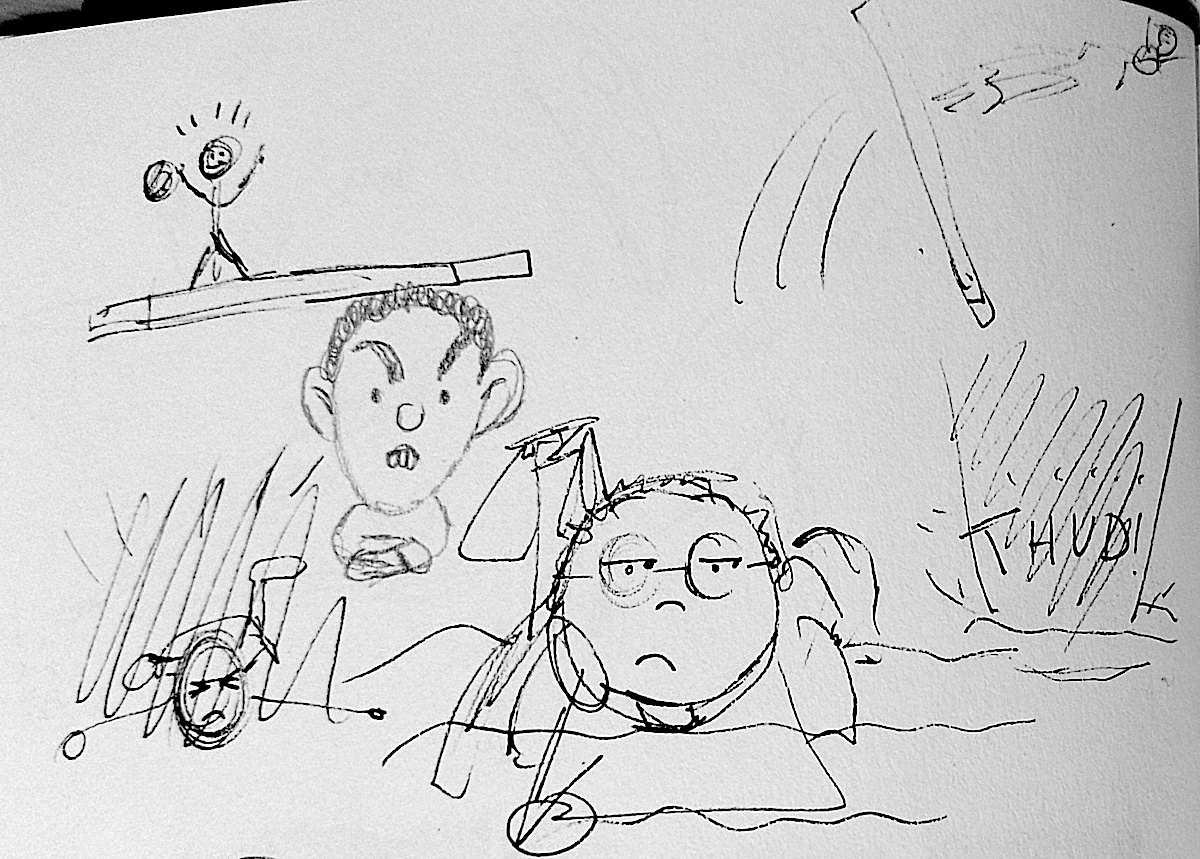
I then started to go slightly off tangent and came up with an long-winded story about a disillusioned worker, which I could picture in an animated form. I made some notes about it, but on reflection it is difficult to decipher what exactly I was planning, both in terms of my writing and the plot (which I think I may have lost).
(click on image for larger version, opens in new tab)
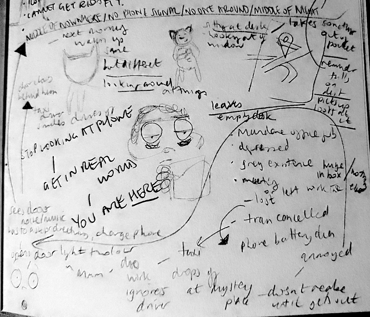
(click on image for larger version, opens in new tab)
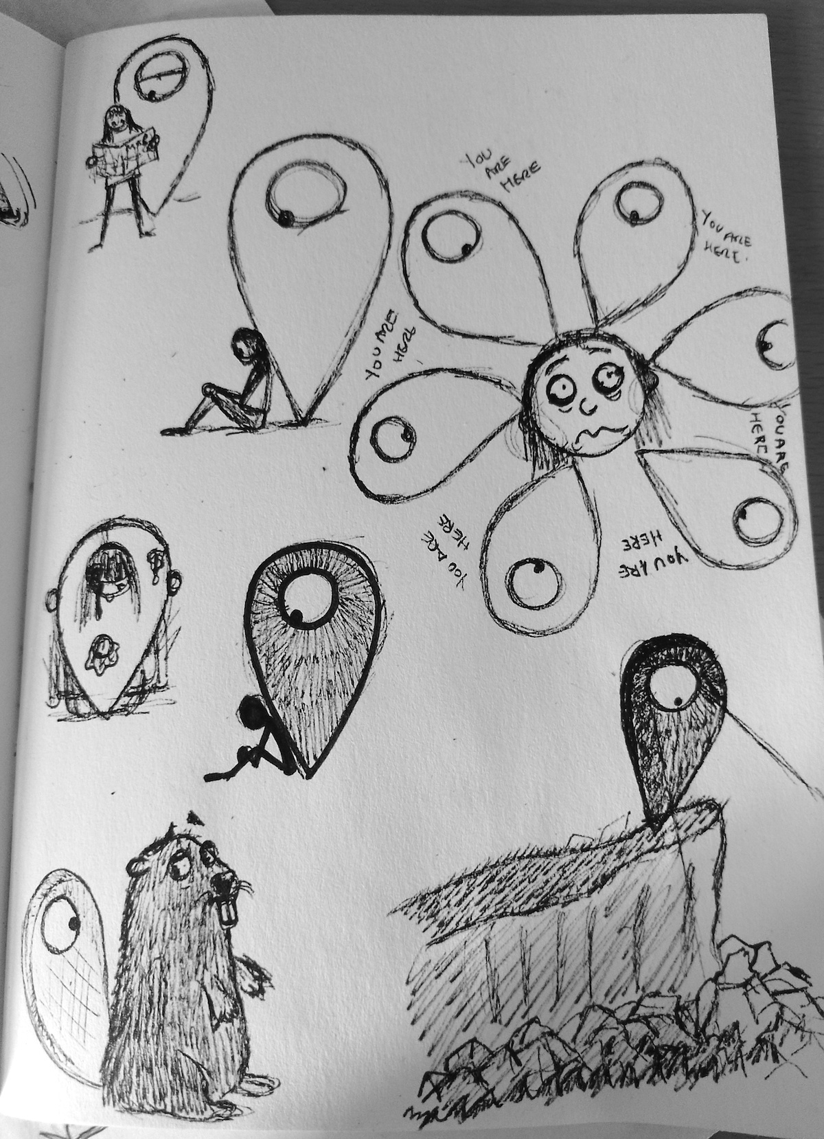
Luckily, I returned to the safer ground of the location marker, which in the drawings below I tried to imagine as a character.
(click on image for larger version, opens in new tab)
I still did not feel confident enough in my idea of the marker, or how I would use this in relation to the brief (i.e. which area of illustration I could apply it to), so I decided to put it aside and follow another idea that had formed.
Another Potential Idea
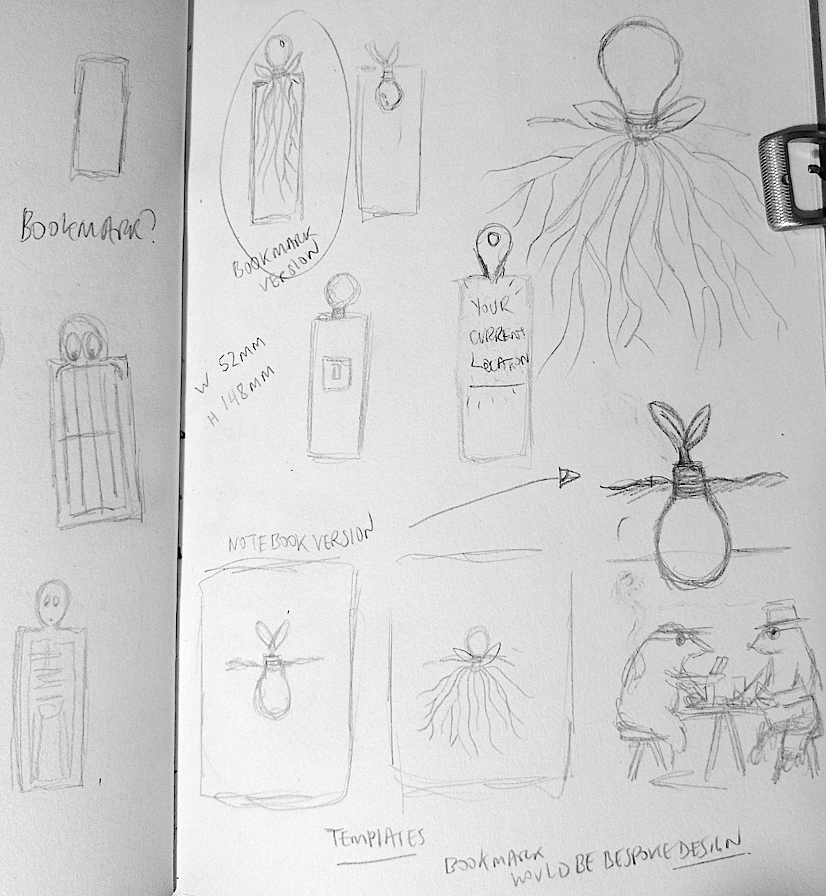
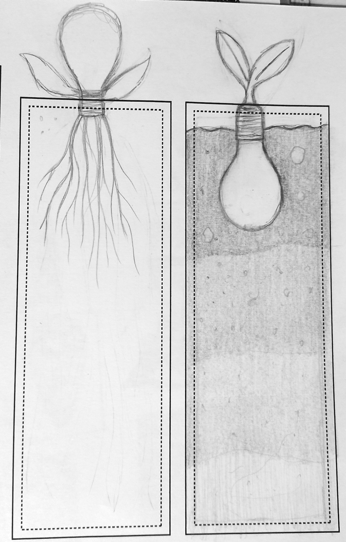
This time I was thinking in more practical terms about how I could apply an illustration to an object and, for the obvious reason of marking your current location, a bookmark seemed an apt choice. I also considered the more philosophical connotations of the term ‘you are here’ and the idea of a lightbulb growing out of the soil was what came to mind (perhaps influenced by my choice of this subject in Self-Publishing exercise).
(click on image for larger version, opens in new tab)
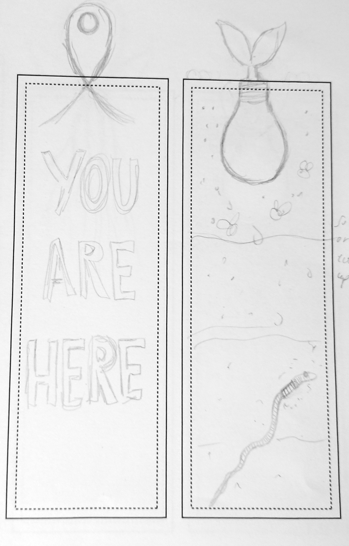
I drew out some neater pencil versions of my ideas, at the correct scale for a bookmark, and I felt the one below right was the most successful.
(click on image for larger version, opens in new tab)
(click on image for larger version, opens in new tab)
However, I just could not get excited about the bookmark idea and I felt drawn back to the marker with it’s big eye – I found it more appealing and it felt more inspired by the brief on a personal level, rather than being a more obvious, standard response of being in the form of a bookmark. However, I still was not sure of how I would be able to fit this concept into the requirements for the outcome of the brief, but I opted to pursue it anyway and see where it would take me.
Returning to the Location Marker Concept
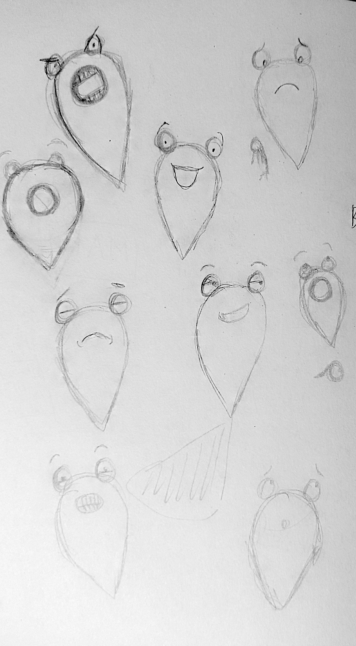
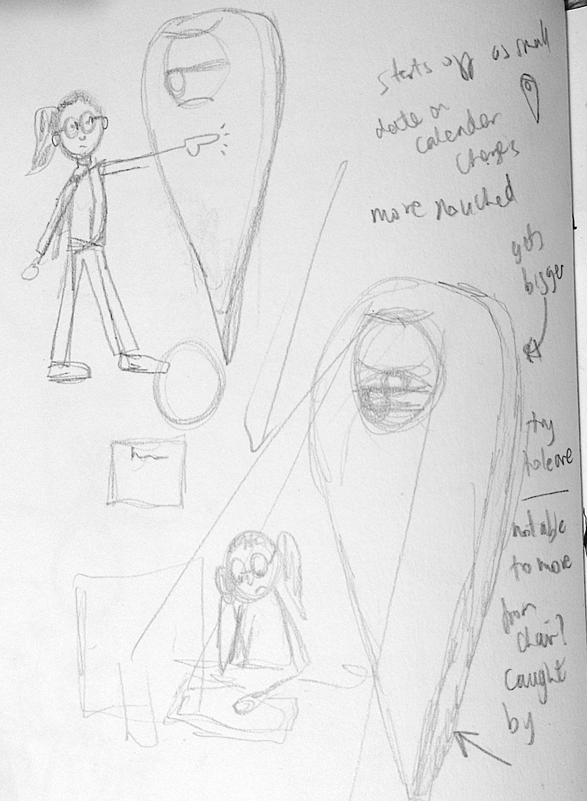
With this in mind I returned to producing further sketches of the marker concept. I decided that the design of the marker could take two forms. Firstly the inner circle would be replaced by a large, single eye, that could also emit light (like a spotlight). The second design would have the inner circle as being a mouth with teeth, two eyes would sit on top of the marker.
(click on image for larger version, opens in new tab)
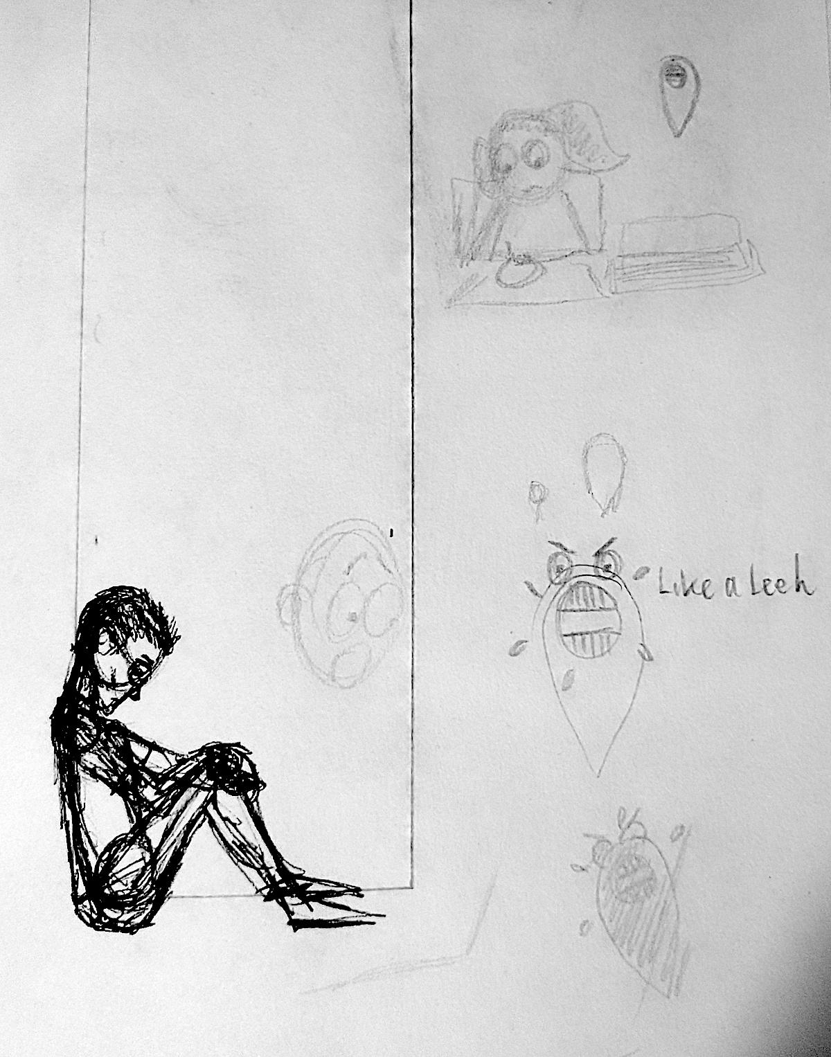
I quite liked the idea of the marker with teeth being quite vicious and looking to latch onto someone, like a leech. ‘You are here’ whether you like it or not – draining the life out of you.
(click on image for larger version, opens in new tab)
I thought the marker with teeth had more of a humorous character whilst the big-eyed marker seemed more reserved and philosophical – you do not always know its intentions or thoughts.
(click on image for larger version, opens in new tab)
I was becoming more keen on the idea of the big-eyed marker with a spotlight radiating from its eye.
(click on image for larger version, opens in new tab)
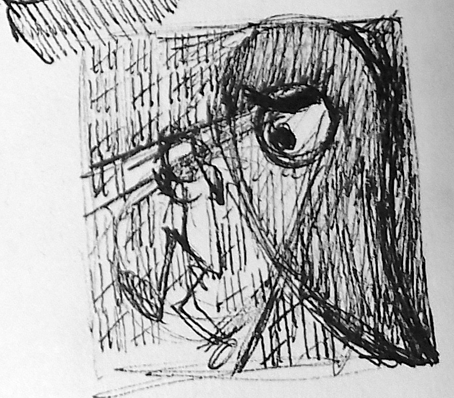
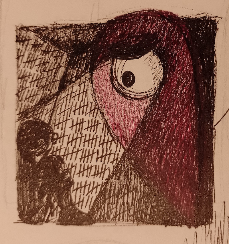
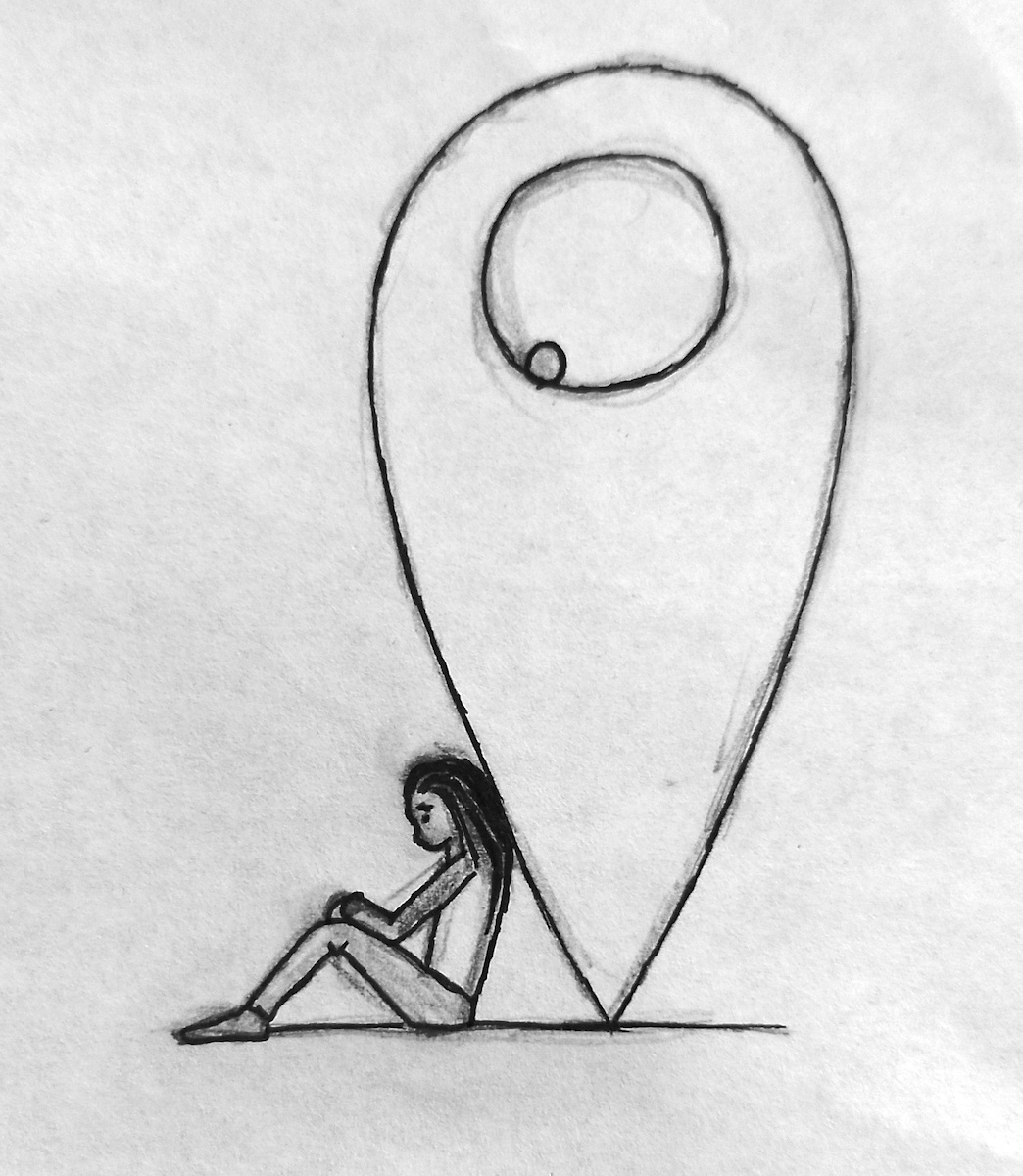
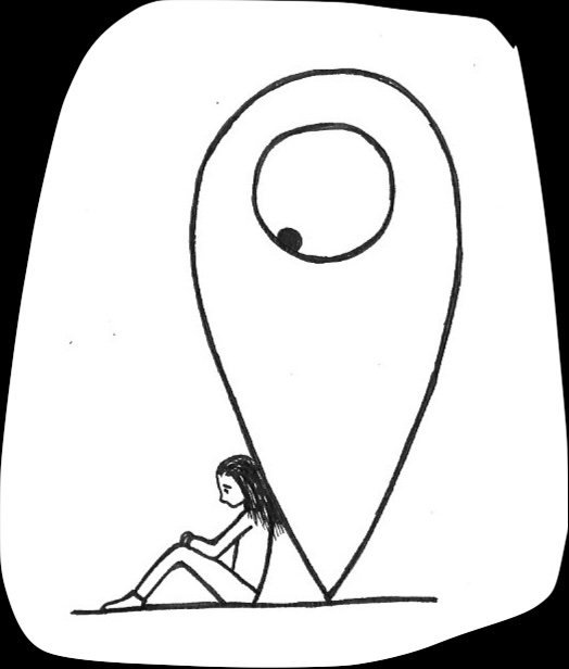
I felt that a clear-ish composition was beginning to solidify in my mind in which one of these markers would be beaming its light on a character sitting in a dark room with tally marks visible on the walls, as though she has been in this place for a long time.
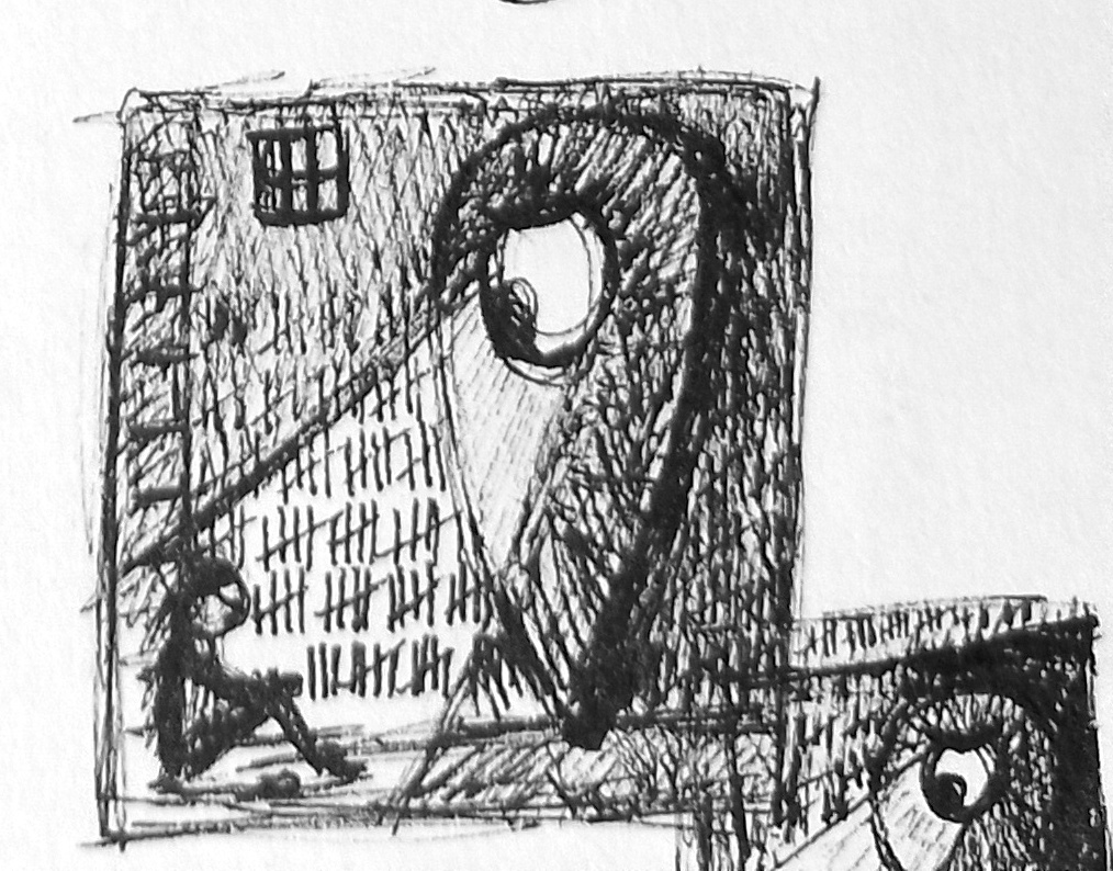
(click on image for larger version, opens in new tab)
As previously stated, the intentions of this form of the marker are less obvious than that of the one with gnashing teeth. I thought it the role of the marker here was quite ambiguous as it could be keeping her in this place (You Are Here.) or it could have found the character and is shining a light on her in a dark place (You Are Here!/?) – it depends on the viewer to form their own interpretation.
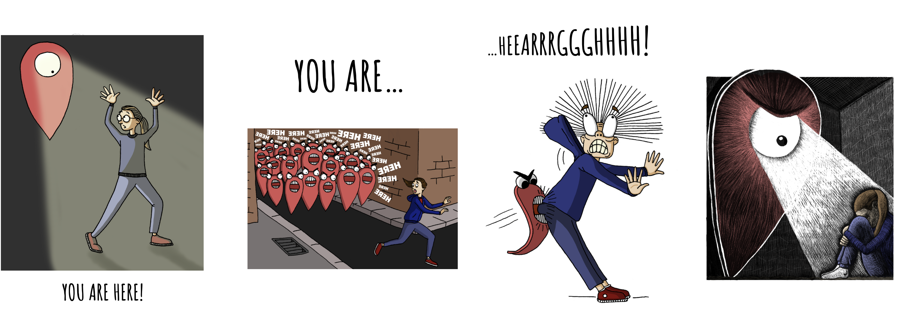
I have to mention that at this particular moment in time I was feeling incredibly negative and low, so this illustration was most definitely influenced by those emotions.
(click on image for larger version, opens in new tab)
I thought adding colour to the location marker would make it easier to identify what it is meant to be, but I am not sure how clear this would be to others.
(click on image for larger version, opens in new tab)
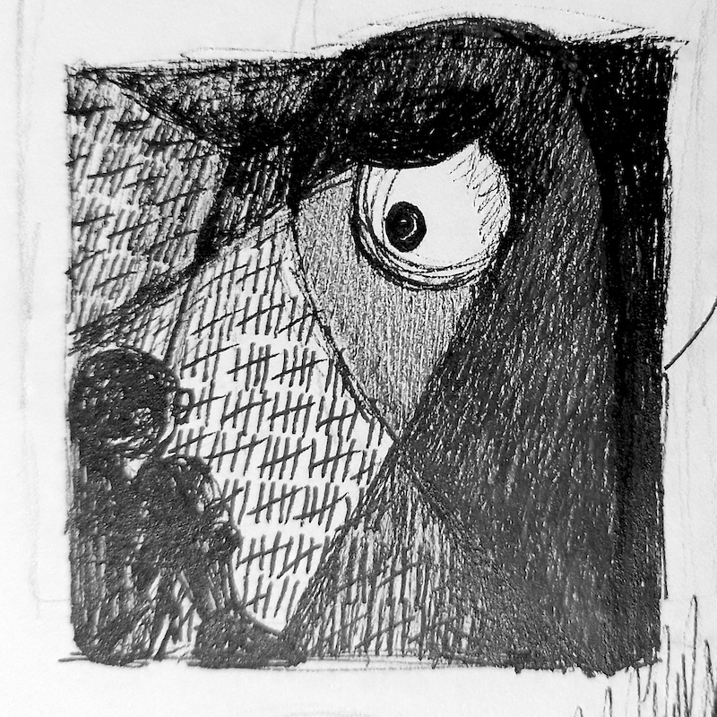
Scratchboard Illustration
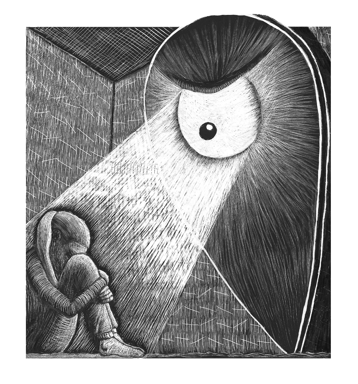
I was not really sure where I was going with this illustration, but I felt that I wanted to develop it further. I remembered having one scratchboard left from an earlier exercise and that this would be the perfect opportunity to have another go using the medium.
I looked at some of the work by Bill Russell, whom I had discovered during the aforementioned exercise, and was again inspired by his skill in creating scratchboard illustrations. He manages to use such a diverse range marks on the surface to indicate different surfaces or lighting effects. I wanted to try to add more variety to my own mark-making in this attempt than I had in the previous ones.
I drew out a larger version of the composition and then used white transfer paper to copy it onto the scratchboard. I used my tools to make the outlines more definitive.
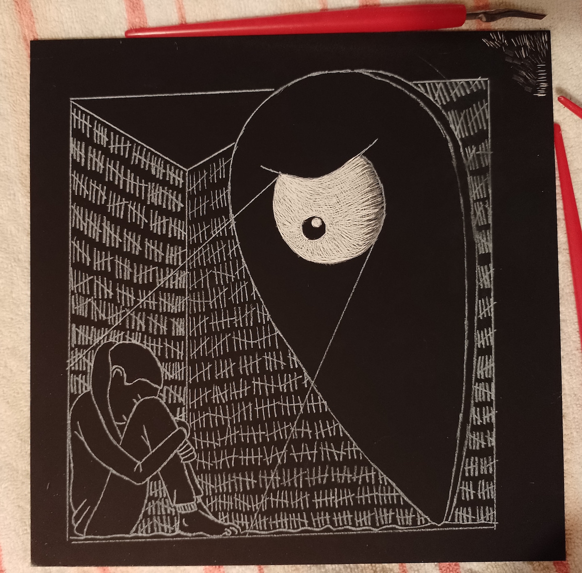
(click on image for larger version, opens in new tab)
On reflection, I am not sure if starting with the outlines in this way is always the best method on scratchboard as once the mark has been made, it difficult to cover it up. It can be quite limiting if you want to make changes or do not want a solid line as the edge of a shape.
Moving on, I spent a long time adding marks to the different elements in the composition. I still found it very challenging to mix the marks up, but I thought the character on the left was quite successful.
(click on image for larger version, opens in new tab)
At this point I felt I had not reached a conclusion with this illustration and I was not able to think of a way it could be presented in a form relevant to the brief requirements (apart form as an illustrated tile?). I chose to put it to one side and hope to return to it once I resolved its next steps.
Exploring Yet Another Idea
I found the previous illustration to be quite dark (in more ways than one) and I wanted to go back to a bit of light humour, whilst still focusing on the ‘marker’ idea.
I returned to my sketchbook and a selection of more cheerful (although possibly not so much for the character involved…) illustrations evolved.
(click on image for larger version, opens in new tab)
(click on image for larger version, opens in new tab)
(click on image for larger version, opens in new tab)
(click on image for larger version, opens in new tab)
(click on image for larger version, opens in new tab)
I also had another go at developing the short sequential series of illustrations from earlier. I would like to try and make a simple animated version of this some time.
(click on image for larger version, opens in new tab)
Drafts
I was keen to expand on these ideas as I felt they had potential, so I set about drawing neater, scaled up versions. I used pencil for the first draft and then went over the outlines using a 0.1 fineliner.
(click on image for larger version, opens in new tab)
(click on image for larger version, opens in new tab)
(click on image for larger version, opens in new tab)
(click on image for larger version, opens in new tab)
(click on image for larger version, opens in new tab)
(click on image for larger version, opens in new tab)
(click on image for larger version, opens in new tab)
Final Drafts
I was quite happy with the first drafts so, using cartridge paper and a lightbox, I drew neater pen versions of each illustration.
(click on image for larger version, opens in new tab)
(click on image for larger version, opens in new tab)
(click on image for larger version, opens in new tab)
(click on image for larger version, opens in new tab)
(click on image for larger version, opens in new tab)
(click on image for larger version, opens in new tab)
(click on image for larger version, opens in new tab)
Final Illustrations
I scanned the pen drawings into Photoshop, cleaned them up and made a few adjustments before digitally colouring each one. This was also the first time I made a pointed effort to add shadows to the illustrations, which I felt enhanced them.
(click on image for larger version, opens in new tab)
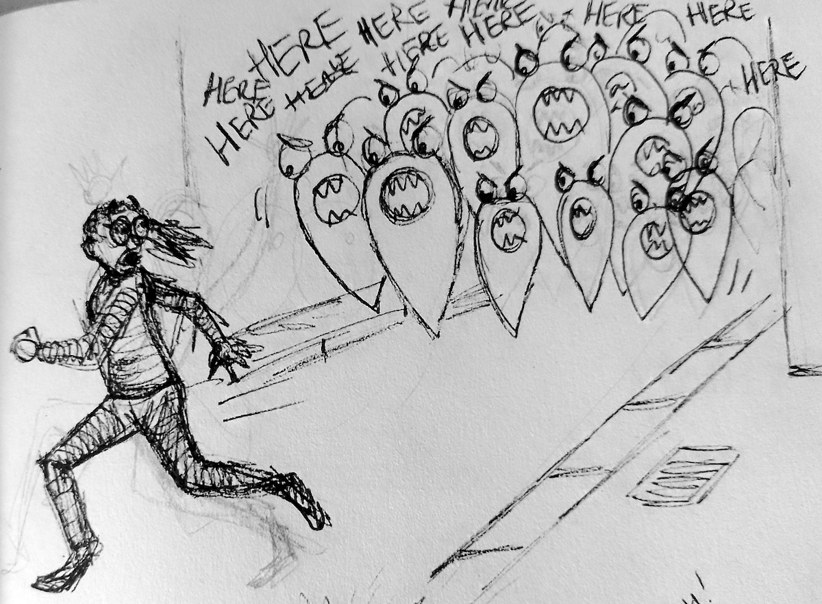
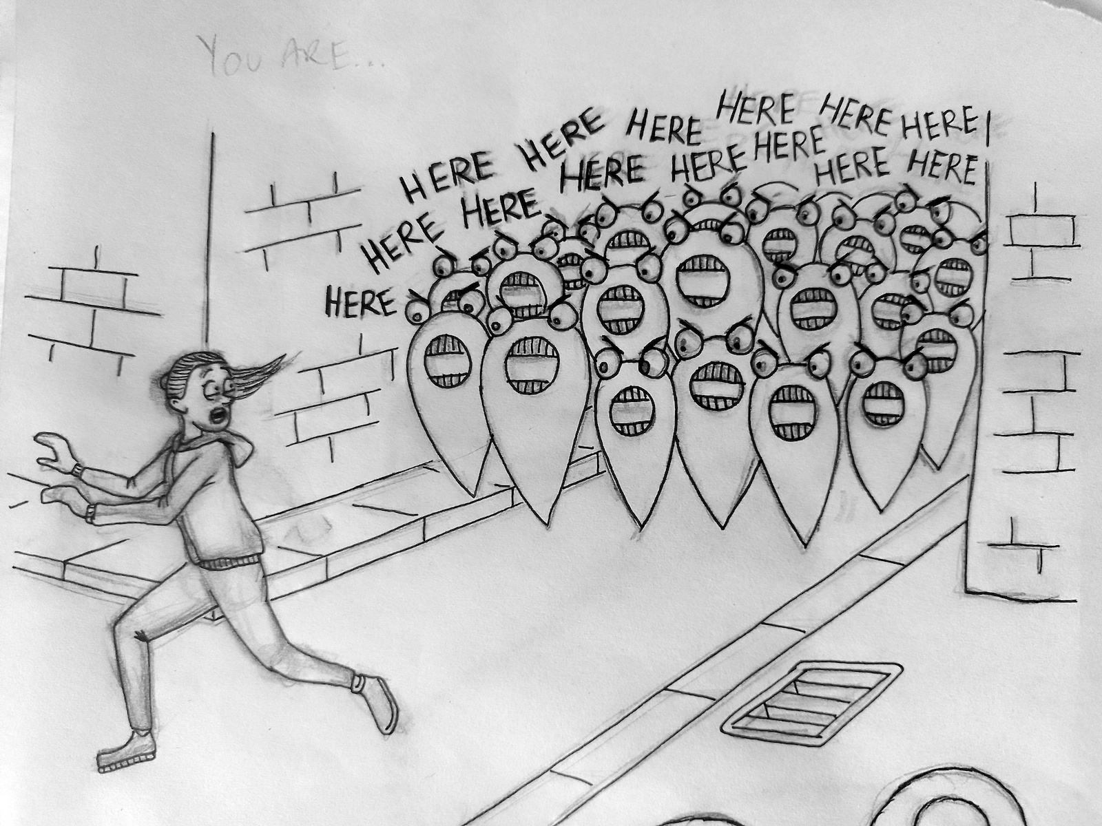
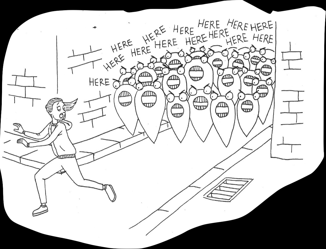
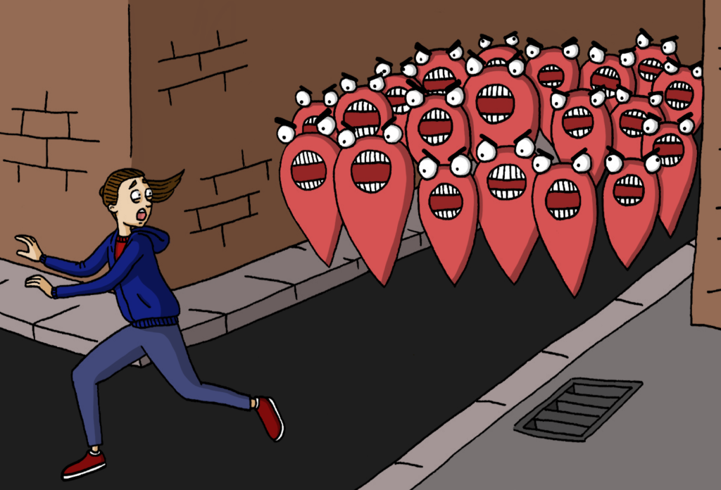
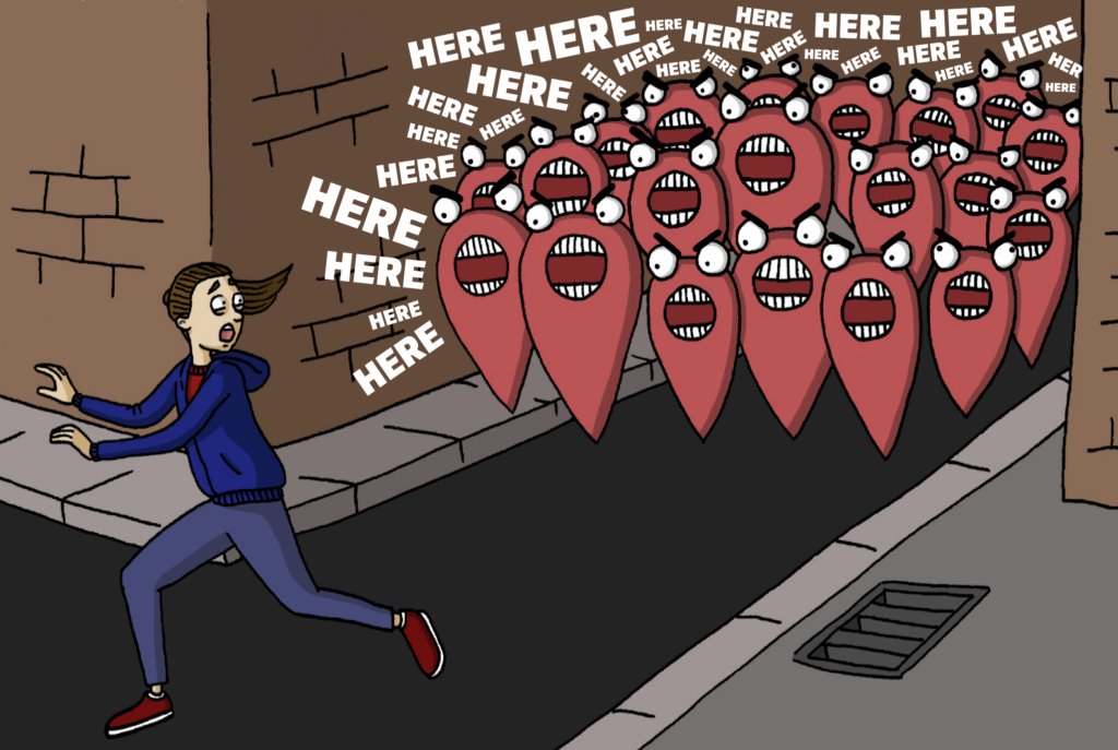
In the illustration below I added the text using Illustrator (after saving the Photoshop version as a PNG). I opted for white fill rather than black to make the words stand out against the background. I was not sure about the addition of these at first, but in the end I concluded that the words increased the sense of mayhem and menace of the marauding markers.
(click on image for larger version, opens in new tab)
I was not satisfied with the original version of the drawing below, so I made some changes to the character’s face and hair. I felt much happier with the result and decided the style now fitted in better with the other images.
(click on image for larger version, opens in new tab)
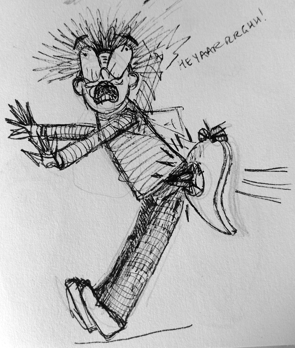
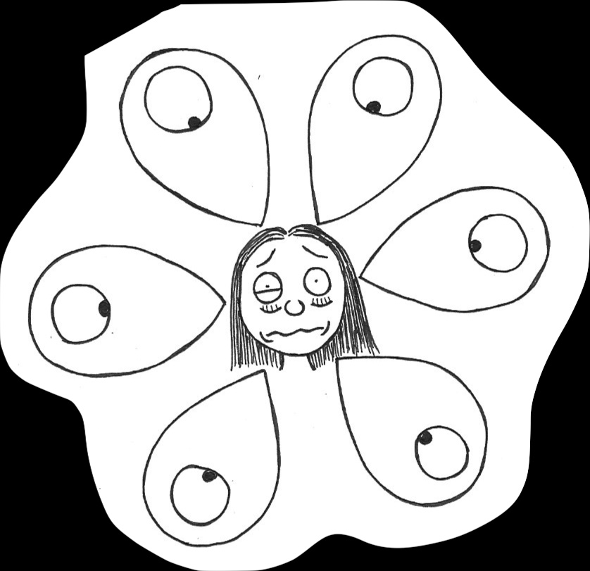
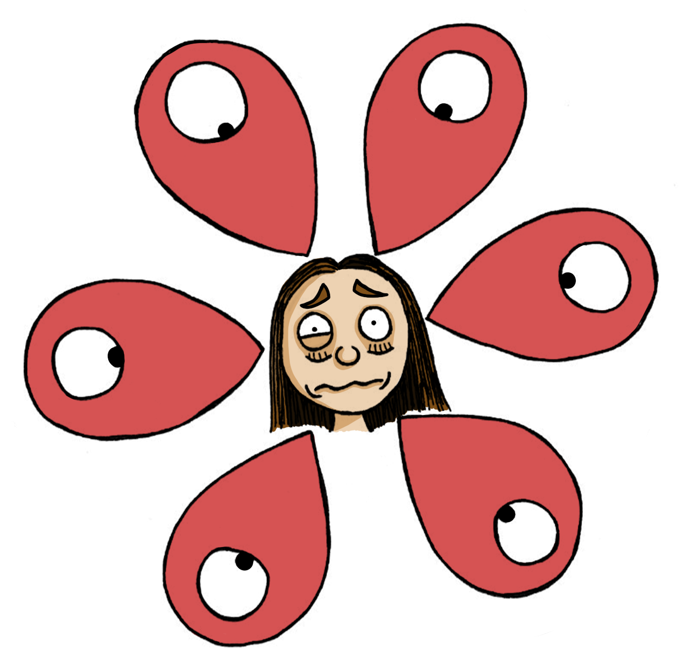
I made a conscious effort to create expressions that clearly described the character’s current mental state and emotion. I thought I was quite successful at this objective.
(click on image for larger version, opens in new tab)
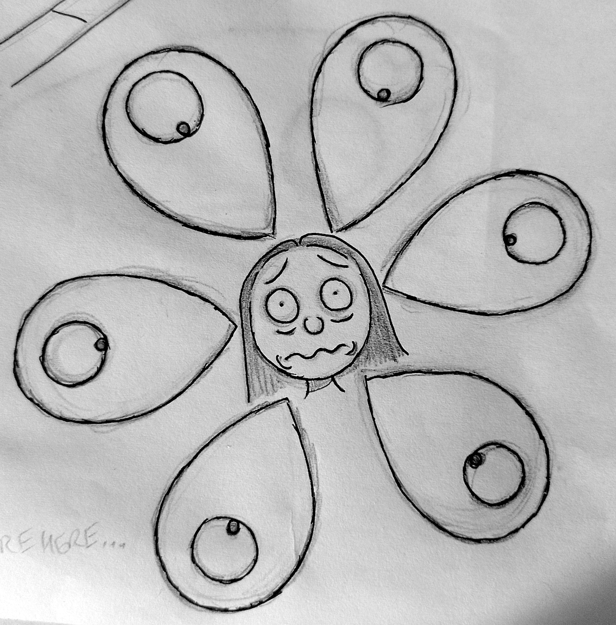
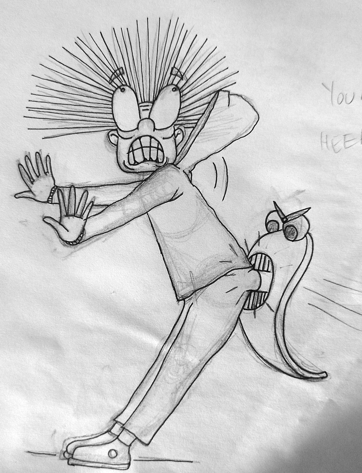
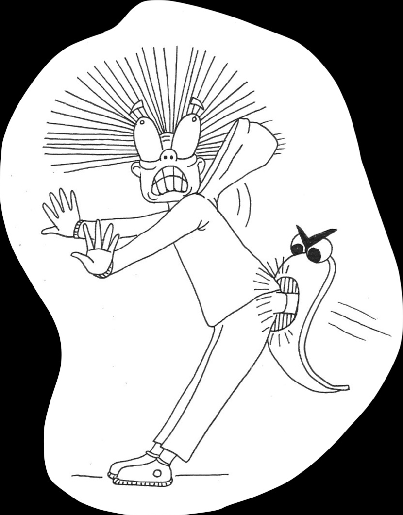
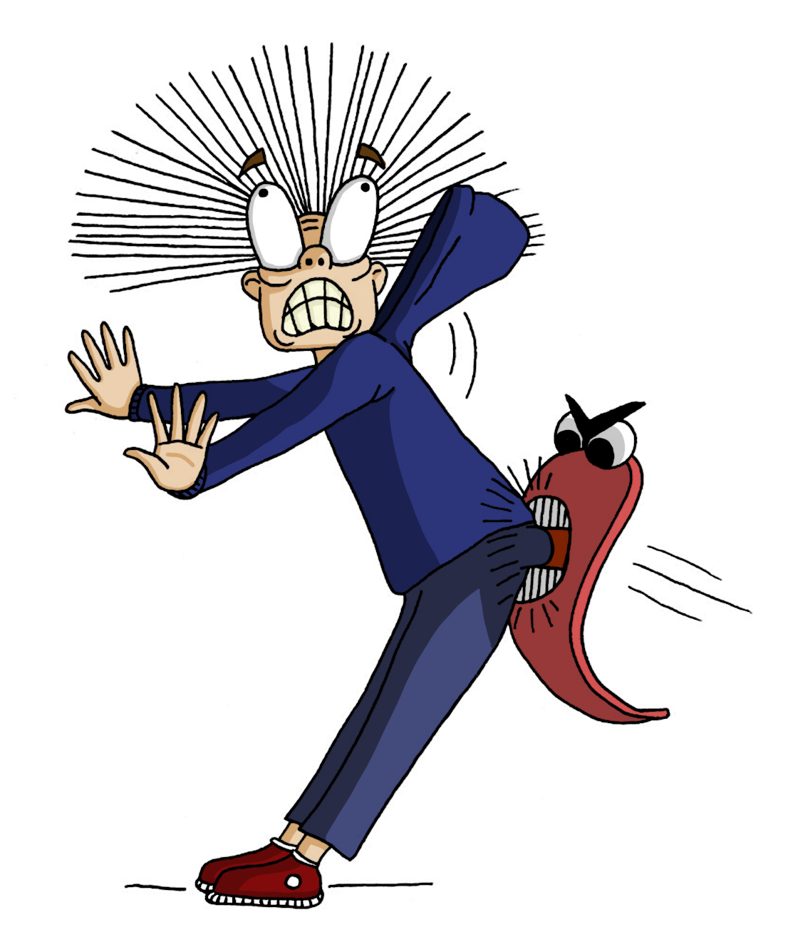
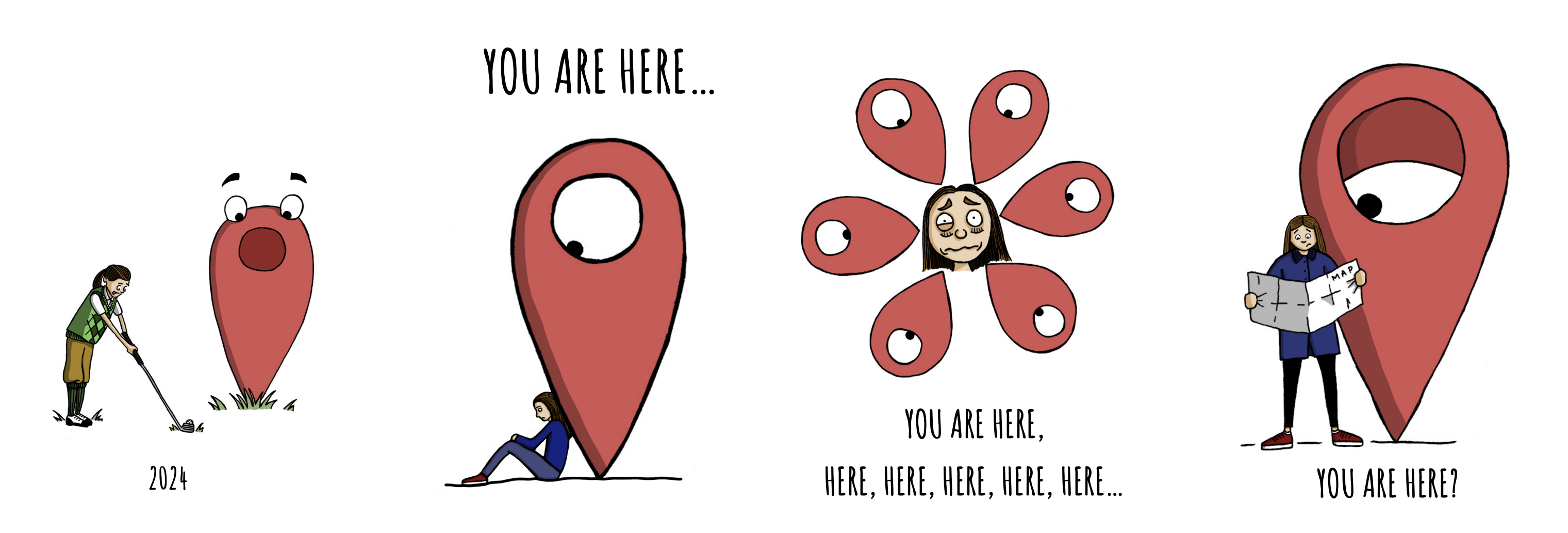
I decided that the illustration below was my favourite. I felt I had managed to visually communicate both of of the characters’ feelings and intentions very clearly. However, it would have been good if I had managed to show more of an exaggerated effort in the biting motion, to make it apparent just how hard those teeth are chomping together. I also should have made the tail of the marker smoother as it looks too crinkled. Also, I felt the feet were a bit too small in comparison with the rest of the character’s body.
(click on image for larger version, opens in new tab)
The illustration below was the most fiddly to create as I had to experiment with various blend modes to get the lighting and colour to look believable. I got in a bit of a muddle with the different layers, but the final result turned out not too bad.

(click on image for larger version, opens in new tab)
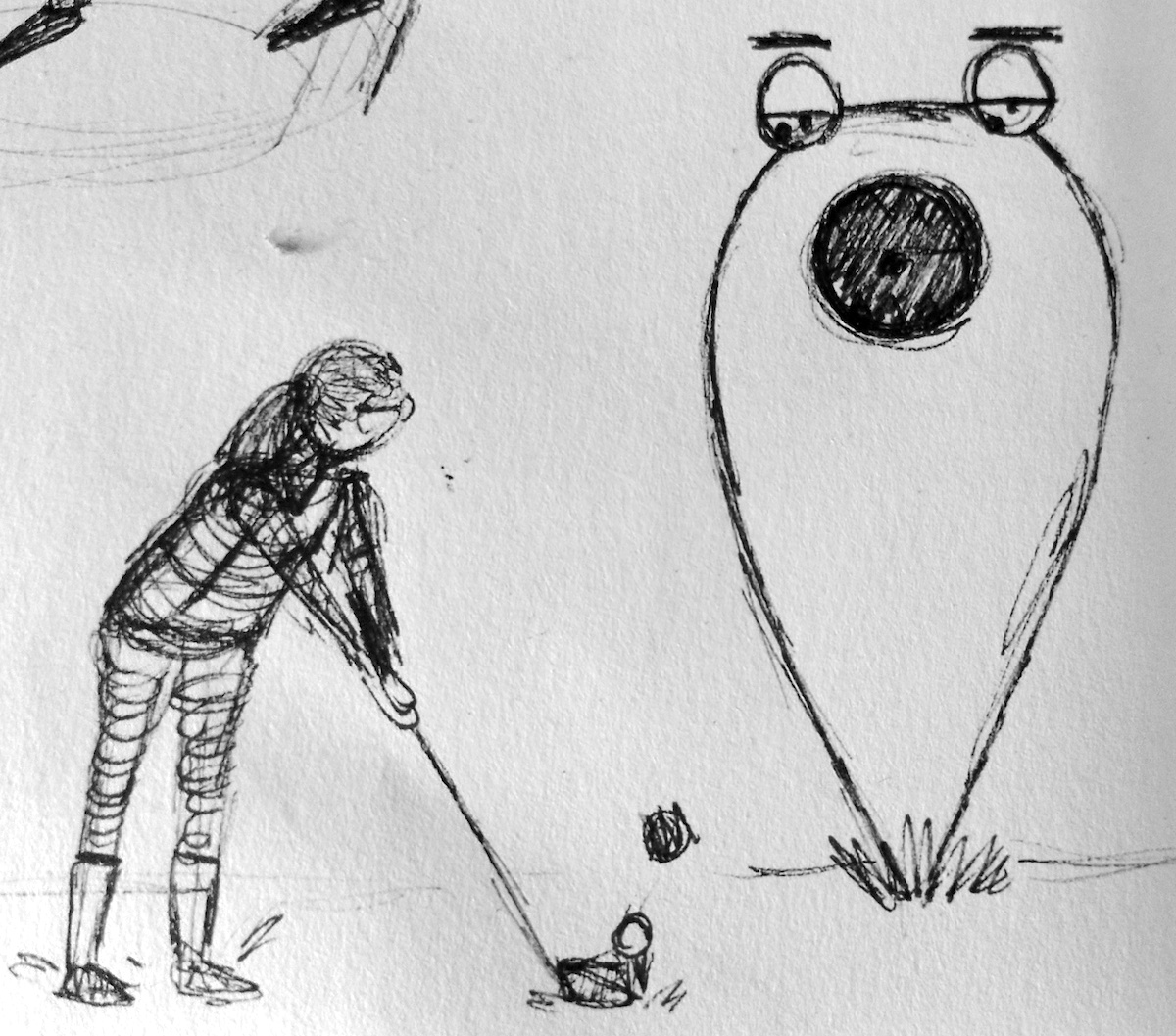
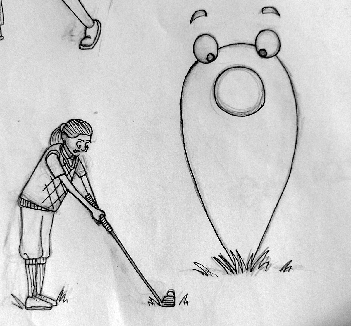
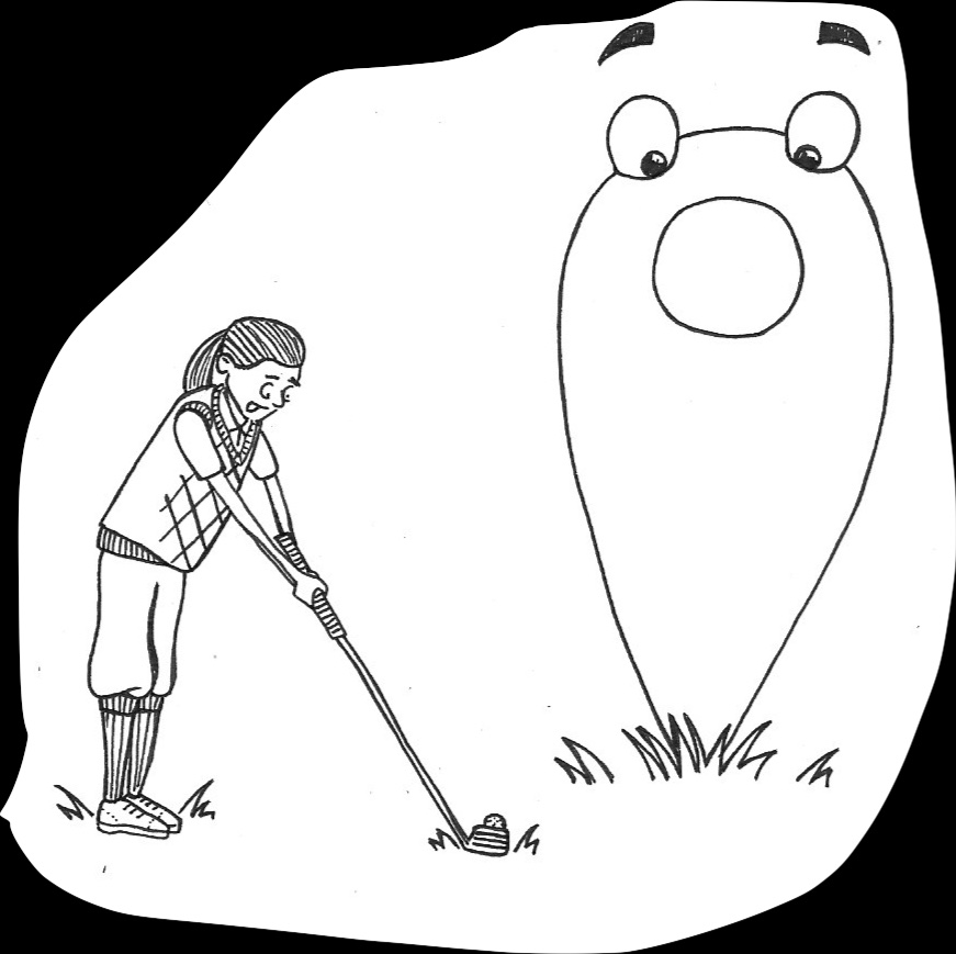
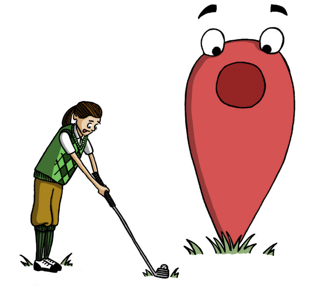
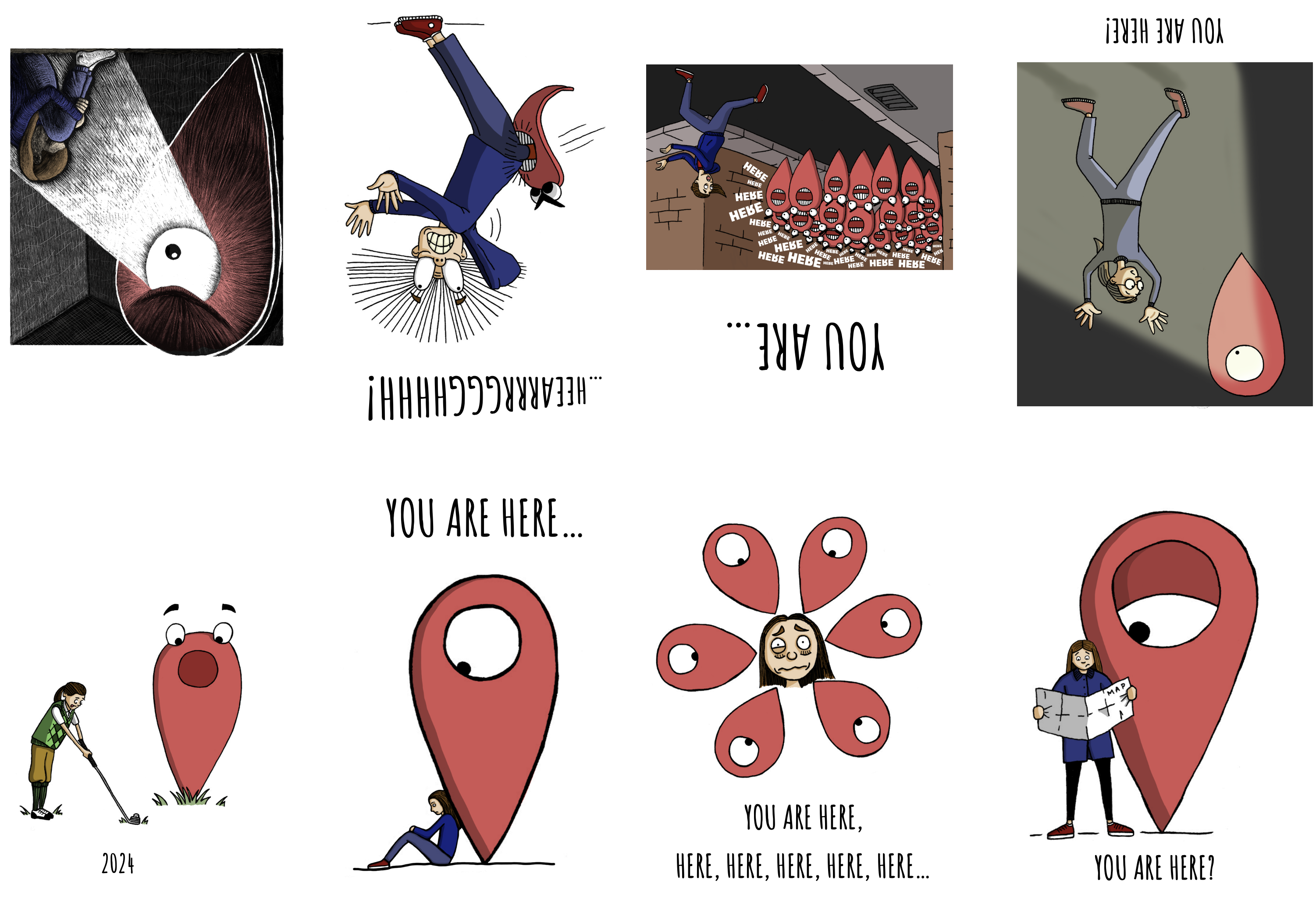
I thought that the illustration below was quite an inspired design, as I have no particular interest in golf. I am not sure how clear it is that the tongue on the character is meant to be poking out in concentration rather than her mouth being open.
(click on image for larger version, opens in new tab)
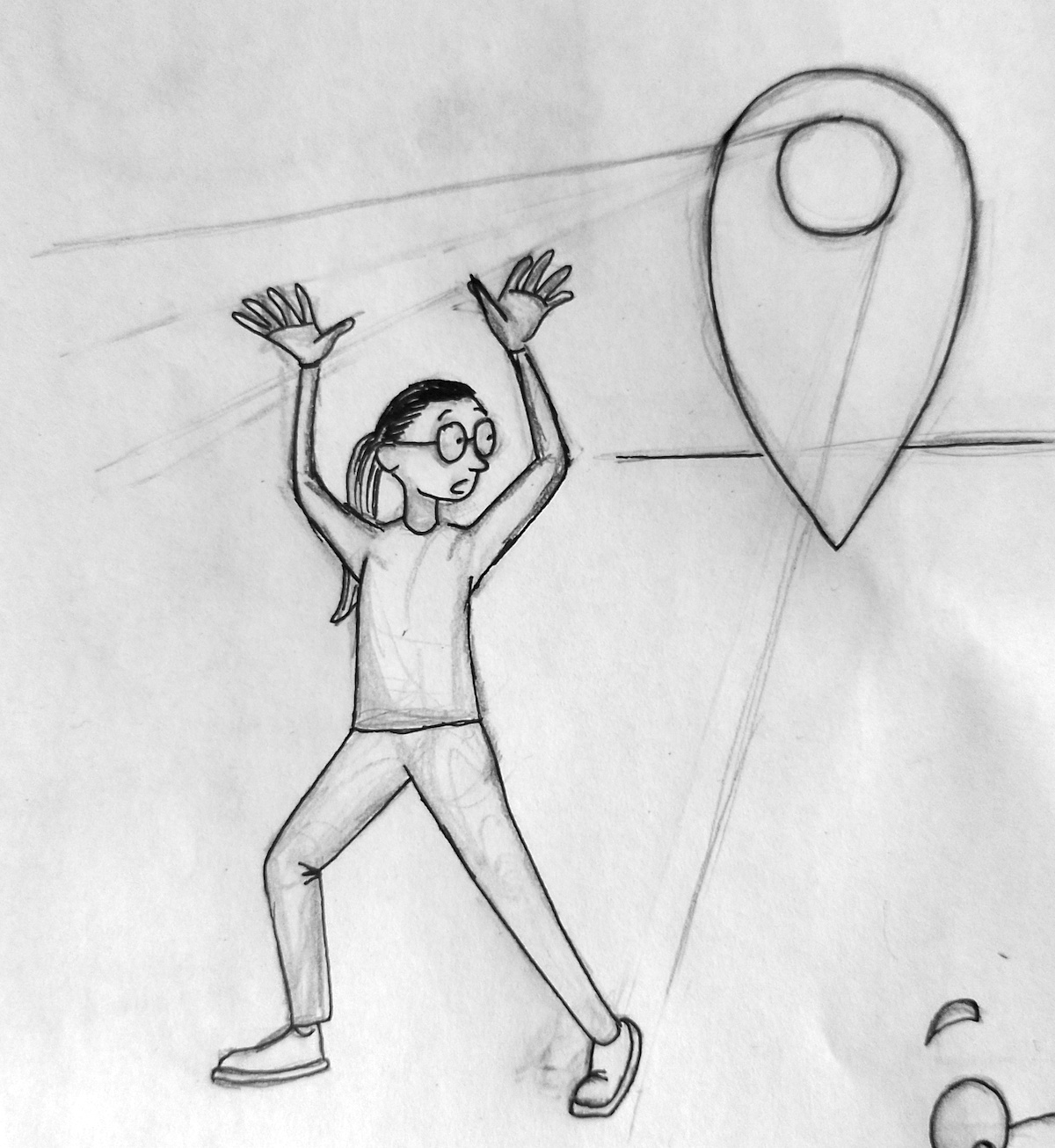
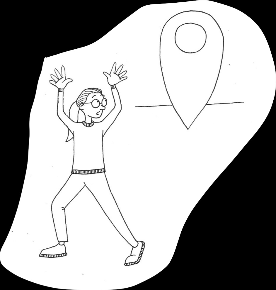
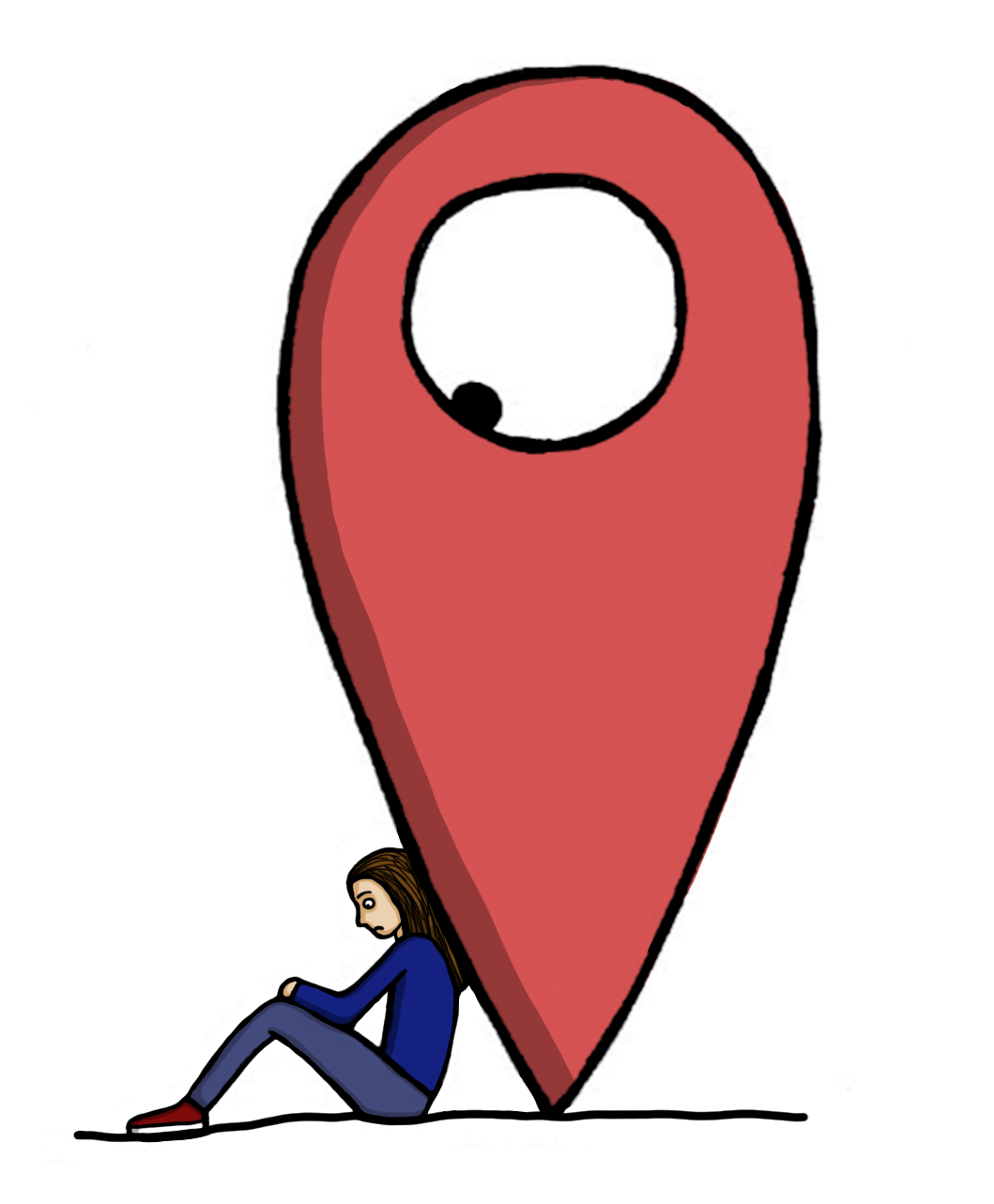
I thought the illustration below was perhaps the most obviously linked to the idea of a location marker from an online map, particularly when associated with the title ‘You Are Here’.
(click on image for larger version, opens in new tab)
I felt quite pleased with the seven illustrations and taking the time to add the shading was certainly worthwhile. I liked that I managed to visually connect the series of images in terms of colours and style.
Adding Digital Colour to the Scratchboard Illustration
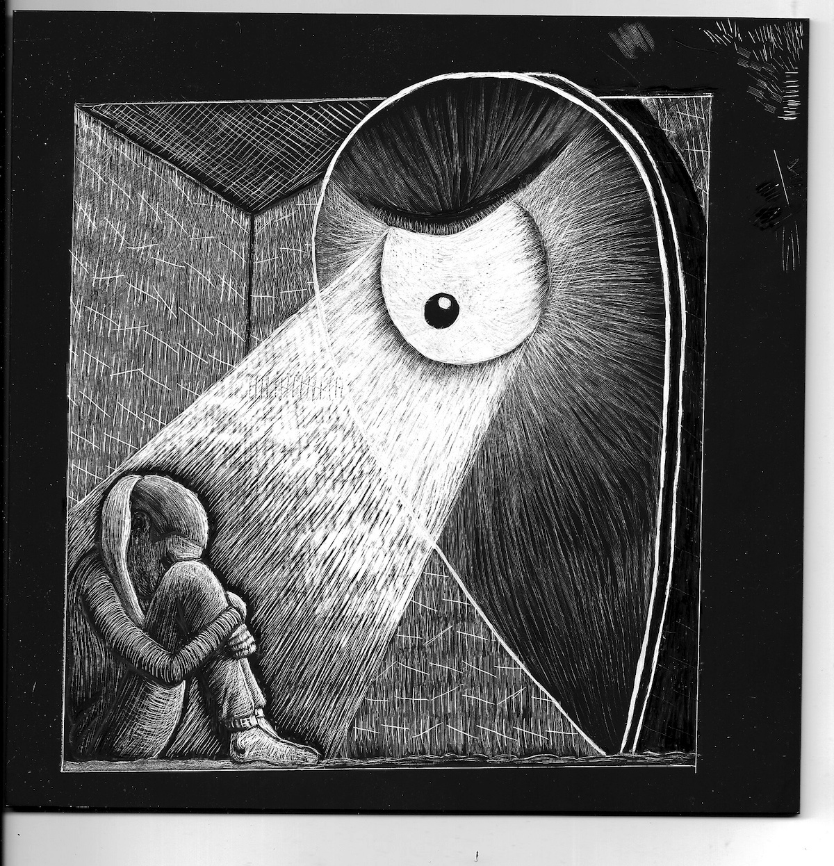
Now that I had taken break from the scratchboard illustration, I decided to return to it and attempt to add colour, so that it could linked to the other illustrations. I cropped the image before placing it in Photoshop.
(click on image for larger version, opens in new tab)
Using the same colour scheme as the previous illustrations I proceeded to add colour to a layer underneath the scratchboard layer (on which I had changed the blend mode). I also cleaned up the black surroundings, for example, around the hunched character, which made each element more distinctive.
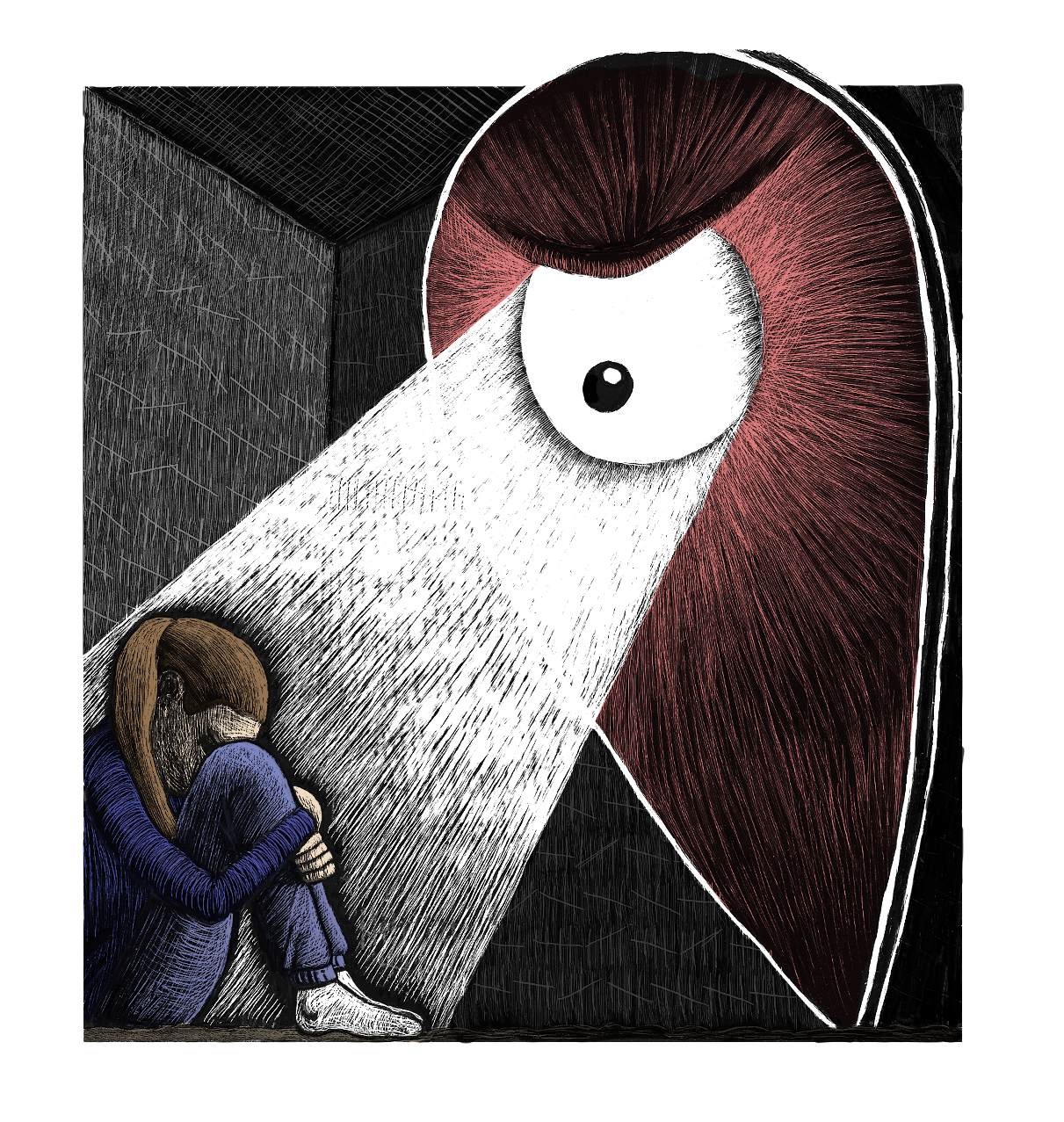
(click on image for larger version, opens in new tab)
I was pleased with the result for my first attempt digitally adding colour to a scratchboard illustration and I was particularly happy that I had managed to connect this stylistically very different illustration to the others by the use of a common colour scheme.
Compiling Illustrations into a Mini-Comic
Even though I was encouraged by what I had created so far, I still was not sure how to present these in a format that would be appropriate for the brief.
In the end, I decided that a mini-comic would be best suited as a method of showcasing the illustrations as a series. Using the template I had set up for the earlier Self-Publishing exercise, I added each of the illustrations along with a few versions of the statement ‘You Are Here’.
(click on image for larger version, opens in new tab)
(click on image for larger version, opens in new tab)
(click on image for larger version, opens in new tab)
I realised after the fact that I had got in a bit of a muddle when flipping and rotating the images to fit within the template, so that when seen the right way up (as above) the images are all shown in reverse of their original design. However, luckily this does not seem to make them any less effective.
Final Thoughts
This assignment ended up being quite a rollercoaster of highs and lows. I began with the apprehension of having been given an extremely open brief, which then evolved into producing various potential ideas, one of which felt very personal in its content, and ended, I believe with quite a successful outcome of several illustrations that were relevant to the brief.
I am not confident that the final mini-comic was fully considered and it felt like a bit of a last minute add on, but if I had more time I would like to try and produce a larger scale mini-comic that is more professional in appearance.
One requirement of the brief I am fairly certain that I met was ensuring that I developed my illustrative work in some way. Examples of this include adding shadow to my digital colouring; experimenting with scratchboard and adding colour to this digitally; and I also built on my character design skills – particularly concentrating in expressions/body language to convey feelings and emotions.
What went well…
- I believe my use of a sketchbook in the early stages of projects is continuing to improve and I can see the benefit of these rough drawings and thumbnails, rather than just doing it for the sake of it.
- I feel I am steadily improving my analogue drawing ability and becoming better at portraying characteristics, such as emotions, through expressions and body language.
- I was pleased to be able to have another go using scratchboard and I thought the final result, combined with digital input, was quite an achievement. I need to continue to experiment with different mark making techniques to convey different surfaces and lighting situations.
- I felt the final selection of illustrations were quite well devised and I had not opted for an obvious option, such as a bookmark, and instead pursued my peculiar imagination.
- I thought I did quite well producing an illustrative representation of a very negative moment in time (in the form of the scratchboard illustration) which communicated my feelings at the time very clearly, but I think could also be relatable to other people for many different reasons that are personal to them.
What could be improved…
- I was not fully satisfied in the final presentation of my illustrations as a mini-comic and should have thought about this at an earlier stage. I seemed to work through this assignment in quite a disjointed way that happened to come together in the latter stages, but maybe that is just what occurs sometimes?
- I need to continue experimenting with scratchboard in terms of mark making and how to plan an illustration on this surface without committing solid white outlines that are difficult to remove or cover/disguise.
- I would like to continue to take the time to develop my use of light and shadow in my work as the addition of this definitely results in a more finished illustrations.
- I should have more confidence in my ability to tackle open briefs and, therefore, start with a more positive mindset rather than expecting the worst (a lesson for life, really).
- I want to start adding more variety to my character designs, for example in terms of different clothing and body shapes as I tend to stick to the same kind in most of my drawings. I also need to continue the fightback against drawing stiff characters, which is all to often the case. As previously stated many times over the course, practice, practice, practice is the answer, I just need to continue to get into the habit of regularly doing this.
Bibliography
Russell, B. (n.d.) The Scratchboard Illustration Portfolio of Bill Russell. Available at: https://billustration.com (Accessed 23 December 2023).
V&A (2023) William De Morgan – an introduction. Available at: https://www.vam.ac.uk/articles/william-de-morgan-an-introduction (Accessed 20 December 2023).
Wikipedia (2020) File:Google Maps icon (2015-2020).svg. Available at: https://en.m.wikipedia.org/wiki/File:Google_Maps_icon_%282015-2020%29.svg (Accessed 21 December 2023).