Choose a short story and turn it into a mini graphic novel. The length of the graphic novel will largely depend on the story you choose, so pick something manageable. Aim to work over two or three pages only.
Be creative with how you approach this. Think about how you edit the story, the kinds of shots you take, the relationship between dialogue and the characters. How do you depict the sounds and describe the action both visually and in terms of text?
Along with the narrative itself, design a cover for your graphic novel that includes the name of the short story, the author’s details and your own.
Reflect on the experience of converting the text to visual form. What did you learn from this experience? How have your illustrations developed to accommodate the demands of of the narrative?
Initial Thoughts
Firstly, I was quite relieved to have finally reached the Assignment for this section of the unit. I have thoroughly enjoyed it, but, as a result, I possibly have spent too much time working through it. Although I was under some pressure to complete this section, I wanted to focus completely on creating a decent final piece as possible for this Assignment.
This Section had introduced me to numerous new aspects of narrative illustration and I wanted to to try using some of it to influence the outcome, to the best of my ability.
Selecting a Short Story
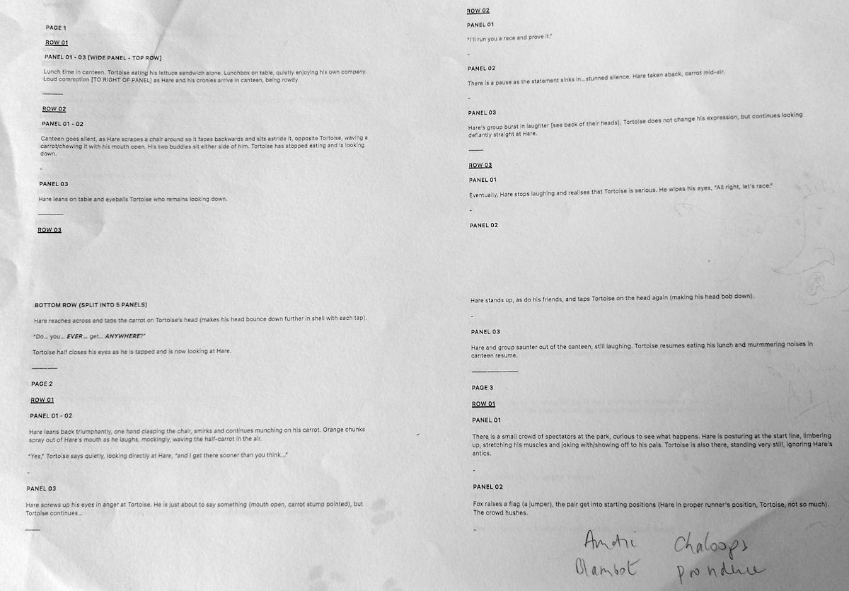
Initially, my main hesitation regarding the Brief was finding a short story that would fit into just 2-3 pages. Even the task of narrowing down the countless stories available to one that would be suitable was challenging. After some contemplation I decide to return to the fables and stories that I explored in the first exercise, Once Upon A Time.
Although some of the fairy tales did interest me, a high number of these, in their original form, are actually quite long. Additionally, I was not very keen on the endings of some as there seemed to be a big build up and the conclusion seemed like a bit of a weak afterthought.
I decided to return to Aesop’s Fables and this time I selected The Tortoise and The Hare. Compared to many of the other stories I had looked through, this one was at the other end of the scale in terms of length and, therefore, felt more manageable.
Source: American Literature.
Adapting Story
I was happy with my choice, but I wanted to expand on the story and, as usual, my imagination went slightly over the top. Although the Brief suggested being ‘creative’, I am not sure if I may have taken this slightly too far, but once I started to write out an adapted version, there was no going back.
Initially, I printed off the original story and then made notes of the ideas I had for expanding it in terms of character, location and narrative. I was mainly writing down the visuals forming in my head.
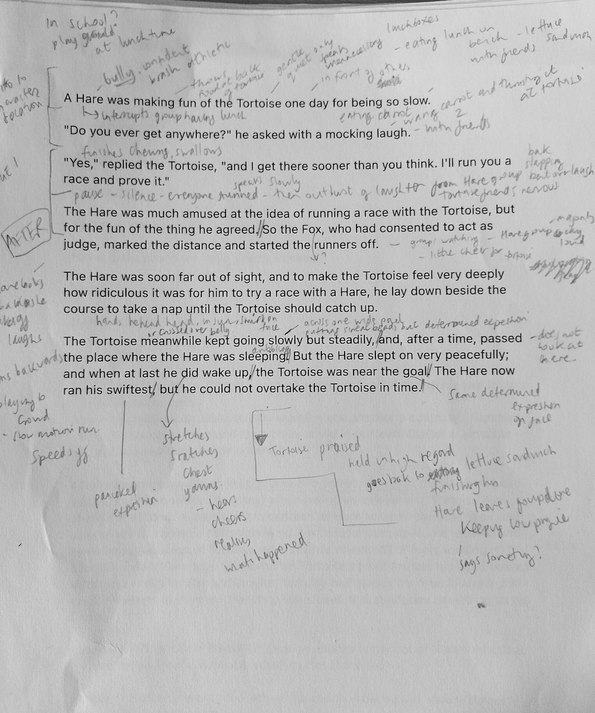
(click on image for larger version, opens in new tab).
I continued in this manner by typing my own version of the story, which was now solidifying my mind. At this point, I appeared to be imagining it in an animated format, which is what I tend to do, so I would need to figure out how to produce the same outcome using a series of still images laid out in panels.
At this stage I intended to stick to my usual preference for graphic novels by limiting the amount of text to just speech, although I did want to experiment with sound effects as I was yet to attempt this. I also planned to only use the speech from the original story.
Again, I printed off this draft and made additional notes.
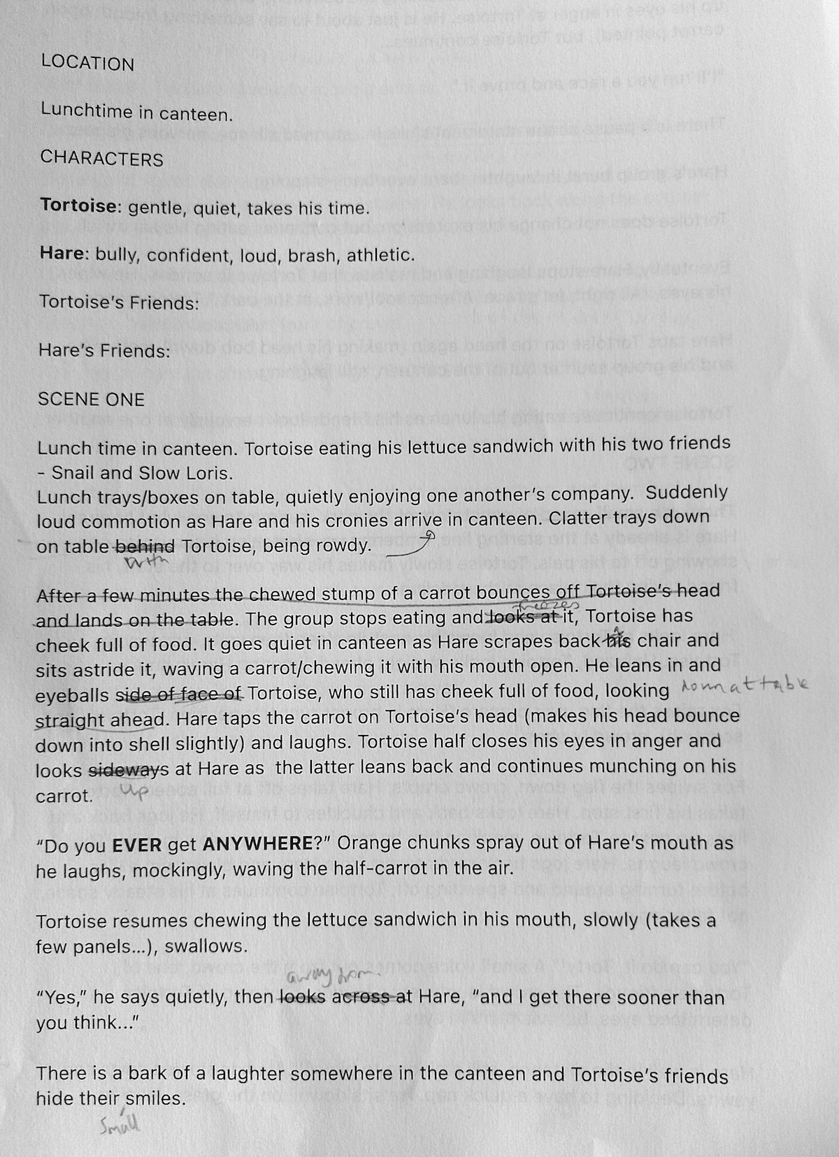
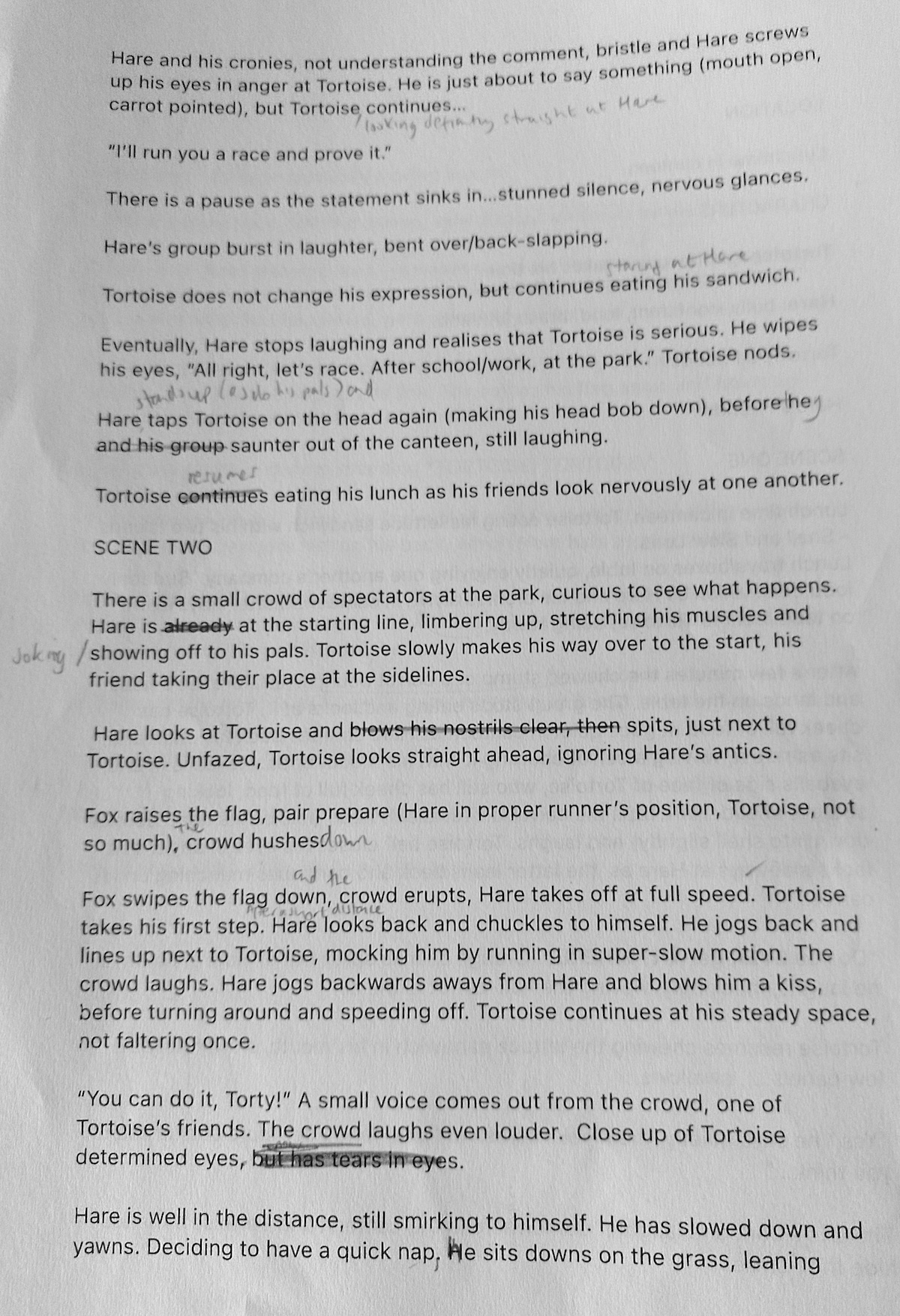

(click on images for larger version, opens in new tab).
I repeated this process, this time breaking down the text into potential panels – based on a nine panels per page layout. I hoped to keep within the three pages requirement, but I was finding it almost impossible to do this!
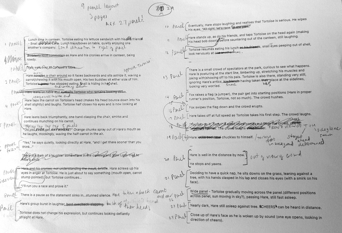
(click on images for larger version, opens in new tab).
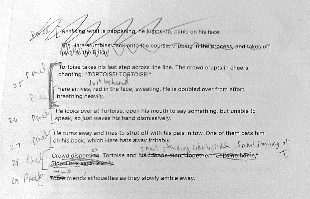
I repeated this process again.
(click on images for larger version, opens in new tab).
Eventually I reached a point were I felt reasonably satisfied that I had a fairly solid story to build on and I had the visual version quite clear in my imagination.
(click on image for larger version, opens in new tab).
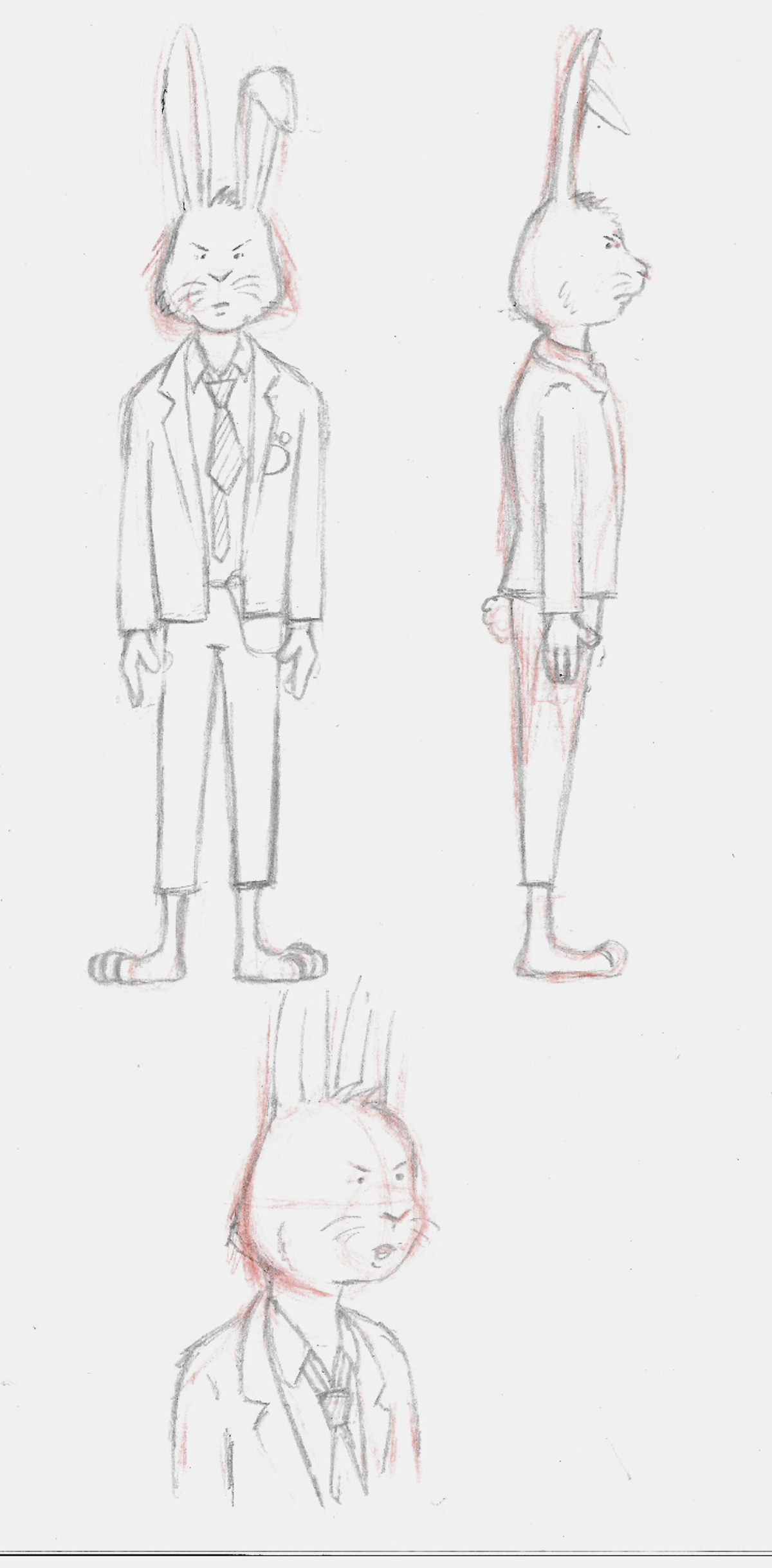
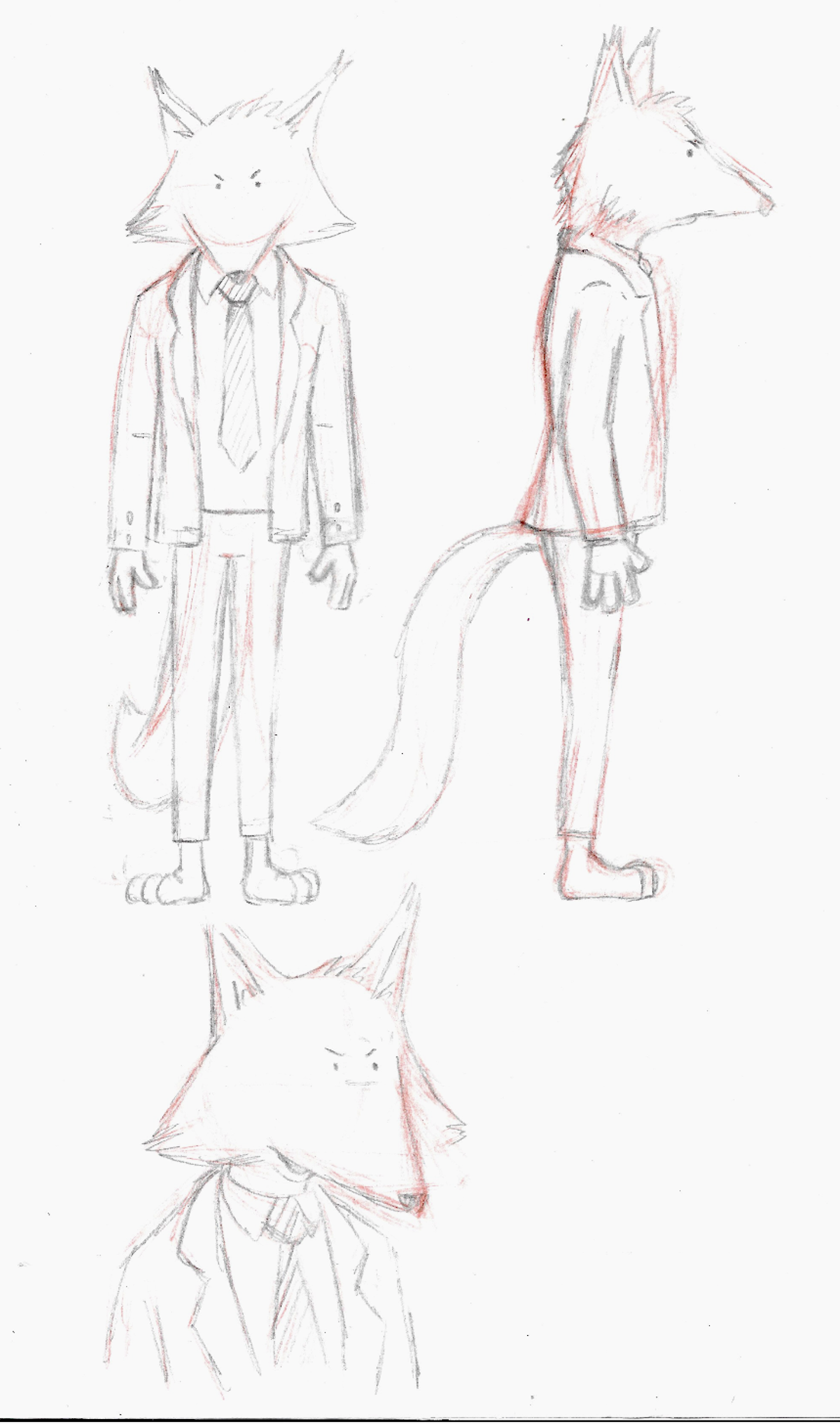
Character Design Ideas
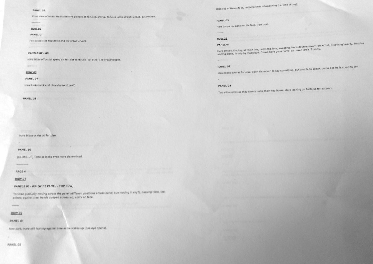
Whilst working on the text version of the story, I was also thinking about character design and I had a rather clear idea of how I wanted them to look. Indeed, one of my main motivations for selecting this story was due to the two characters that I designed for Assignment 2 in the first unit I completed, Graphic Design: Core Concepts, a tortoise and a hare about to race.
(click on image for larger version, opens in new tab).
As described in my drafts, I had originally planned to include quite a selection of additional characters, e.g. Slow Loris, Crow and Snail, along with background characters for the canteen and at the park. I soon realised that, although I would have liked to include them, this would require a huge amount of extra work and time, so I reined it back to the three characters mentioned in the original text – Tortoise, Hare and Fox. I also did not like the design I came up with for Crow, so that helped with the decision to remove him from the story.
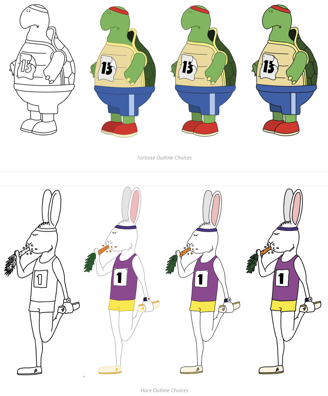
I spent some time sketching out rough versions of the characters.

Next, I drew slightly more refined versions of the three characters in a front and side view, as well as a 3/4 head shot.
(click on image for larger version, opens in new tab).
(click on image for larger version, opens in new tab).
(click on image for larger version, opens in new tab).
I was quite happy with these designs and how they blended as a group in terms of style.
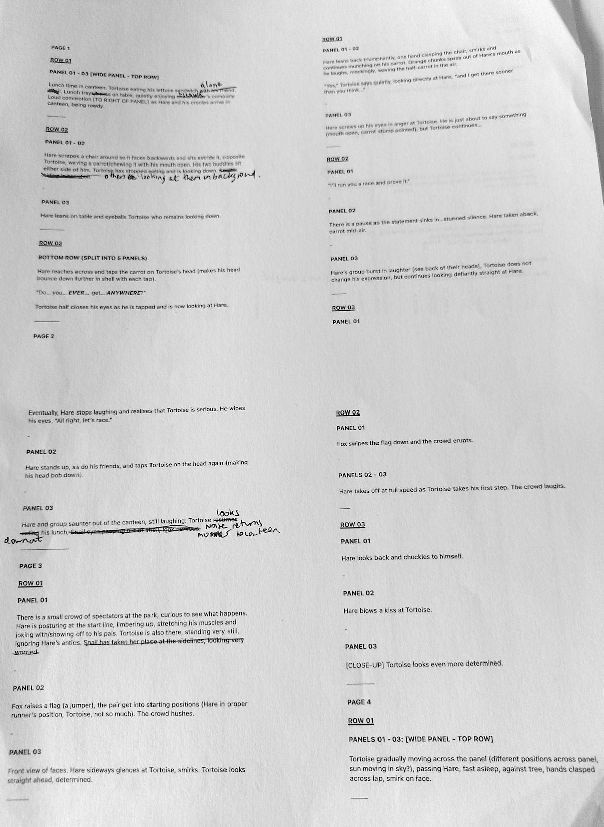
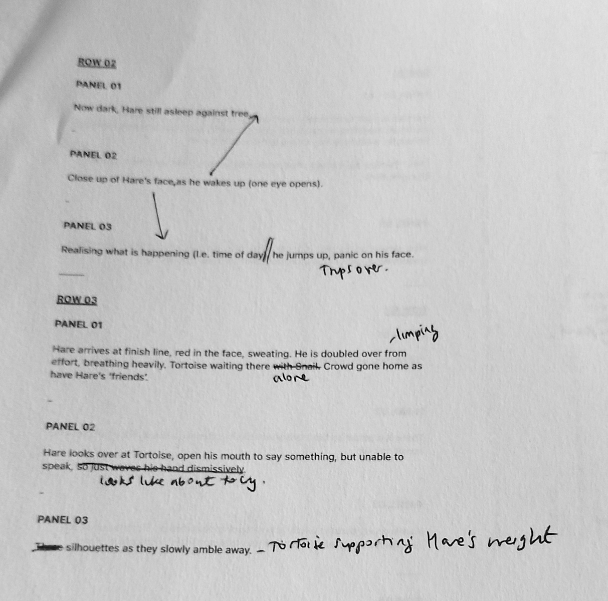
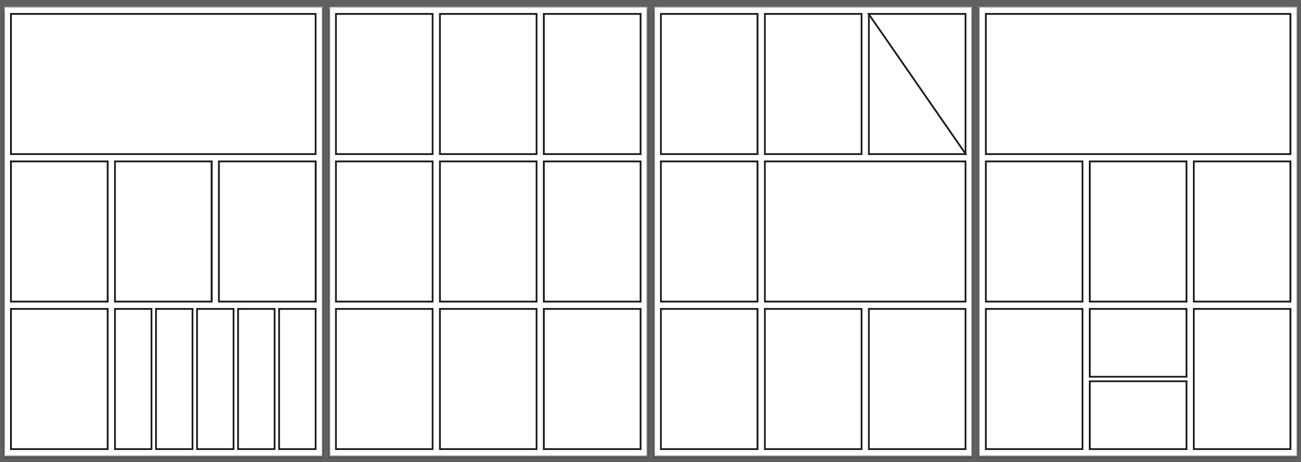
Panel Layouts
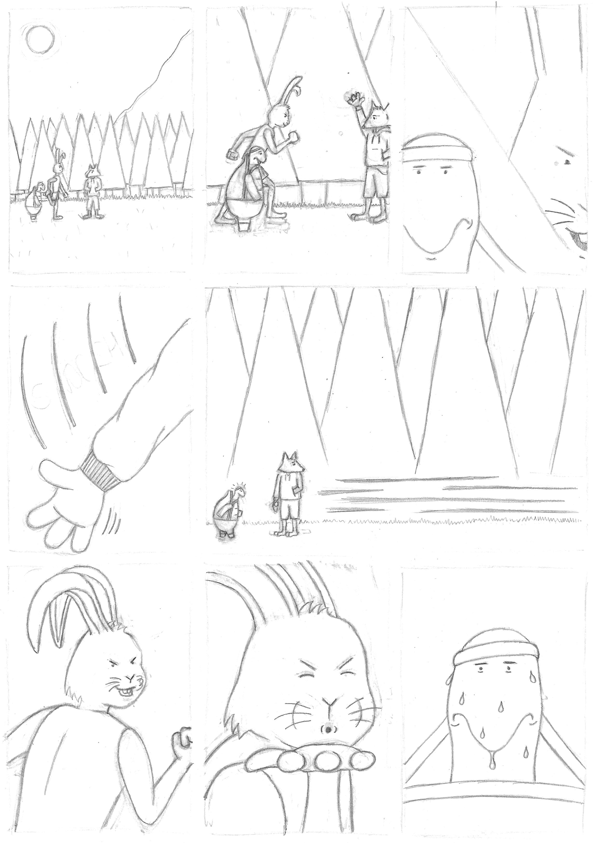
I used my final draft of the story as reference to draw the layout of the panels on each page in Illustrator. I had ended up with four pages, as removing any more panels would make the narrative less clear. I felt the extra work would be worth the effort and was willing to undertake this. I printed the pages off to use as guides.
(click on image for larger version, opens in new tab).
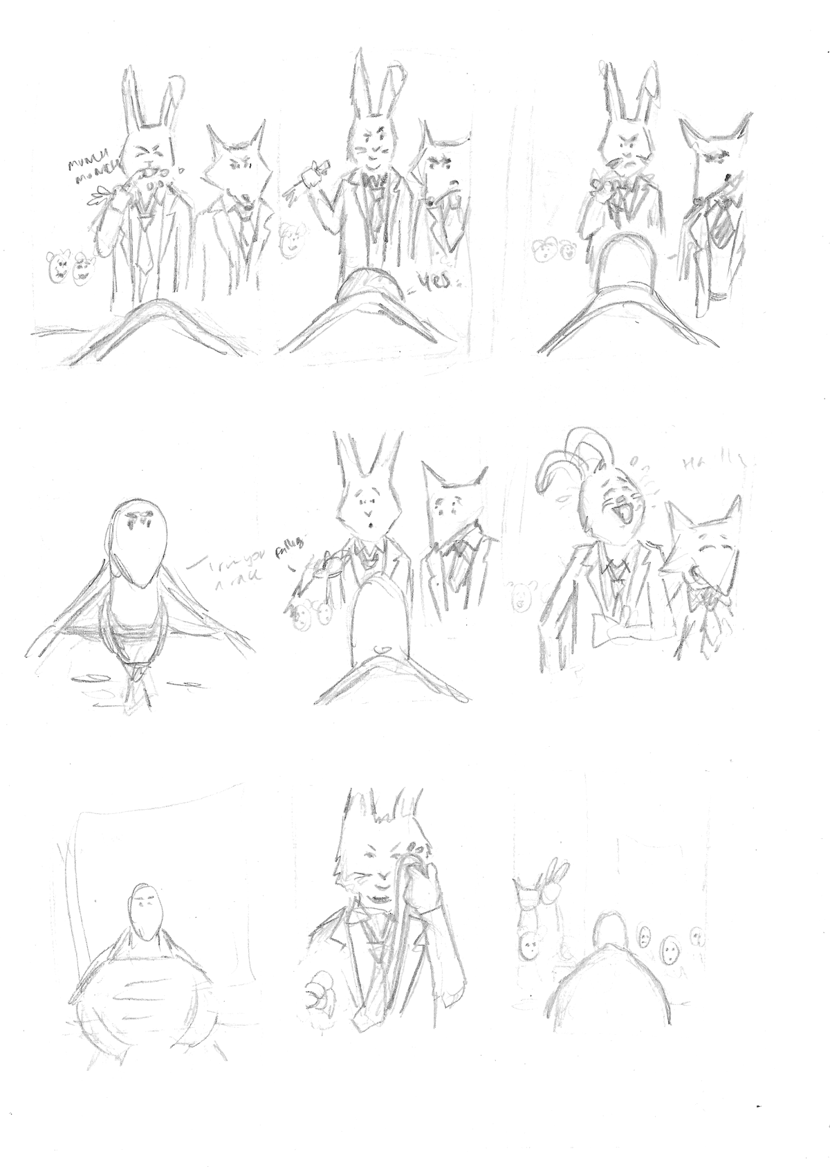
First Drafts
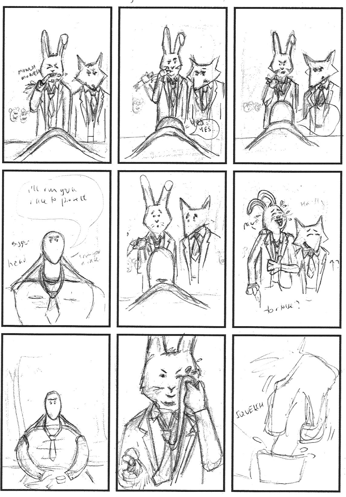
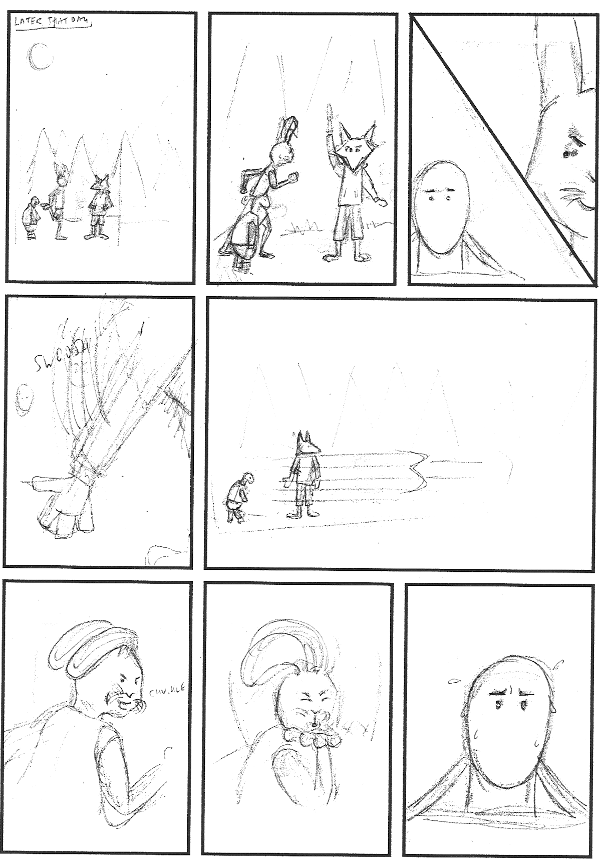
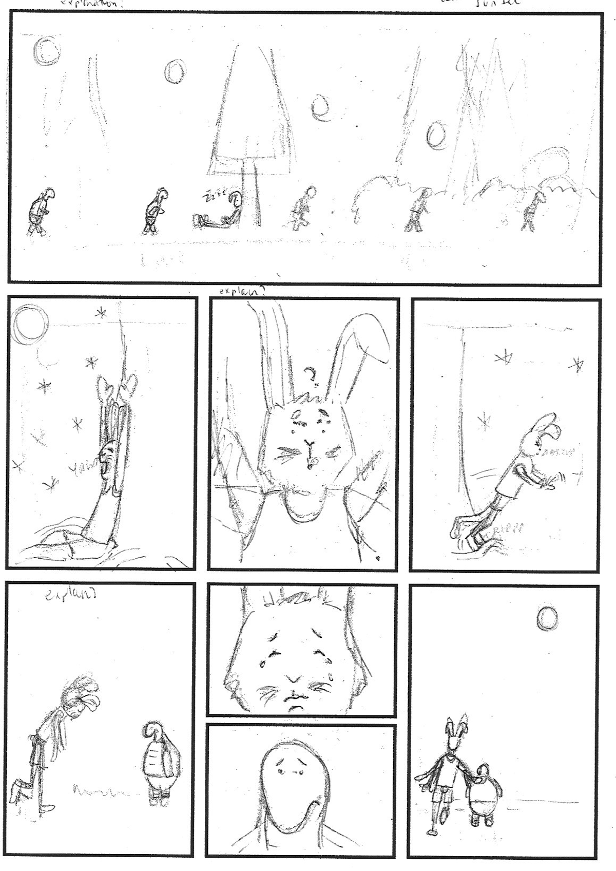
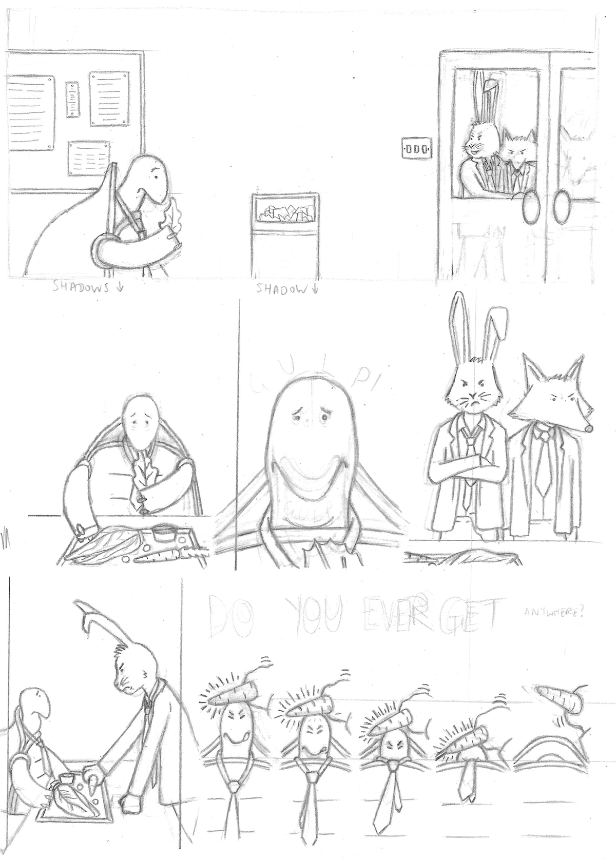
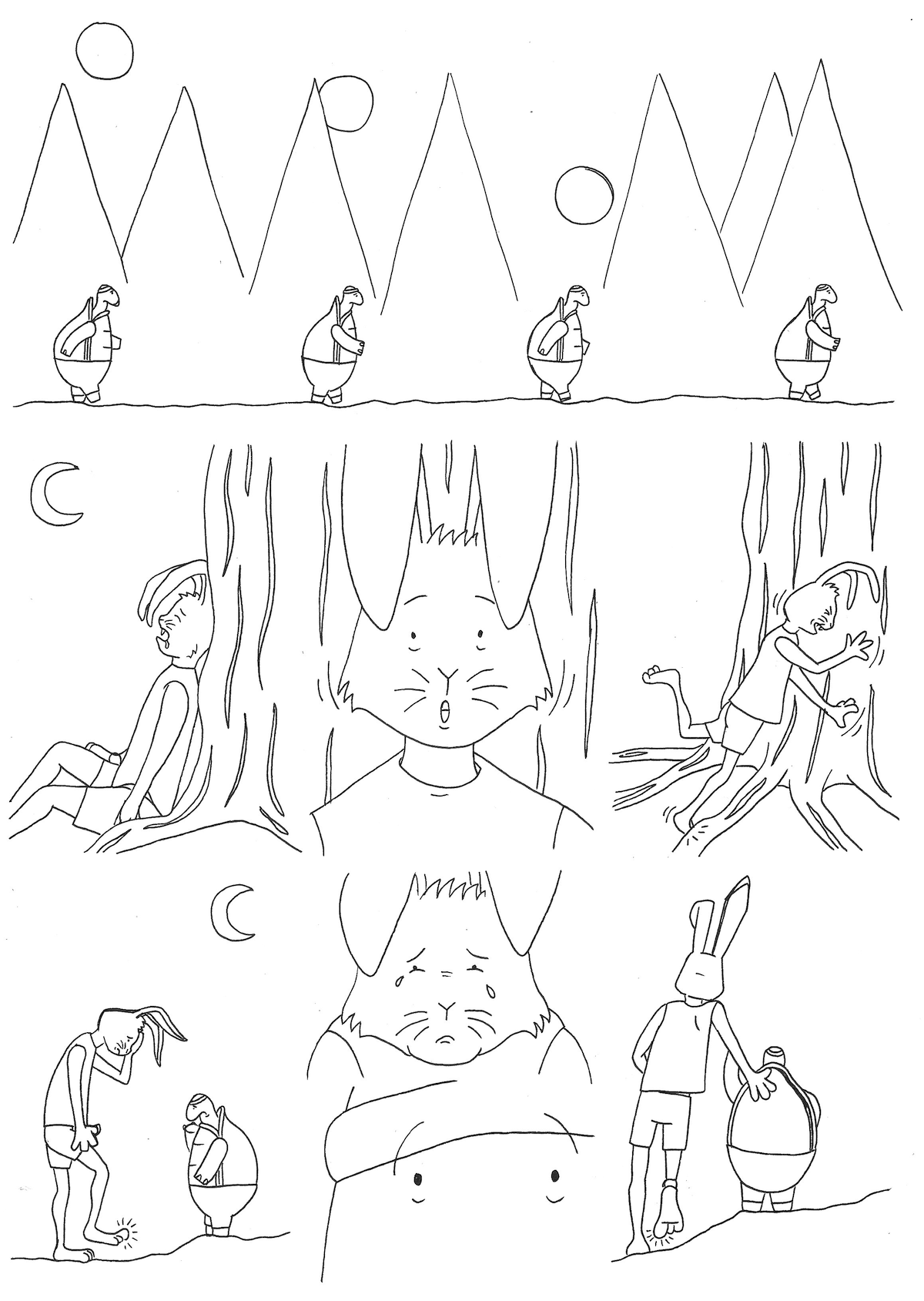
With the first planning stages now more or less complete, I felt ready to move forward. I used a light box and the printed page layouts as guides to sketch out rough drafts of the panels.
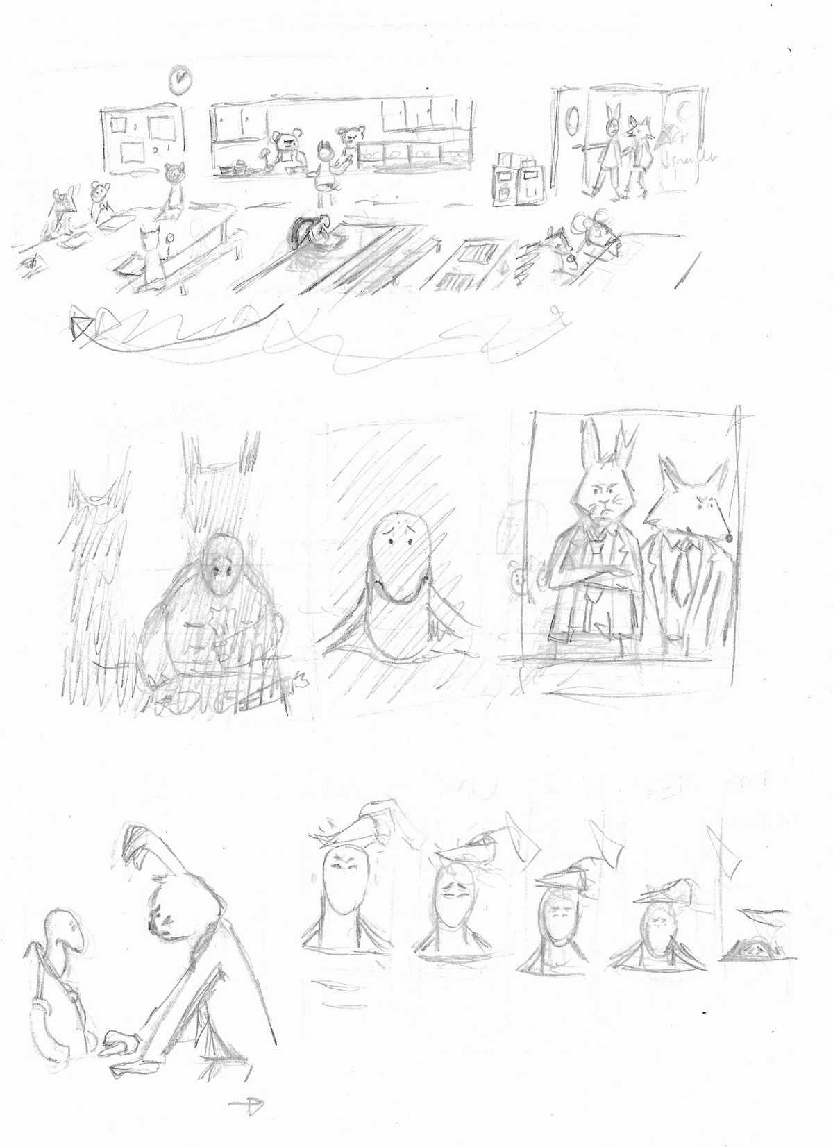
(click on image for larger version, opens in new tab).
(click on image for larger version, opens in new tab).
(click on image for larger version, opens in new tab).
(click on image for larger version, opens in new tab).
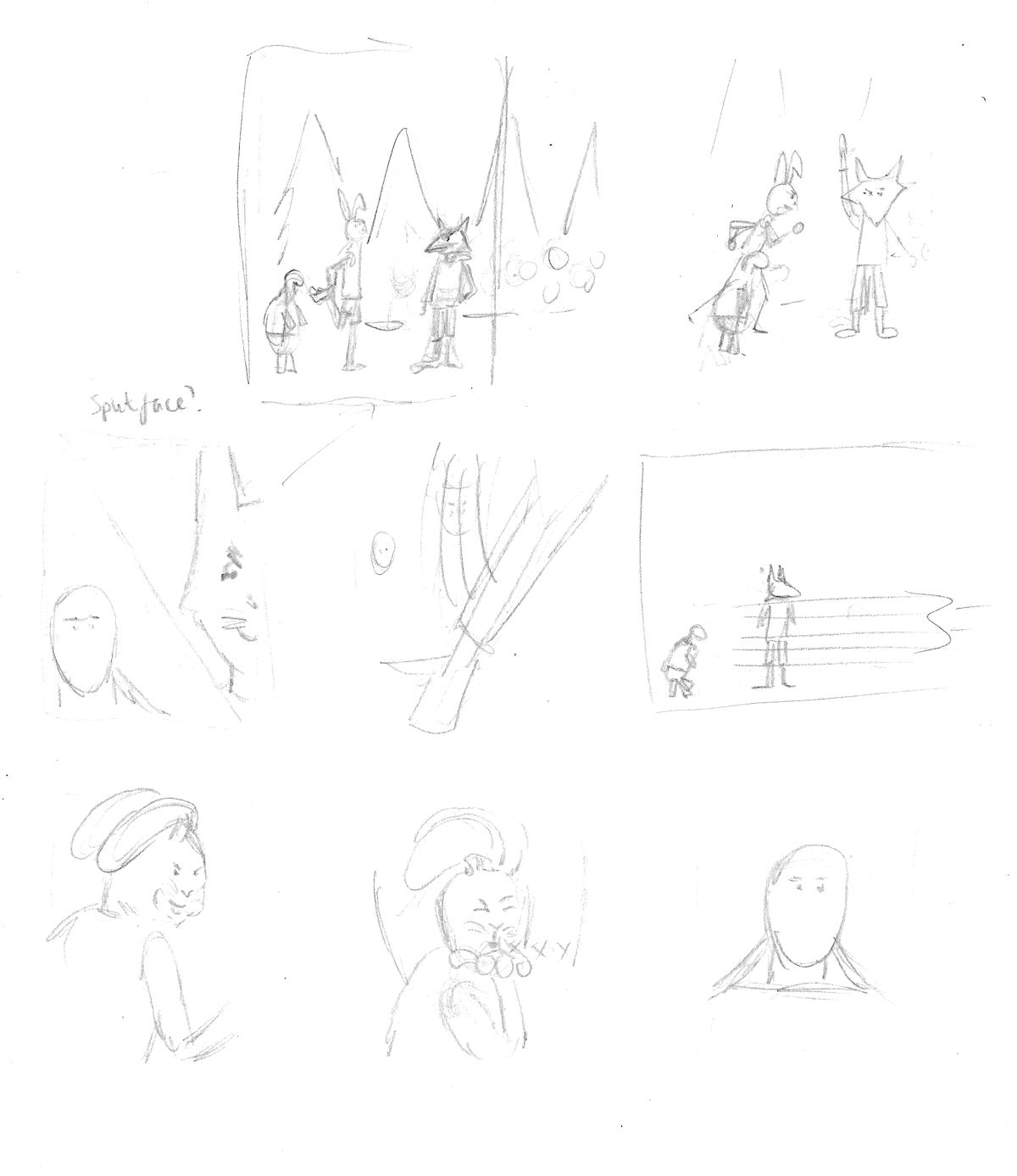
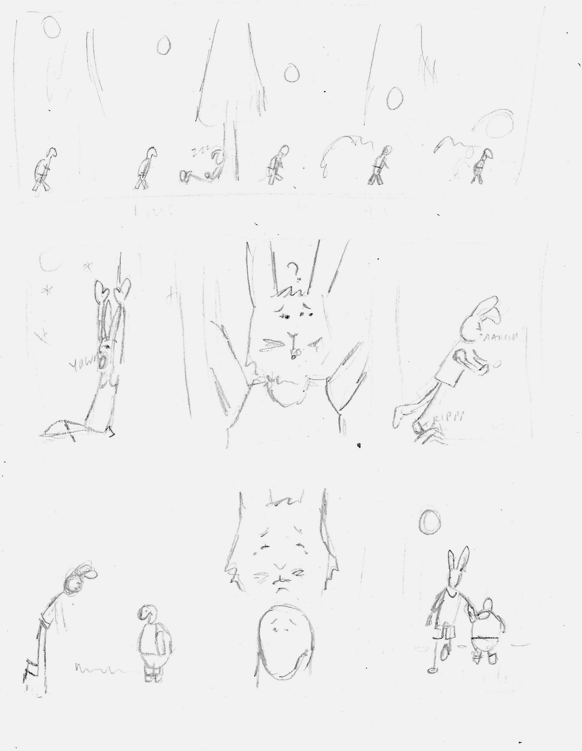
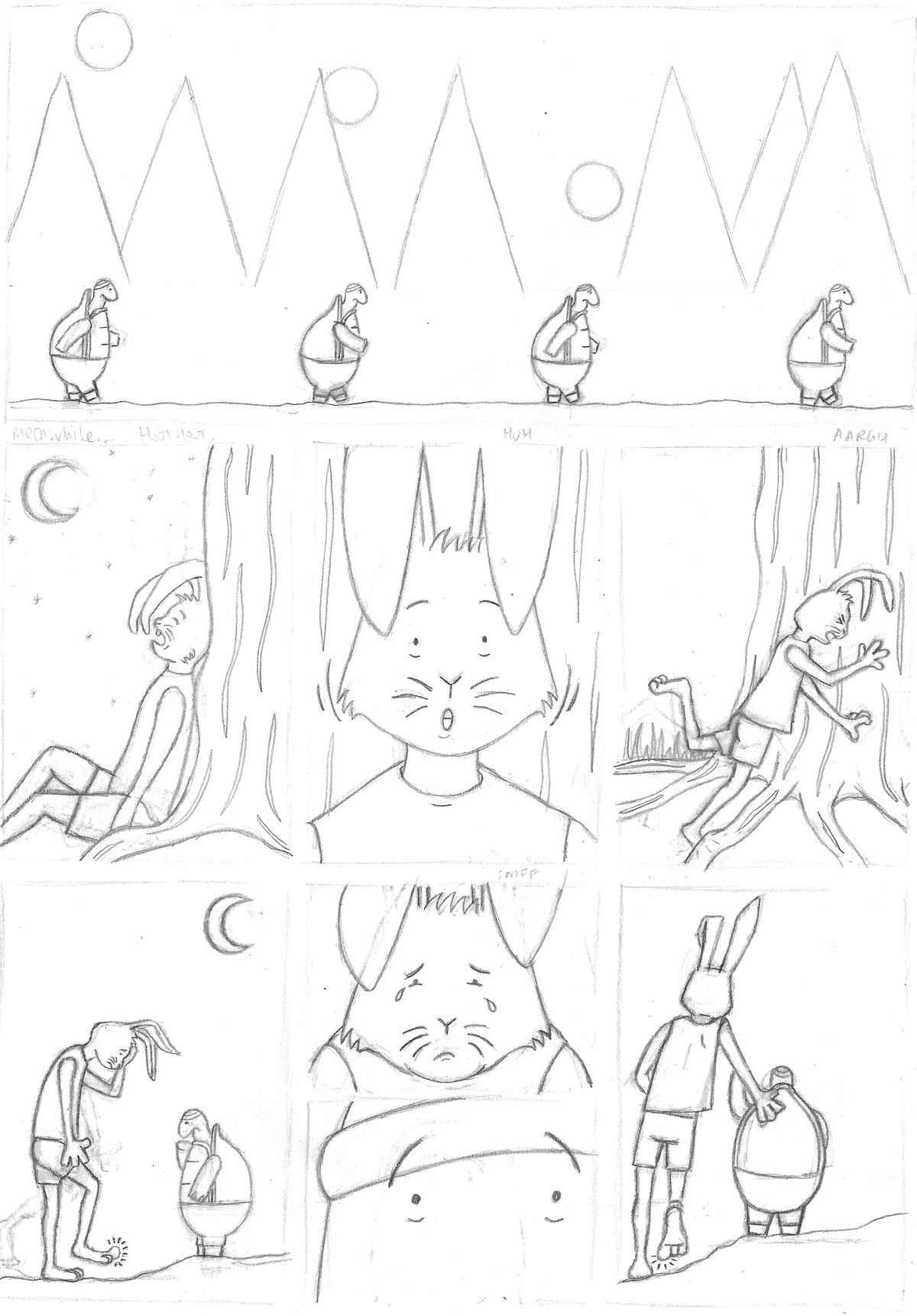
Second Drafts
I scanned the sketches into Illustrator and placed each one in the corresponding panel in the layout. I then printed this off and drew more defined versions over the top using a black biro.
(click on image for larger version, opens in new tab).
(click on image for larger version, opens in new tab).
(click on image for larger version, opens in new tab).
(click on image for larger version, opens in new tab).
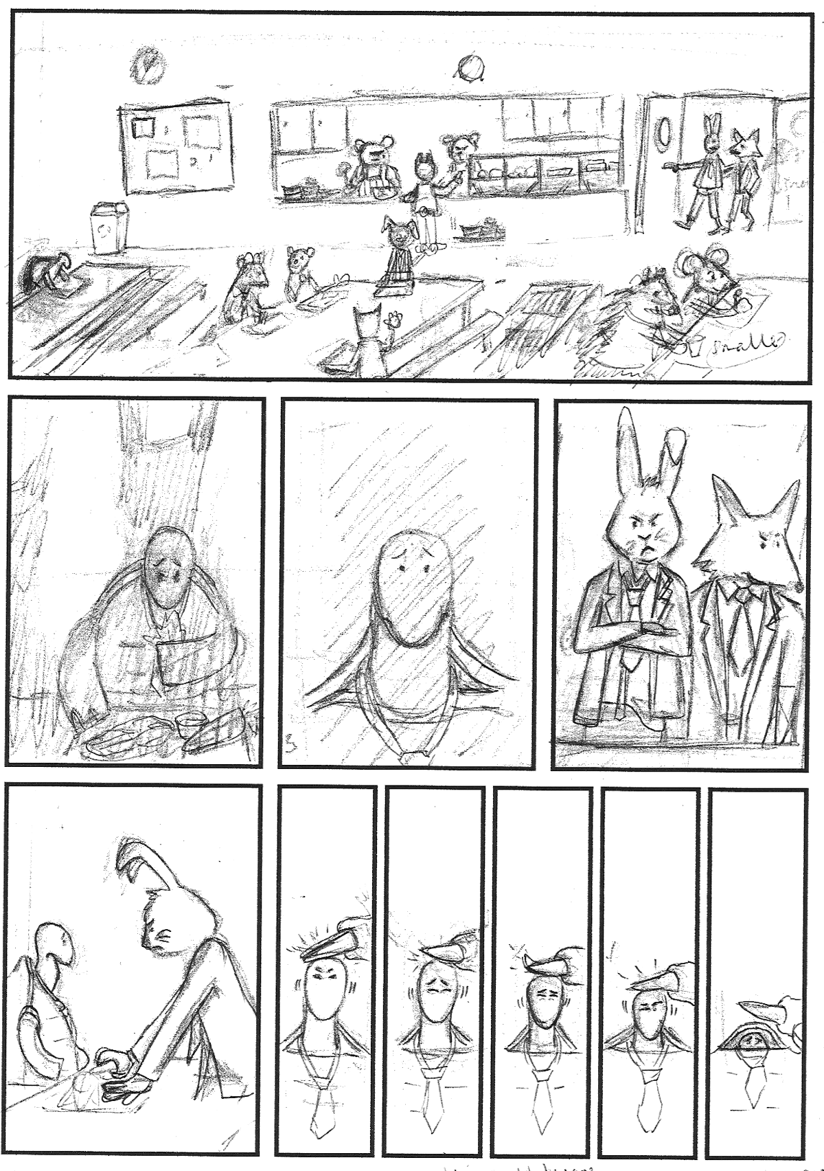
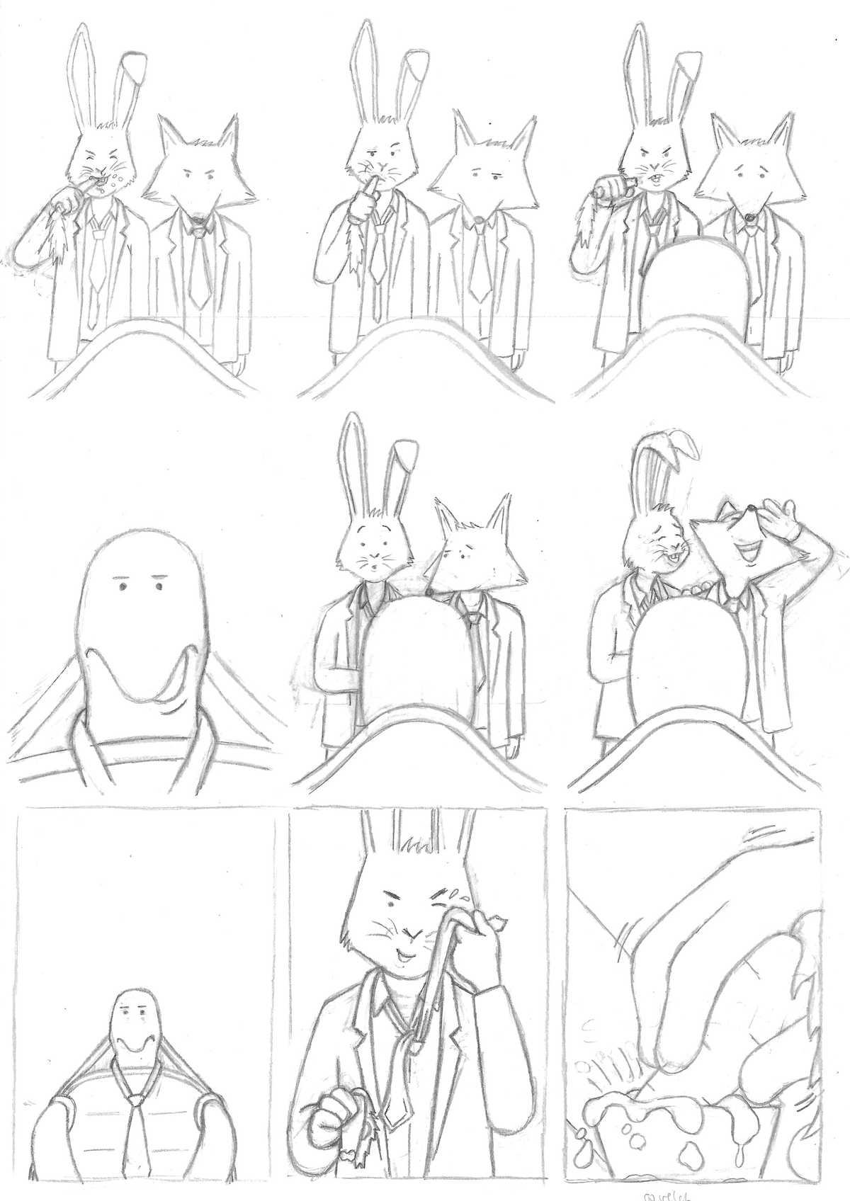
Pencil Version
At this point I was starting to wonder how I was going to be able to progress from these, to be frank, scribbles to a decent looking graphic novel version of the story!
Rather than go digital, which I did consider, I decided to continue with my aim of becoming more proficient using analogue tools. I would then have the option to combine this with digital input later, for example, when adding colour. I also wanted to avoid going digital at this point as I tend to become obsessed with the lines being perfect and the designs can sometime look quite clinical.
I ended up spending several hours creating pencil versions of each page, but I was genuinely surprised I had managed to produce outcomes that I was quite proud of – it doesn’t happen often! I also discovered eraser pens and I do not think I have never been so delighted to find a new tool. Using one of these allowed me to erase more precisely and there was plenty of erasing involved in the process!
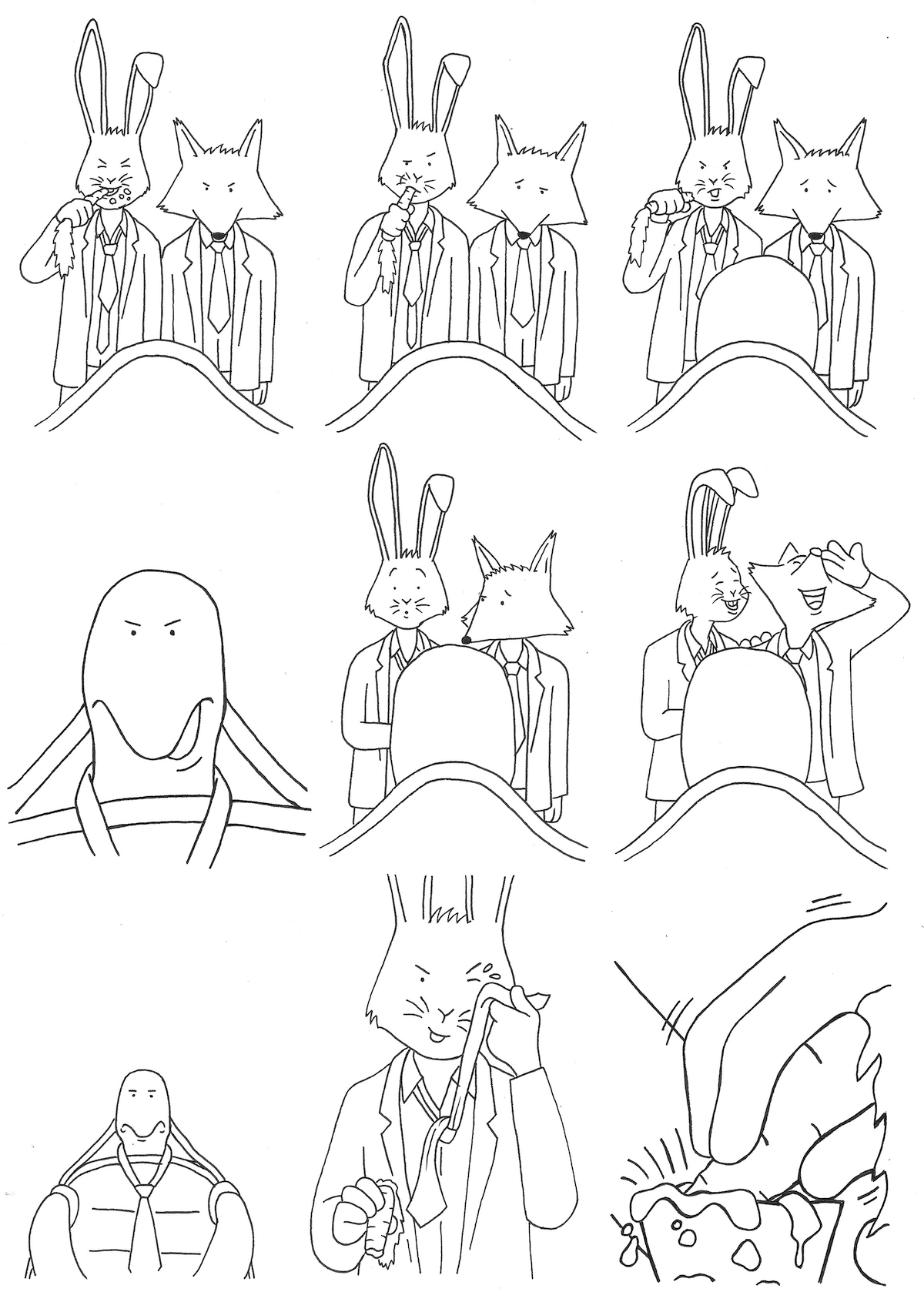
As can be seen below, the most drastic change to the original sketches was in the top panel on page one. I chose to completely remove the other tables, extra characters and background in this version. Instead I zoomed in on the three remaining characters. One of the reasons for this was the issue of perspective in the original, which was too mind-boggling for me to contemplate. I actually prefer this revised version as it focuses on the requirements of the story, helping to define the relationship between the characters.
(click on image for larger version, opens in new tab).
(click on image for larger version, opens in new tab).
(click on image for larger version, opens in new tab).
(click on image for larger version, opens in new tab).
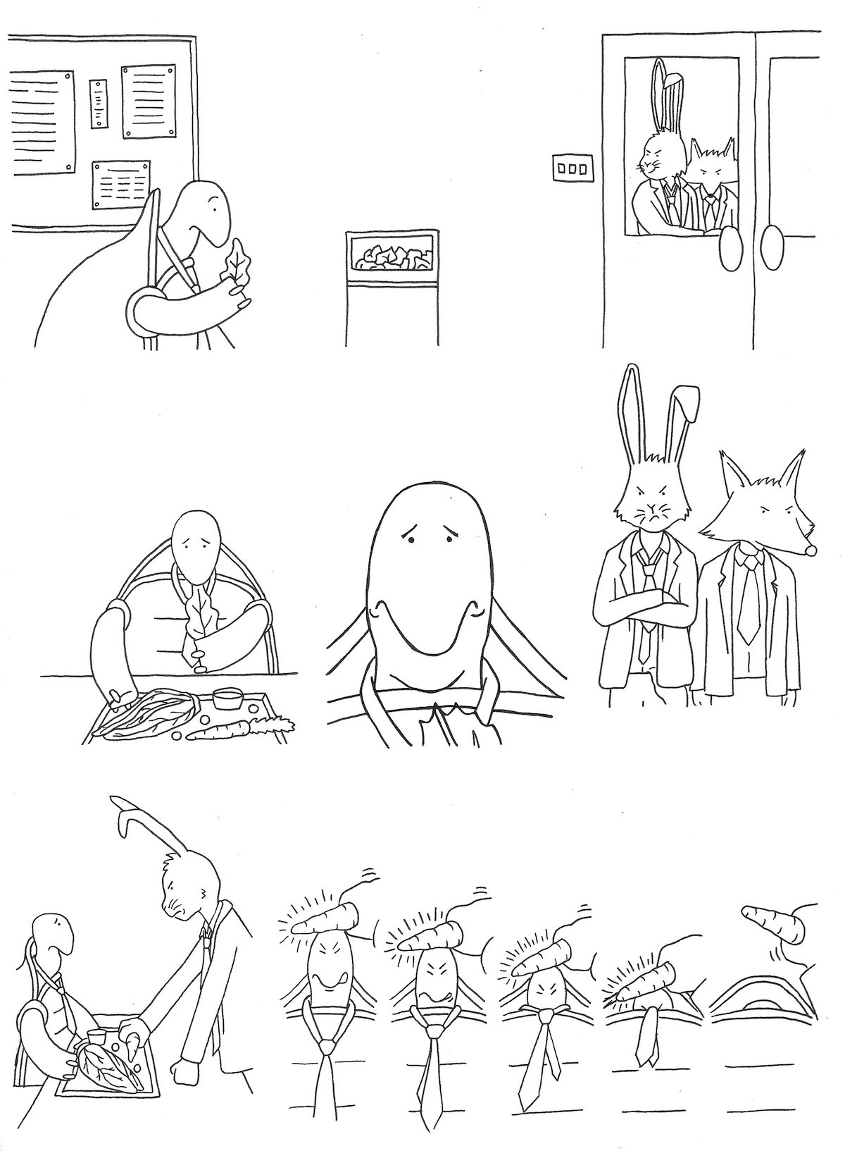
Pen Version
I was feeling quite encouraged by my progress at this stage. Next, I moved onto creating the black ink version, using a 0.1 fineliner and a light box. I had learned my lesson in Exercise 1, You Are What You Eat, and, therefore, rather than use a thicker pen and regret it, I kept to the thin line.
Compared to the pencil drawings, at the time of doing these pen versions, I was not too pleased with them. I think it was the pressure of using a permanent line and I wanted them to be ‘perfect’. Using a pencil felt more intuitive and I could enjoy the process more. I reminded myself that any ‘mistakes’ could be amended digitally, so that put me more at ease. When I looked back at these drawings at a later stage, however, I was more content with them.
(click on image for larger version, opens in new tab).
(click on image for larger version, opens in new tab).
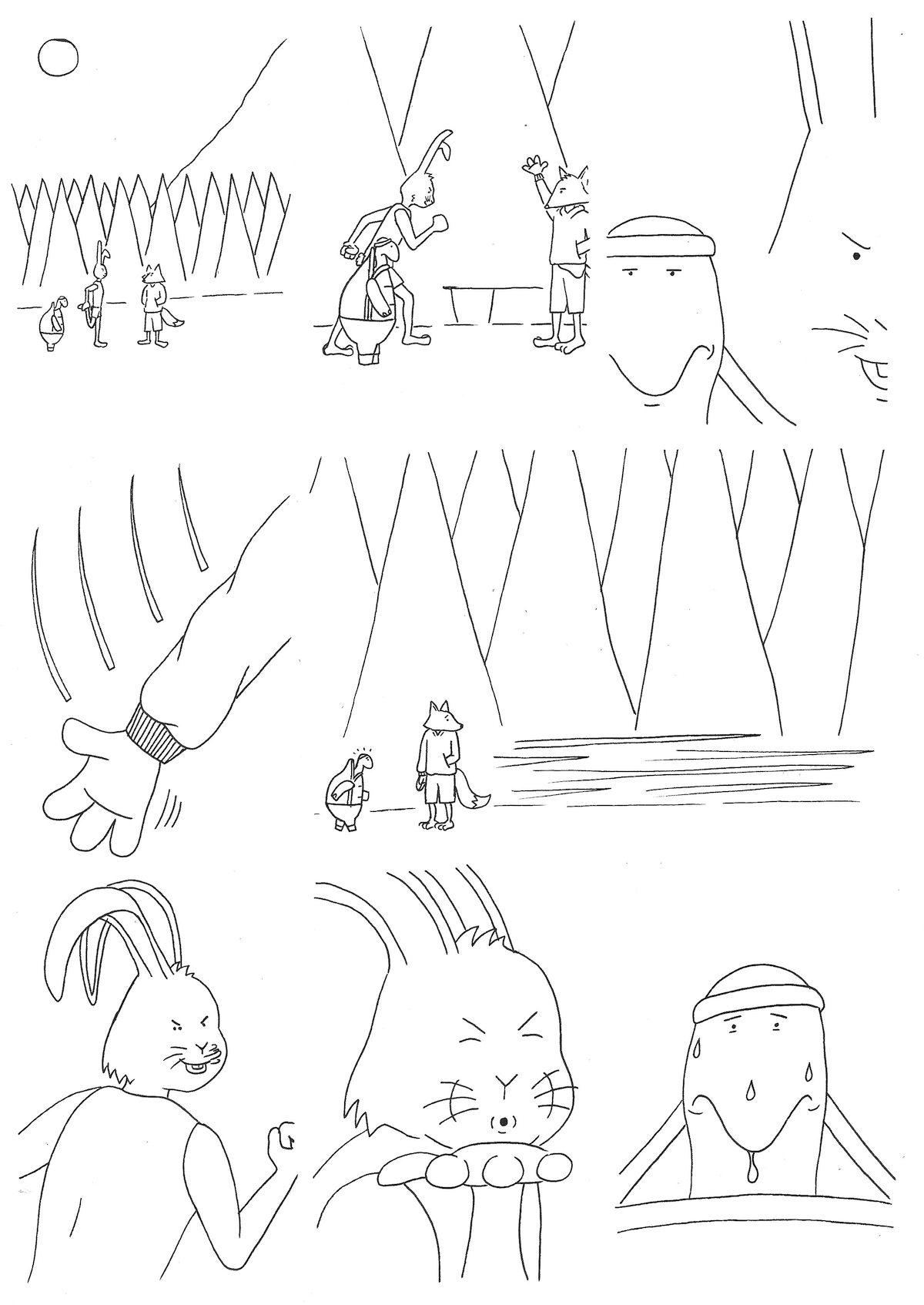
(click on image for larger version, opens in new tab).
(click on image for larger version, opens in new tab).
Up to this point in the development, I was not completely sure whether I intended to add colour or not. This was most likely an aversion technique to get out of working with colour rather than considering if it would be beneficial to the work or not. So I went against my habitual reservations and, deciding to move into a digital format for colouring, scanned the pages into Photoshop.
Moving into Photoshop
I am gradually becoming more confident using Photoshop, at least being familiar enough now to carry out what I wanted to achieve for this work.
Before doing anything else, I ensured the layers were set to Multiply in the Blend Mode so I would be able to add colour in layers underneath. I also placed the panel templates as the top layer so I could, again, use these as guides. I then had to cut paste, resize each panel drawing so that they fitted within these.
The next task was to remove artefacts that had appeared on the pages, such as dust that may have been on the scanner.
I then cleaned up the black outlines, removing and adding details as required. This process seemingly took the longest as it was key to ensuring the drawings looked how I wanted them too.
Finally, I was able to start adding colour. I tried to select ones that did not clash and not particularly saturated.
This entire process in Photoshop took numerous hours and several times I felt disheartened with how it looked, but I persevered and I thought the outcome was actually rather decent. Indeed, when I looked back to my original sketches from the start, I could not quite grasp how I had managed to achieve it.
(click on image for larger version, opens in new tab).
(click on image for larger version, opens in new tab).
(click on image for larger version, opens in new tab).
(click on image for larger version, opens in new tab).
There was still some important elements that needed adding to the panels, namely sound effects and speech. I also was starting to believe I would need to include additional captions that would help communicate the narrative. In order to add text to the pages, I exported them from Photoshop and moved into Illustrator.
Working on Final Version in Illustrator
Once the pages were in Illustrator, I cropped each panel and then pasted these into the panel layout template I had created earlier.
The first text that I added was speech, which also required the placement of speech bubbles. I had not really thought of this in depth when I drafted the original sketches, so I had work out where to put these without obscuring anything important.
I then moved onto sound effects, which I had not used before so it was quite a learning curve. I spent a long time fiddling with these in terms of placement, colour and size. I felt some of these, such as the ‘Swoosh!’ and ‘Munch! Munch!’, were more successful than others, such as ‘Gulp!’ and ‘Zooooom!!!’. I did not think the movement lines helped the latter, for example, as they were not defined enough.
Ultimately, I did choose to add captions to some of the panels. Again, as I had not planned these, I felt they were not completely successful, but they did help with the flow of the story.
As with Photoshop, this process ended up taking an extremely long time as I kept making further revisions.
I finally forced myself to stop and decided I had reached a satisfactory conclusion (see images in section below).
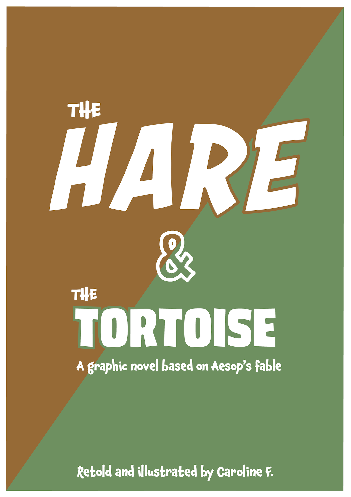
It was at this point that I remembered that the Brief asked for a cover page! This had been in the back of mind, but I became so preoccupied with the inside pages that it ended up being neglected. After a minor meltdown, I took the executive decision to create a text-based cover. The main reasons for this included the fact that my computer had kept crashing when using Photoshop and, to a lesser degree, Illustrator, so the prospect of going through the process again was quite overwhelming.
I genuinely believe that the cover page I did create in Illustrator (below), is suitable and fits in with the overall aesthetics of the inside pages. The order of the words ‘Hare’ and ‘Tortoise’ in the title seemed to vary depending on the source of the original story. I opted to put ‘Hare’ first as I felt this suited his sense of self-importance.
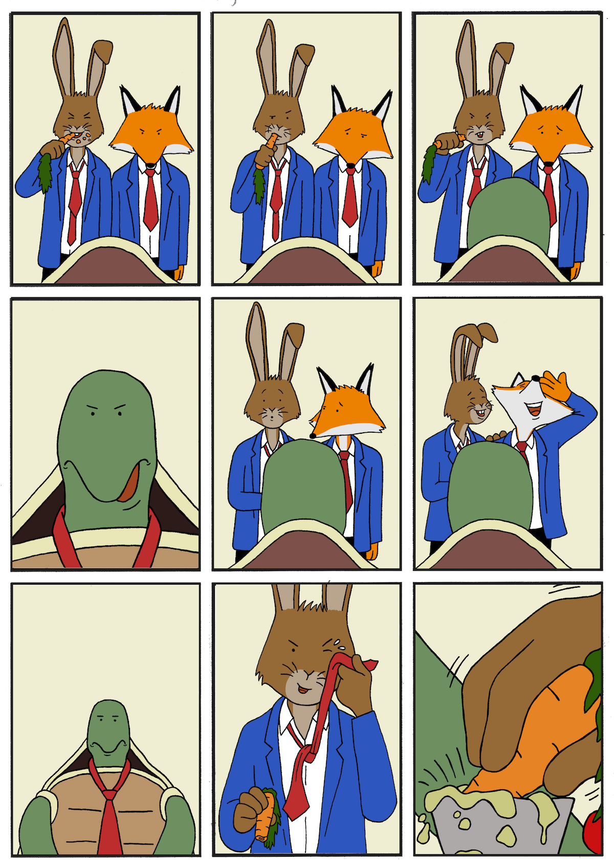
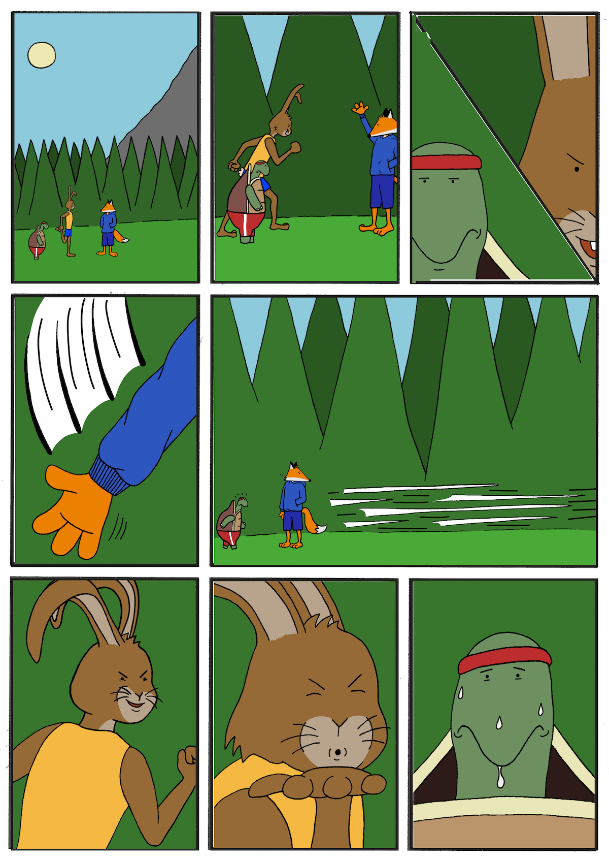
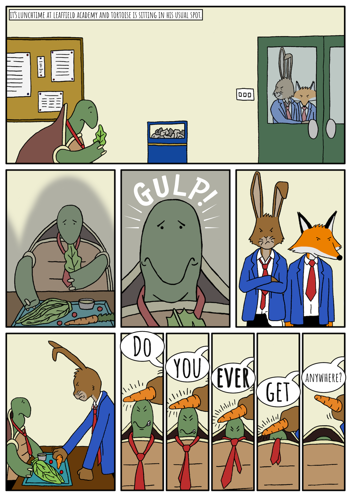
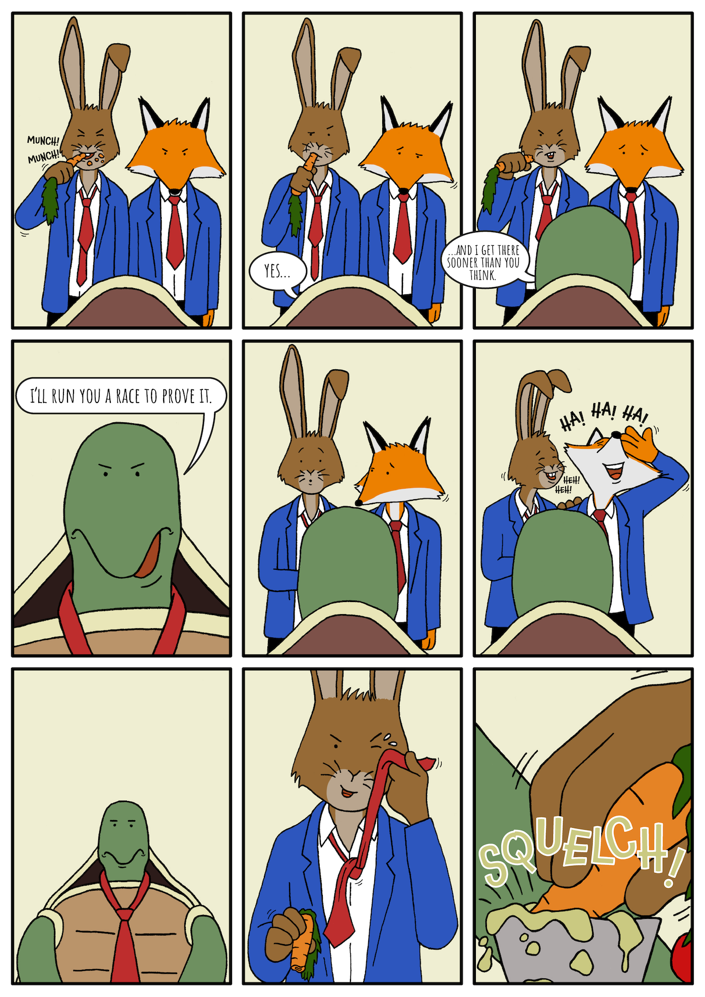
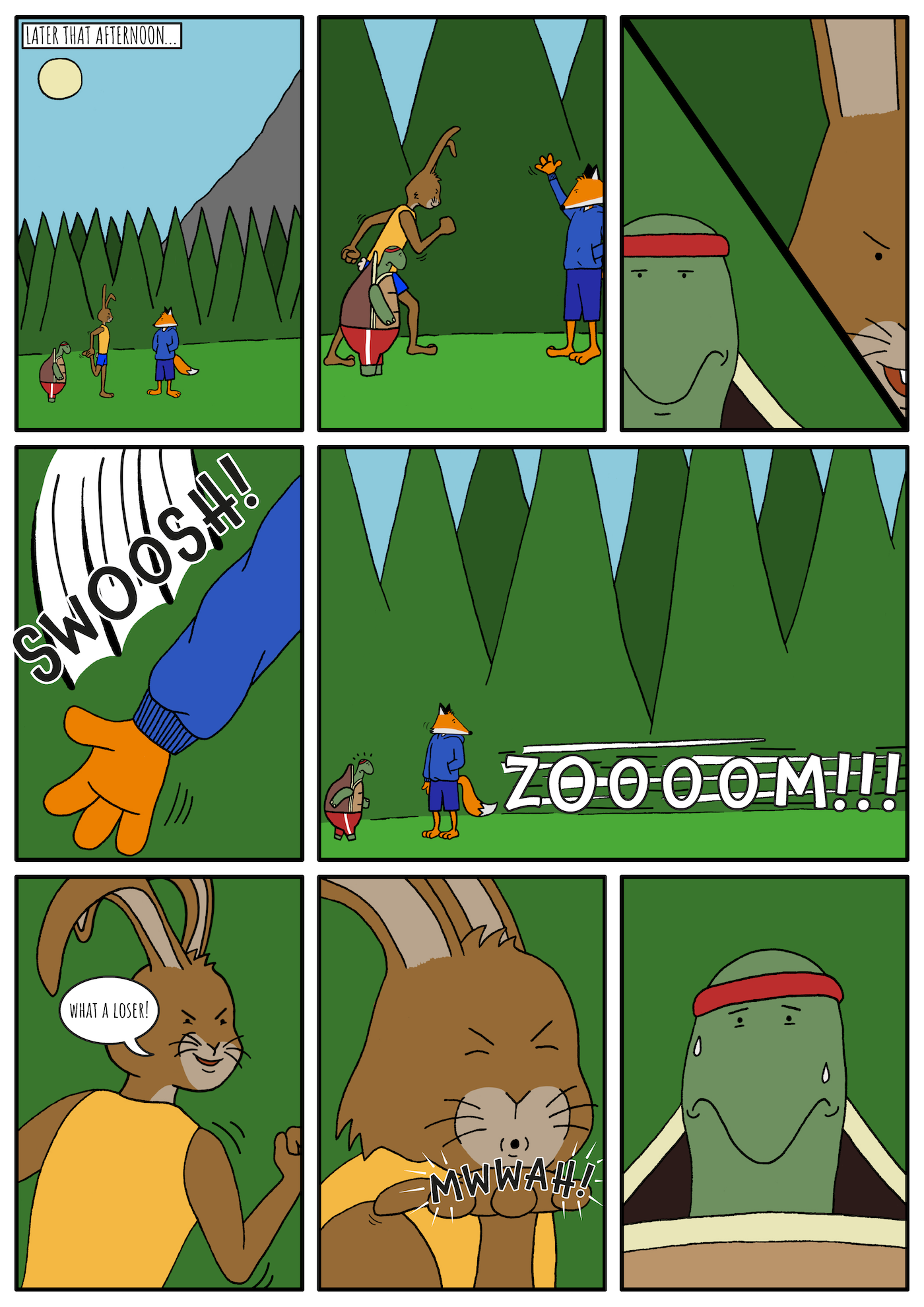
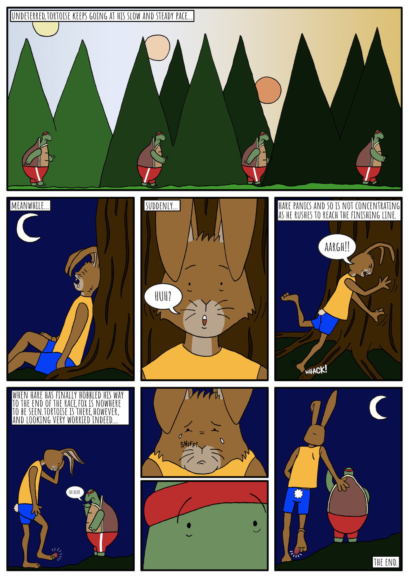
Final Version of Mini Graphic Novel
The final version of the mini graphic novel can be seen below.
(click on image for larger version, opens in new tab).
(click on image for larger version, opens in new tab).
(click on image for larger version, opens in new tab).
(click on image for larger version, opens in new tab).
(click on image for larger version, opens in new tab).
Final Thoughts
On the whole, I felt that the final outcome for this Assignment to be mostly a success. I found it to be just as rewarding as it was challenging, which is perhaps an ideal combination. As previously stated, I am not sure if, perhaps, I deviated too far from the brief by modifying the original story, but I did make sure it was still definitely recognisable as originating from the traditional version.
As is often the case, however, some aspects were certainly more successful than others, several of which I elaborate on below:
- I was generally happy with the character designs for this Assignment. I thought they were all consistent in style, both in relation to one another and throughout the four pages. I managed to draw the characters from a few different angles and they did not look too peculiar. I was particularly pleased with the expressions as I believe they communicate the characters’ feelings and the narrative as intended.
- I found the first two pages to be visually stronger in terms of composition and framing of the characters. This is demonstrated by the lack of additional explanation required via captions, as per the last two pages. I also thought the quality of the drawings was of a higher standard, particularly on page 2.
- One of my weaknesses is background design, which was evident in this Assignment. However, at the same time, I did not want to have particularly detailed backgrounds in this instance, which could distract from the focus being on the main characters.
- I was uncertain if having additional characters would improve the overall story, perhaps having a crowd would have enhanced the atmosphere of the race setting, for example, as I originally intended, but I do not think not including them had a particularly negative impact.
- I felt more confident with my colour choices in this Assignment. It would be good to begin experimenting with adding shadows and highlights to further enrich the illustrations.
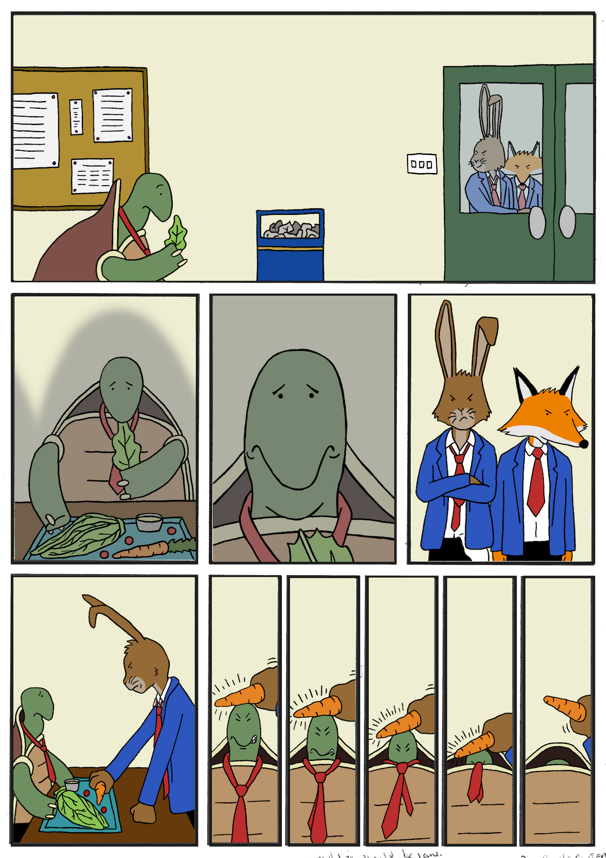
- I played it fairly safe in terms of the layout of the panels, although I thought my choices were fit for purpose. I used the wide panels to introduce new locations, i.e. the canteen and the park. The five narrow panels in the bottom row, on page 1, were successful in showing the forced retreat of Tortoise’s head into his shell. I switched the viewpoint several time and included close-ups, where appropriate. I was quite happy that I managed use one wide panel (top panel, page 4) to visually describe the sun setting to demonstrate Tortoise slow progress, as I was not sure if this would work. I did not think the diagonally split panel on page 3 was that successful, perhaps a vertical split would have been more fitting.
- I was generally satisfied with the logical process I followed for this Assignment, from planning through to completion. Throughout this section of the Unit, I have learned how important it is for me to have a solid plan and narrative (if appropriate) prior to starting on the visuals. In future, I should take more time to consider the inclusion and placement of text (such as captions, speech bubbles and sound effects), as this would have saved frustrations at the latter stages in this Assignment.
- Further to the previous point, I was pleased that I began experimenting with sound effects and I felt that, although the placement and colour choices were not entirely satisfactory, these definitely enhanced the story.
N.B. – Further to feedback received in the Tutor Report for this Assignment, I completely agree that the text is quite difficult to read – particularly the panel captions – and, therefore, should have been bigger and/or bolder.
Bibliography
American Literature (n.d.) The Tortoise And The Hare. Available at: https://americanliterature.com/author/aesop/short-story/the-tortoise-and-the-hare (Accessed 22 July 2023).