Produce an illustration that visually responds to the provided extract from Italo Calvino’s 1972 novel Invisible Cities. Try and reflect the visual depth portrayed in Calvino’s writing. Choose how you do this, either by applying the principles of perspective or throwing out the rule book to create an image with its own visual logic.
Research and Initial Thoughts
Prior to starting this assignment, I was expecting to find it easier to come up with viable ideas, but all I could think about was how I was going to depict perspective as I still felt very unconfident in this area. I was also apprehensive about drawing an environment with such detail as described in the passage – as stated previously I am a complete novice when it comes to drawing backgrounds such as landscapes or urban environments. Additionally, when I see examples of this genre of work, such as concept paintings or fantasy landscapes, I find it quite intimidating as they are generally fairly spectacular!
I made a start by reading through the text several times and underlining key words and phrases. I then wrote down some initial thoughts, similar to a mind-map (but without the lines), alongside the paragraphs. Examples included:
- Octavia – eight/born eighth
- Web-like
- Fragile
- Swaying
- Open to elements
- Clouds
- Gas lights
Initially, the only artist that I could think of in relation to this assignment was Moebius, who I discovered during the Graphic Fiction unit. I found some examples of his work on Pinterest (in addition to a couple of other works). I did not realise that Moebius was the concept artist for the film The Fifth Element (1997), which was interesting as the scenery/landscapes from that film entered my head during these initial stages due to the city being vertical and the regular use of perspective shots to give an enhanced sense of height and drama. Another film that came to mind was Hook (1991) as I remembered the Lost Boys’s hideaway included wooden/rope bridges suspended between trees.
I also searched on Google for artists that have produced illustrations that specifically relate to Calvino’s novel. Some of these include:
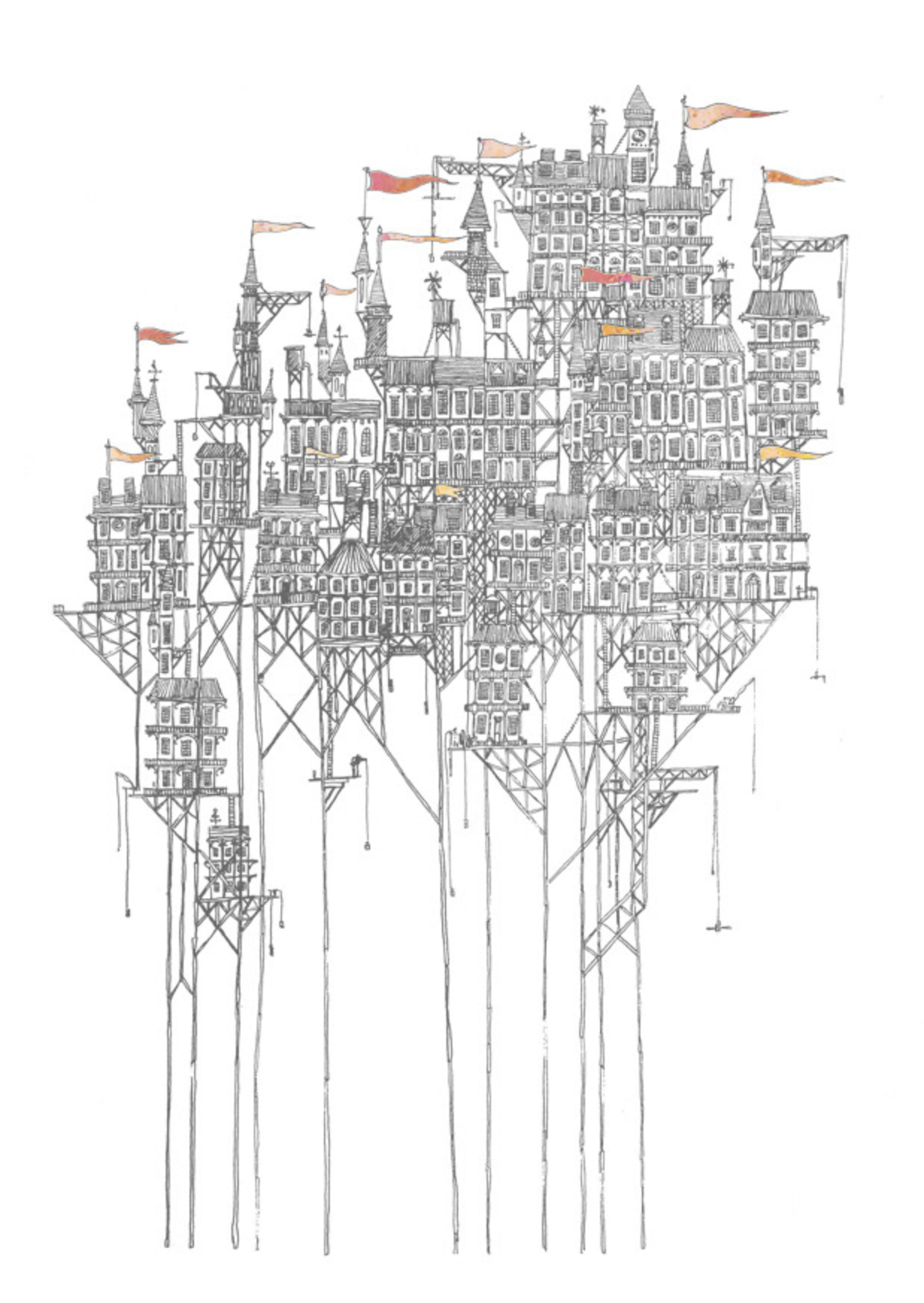
David Fleck – who has created intricately detailed, hand-drawn illustrations of several of the cities described in Calvino’s novel. Fleck’s illustrations, such as the one below, emphasise height rather than depth.
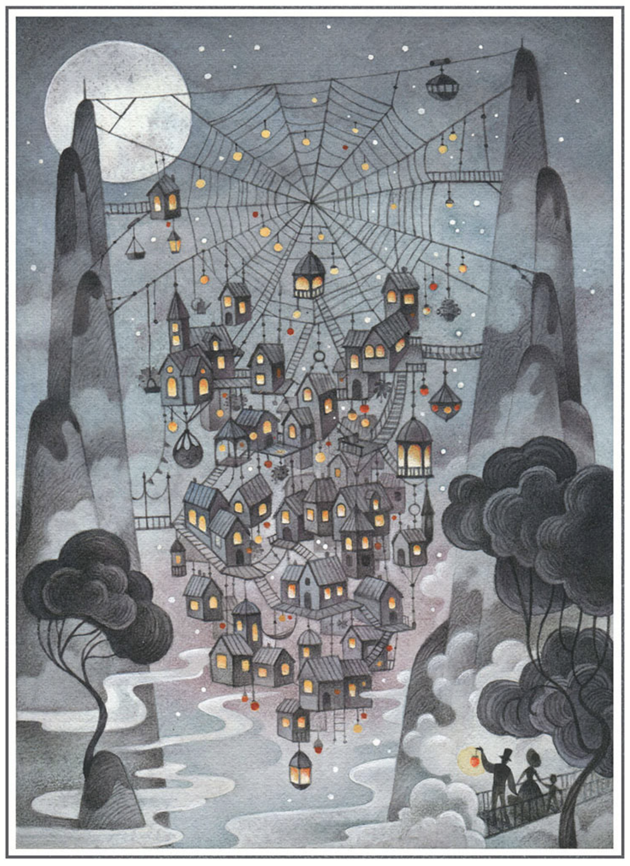
Gaia Bordicchia – who has created a fantastical representation of the city that is the subject of this assignment. The style is reminiscent of a children’s book illustration. I considered the composition to be well-balanced and I liked the inclusion of the spiderweb. The only aspect that I felt did not represent the text was that the houses are solid forms whereas Calvino describes them as ‘like sacks’, but this is an example of artistic licence.
Thumbnail Sketches
Next, I decided to draw out some very rough thumbnail sketches of potential concepts.
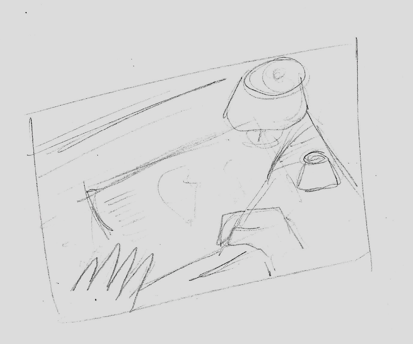
My first idea was to create an illustration that showed the narrator of the text drawing out a map/blueprint of the city with additional close-up detailed drawings of particular items, e.g. the gas lights. The composition would include the hands of the character, holding a feather dip pen, poised over the paper on a wooden desk. There would be a lantern lighting the scene. I quickly realised that although I could picture the illustration clearly in my mind, my current abilities would not allow me to create a satisfactory illustration, but I did like the idea.
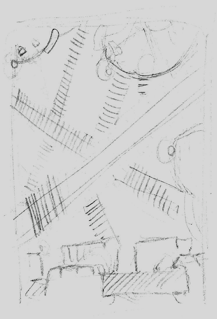
I then felt quite lost and frustrated, so just drew out some simple sketches, as below, in which I thought about how to include the web-like structure, the hanging sack-houses and the criss-crossing walkways. I also started to favour the illustration being from the point of view of someone looking down from one of the bridges.
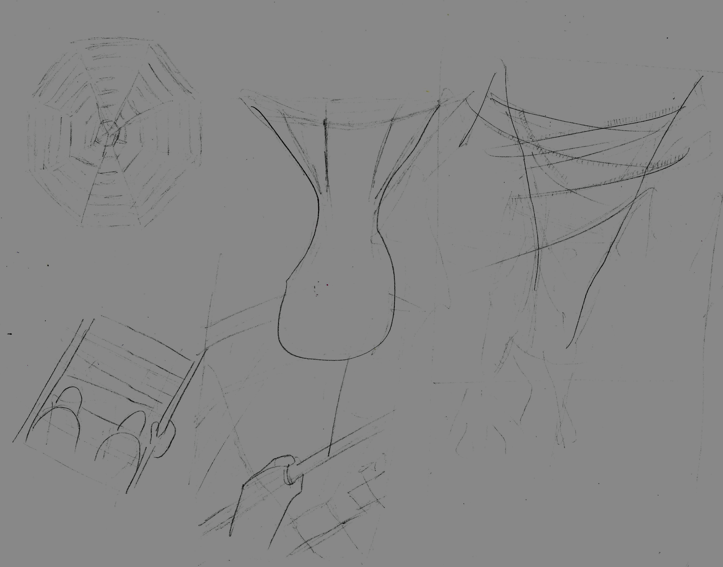
I decided to expand on this idea and sketched out another thumbnail from the POV of the character looking down onto the city from a walkway. Again, I liked this idea, but there were two main hesitations that I took into consideration. Firstly, and most importantly, as stated in the introduction, I was not confident at all that I would be able depict the level of detail I wanted in perspective, looking down on the city – it is one thing drawing straight lines in my kitchen as in a previous exercise, but it is another level altogether when required to include organic forms such as here. Secondly, I thought this was probably quite an obvious solution to the brief and I wanted to think of something less so (although I may have been using this as an excuse…).
Developing An Idea
After a while I started to consider other ways that visual depth can be depicted, such as:
- Overlap – objects nearer to the viewer obscure the view of those further back.
- Scale – relative objects are smaller the further away they are.
- Atmosphere – this affects the value and clarity of an object, for example, those closer to the viewer will be darker, more detailed and sharper.
I then recalled that one of Laurence Whitely’s artworks, below, found during the Less is More exercise incorporated the above to suggest visual depth.
Source: Laurence Whitely.
I began with a very rough sketch, as below, in which the ‘sack-houses’ hang down and the walkway bridges criss-cross between them.
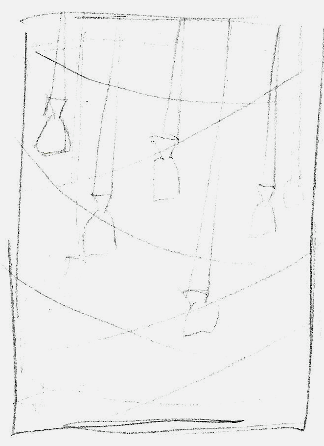
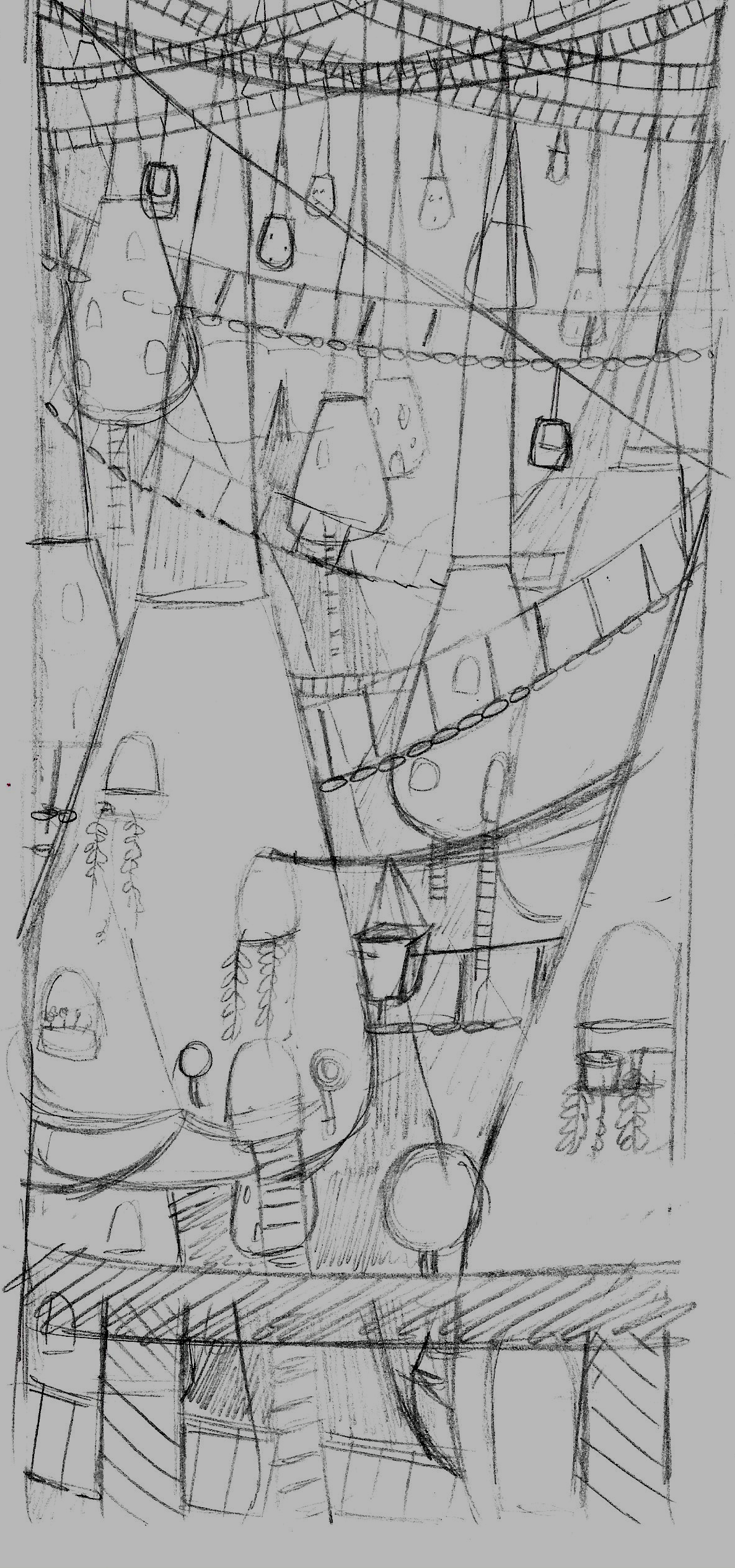
I chose to pursue this idea and see what happened. I made further sketches, each one expanding on the detail.
I also decided to not use a regular size for the composition, e.g. A3, as I thought that using a narrow, elongated format would help to emphasise the hanging element of the illustration (in a similar vein to Moebius who compositions were often wide-scale to emphasise the expanse of his landscapes).
Additionally I began considering setting my scene at night time, so I could include lights/moonlight and therefore silhouettes.
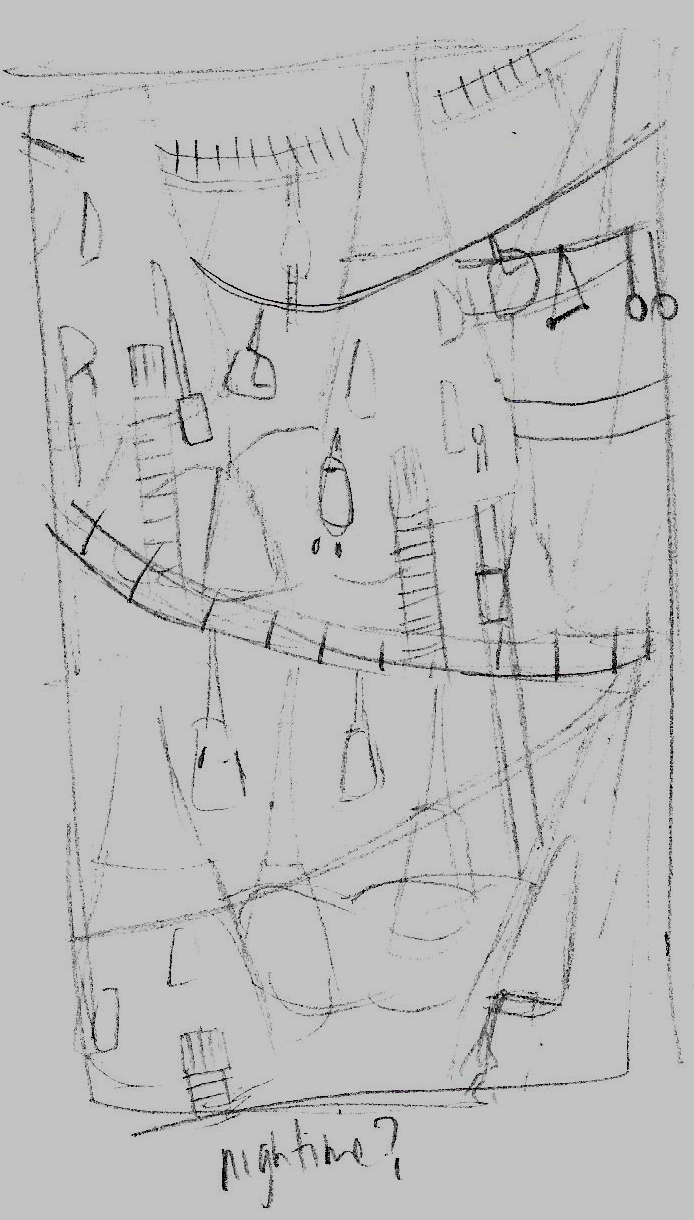
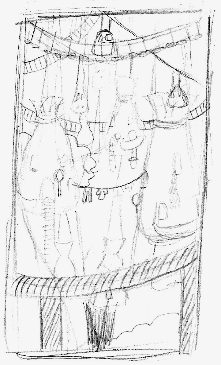
I began feeling a bit more positive about my idea with each sketch, however, one aspect that needed particular attention was the hanging quality of the sack-houses as they currently looked too rigid.
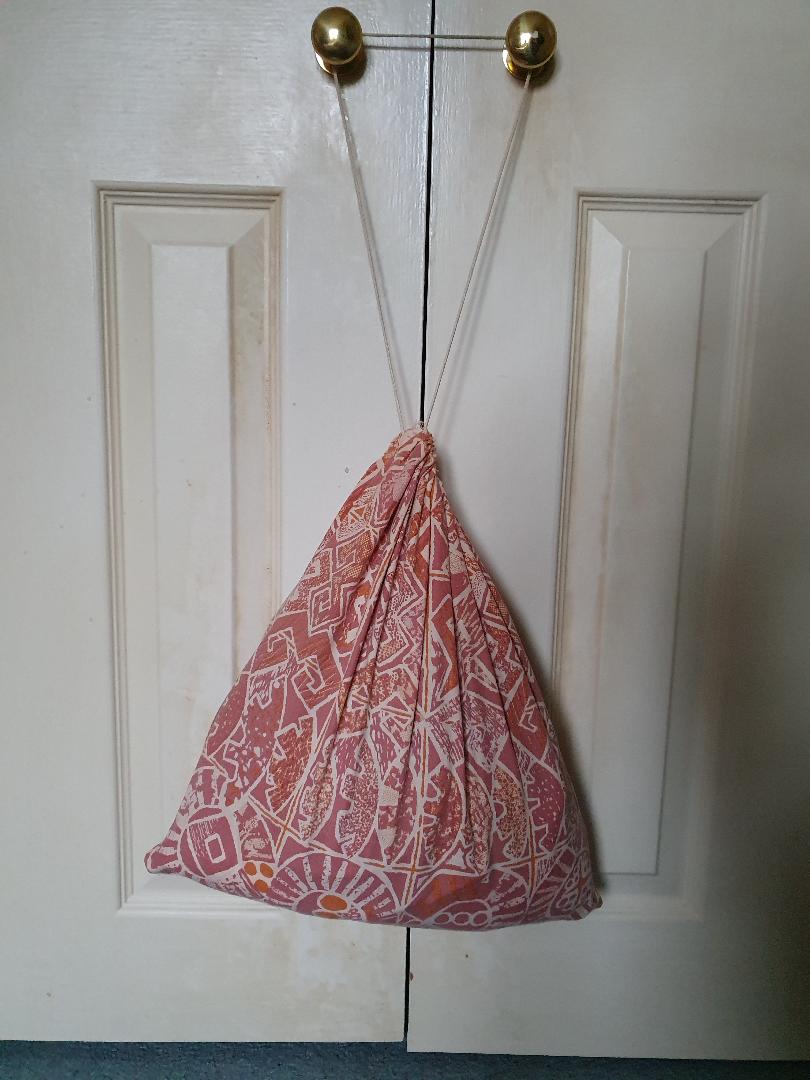
To remedy this, I took a photo of a drawstring bag hanging from door handles and used this for reference.
Once I had reached this point I was unsure how to proceed, for example, whether to go digital or analogue. I generally do seem to have a creative block at this stage in every exercise/assignment. I also began to have some doubts about the piece, for example, how I was going to add all the detail I had begun to include in the sketches (it would probably take me months!). I also did not know whether I should consider adding colour or not. On the positive side, I did feel I had managed to portray a sense of visual depth, using some of the techniques described earlier, along with height, with the inclusion of the mountains on the side and the houses hanging at various levels.
Producing the Final Artwork
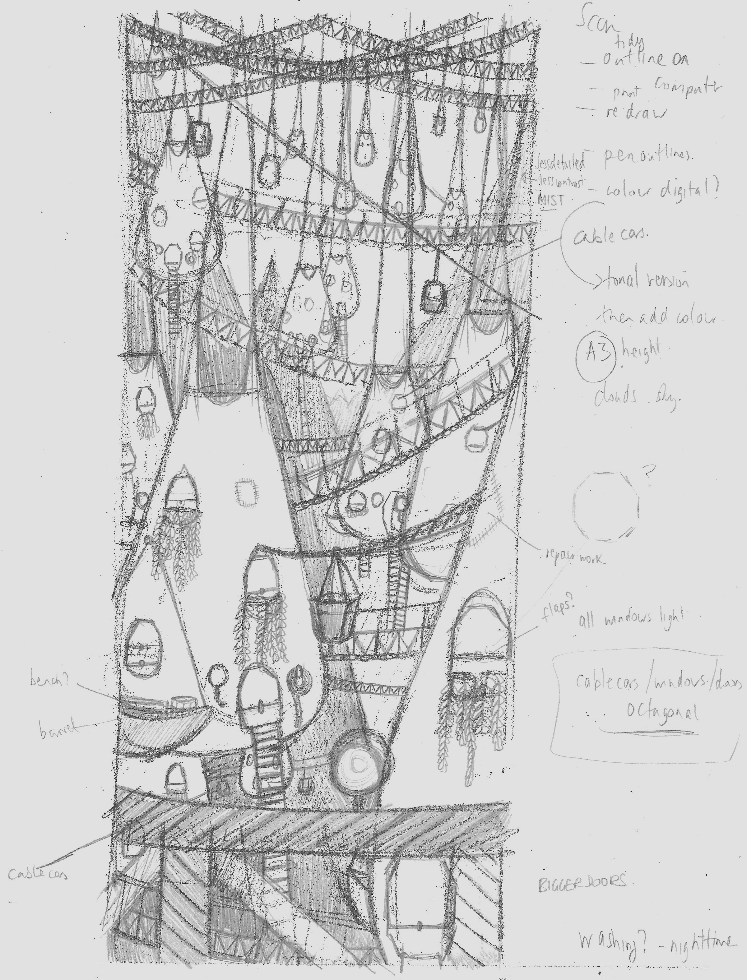
Just to move forward with the assignment, I scanned the most current sketch onto my computer and, using Affinity Designer, I created an outlined version using the pen tool. I have found this to be a helpful method for positioning and re-adjusting any skew-whiff objects. I then printed this off on two pieces of A4 paper that I aligned and fixed together to create an A3 version. I taped this onto my A3 Lightbox, as shown below.
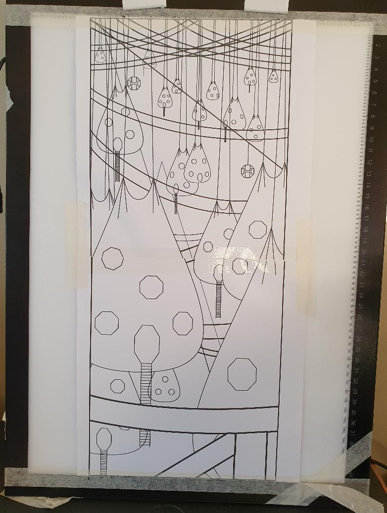
At this point I had briefly considered staying with the digital version and developing it, but it looked too clinical and ‘perfect’ which is not the style I wanted for this assignment. I experimented with the idea of including octagonal shape elements, such as the windows and the cable cars, as a nod towards the name of the city.
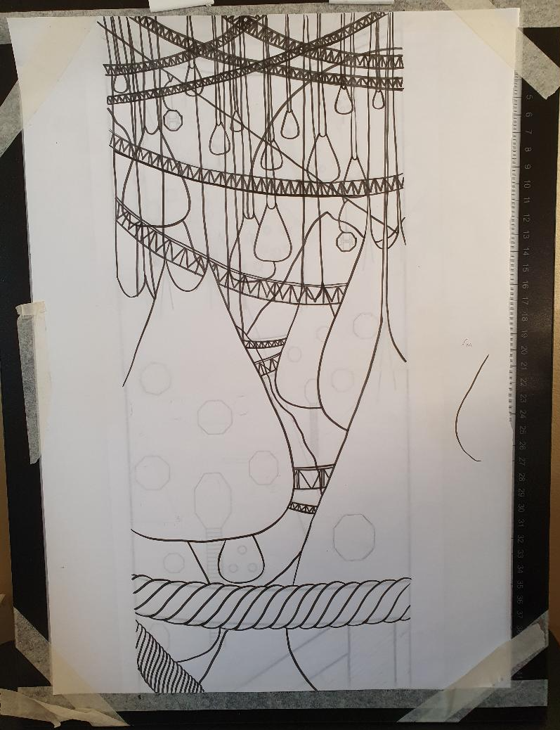
I used this as a template upon which I placed overlay paper and I then traced the outlines using fine liner pens. Although some of the lines were a bit wobbly at this stage, I preferred this version to the digital one and was glad I had made the decision to work in analogue.
Finishing the Artwork
Once again I found myself quite stuck with how to proceed to finish the illustration. I quite liked the current version without all of the additional details that I had added in the initial sketches. I looked back at the work of the two artists I had found in my research and saw that the illustrations are not extremely detailed. I decided to take the text as an inspiration rather than thinking I needed to include every single thing being described. I felt it was more important to give an overall sense of the city’s appearance and location.
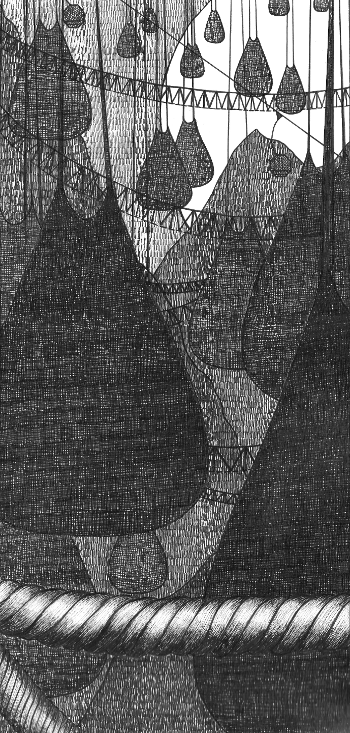
As I had chosen to depict a night-time scene, lit by moonlight from behind, I focused on contrasting the value within the illustration. I have been working hard on this area of drawing as I had never properly understood the concept of value until fairly recently. I hope that as I grow more confident using value, I will be able to apply this to my use of colour.
Using various size fine liners, I made numbered reference scale in value (0=lightest/6=darkest) on the side of the paper. Another area I have been working on is mark-making, inspired by artists such as Edward Gorey and David Roberts, so I tried to think of ways to vary the marks I would use for the different objects within the composition.
Next, using this reference scale, I added corresponding numbers to each outlined area in the composition. For example, those further back would have a lower number (e.g. the moon was 0) and those at the front would have a higher number (e.g. the front hanging house was 6). I worked from the ‘back’ of the scene and moved forwards. I found that I had adjust some of the values so that there would be enough contrast between adjacent areas.
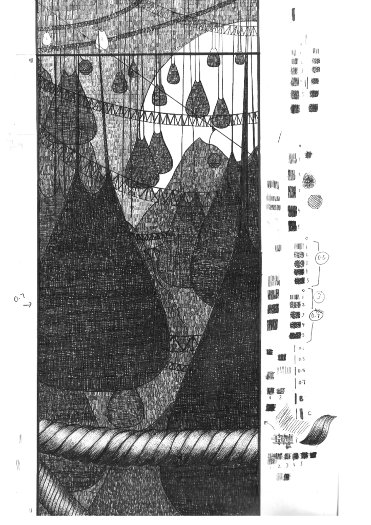
I regularly reapplied the outlines as I worked because it did become slightly like an optical illusion trying to focus on some areas. I made a mistake by adding some marks on the bottom of the moon (which I covered up digitally at the end). I also found that the top area of walkways became too messy and complicated in appearance, so I edited out this area, which created a much more aesthetically pleasing result.
I was not sure how to differentiate the rope at the front of the illustration from the already extremely dark foreground. After some contemplation I added a highlighted area on the ropes, which made it visually pop and distinguishable from the rest of the illustration.
Final Illustration and Final Thoughts
The final illustration can be seen below. The mark-making stage took me several hours to complete, but I am glad I took the time to do it.
I realise that I need to experiment more at the initial stages of exercises/assignments and I am trying to do this, but sometimes I have a complete mental/creative block and end up going with whatever idea I can. I have improved my use of thumbnailing and rough sketches before moving onto more defined work, but I need to do more of these, perhaps I should set myself a target of at least six.
I should have tried adding more details to the final piece, such as including some windows and clouds. I also could have experimented with different media.
I was tempted to attempt a flat illustration in the similar style of those I found during the previous Research Point, as it would be interesting to design a pattern-like version of the city.
On the positive side I think my final illustration does achieve the objective of the brief in terms of conveying visual depth (as well as height), through implementing the use of scale, value and overlapping.
I am happy that I am continuing to work in analogue, which I hope will ultimately benefit my digital work.
I also benefitted from putting into practice what I have been learning about value and mark-making, the former of which I felt I used quite effectively. Going forward I would like to apply the same method I used for value with colour and continue to feel confident enough to add more detail to my work.
Bibliography
Bordicchia, G. (n.d.) Gaia Bordicchia – The Invisible Cities. Available at: https://lagaia.art/the-invisible-cities-calvino-illustrations (Accessed: 22 November 2022).
Fleck, D. (2022) David Fleck, Illustrator & Artist – Invisible Cities Collection. Available at: https://davidfleck.co.uk/invisible-cities (Accessed: 22 November 2022).
Foxell, I (n.d.) Illustration Knowhow Decoration and Perspective. Available at: https://www.wordsandpics.org/2018/06/illustration-knowhow-decoration-and.html (Accessed: 23 November 2022).
Moebius Production (2020) Moebius Production – Editions, art print et expositions! Available at: https://www.moebius.fr/index.html (Accessed: 22 November 2022).
Olcayto, R. (2009) Top 10 comic book cities: #5 The city in Moebius’ The Long Tomorrow. Available at: https://www.architectsjournal.co.uk/practice/culture/top-10-comic-book-cities-5-the-city-in-moebius-the-long-tomorrow (Accessed: 22 November 2022).
Stace, C.L. (n.d.) Silhouettes: Art Between Light and Shadow. Available at: https://magazine.artland.com/silhouettes-art-between-light-shadow/ (Accessed: 23 November 2022).
Whitely, L. (2007). Laurence Whitely Design and Illustration. Available at: https://www.laurencewhiteley.com (Accessed 28 October 2022).
Wikipedia (n.d.) Octavia (given name). Available at: https://en.wikipedia.org/wiki/Octavia_(given_name) (Accessed: 21 November 2022).
Wikipedia (n.d.) Waterskin. Available at: https://en.wikipedia.org/wiki/Waterskin (Accessed: 21 November 2022).