Your local tourist board has commissioned you to produce a series of reportage illustrations that celebrates aspects of local culture.
Base your illustrations on real local events, locations and people. Capture a sense of place through drawing from life. Produce between three and five pieces of work, at least one of which should be in colour.
The style of illustration is up to you, but the tourist board wants something that portrays vitality and life. They want to see people at a destination, engaging with activities or enjoying themselves taking in the views.
As with the exercises you’ve done so far, use your sketchbook to document and gather information. Your final illustration could be selection of your best drawings or re-worked illustrations based on your sketches. Reflect on what sort of reportage you are most interested in and how you’ve produced your best drawings, then pick a place that supports this way of working. For example, if you are interested in architectural illustration, focus your assignment on illustration local buildings of interest.
Initial Thoughts
I have struggled with most of the exercises in this part of the unit and, therefore, I am particularly glad to have reached the assignment at last! Reportage is not an area of illustration that appeals to me very much so I have found it difficult to be overly enthusiastic about many of the tasks in this section. However, I have been surprised by how much I have enjoyed the research side, much more so than the exercises, and I have learned a great deal about a wide range of subjects and been introduced to a selection of new artists/illustrators.
I have decided to base my tourism illustrations on Kingston upon Thames as it is fairly local to me. Upon reading through the brief, which states that the illustrations should ‘portray vitality and life’, my first stumbling block was encountered as it is currently forecast to rain most days in the near future! I chose to not worry about this aspect and start, as always, by carrying out some research.
Research
The illustrator who really stood out for me throughout this section of the unit was Tom Purvis, whom I discovered during the research for the Fashion Illustration exercise. I learnt that Purvis was also famous for his travel illustration posters and I was drawn to his graphic, bold and visually appealing work. I was impressed with Purvis’s skilful application of colour by which he combined different hues that blend and do not clash, whilst also being striking, as well as using colour to show depth and light/shadow within the composition. He also used a minimalistic approach to details with large areas of flat colour, for example, and often the subjects had limited or no facial details. I also noticed that in many of Purvis’s illustrations the view of from behind the people in the composition, which could be a tool to make the viewer feel as though they are there, in the scene, with them.
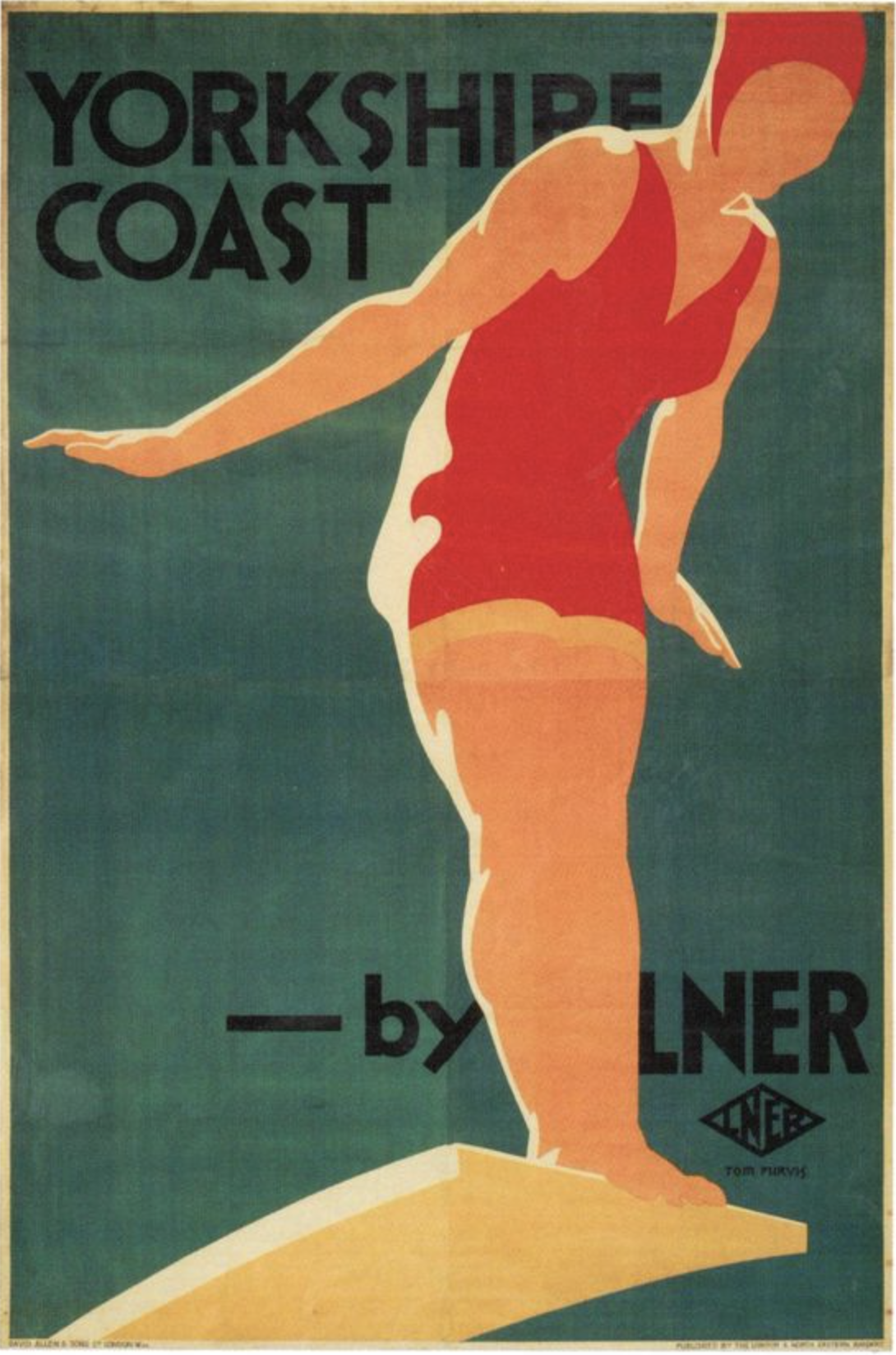
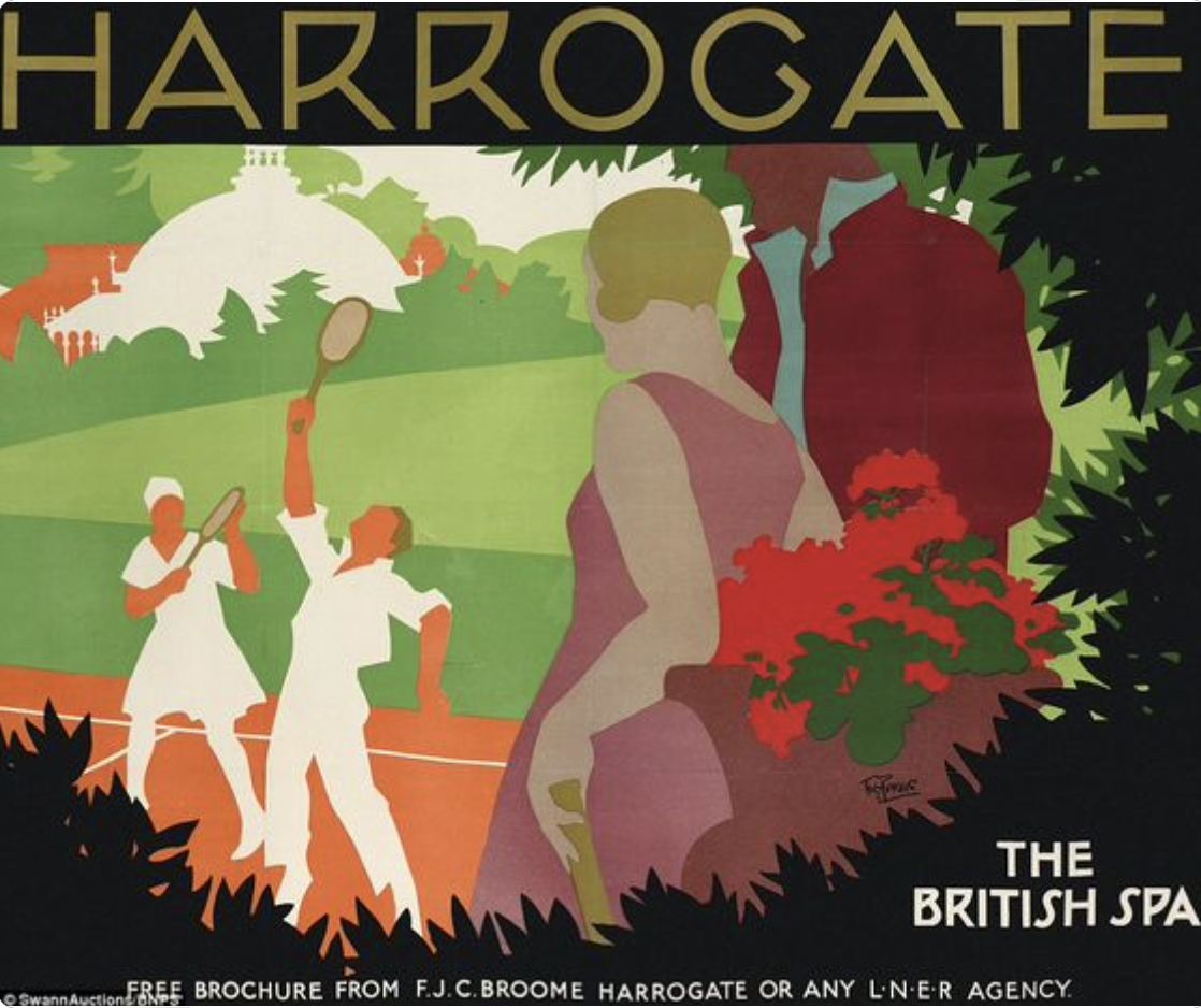
Tom Purvis is an example of the Art Deco style of illustration from the 1920s and 1930s. I found a contemporary company White One Sugar which is inspired by this style and has created digitally illustrated versions of posters advertising certain areas of the UK (and abroad). I really liked these posters. As with Purvis, the style is flat with fairly muted colours that blend seamlessly. A sense of depth is evident in all of the examples below, achieved using scale, contrast and perspective. Again, when people are placed within the compositions, they do not have facial features and the observer’s view is often from behind them.
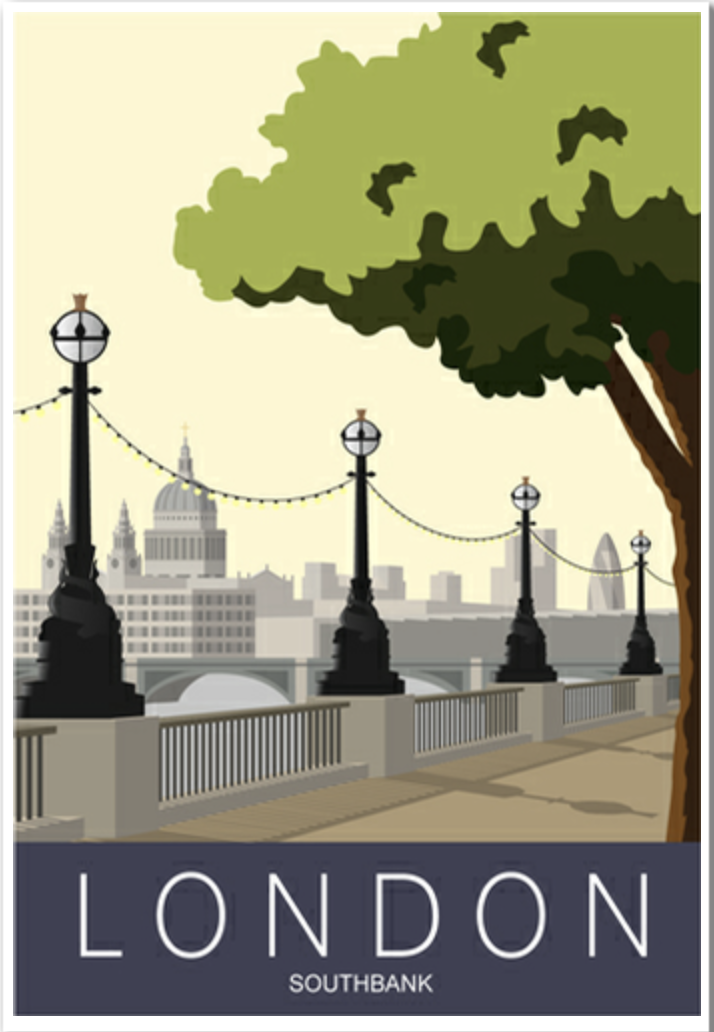
by White One Sugar.
Source: White One Sugar.
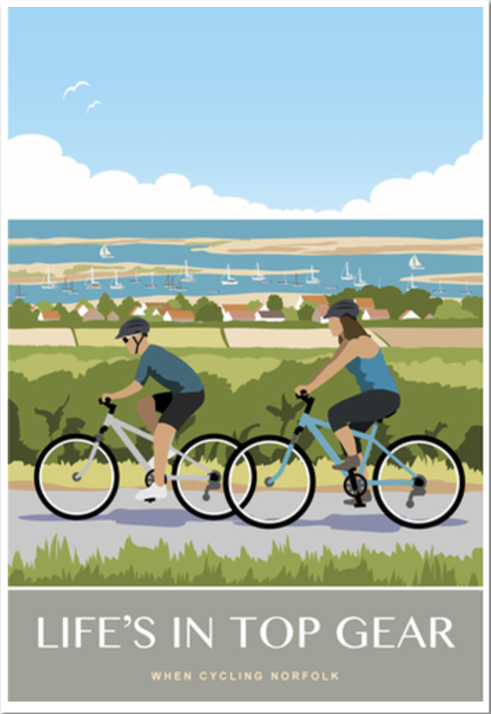
by White One Sugar.
Source: White One Sugar
I particularly liked how the artists have suggested wind in the Clacton on Sea Pier illustration (below) by the woman holding onto her hat, the canvas of the deck chairs, the seagulls and flags being blown in the same direction and, also, the ride in the background, which is most likely not powered by the wind, but its position adds to the sense of movement in the composition.
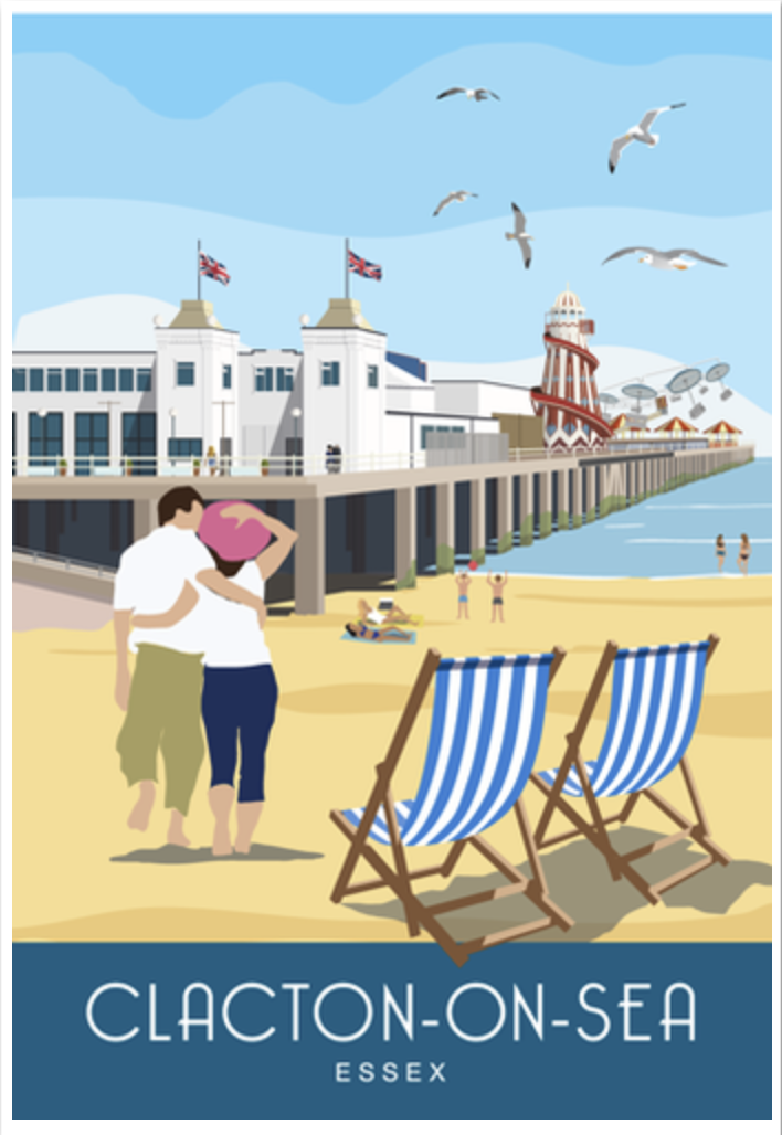
Source: White Sugar One.
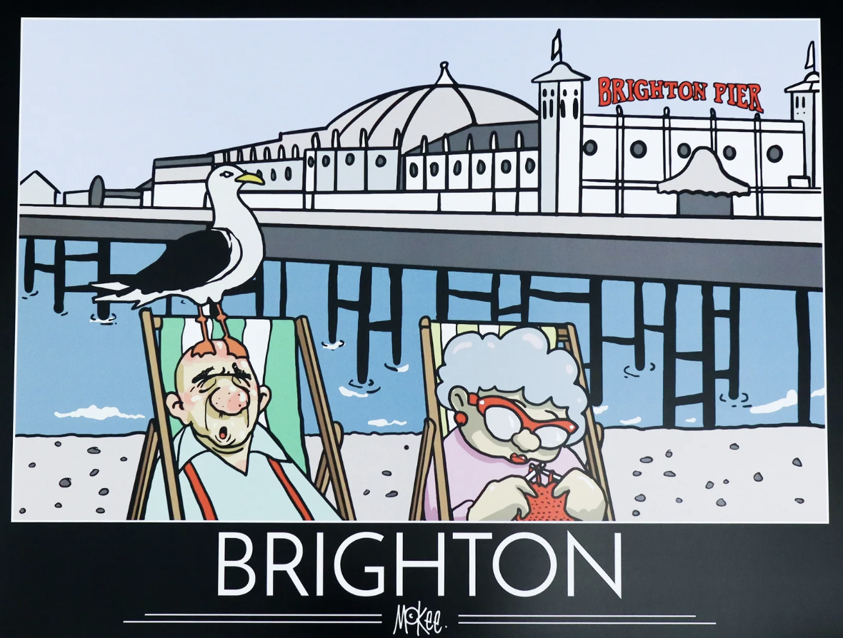
Another example of an artist/illustrator whose practice I hope will inspire my work for this exercise is Pete McKee, a contemporary practitioner from Sheffield. I think that McKee’s is the choice that appealed to me the most. I like the cartoony style, often with added humour, used to depict everyday situations. Although they are simplified and stylised, the characters in McKee’s illustrations look like ‘average’, everyday people. He has managed to create a instantly recognisable style.
As with the previous two examples, many of McKee’s illustrations show very little detail in the faces of people, generally the eyes are depicted by a single line across the face, above a nose, but with no mouth. I initially thought the illustrations were created digitally, but I was surprised to learn that McKee paints them using acrylics.
The example below is a particularly relevant illustration for this assignment as it shows the hustle and bustle of a crowd on a seafront (the deckchairs suggest this), with the various buildings shown in the background. The simplified and clean aesthetic used for this is something I would like to try and emulate in my work.
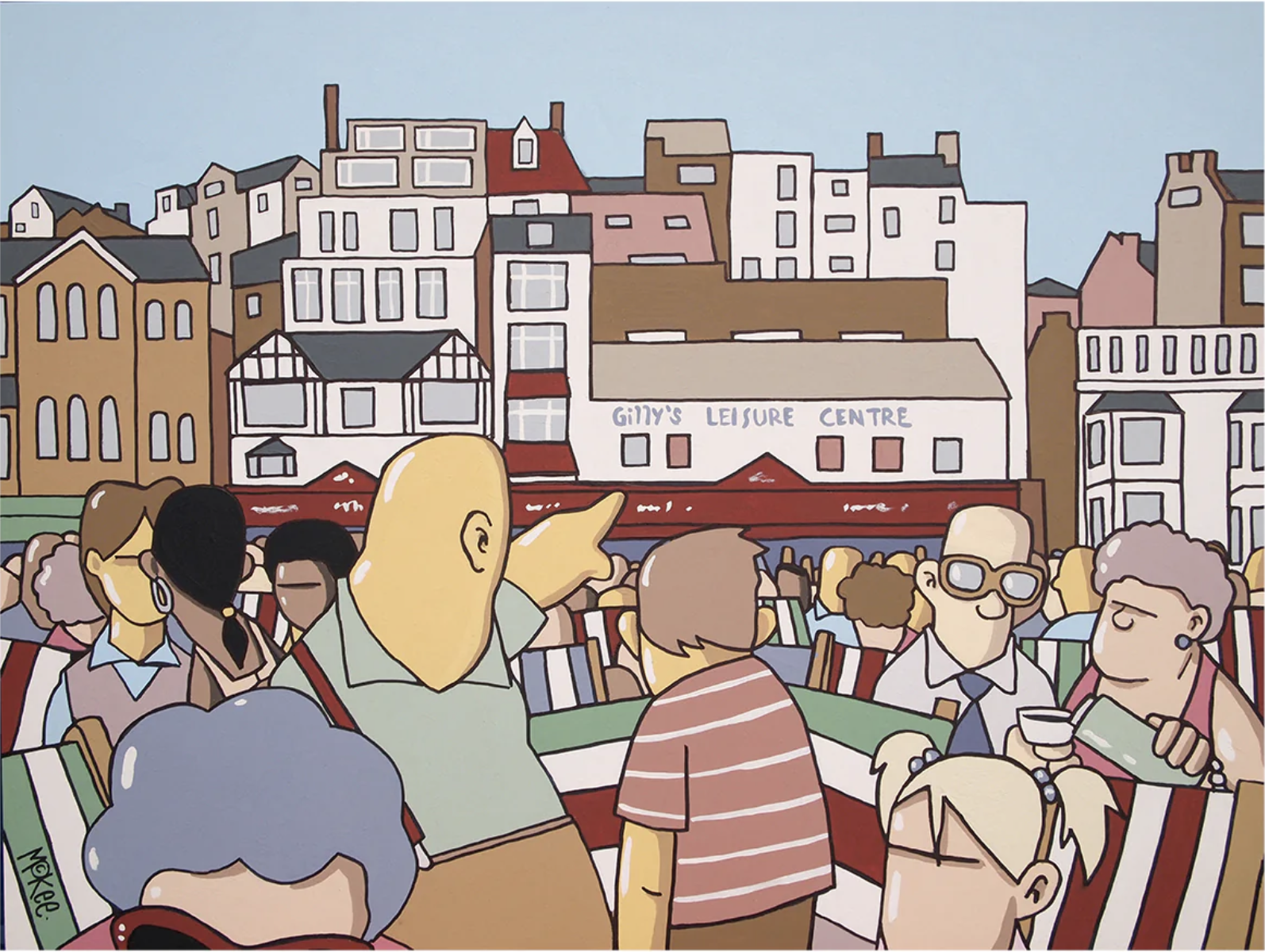
The illustration below is an example by McKee, again, whereby the viewer sees the same outlook as the person in the composition.
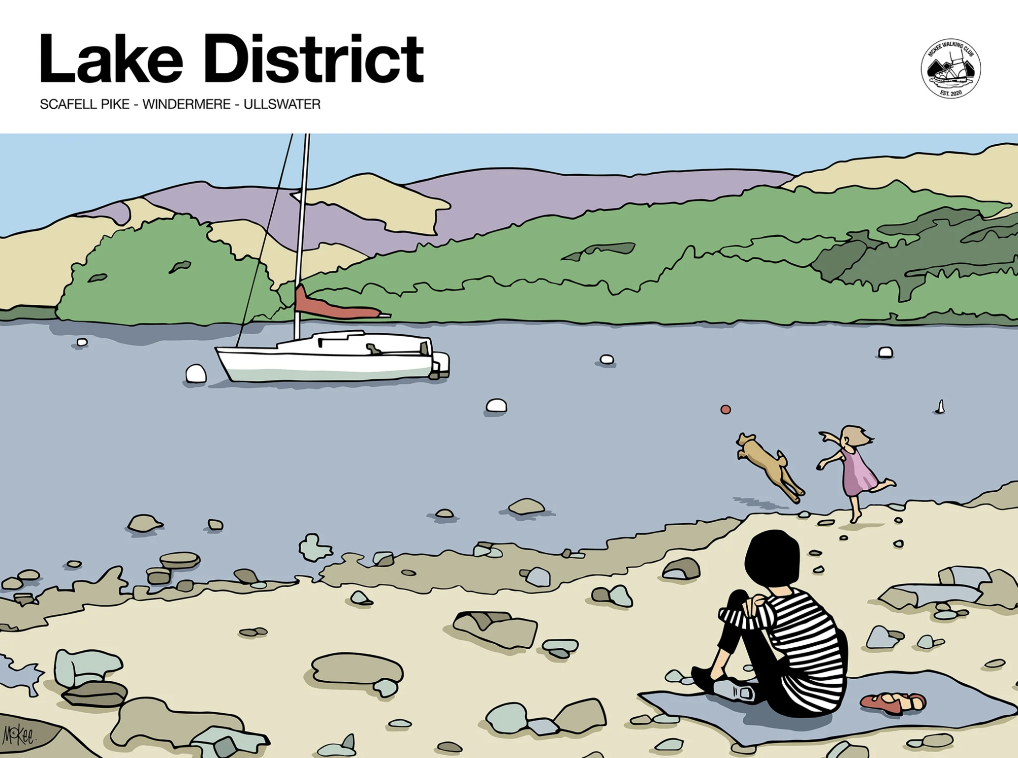
One of the key observations I noted when looking at the various examples is that they mostly all strive to depict an idealised version of the place in question, which is something I will keep in mind going forward. This is particularly relevant for the brief of this assignment as the designs are for the local tourist board, which means then main purpose of the illustrations will be to persuade people to visit the location.
Scouting Sites and Sketching
NB – all of the following images of my work can be clicked on to view a larger size version, which will open in a new tab.
As previously mentioned it is currently forecast to rain quite a bit so when I was able to visit Kingston, it was indeed raining along with being early in the morning so there were very few people around and, additionally, Kingston did not look very inspiring – I realised this assignment was not going to be straightforward! I actually found that I preferred this environment as I was more interested in selecting and making quick sketches the locations that I would use and I felt more comfortable with less people around. I thought I could add people at a later point as well as refine the drawings using my sketches and photos.
I also decided at this point that I would create three illustrations for the final pieces, which felt more achievable than five at this point.
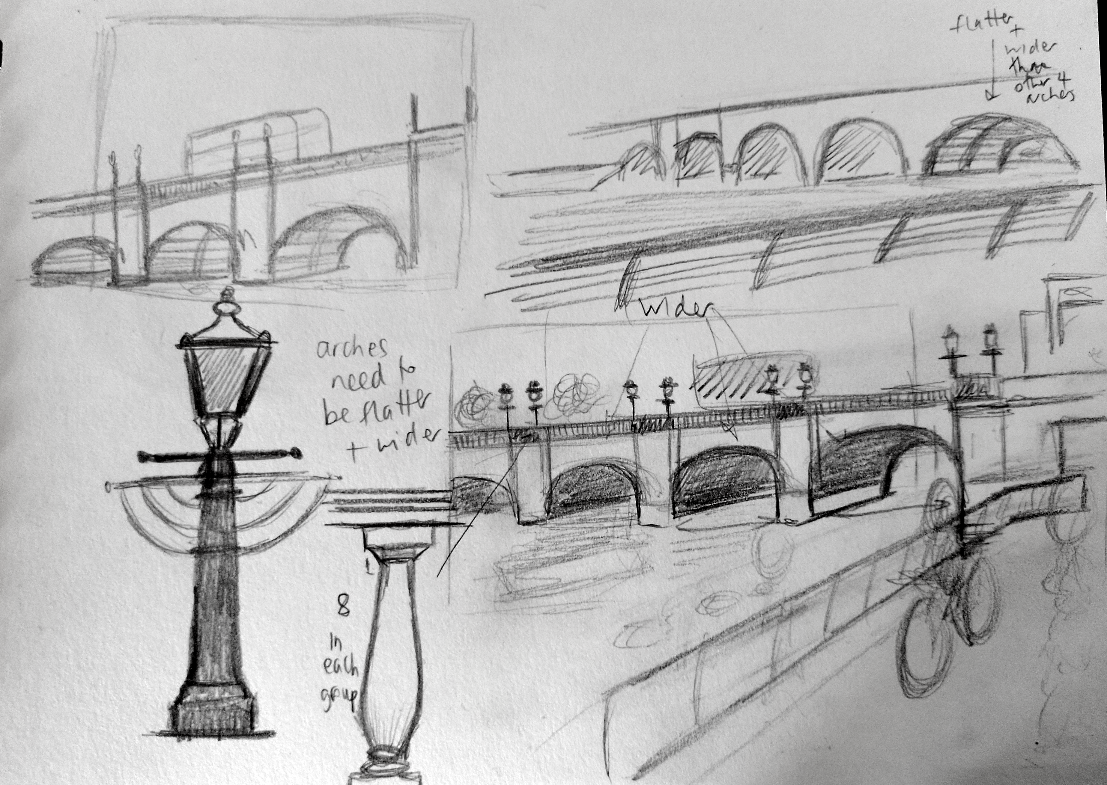
The three locations in Kingston I selected were Kingston Bridge, Kingston Marketplace and the telephone sculpture, ‘Out of Order‘, in Old London Road. I actually found it really challenging to pick suitable sites – the town looks quite unattractive, particularly in the rain, so I felt it would be tricky to make it look appealing from a tourist perspective. There were also no events taking place. To add to the issues to contend with, Kingston Bridge is currently undergoing work, so the side that I as was hoping to include in my illustration is covered in scaffolding! Therefore I decided to base my sketches mostly on images from the an image search online. I was able to see the bridge from the other side when I went to Kingston though, which helped.
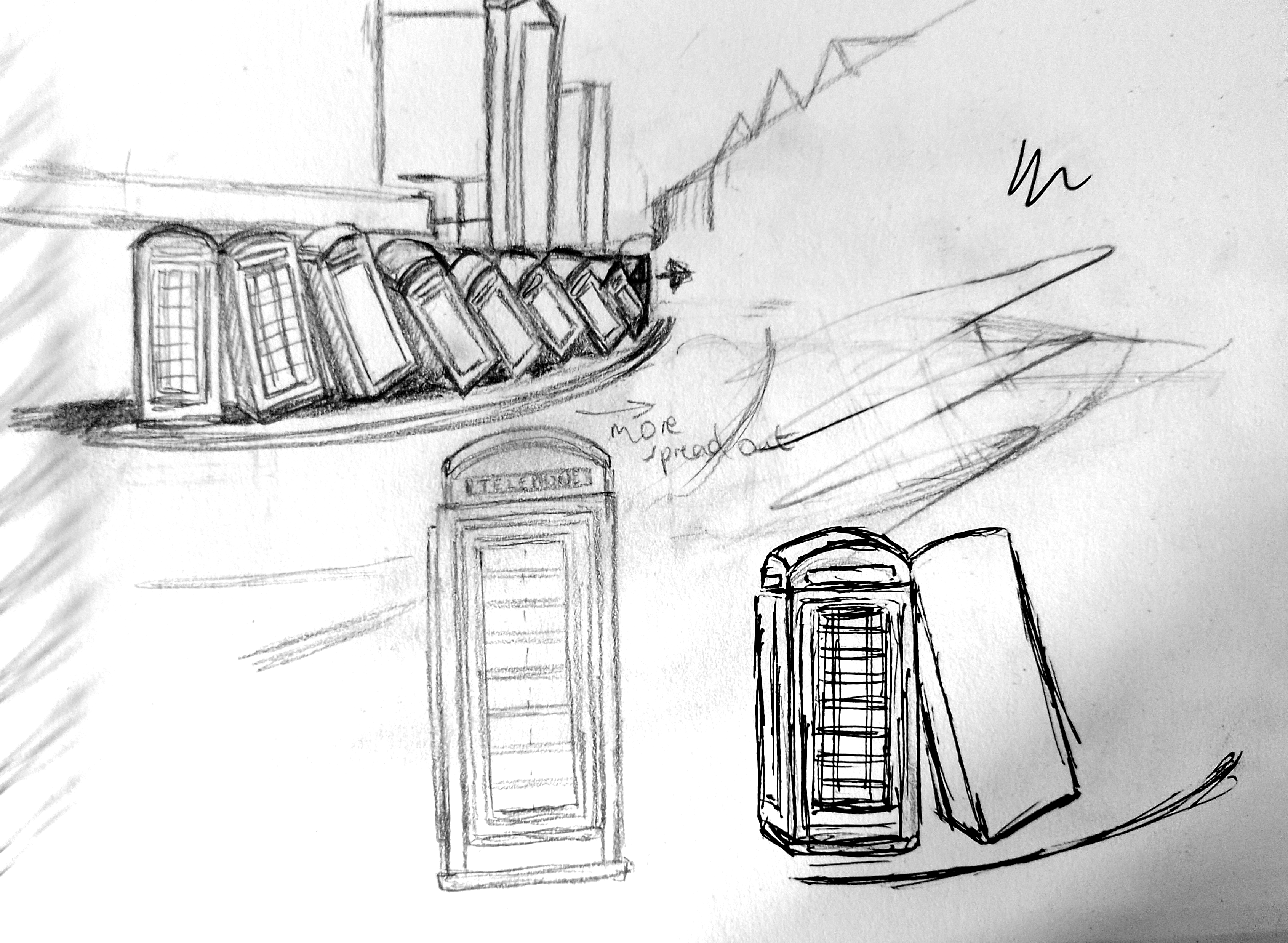
I then went to the location of the telephone boxes. I felt extremely conspicuous standing there, so I backed out of sketching from life and used photographic references for the sculpture instead, along with my memory. I also noted that it would be particularly difficult to make this area look appealing in a tourism sense as some of the surrounding buildings are quite worn out looking and several are boarded up. I seemed to have set myself an impossible task!
I found I was already lacking motivation by this point of the assignment. Therefore I chose to leave the Marketplace sketches for the moment and move on. I really did try to do some more sketches, but I got so frustrated that in the end I decided to just base my work on photos, mostly from the internet as these are more readily available showing Kingston ‘in action’, compared to the times when I have visited.
I realise this is not ideal and not what is asked for in the brief, but, to be honest, I just wanted to move on from the Reportage Illustration part of this unit as I was not achieving anything productive at this point and my enthusiasm for the course was beginning to wane.
Creating the Illustrations
Although originally I was thinking of exploring using Photoshop, as I have been working on in improving my skills in this software, I decided to begin by working in Illustrator to create the final illustrations as I felt most comfortable with this software – again, I know this is not ideal in terms of experimentation, but by this point I wanted to avoid any further (self-inflicted!) obstacles that might prevent me actually working on the assignment.
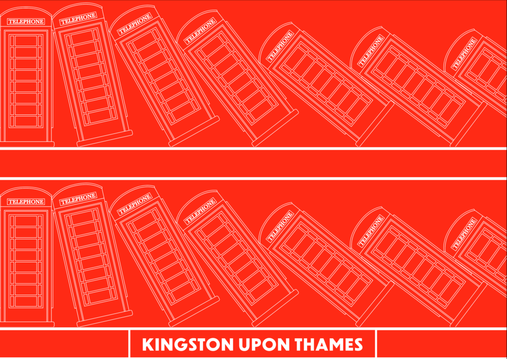
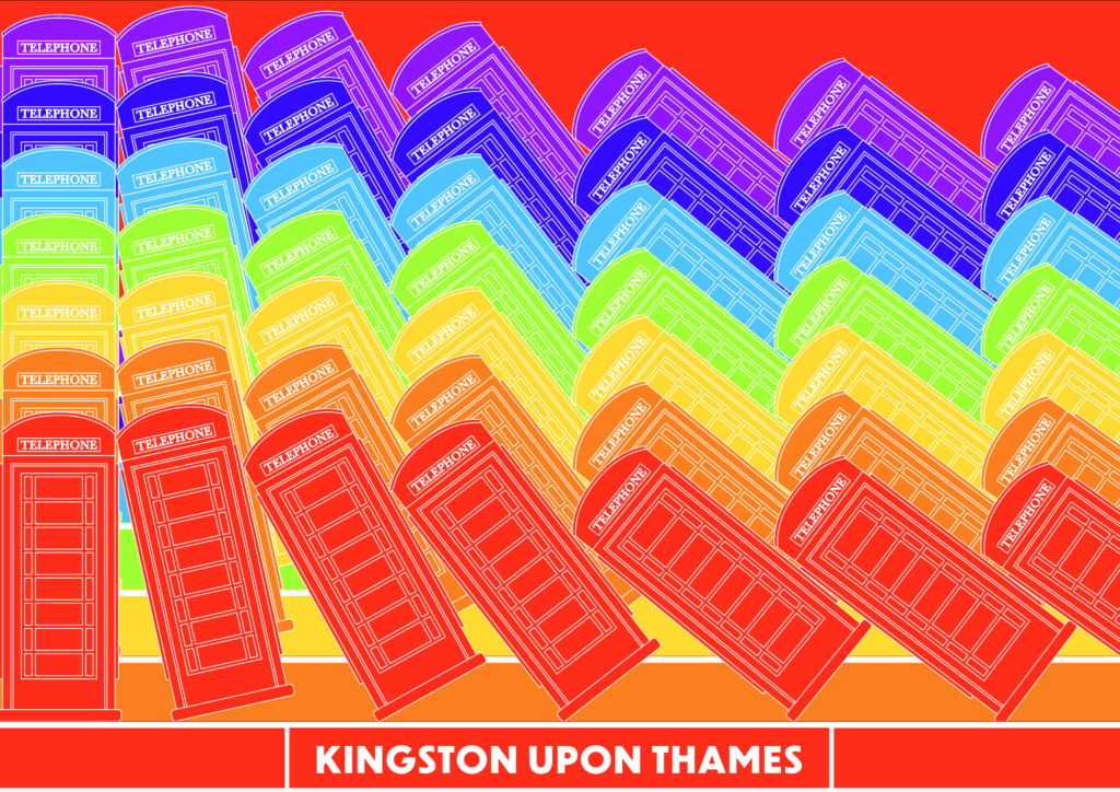
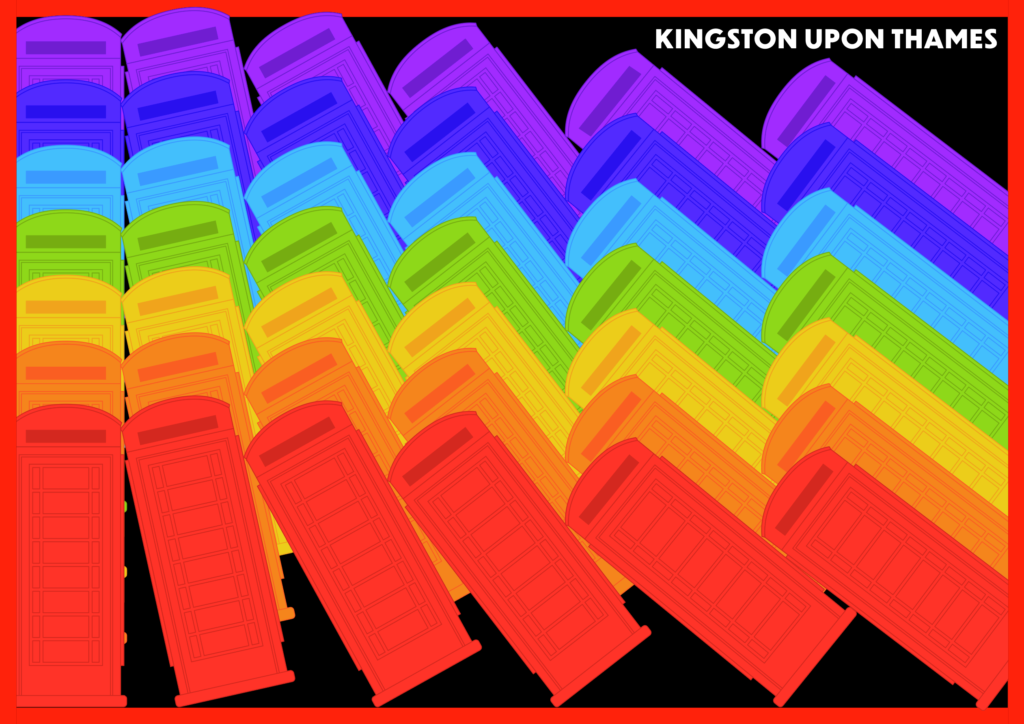
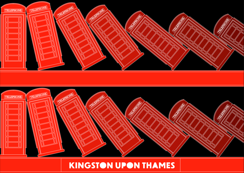
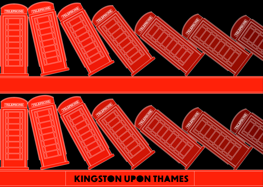
I chose to begin by working on the tumbling telephone sculpture ‘Out of Order‘.
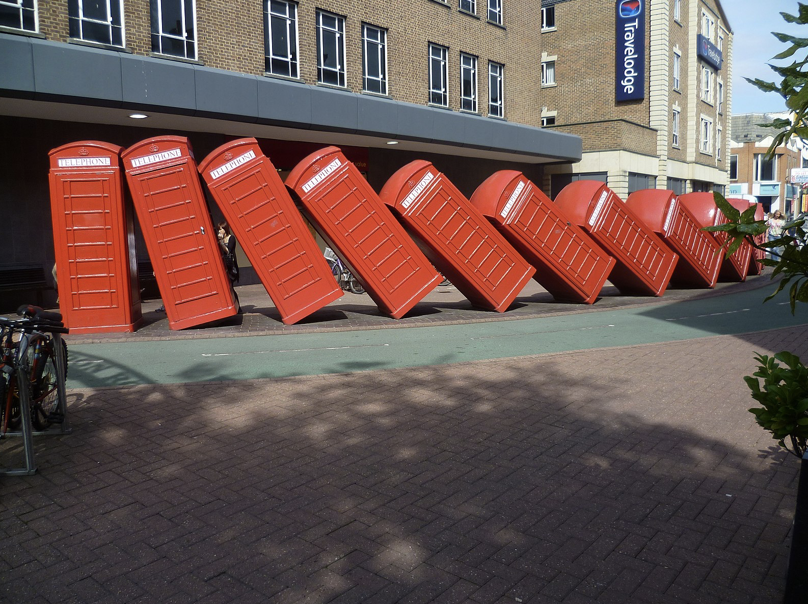
Image source: Wikimedia Commons.
My initial sketches of the telephone boxes show the perspective and angle of their position. I did try to reflect this in Illustrator, but it did not produce any decent outcomes. Upon considering this issue alongside the factors of the rather uninspiring surroundings (I was quite negative at this point!), I decided to create flat, graphic representation of the telephone boxes instead.
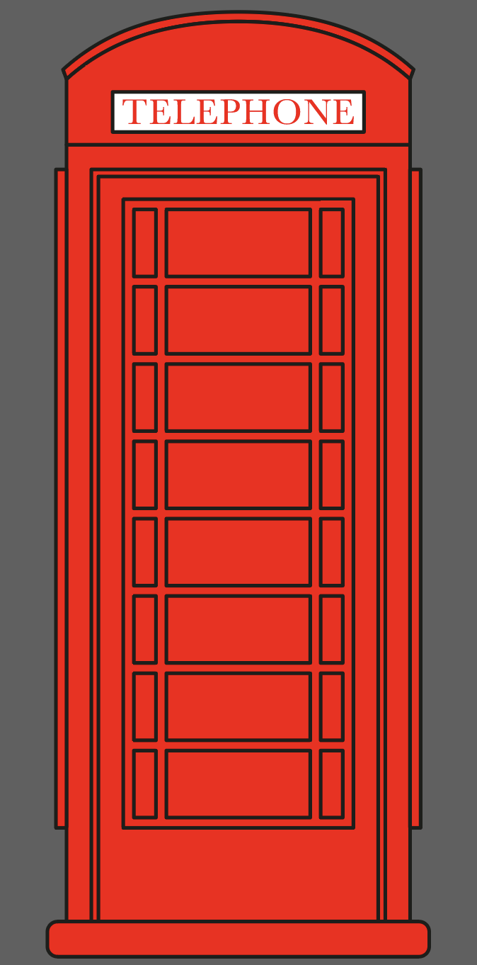
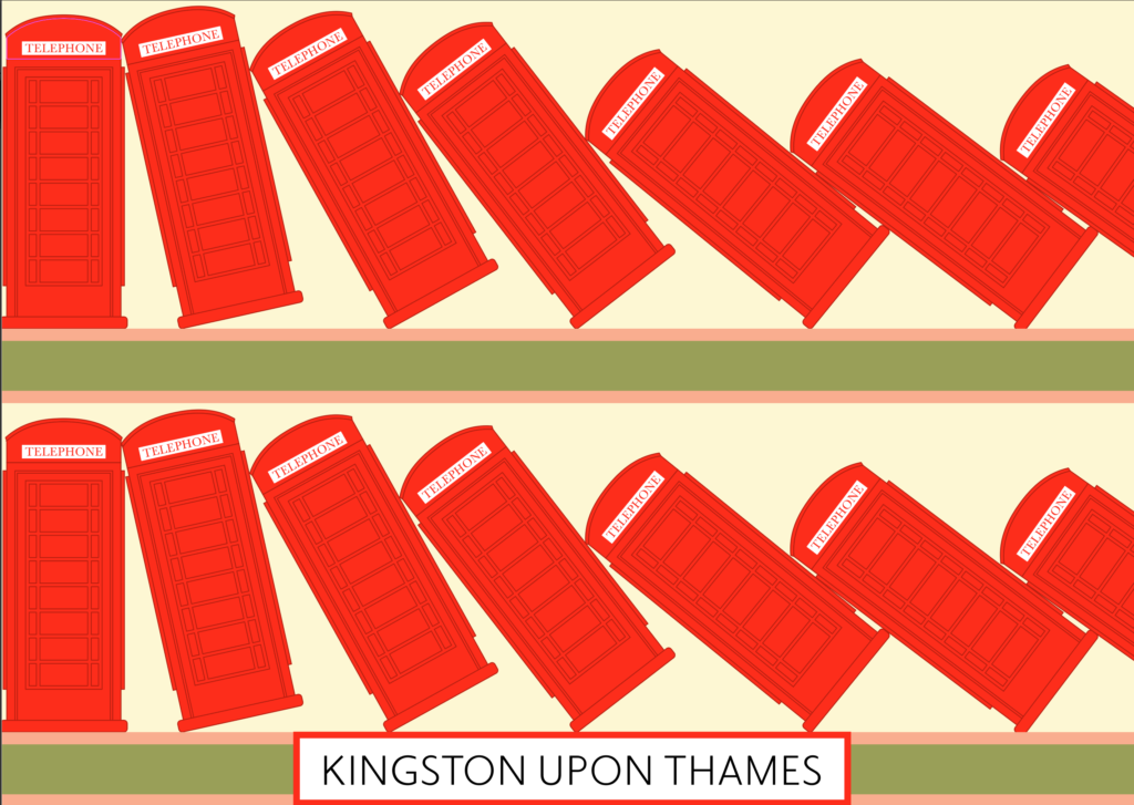
I started by using the Pen Tool and Shape Tool to create a single telephone box, which I then copied and pasted 11 times.
I set the boxes up by leaning them up against one another, trying to reflect the real life versions. I then tried various layouts, choosing to leave out the surroundings and focus on other visual factors such as colour and repetition. I did not fit all of the phone boxes in the composition as they became too small when scaled to fit, but I did cut through the last one on the right, which I hope suggests there are more out of sight.
I felt my process for these initial illustrations was mainly just to make a start and then experiment. I think by the end of working on these I did manage to create some fairly fun illustrations of the Kingston ‘landmark’.
The next location I chose to take on was Kingston Bridge, from the Riverside.
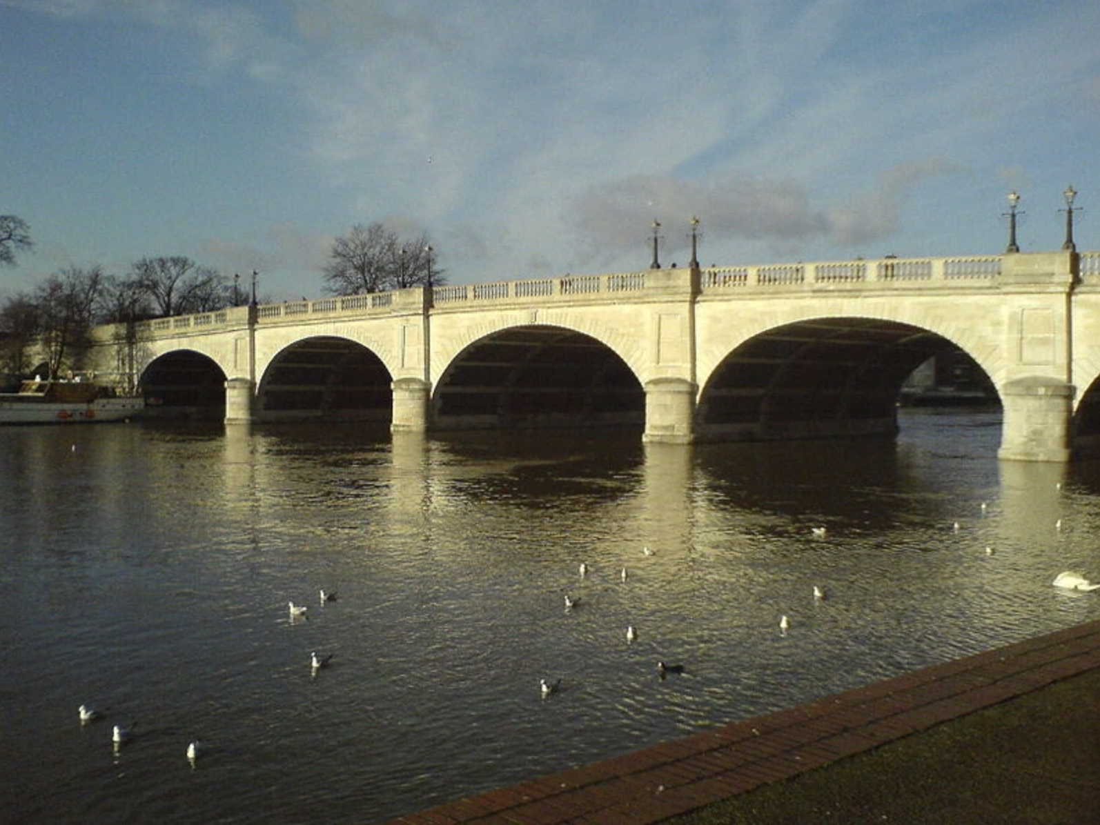
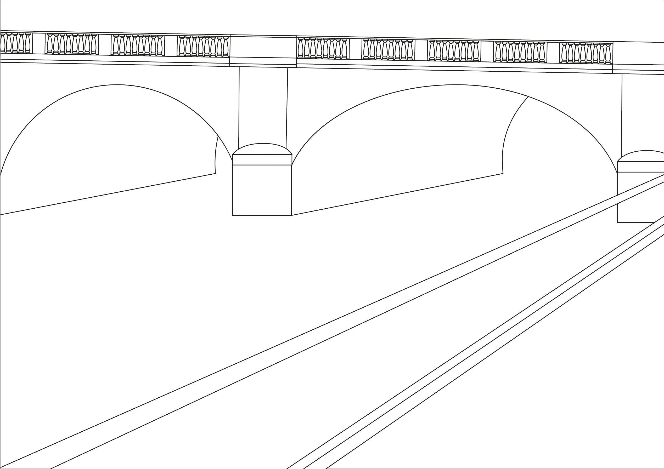
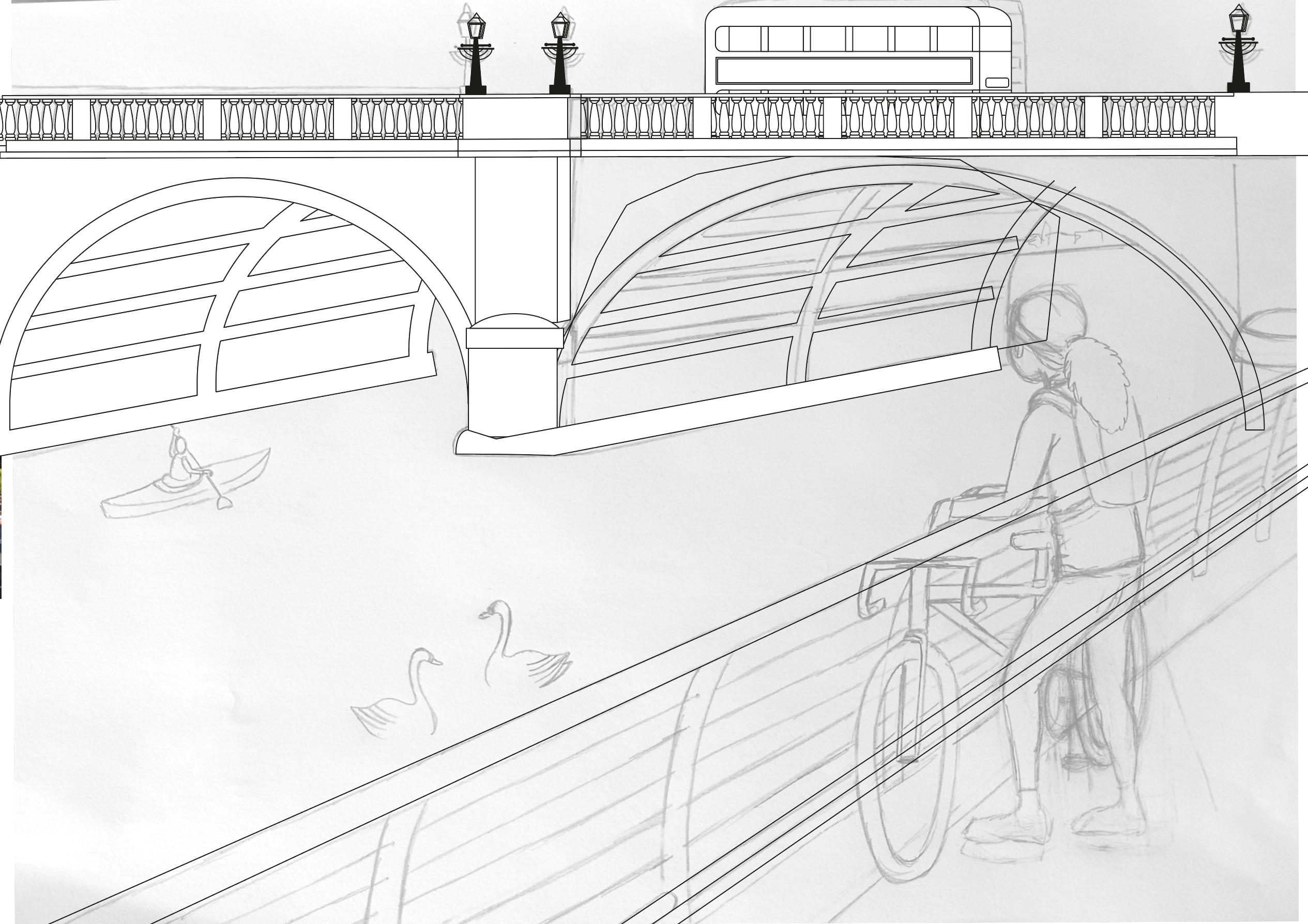
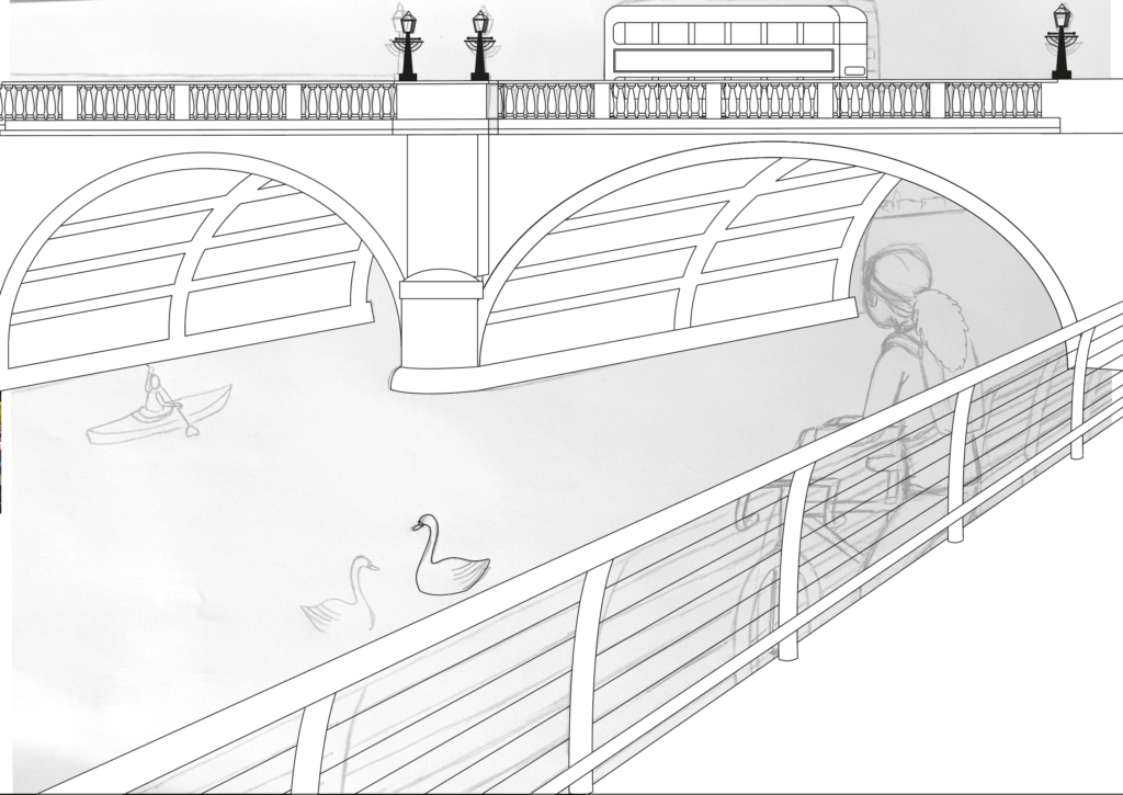
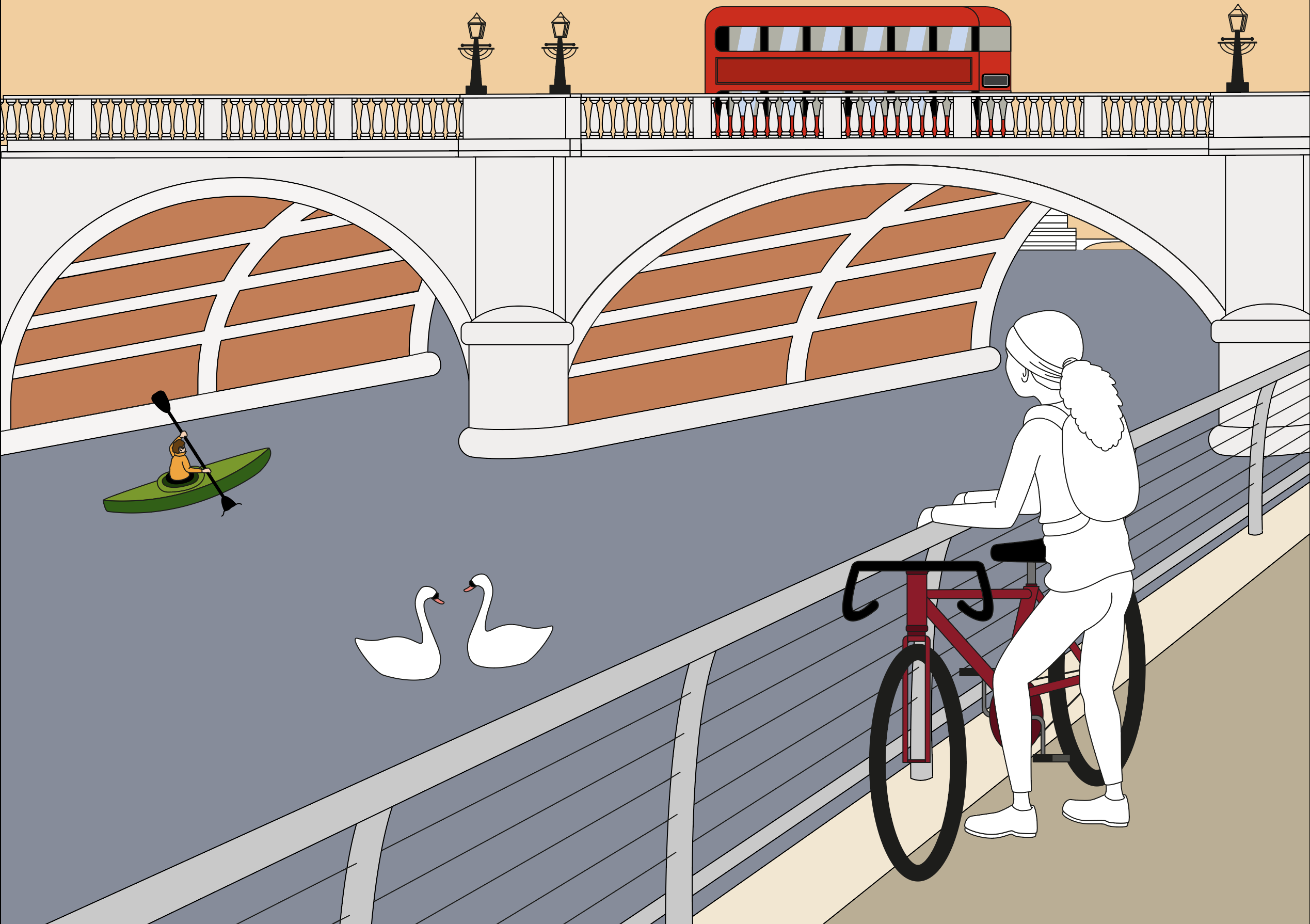
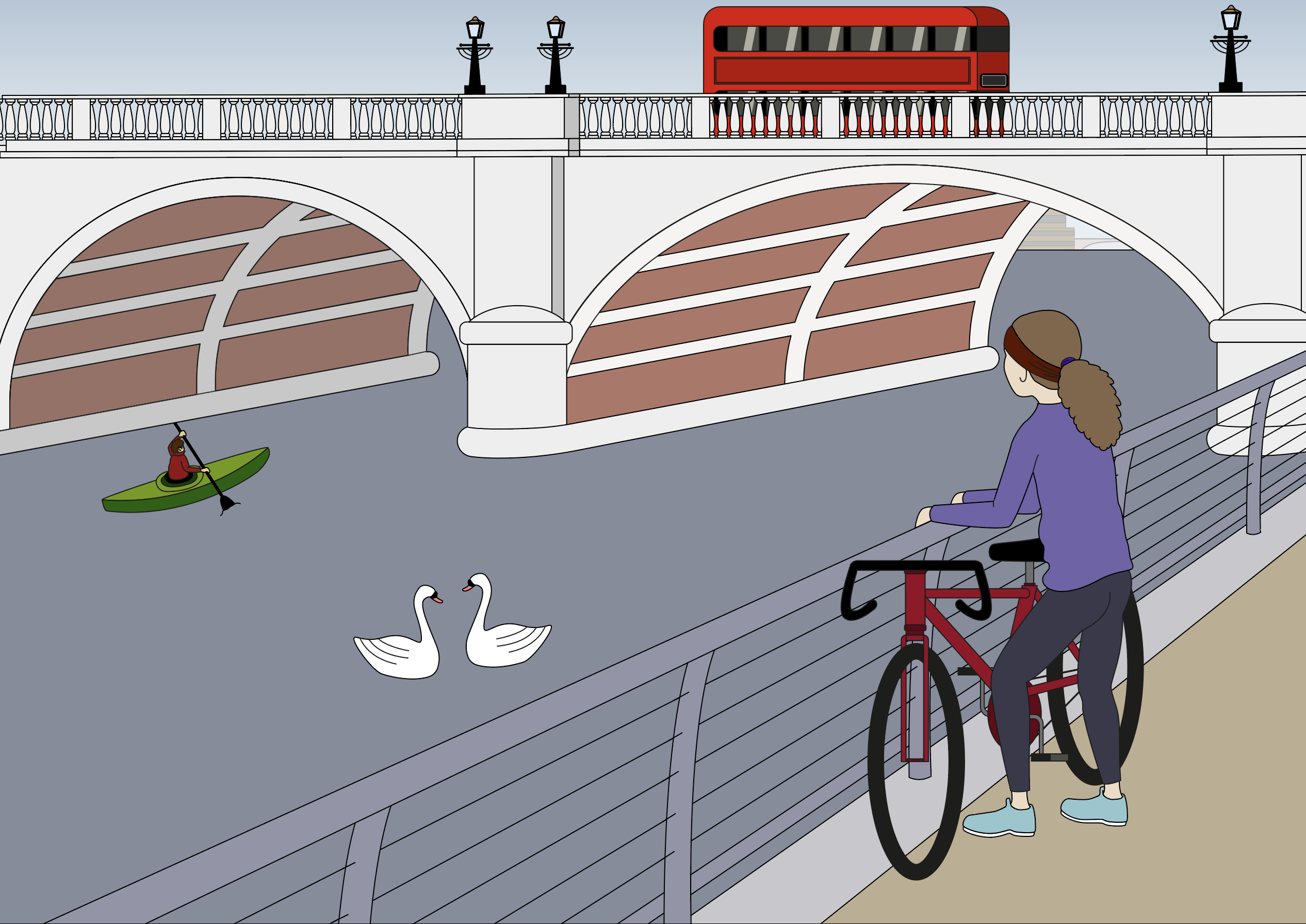
I wanted this illustration to show more inspiration from the artists I mentioned a the beginning one the assignment. This time I drew out a simple layout of the bridge and the embankment in Illustrator. I felt a bit more confident once I had this template in place.
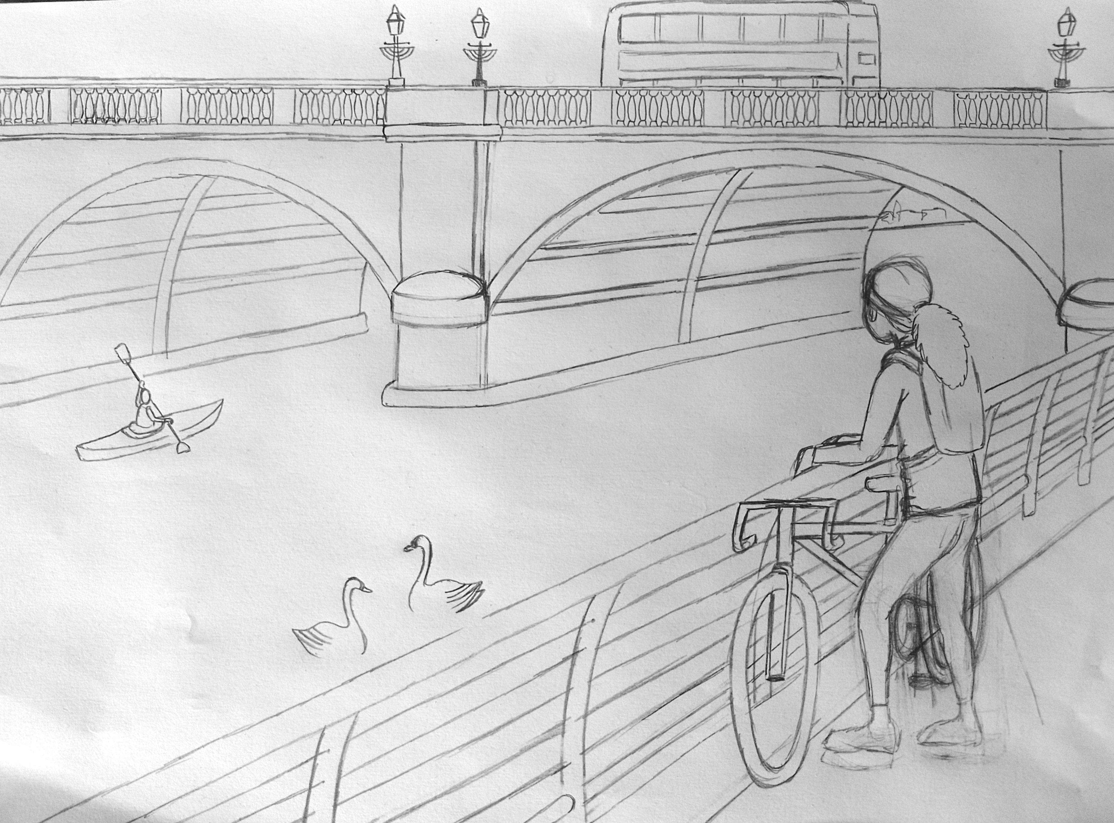
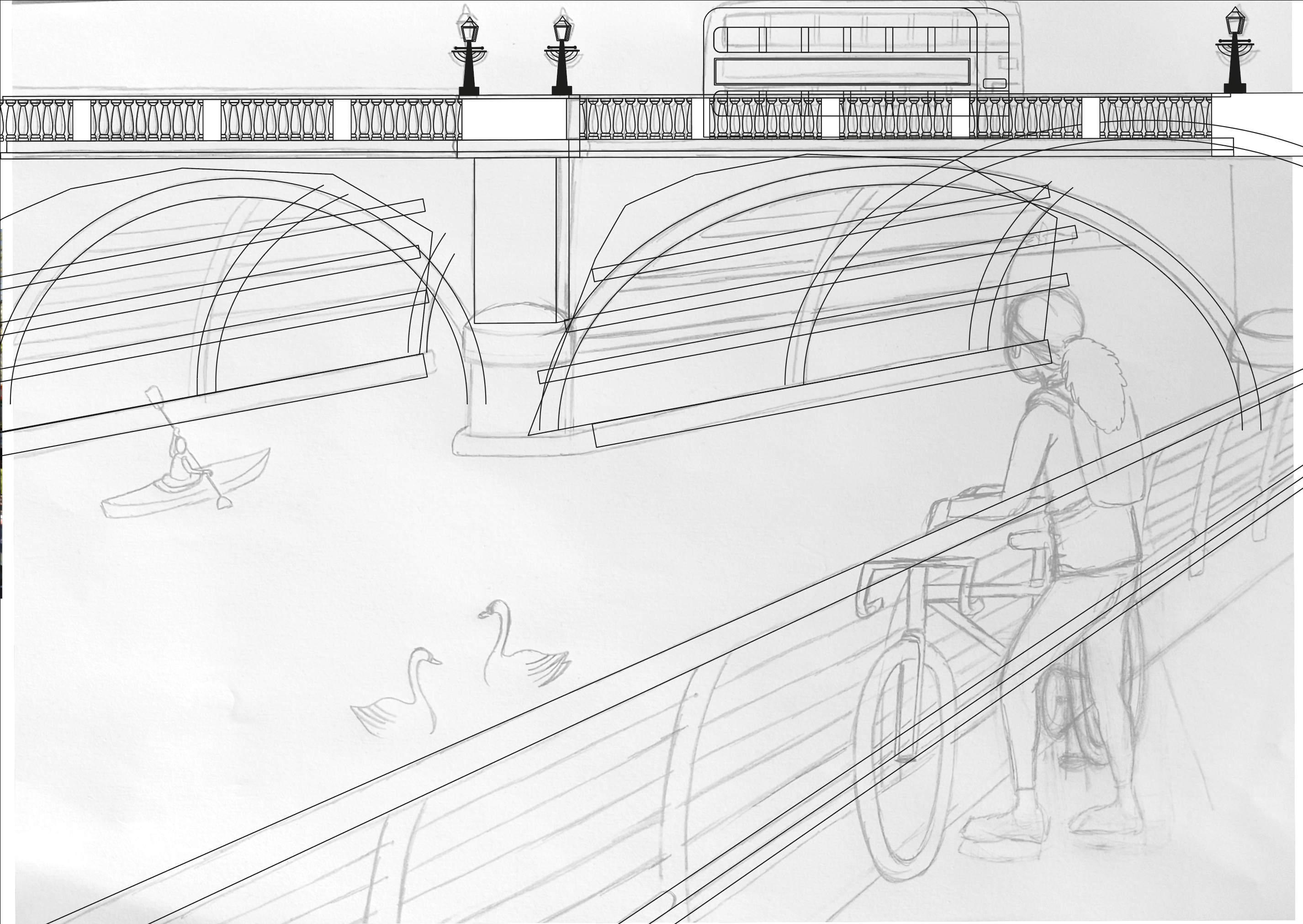
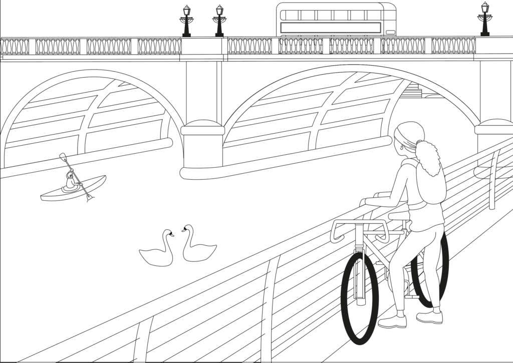
I printed this out and used a lightbox to trace these outlines before adding further features that I wanted to be included in the composition. Once complete, I scanned this version into my computer and opened it with Illustrator.
I could then proceed to build on this foundation.
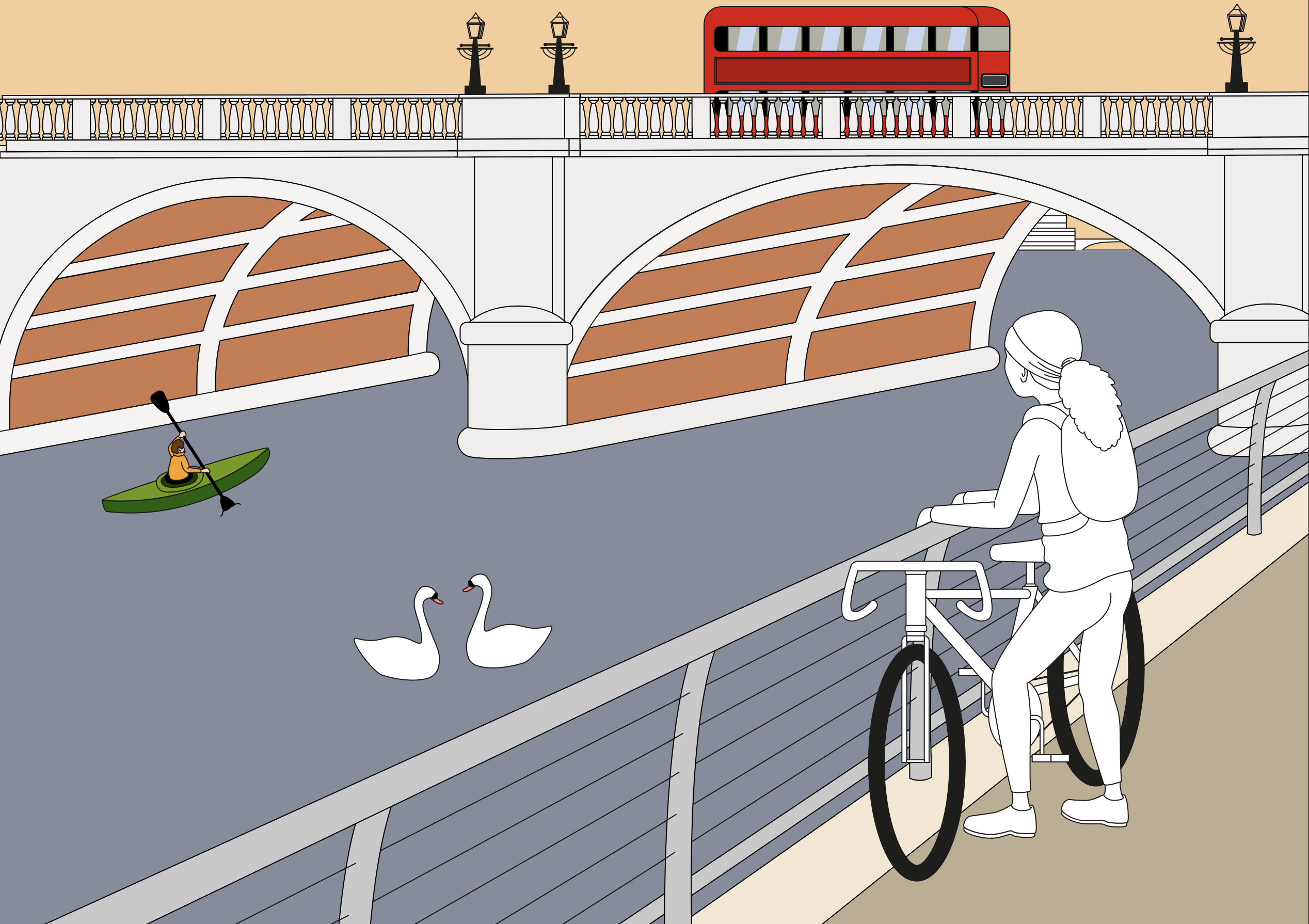
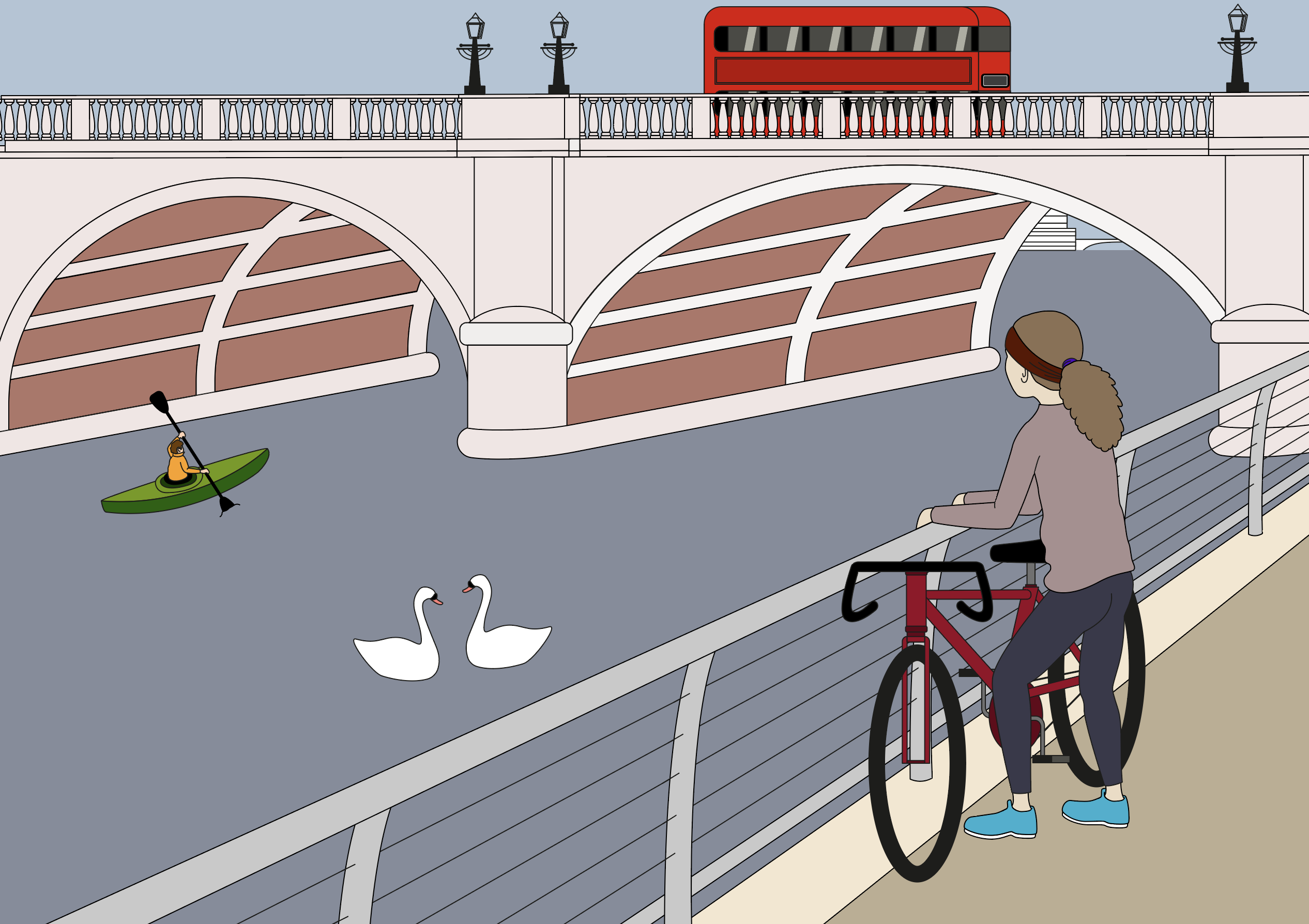
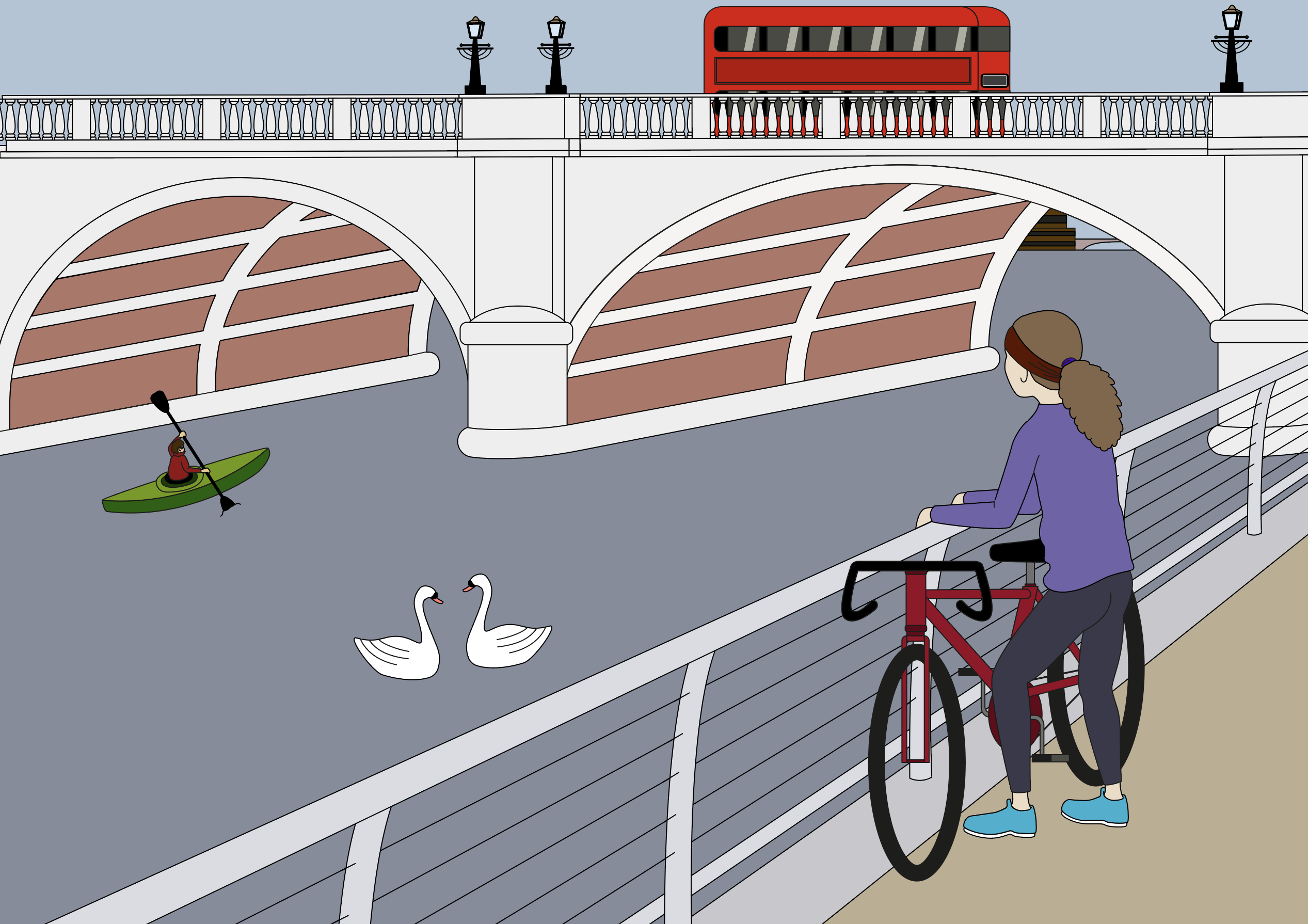
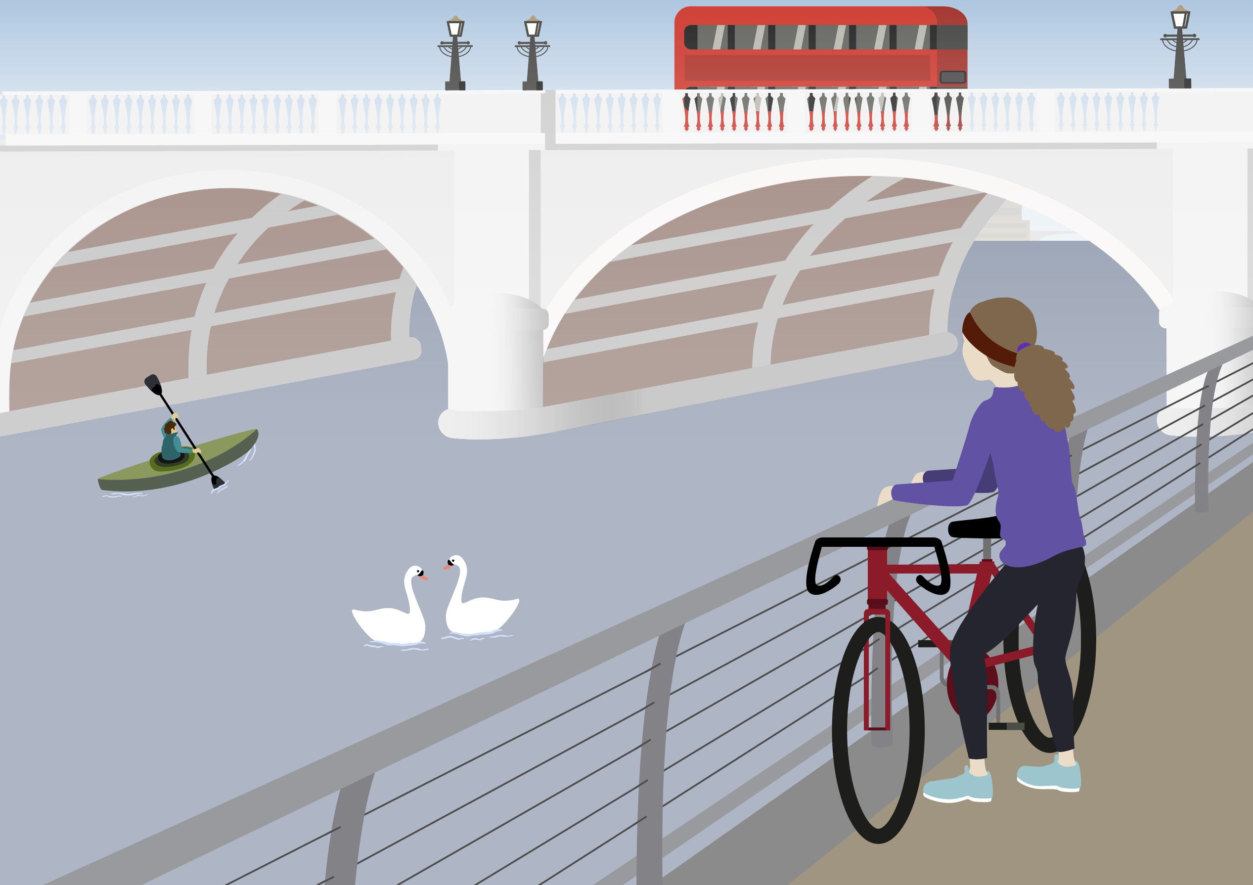
At this point I began adding colour. I tried to keep in mind the muted palettes as per the examples in my research, rather than the more saturated, bright colours used in the telephone boxes illustration.
I spend some time playing with the colours, trying to find a balanced combination, which blended well together.
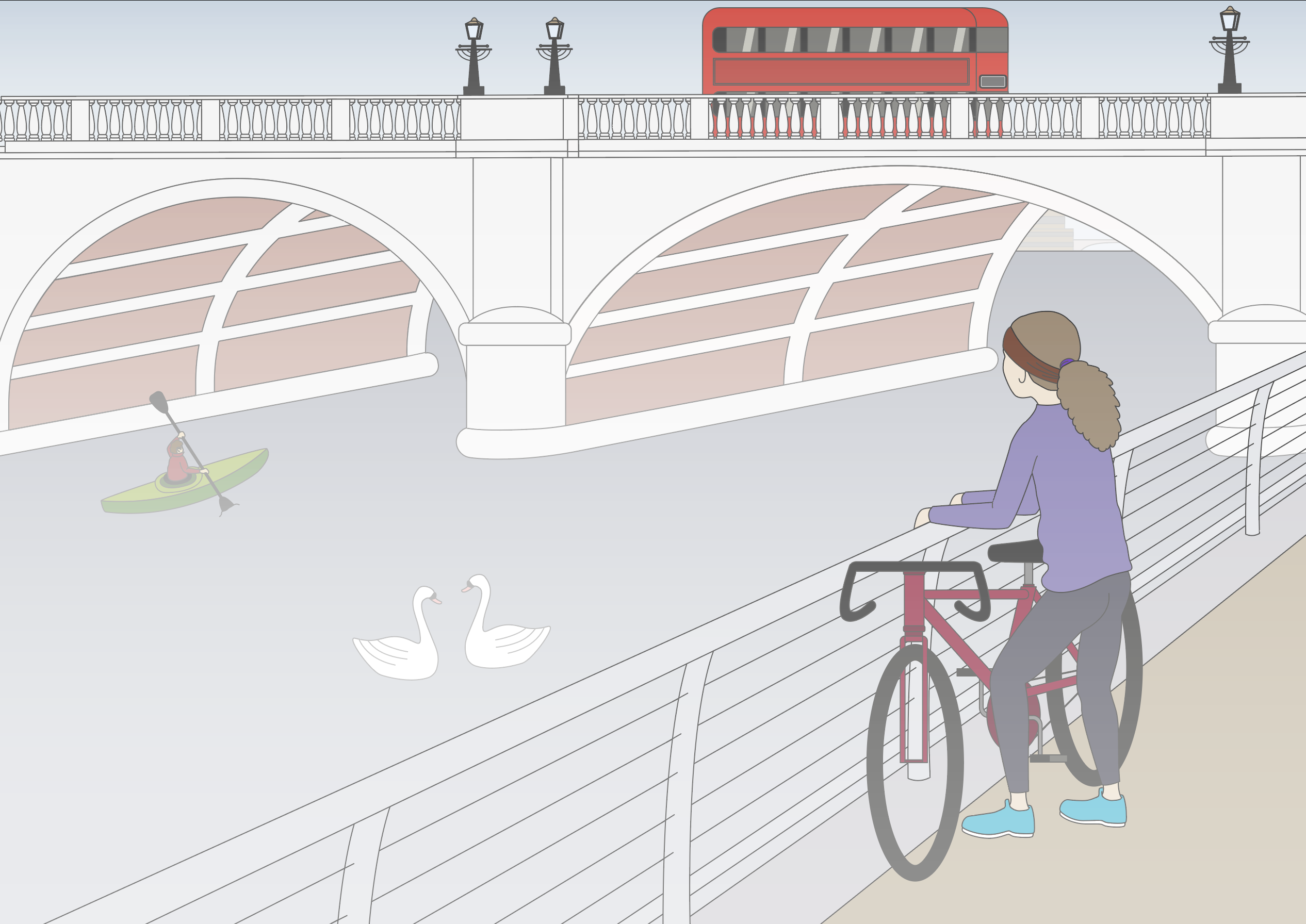
I wanted to convey a sense of it being early morning with the mist hanging in the air. I used the Shape Tool to create rectangles of a grey-white, which I then reduced the opacity of. I layered these in between various points in composition, e.g. one behind the bridge, one in front and so forth. I felt this would help to add depth to the scene as well.
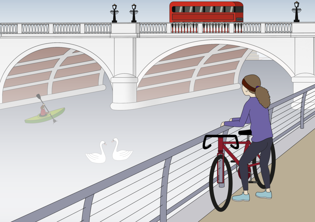
I had reached a point where I was fairly satisfied with what I had achieved so far, but I really wanted to emulate the style of White One Sugar by removing the outlines. I knew this would be a challenge as I would need to make sure it was still possible to see everything and make sure the bridge blended into one shape, for example. This is a style that I have wanted to try for quite some time, so I decided that this was the perfect opportunity to have a go.
I used to suggestion of shadows to prevent the shapes merging, beginning with the bridge, as I felt this was perhaps the most at risk.
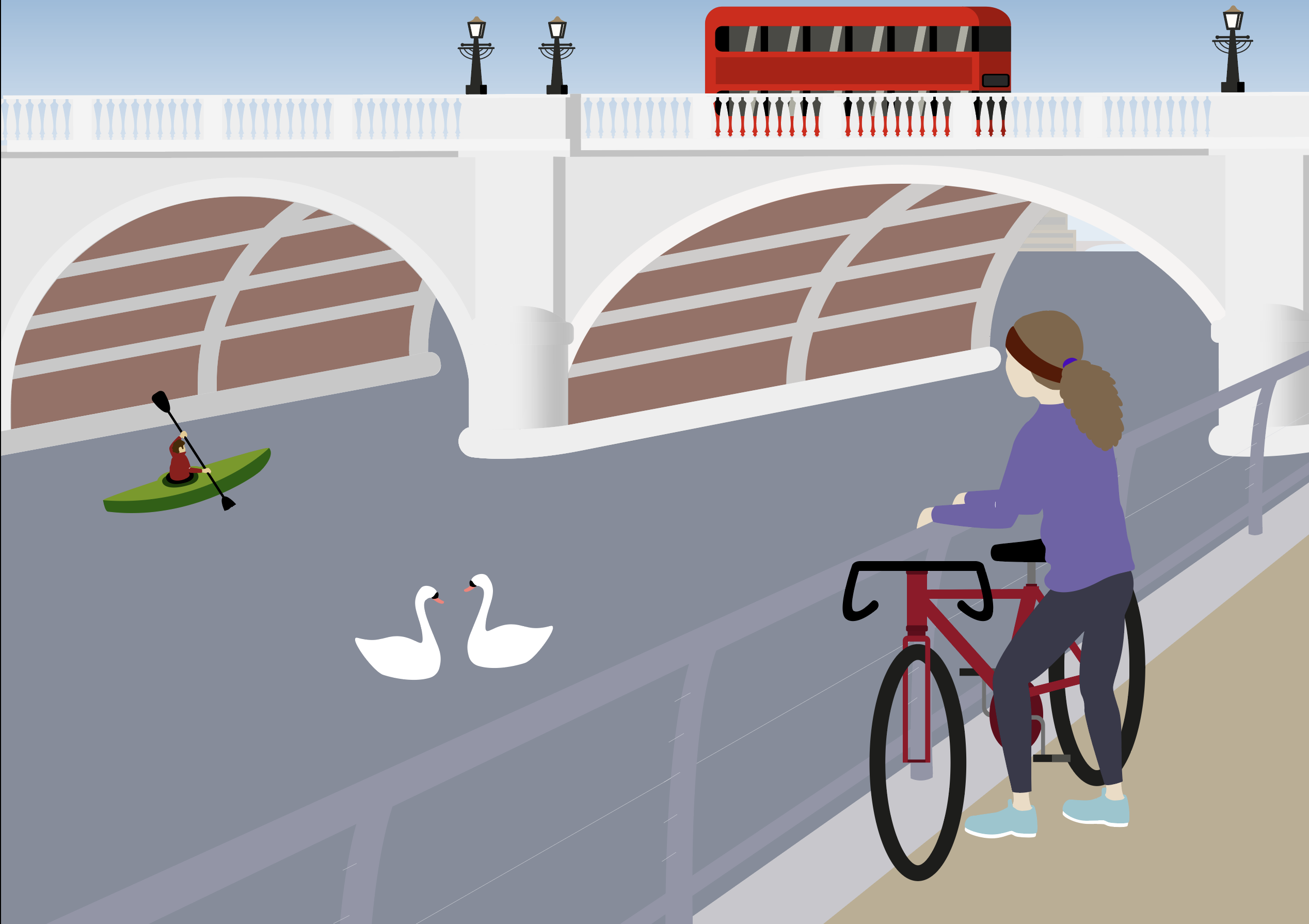
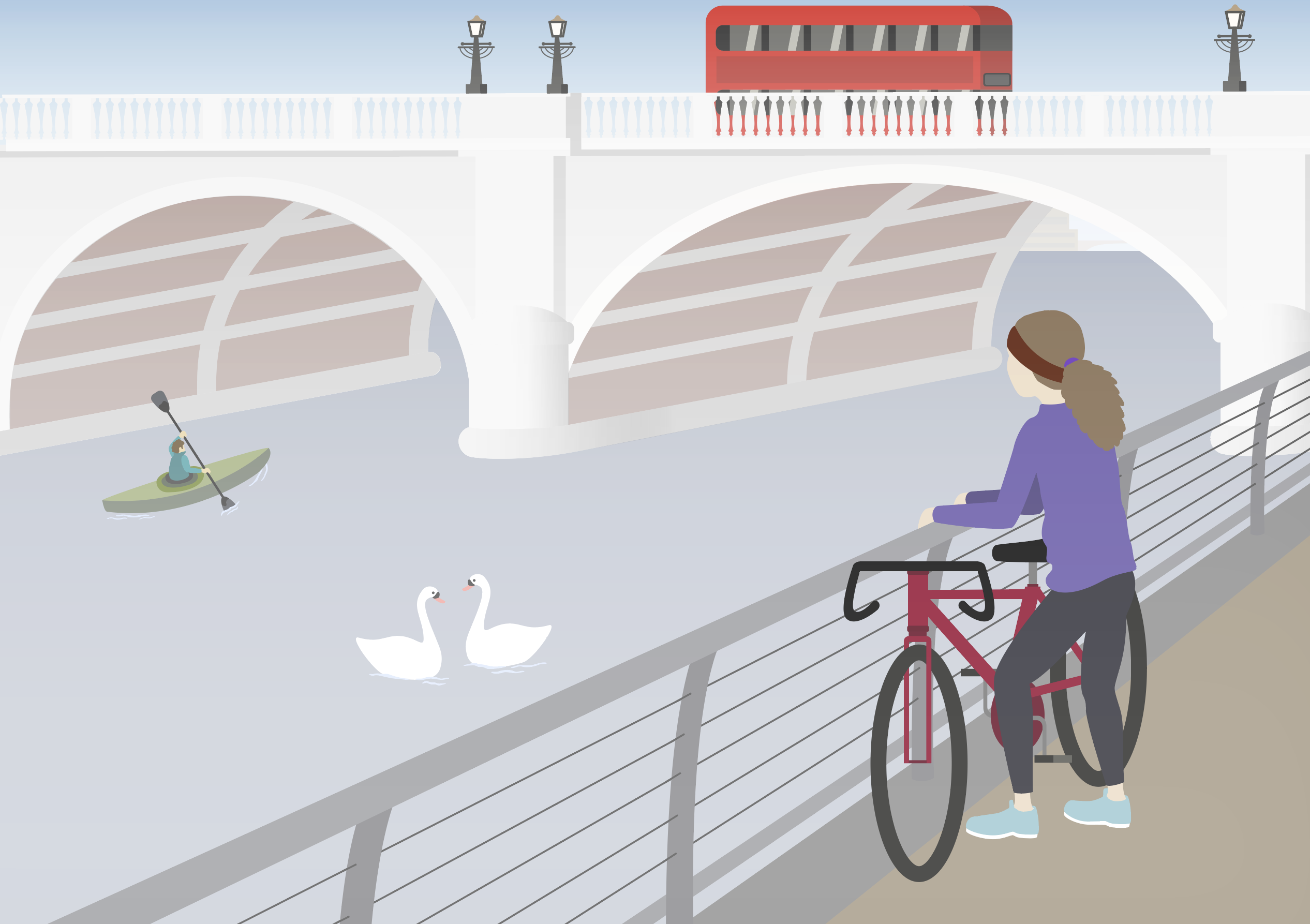
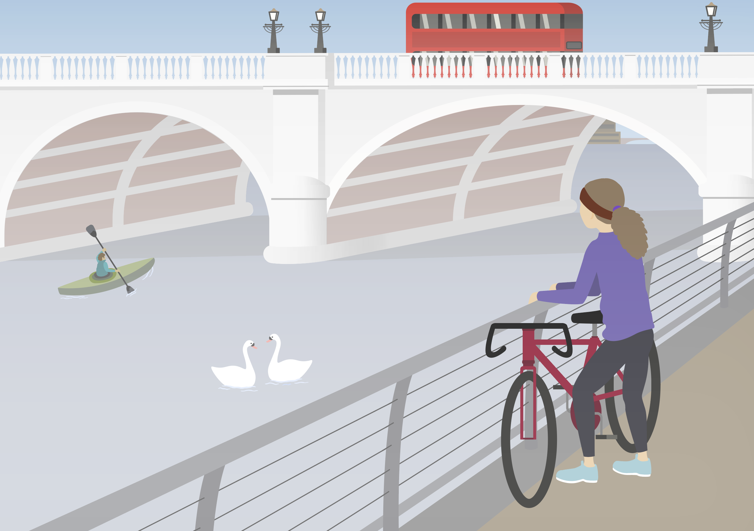
I had reduced the amount of mist in the foreground for the final illustration, below, so that the woman was most prominent, being the closest to the viewer. I also added the final touch of shadows under the bridge arches. In hindsight, I could have enhanced the illustration further by adding further shadows, for example, showing those of the woman and railings on the embankment. I also could have added more traffic and pedestrians on the bridge, which would have made it a more realistic representation. I did spend a long time on this illustration and I ended up becoming quite involved and enjoying it.
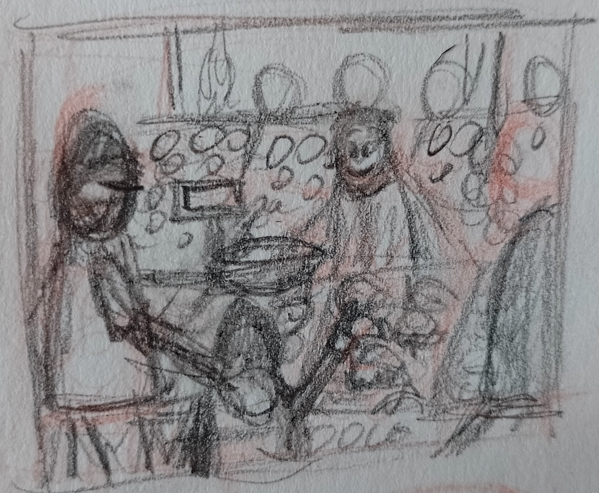
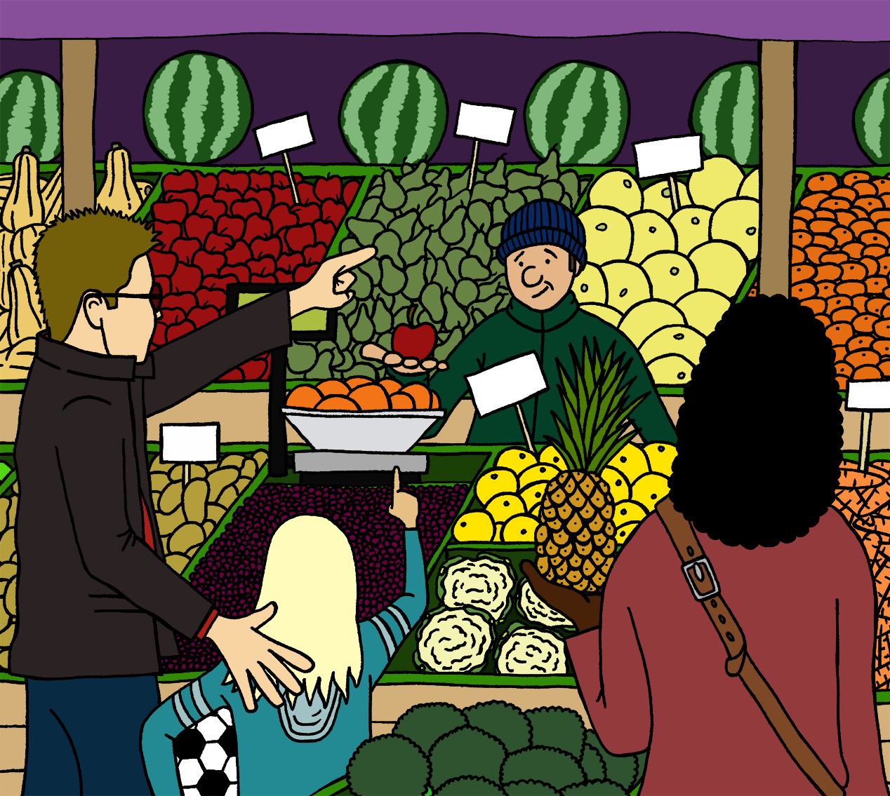
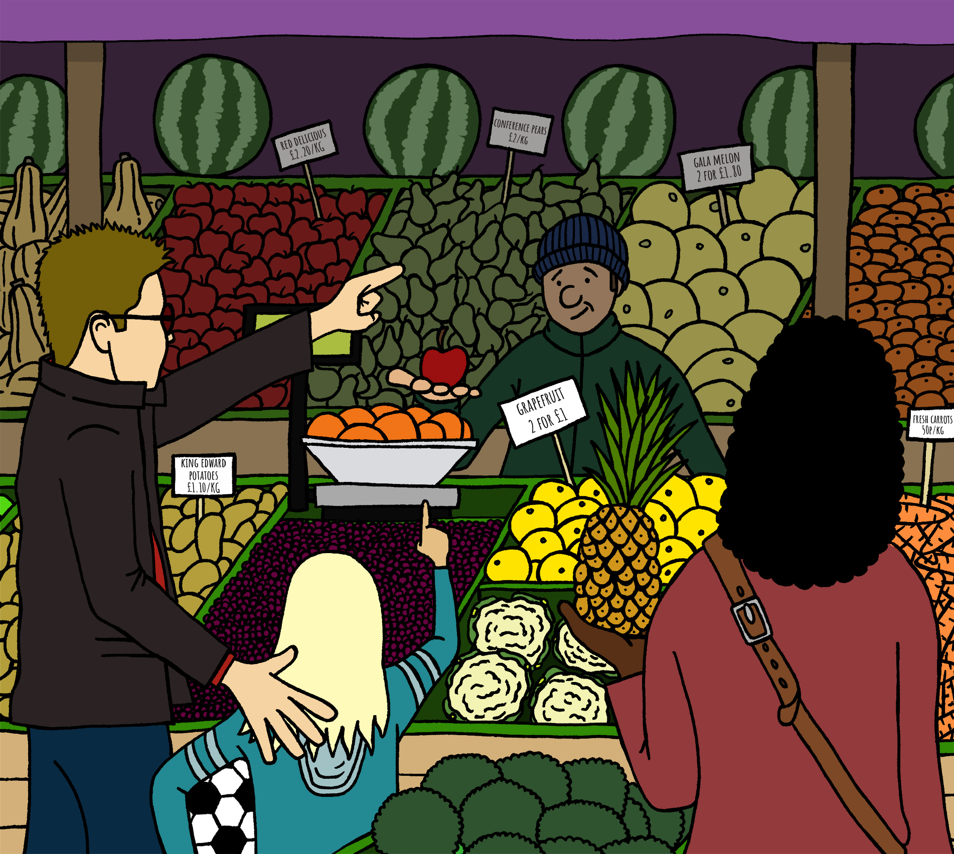
The final illustration was one of Kingston Market. I mostly relied on my memory of one of the stalls as I used to go to the fruit and veg stands every lunchtime several years ago. I have been a few times in recent times, but when I went to Kingston again for this assignment, the stall was not open and there was hardly anyone around. I decided to make this illustration in a similar vein to the Pete McKee examples, in a cartoonesque style. I love fruit and veg and I love cartoons, so after spending most of this section fretting about how I was going to complete each piece, I wanted to just enjoy making this final illustration.
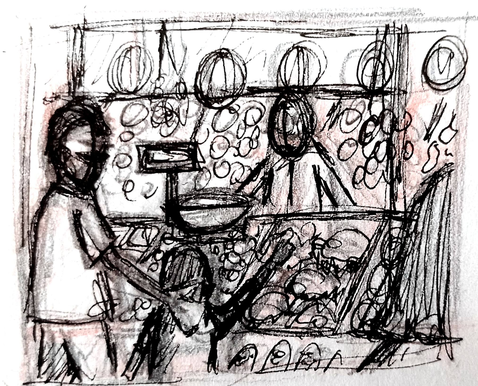
I began my making a very rough pencil thumbnail of my idea and then drawing over this, again in rough, with fineliner.
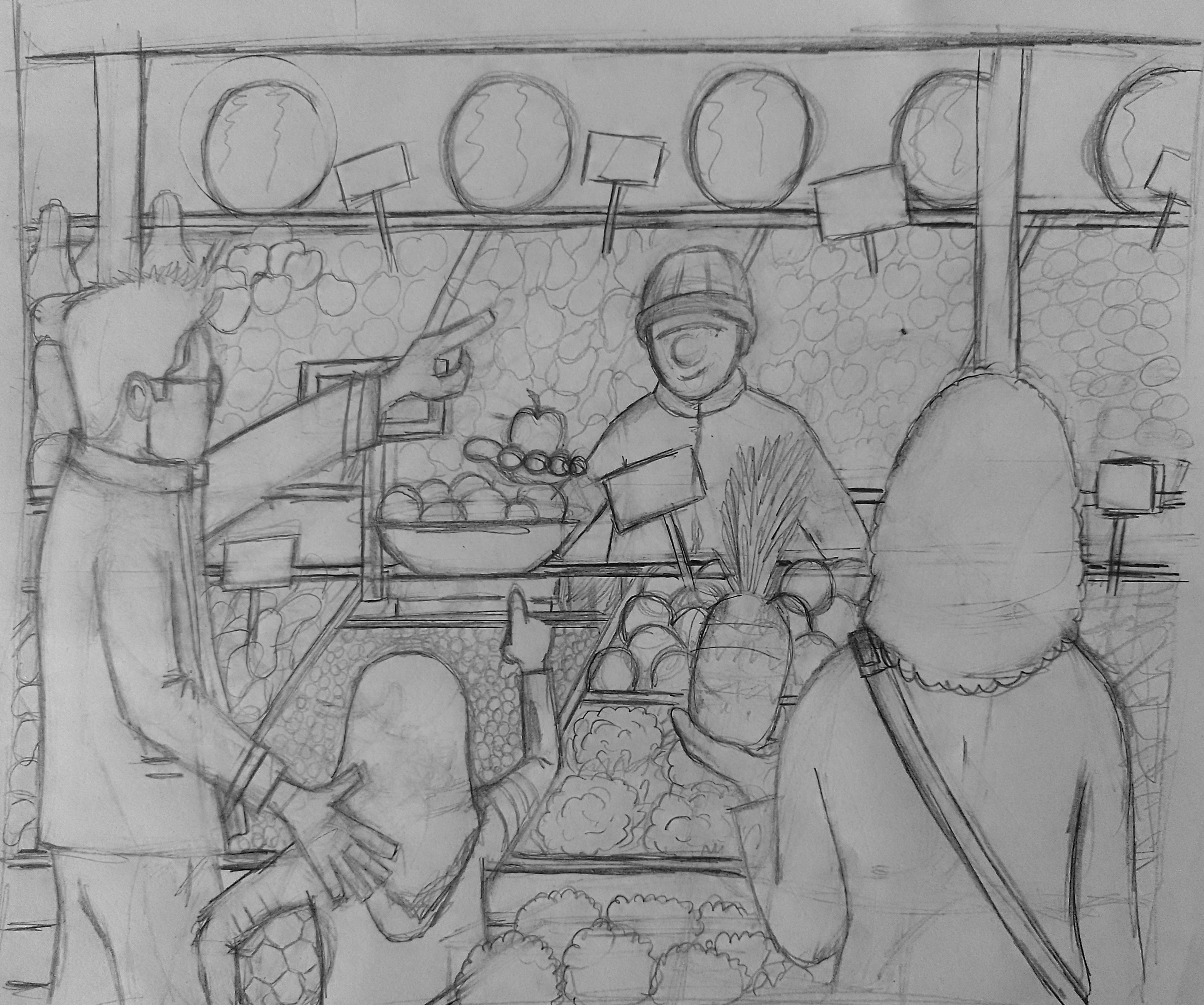
Using the above I used a pencil on an A4 sheet of paper to create a more coherent pencil rough.
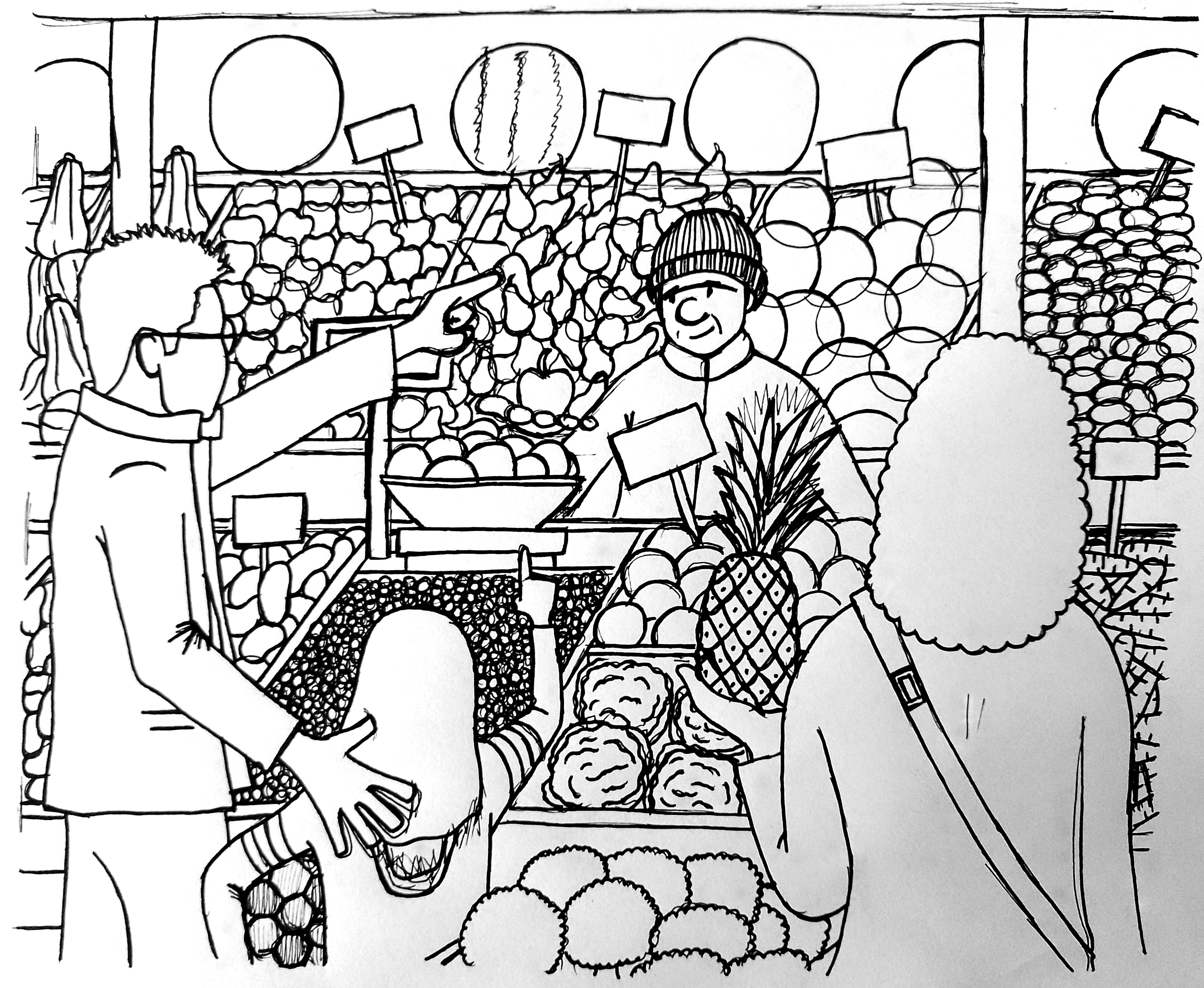
Next, I used my lightbox to draw a rough version in fineliner.
I then drew a final draft of the composition. I scanned this into my computer as a TIFF and opened it in Photoshop.
I was actually rather pleased with my illustration so far, with , surprisingly, very few problems encountered. I felt it did represent the market stall in a cartoon, idealised style. I also think I succeeded in making the viewer feel part of the illustration, by the POV being behind most of the characters in the composition, as per the examples in my research.
Previously, at this stage in exercises/assignments I often become stuck with how to proceed. However, following the Tutor Feedback I received for Part 1 of this unit, I have been working on improving my knowledge of Photoshop and one of the first steps was to watch the tutorial provided in the feedback that demonstrates how to use the Multiply blend mode so that I could add colour on a separate layer to my scanned in line work. Although now it seems like a very simple concept, it was a real eye-opener for me! I think I have put off exploring Photoshop because it seems so complicated and advanced, but I have really been trying to get to grips with it.
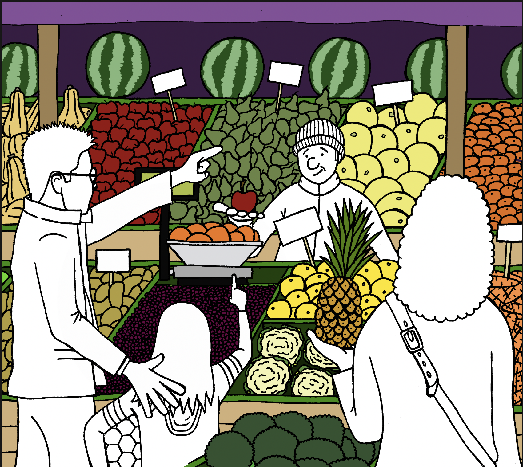
Therefore I opted to open the line drawing in Photoshop and using the Multiply blend mode was able to proceed adding colour on layers underneath. I created a new layer for each section, e.g. one for the pears and one for the carrots. I also made it a priority to ensure I labelled each layer as otherwise it could have become quite confusing.
The methodical process of adding colour took some time. I left the characters until last, as shown below, and I actually quite liked having the people left like this, so that there was no colour added to them at all.
I continued adding colour, trying to maintain a balanced and not overly saturated colour palette, although fruit and veg is colourful, so I had to keep the in mind too.
Once all the colour was in place, I proceeded to clean up the lines and make any minor amendments.
I was happy with the illustration at this point, but I felt it could be improved by adding shadow to the back section of the marquee, to provide a sense of depth. I separated the layers in the foreground from those in the background and put these in two separate groups. Between these, above the background and below the foreground, I placed a coloured rectangle, which I then reduced the opacity of. I made the market stall holder’s hand and the apple in it part of the foreground so it appeared more like it was coming outwards. I also realised I had left the labels blank, so I first tried writing these freehand as incomprehensible scribbles before deciding to add readable fonts instead. The final illustration can be seen below.
Final Thoughts
As previously mentioned, I was glad to have finally reached the assignment for this section of the unit. I really wanted to get it done and move on. Many people would most likely not have any issues with going out and sketching people and settings from life, but it has been quite a stressful experience for me! However, once I had made the decision, perhaps at the expense of fulfilling the brief, to work more from photographic reference and memory, I became more comfortable with this assignment.
I do not think the first illustration (telephone sculpture) was particularly effective in reflecting the brief and perhaps I should have selected a different location, but I did enjoy experimenting with the colour combinations. I also did feel that I was not really pushing myself very much with this initial attempt.
Once I moved onto the second illustration I became much more committed to the work and I found it more challenging, which ultimately had a positive outcome as I felt this illustration was much stronger than the first and related to the brief. It also demonstrated more of an influence from the research I had undertaken and I ended up with style that I have always admired from afar, but not previously had the motivation to experiment with myself. As previously stated, I could have enhanced the illustration further by adding more activity on the bridge. I also could have increased the number of shadows to make it ‘pop’ out more.
By this point in the assignment it dawned on me that my two illustrations so far were a very different style and so I am not sure whether this would be acceptable when taking into consideration that the tourist board would most likely want a consistent style across all 3-5 illustrations. However, I apparently chose to continue in the same way as my next illustration was in another completely different style – therefore I do not think I would get the commission!
Although it was difficult to make a start on the third illustration, once I had an idea and began working on it, I found myself becoming absorbed and thoroughly enjoying the process. There were very few issues and my workflow was very smooth – it actually all seemed too good to be true.
In summary, I was pleased that I managed to produce three final illustrations that did show Kingston in a positive light. I also feel that the influence of my research is reflected in the final two illustrations, which was what I hoped for. I have learnt great deal in this assignment that I believe will improve my work going forward.
Bibliography
British Council (2014) Tom Purvis. British Council – Visual Arts. Available at: http://visualarts.britishcouncil.org/collection/artists/purvis-tom-1888 (Accessed 17 March 2023).
Google Images (2023) Google Images Search. Available at: https://images.google.com (Accessed 17 March 2023).
McKee, P. (2019) Pete McKee. Available at: https://www.petemckee.com (Accessed 17 March 2023).
Quiambao, C. (2017) Art Deco advertisements: Bridging vintage and ultramodern. Available at: https://99designs.com/blog/design-history-movements/art-deco-advertisements/ (Accessed 17 March 2023).
Propeller Propaganda (n.d.) Famous Vintage Poster Artists. Available at: https://www.propellerpropaganda.com/original-vintage-airline-posters/famous-poster-artists/ (Accessed 17 March 2023).
Ruggeri, A. (2015) Tourism gone vintage – BBC Culture. Available at: https://www.bbc.com/culture/article/20150817-vintage-tourism-posters-railways-britain (Accessed 17 March 2023).
Vaughan, H. (2022) Graphic Artist: Helena Vaughan. Available at: https://www.helenavaughan.co.uk (Accessed 17 March 2023).
White One Sugar (n.d.) Modern Contemporary Railway Travel Poster Art of Kent Towns and Coast. Available at: https://www.whiteonesugar.co.uk (Accessed 17 March 2023).
