Choose a houseplant, a cutting from the garden or a bunch of flowers. Focus on a small area and draw what you see. Be as accurate in describing shape, form and detail as you can. Aim to create a drawing from which somebody else could recognise your plant.
Now, draw the plant again, this time from a much more creative perspective. Describe the plant but in simpler and bolder terms. You might want to play down your use of colour, line and form, for example. Your drawing should try to summarise the essence of the plant, so it becomes more universally recognisable than a specific specimen.
Choosing and Drawing a Plant
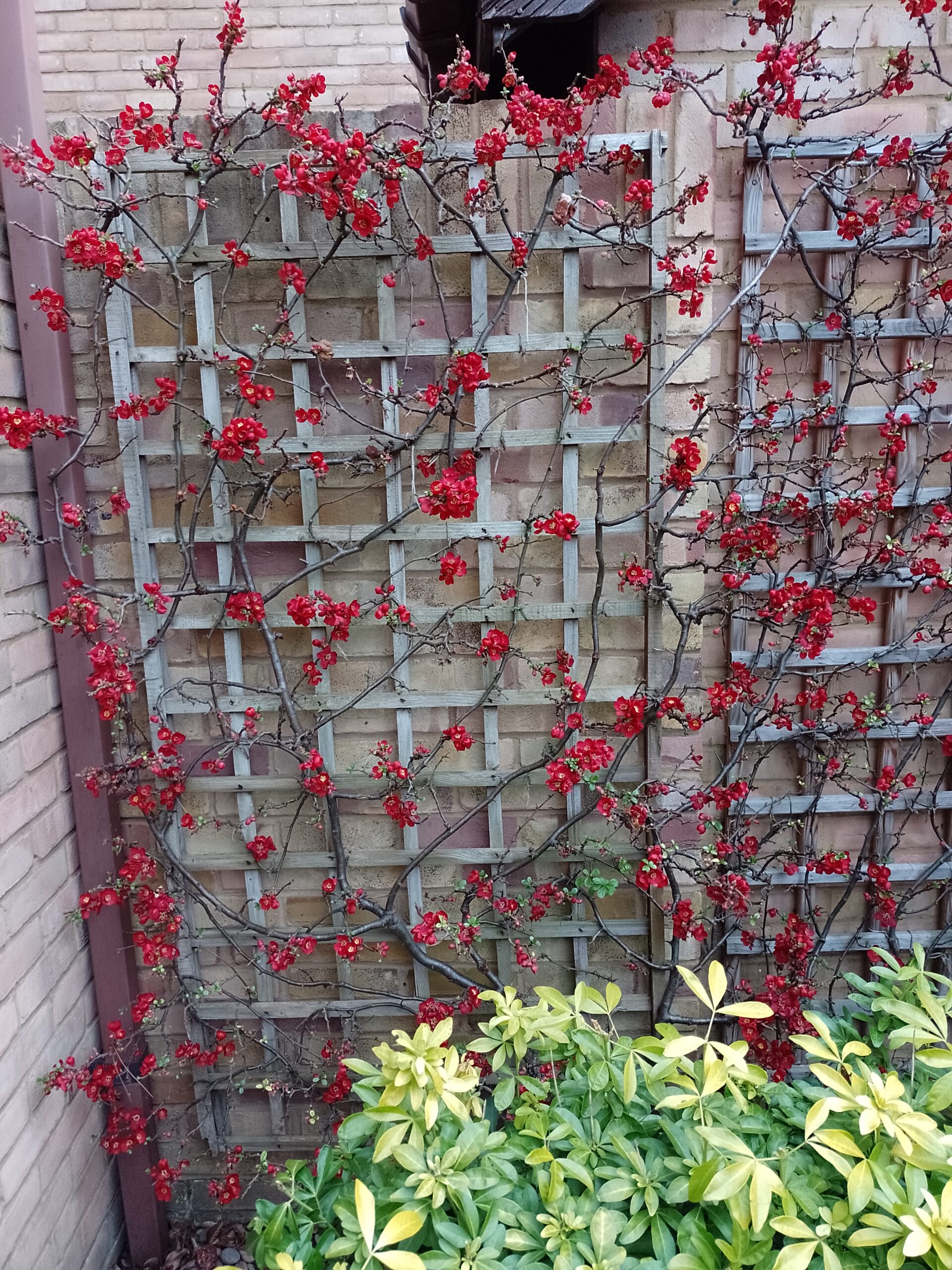
As it is currently winter my choice of plants with flowers in the garden was quite limited, but luckily one that I have always liked was in bloom. I chose the Japanese Quince with its bright red flowers climbing up the trellis.
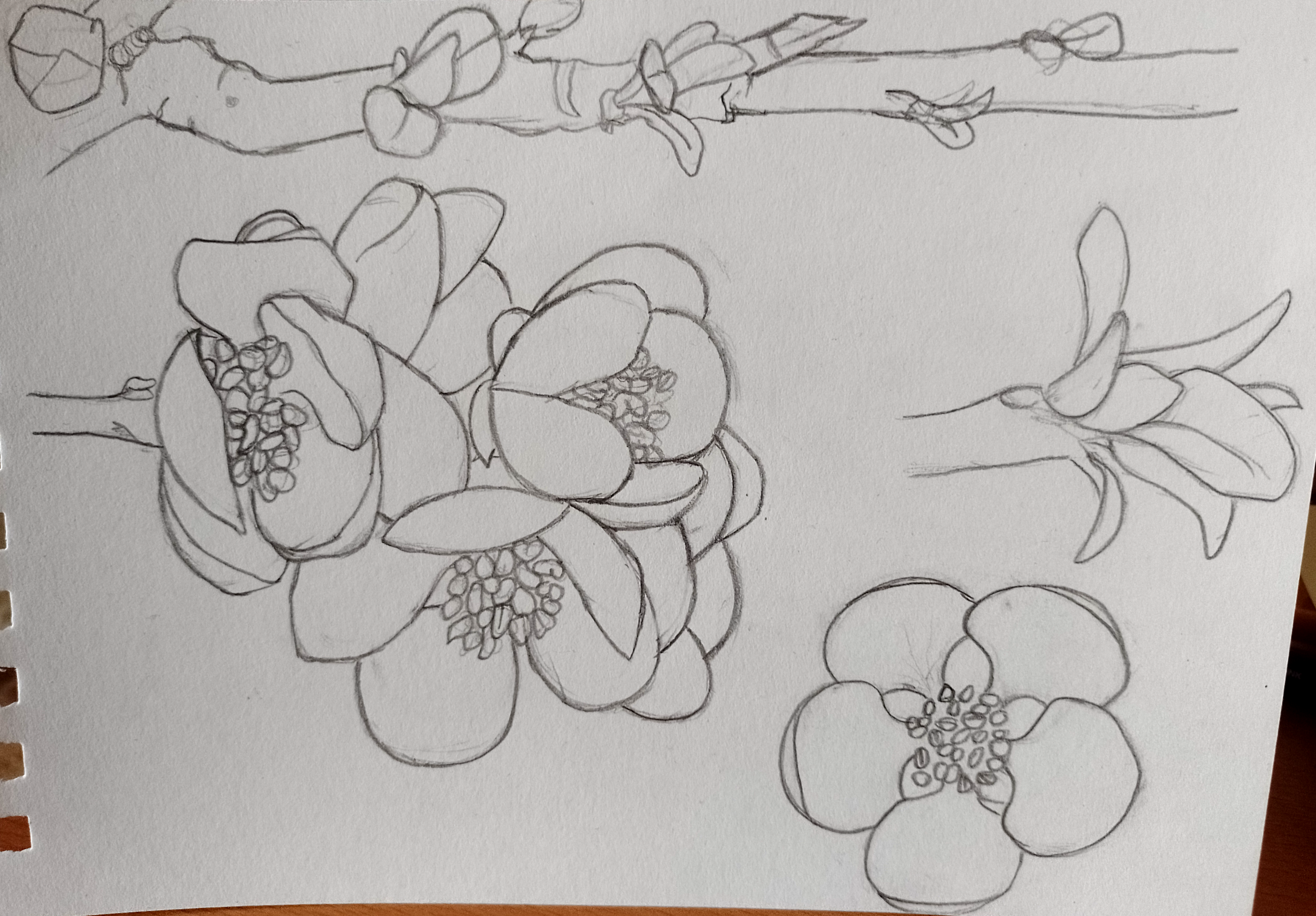
Following the Research Point prior to this exercise I felt I had a fairly good idea of what was expected in terms of the requirements for the initial drawing. I selected a particular section of the plant and attempted to replicate this on paper as accurately as possible. The first drawings were done using pencil – I tried to make positive marks on paper. It was really challenging to focus and thus ensure that I was copying exactly what was in front of me, particularly where there were several petals overlapping one another.
I then decided to do another set of drawings using coloured pencils. I actually found this more enjoyable to do than the pencil version, although I did notice that I avoided doing another drawing of the ‘clusters’ of flowers.
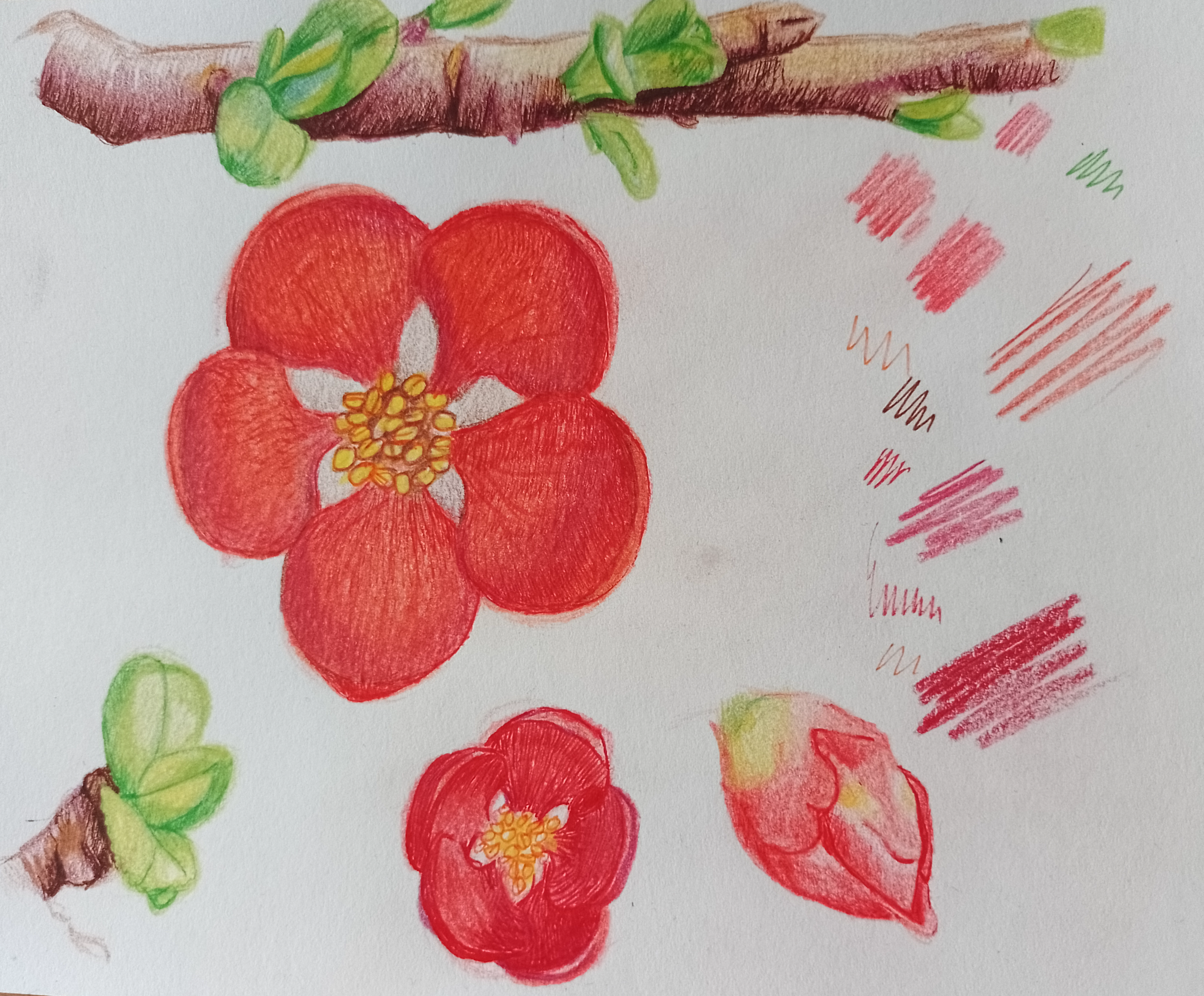
Considering that this was the first time I had tried drawing flowers for a very long time, let alone trying to be so accurate when doing it, I was quite pleased with my attempts. I am not sure if someone would be able to recognise these as being drawings of Japanese Quince, but as least they look like flowers! I believe if I had more practice I would be able to do better versions and I would also like to try using watercolour as this seems to be more or less standard practice for botanical illustrations.
Creative Version of Chosen Plant
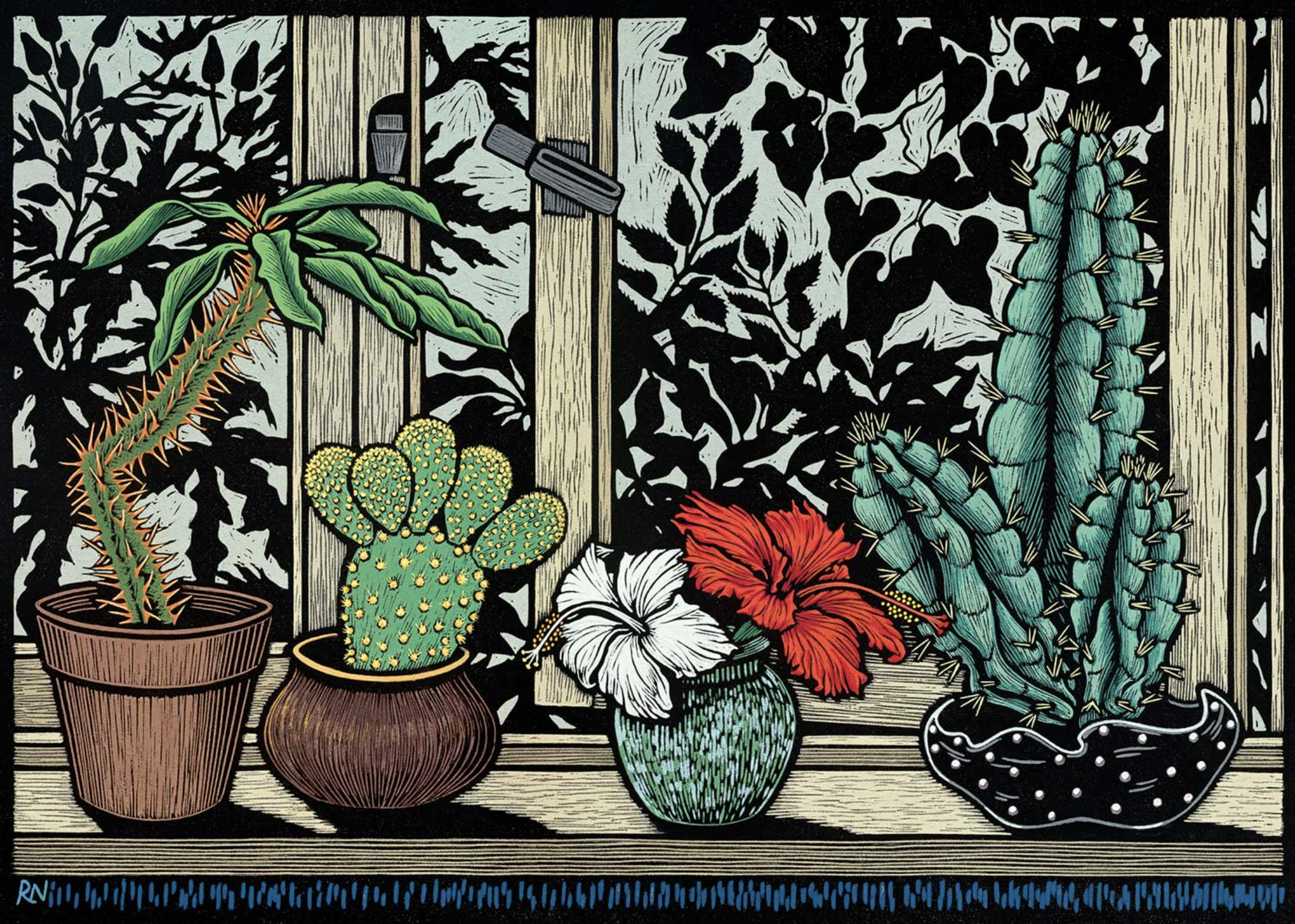
I fairly quickly made the decision that I wanted to incorporate linocut printing in this part of the exercise. I had only tried it a couple of times previously and I liked the bold, graphic designs that can be made using this method. Initially I considered trying to create an illustration similar to the artist Rachel Newling, whose work I had discovered in a previous unit. She uses Linocuts to print the outlines for her artwork, then adds colour using paints. I was really drawn to Newling’s style of work – I could imagine these being used in a graphic novel.
The brief for this exercise asks for me to ‘describe the plant… simpler and bolder terms, which I felt would be perfectly suited for linocut printing.
I had purchased two 7.5cm square blocks of lino, which unfortunately was not big enough to attempt something as detailed as the example above. I also had to take into consideration the time that it would have taken me to attempt a larger scale linoprint that included so much detail as I am a complete novice using these materials. However, I definitely want to continue trying to improve my skills with linocuts, perhaps using it to create a larger scale piece of work for an assignment.
Preparing the Linocut Designs
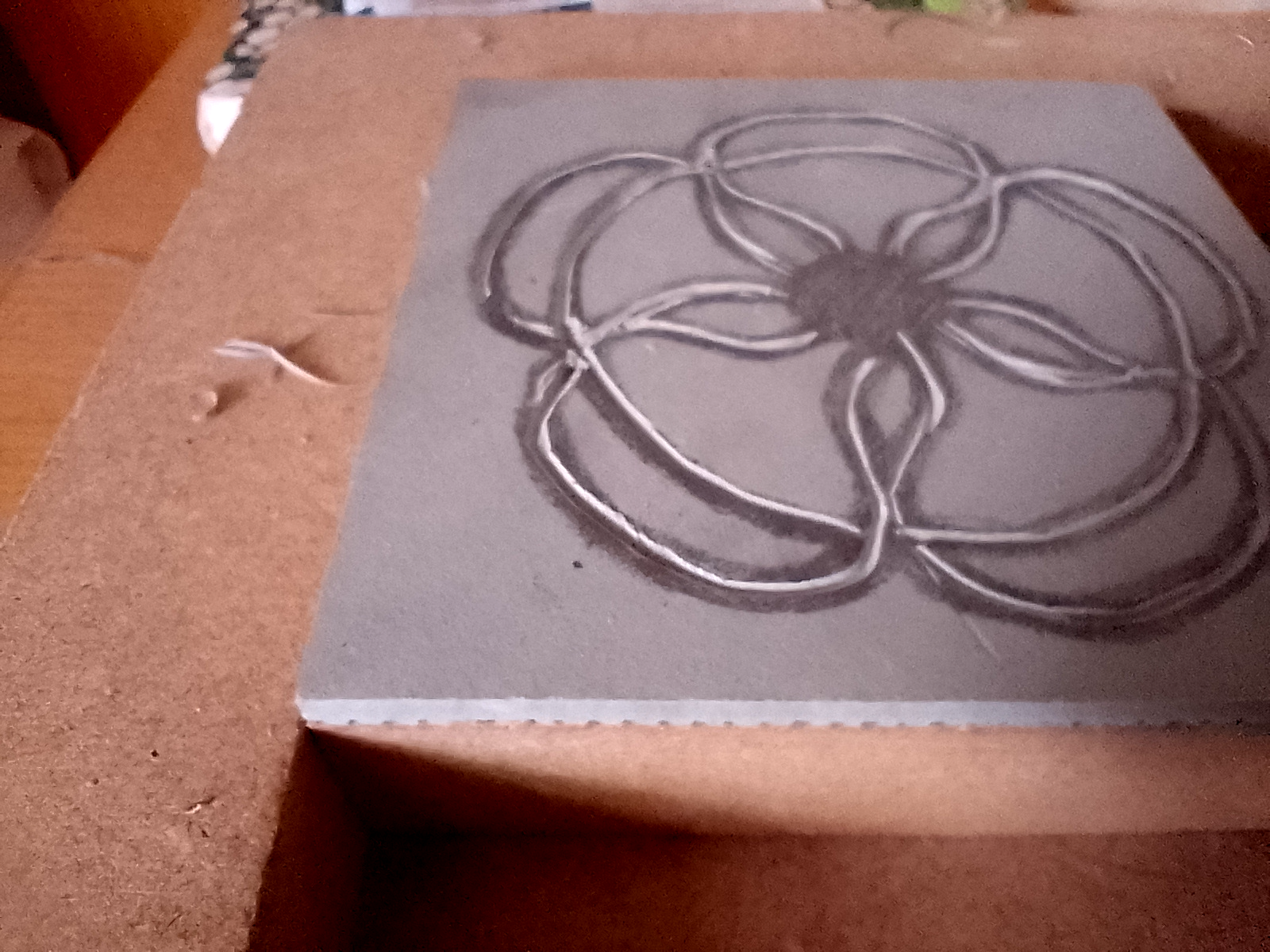
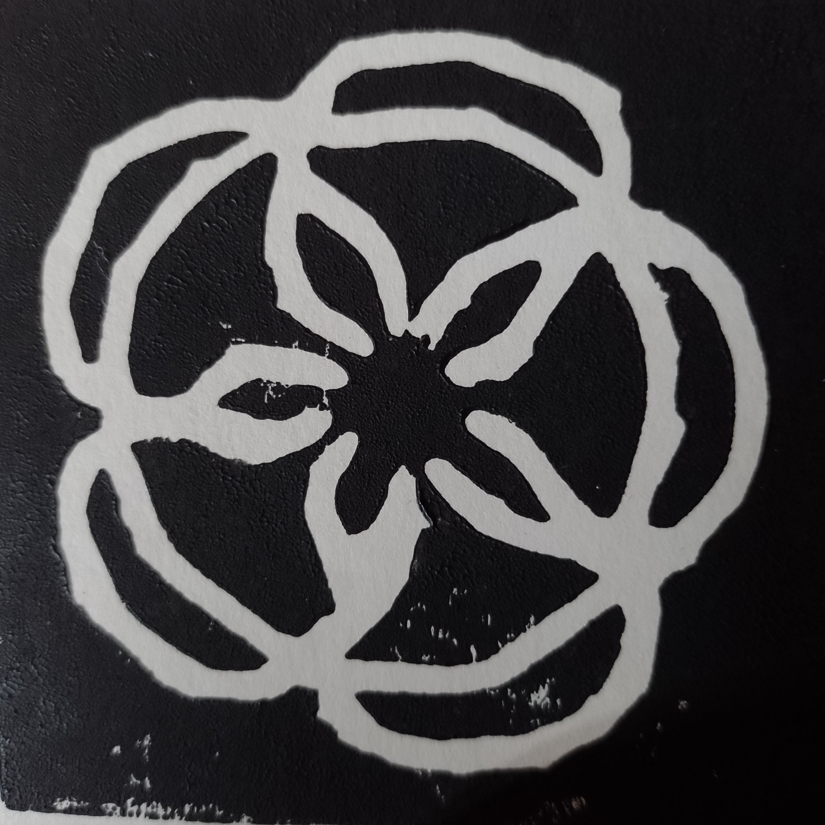
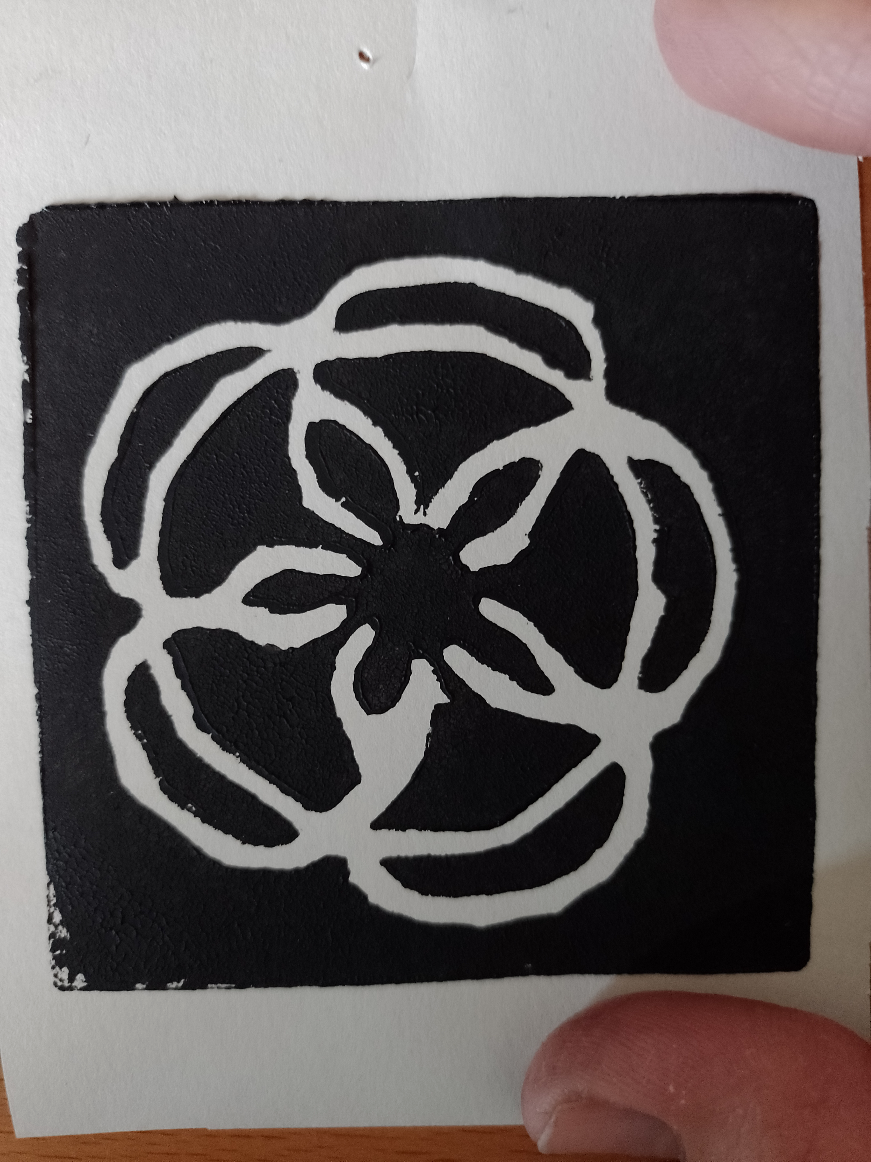
I spent some time drawing a very simplified version of one of the flowers. This involved plenty of erasing and trying to clarify in my mind which sections of the lino were to be removed. Initially I was intending to cut away most of the lino apart from the the outlines of the petals. This would have resembled the style of Newling’s work in terms of having a black outline, which I could then fill in with colour.
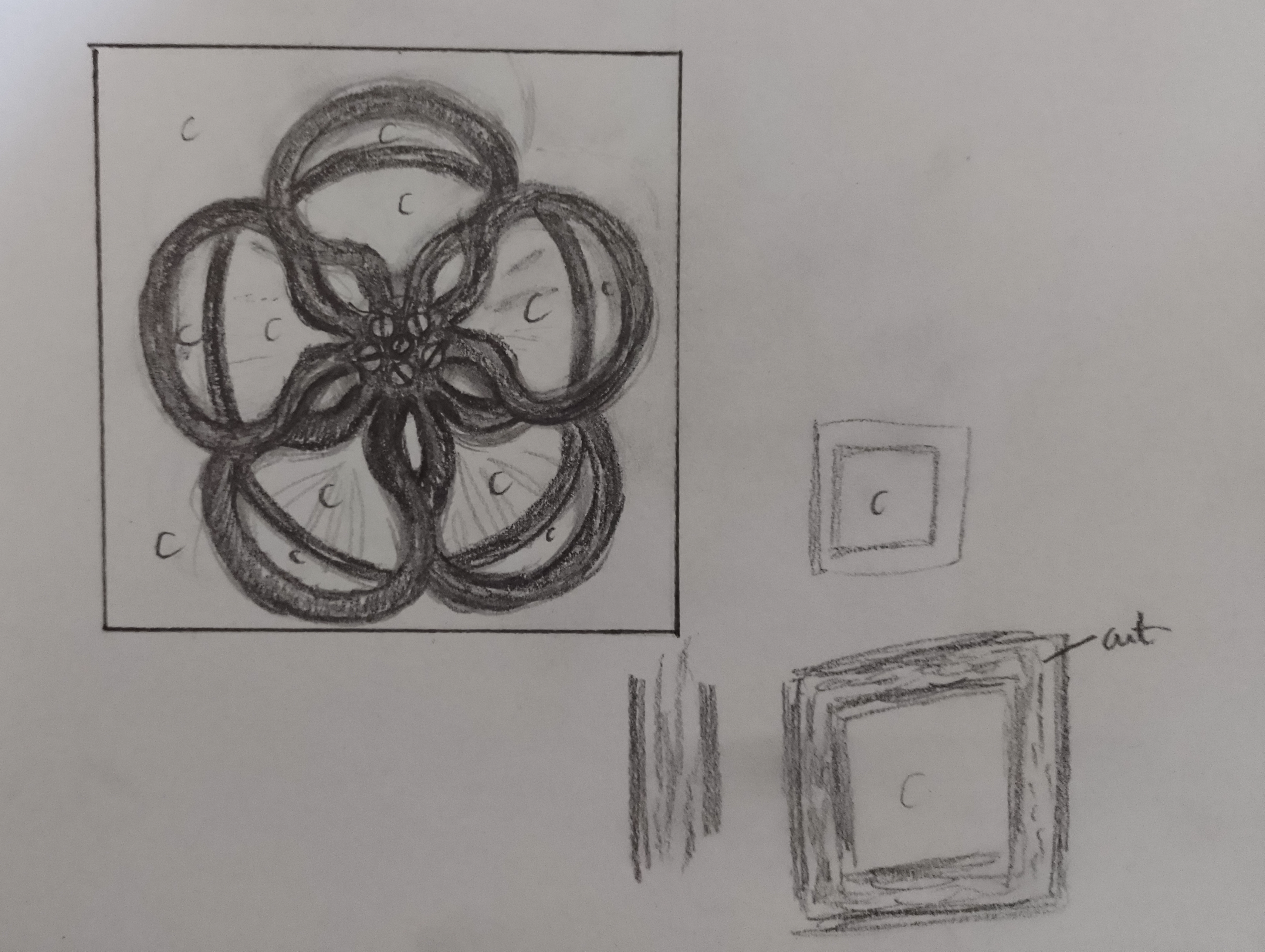
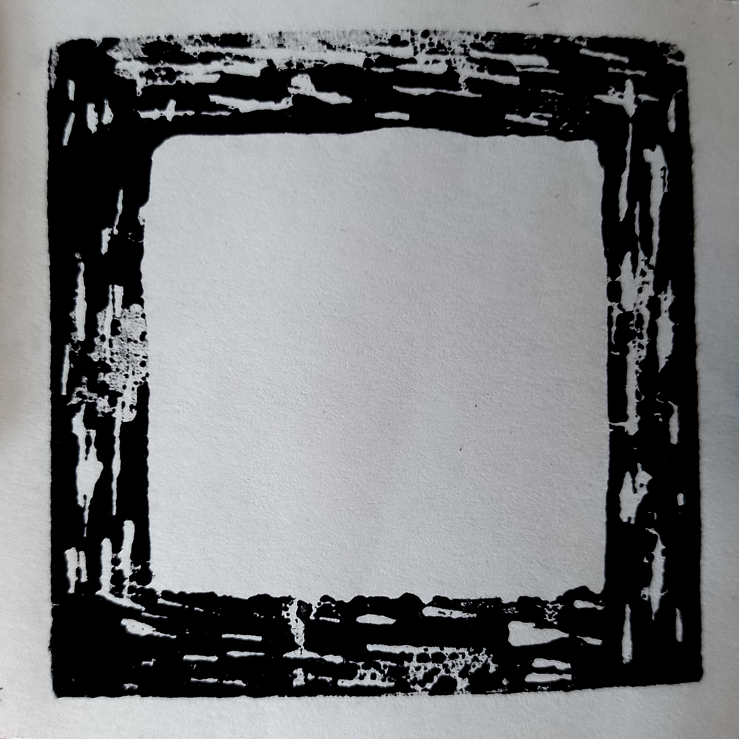
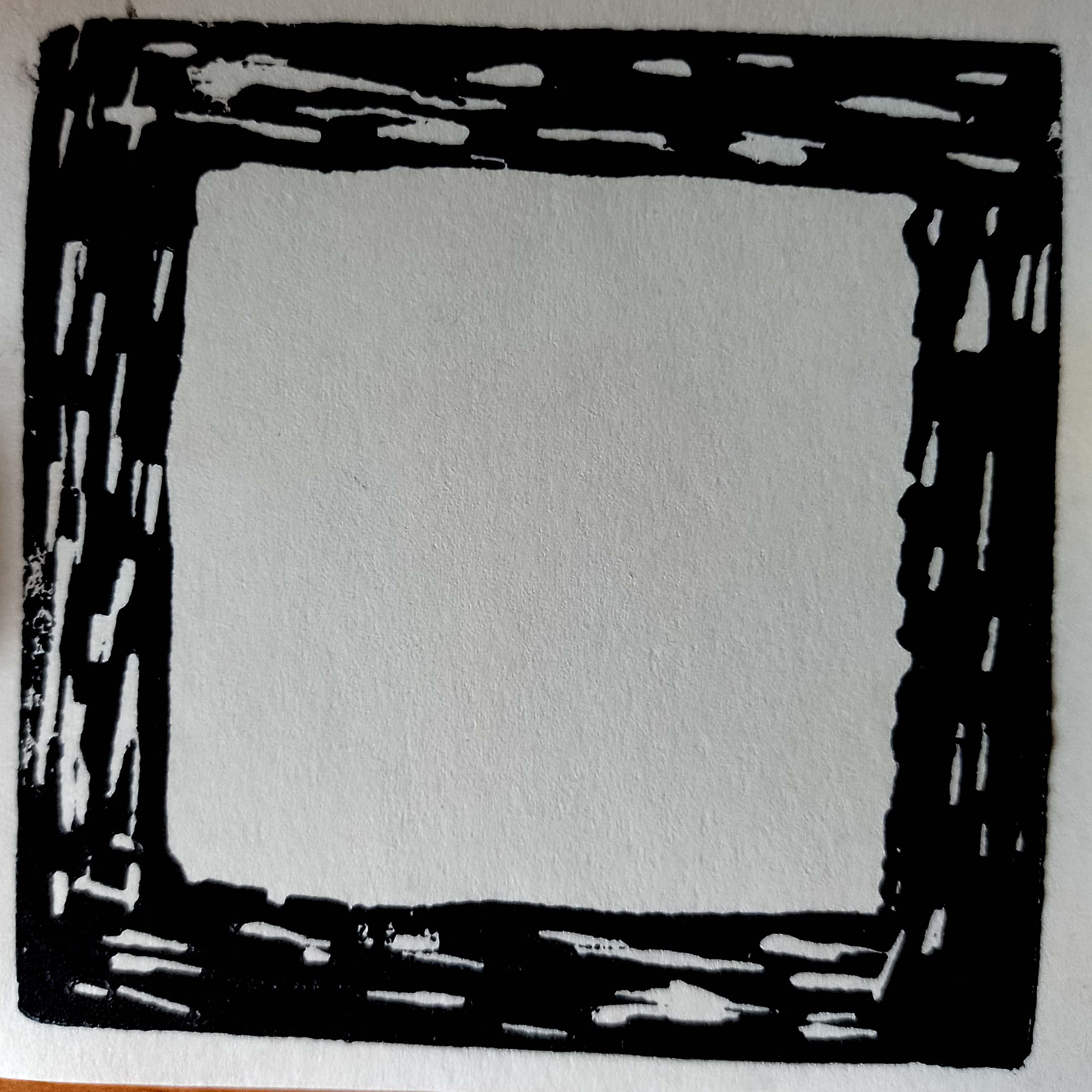
However, after stepping back and considering the size of the mounted lino blocks that I had available, a rethink was required as there was no way I would have been able to neatly remove the smaller areas of lino and I could not afford to waste the materials. Therefore, I reversed my plan and cut the outline from of the lino, which would result in the surrounding areas being black when inked.
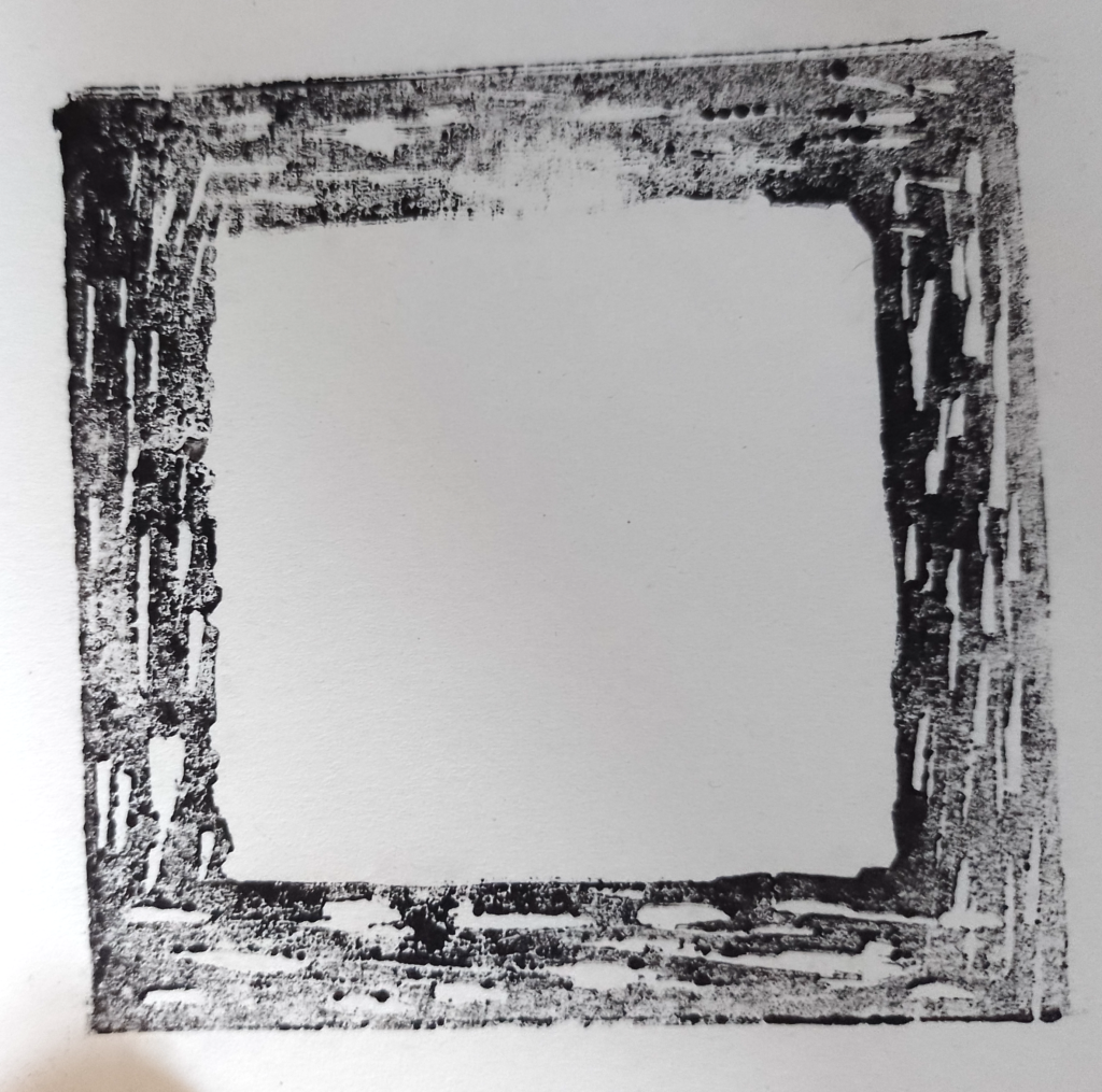
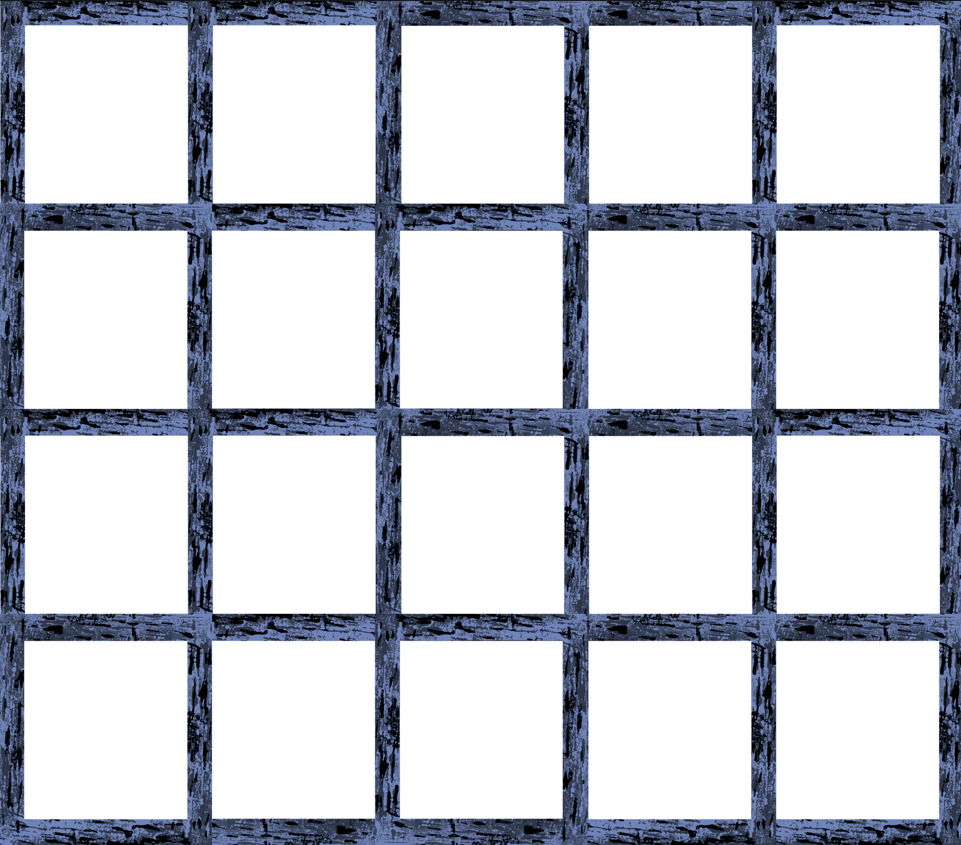
In addition to the flower print, I decided to use the additional lino to create a square of the trellis supporting the plant up the wall in my garden.
Once I was fairly happy with the designs, I drew them out on tracing paper using a very soft pencil.
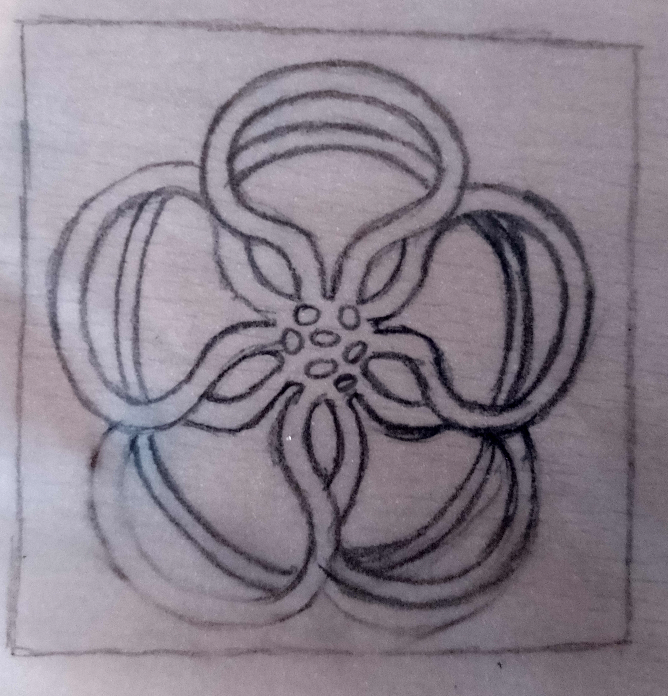
I filled in the sections that should remain uncut on the lino to reduce the possiblity of any confusion.
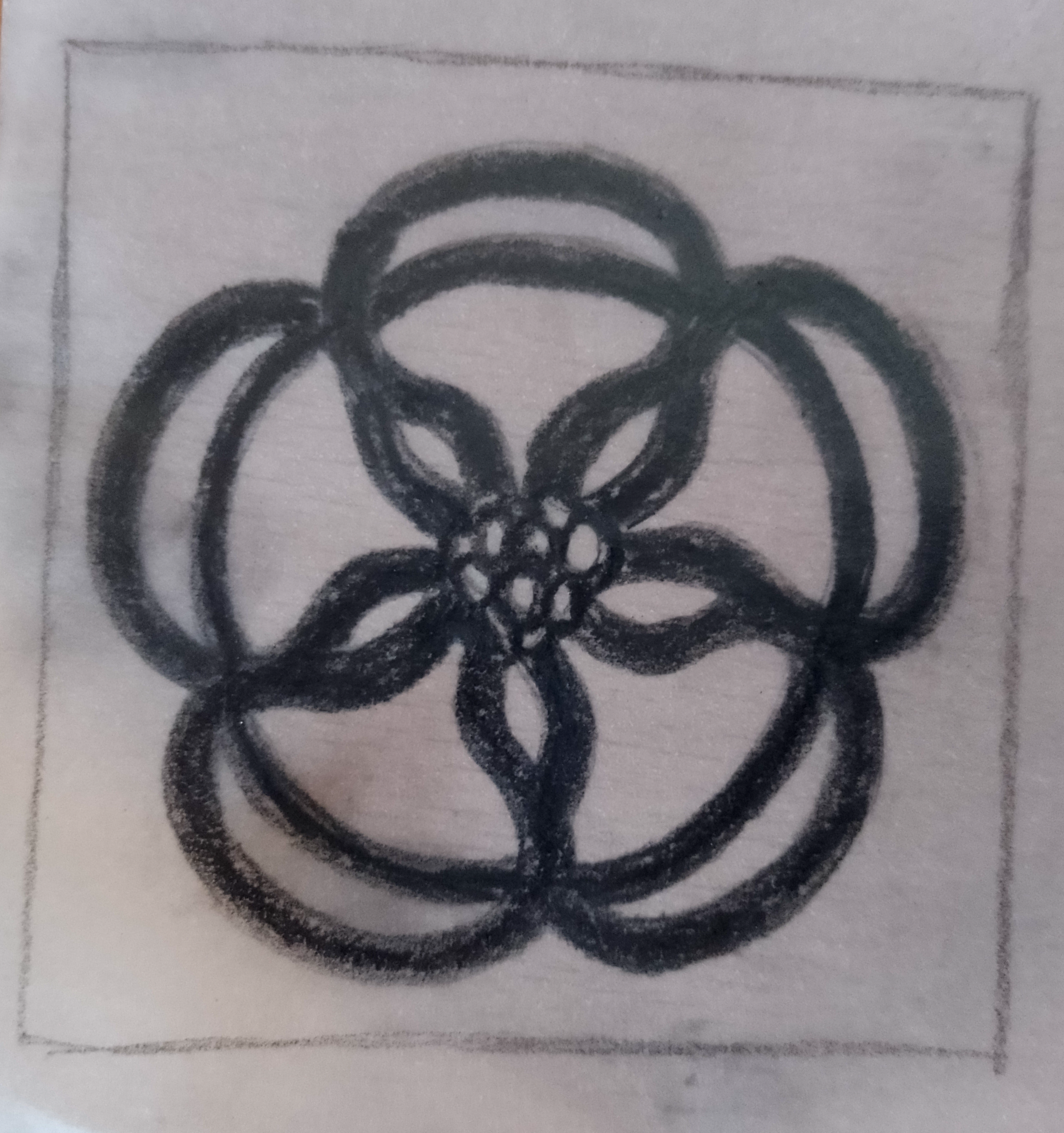

I then flipped the tracing paper over on the lino blocks and drew over the back side, which meant the designs copy onto the lino. I could then fill in any faint areas and clean up the edges.
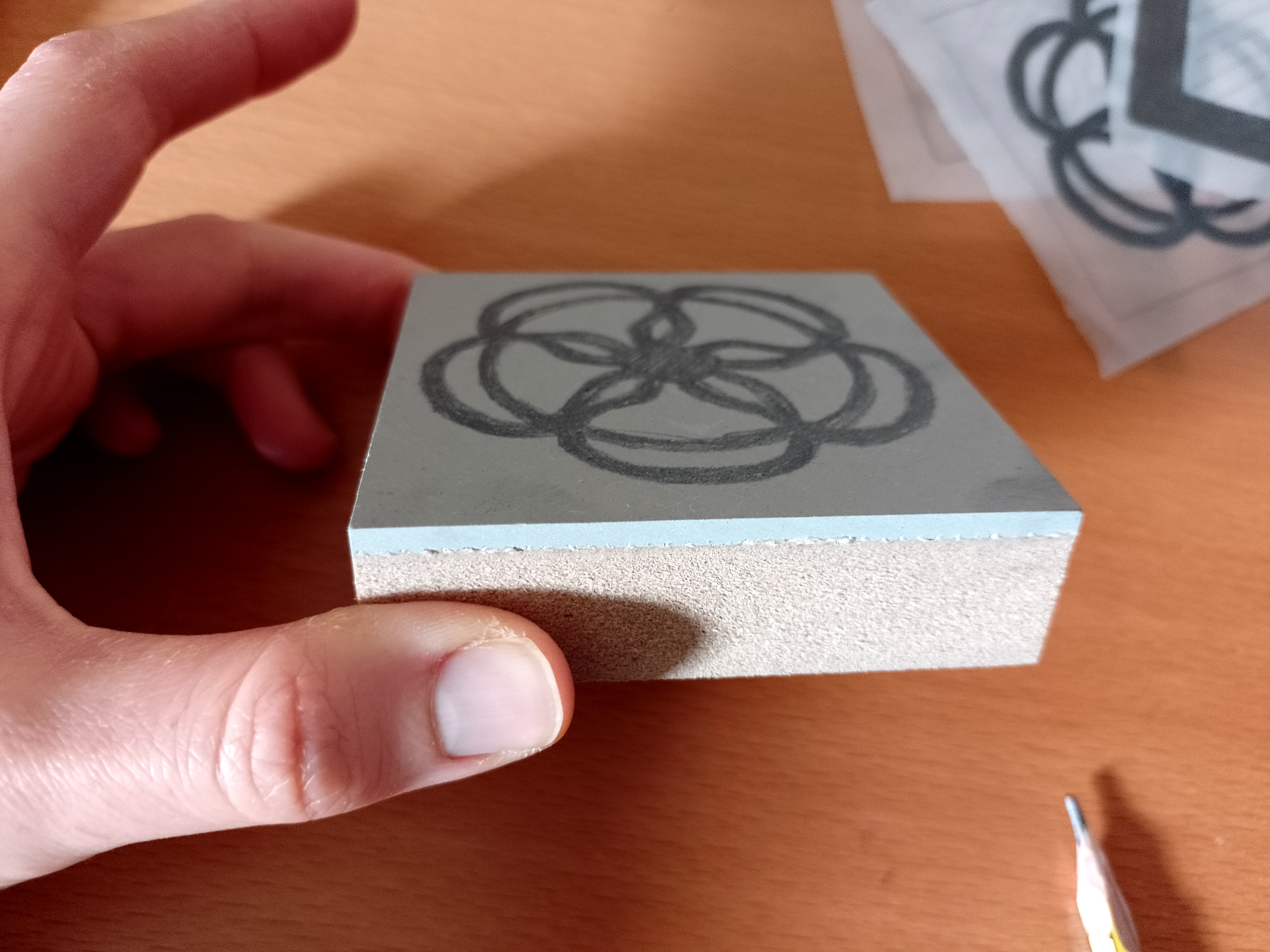
Cutting the Lino
Next was the part I was most apprehensive about as it was time to cut. I have a bench hook for safety purposes, but working on such a small piece of lino was extremely fiddly and I found it challenging to keep the lines smooth. I have a few different basic blades and began by using the shallowest and narrowest to make initial lines, which I could then flesh out with larger, deeper blades. It was difficult to feel how far to cut, but I much preferred using the mounted blocks rather than the lino sheets that I had previously used as the felt more secure and solid (although they are much more expensive).
Eventually I managed to cut out a pair of designs that were acceptable. I decided to stop at this point before I caused any irreparable damage!
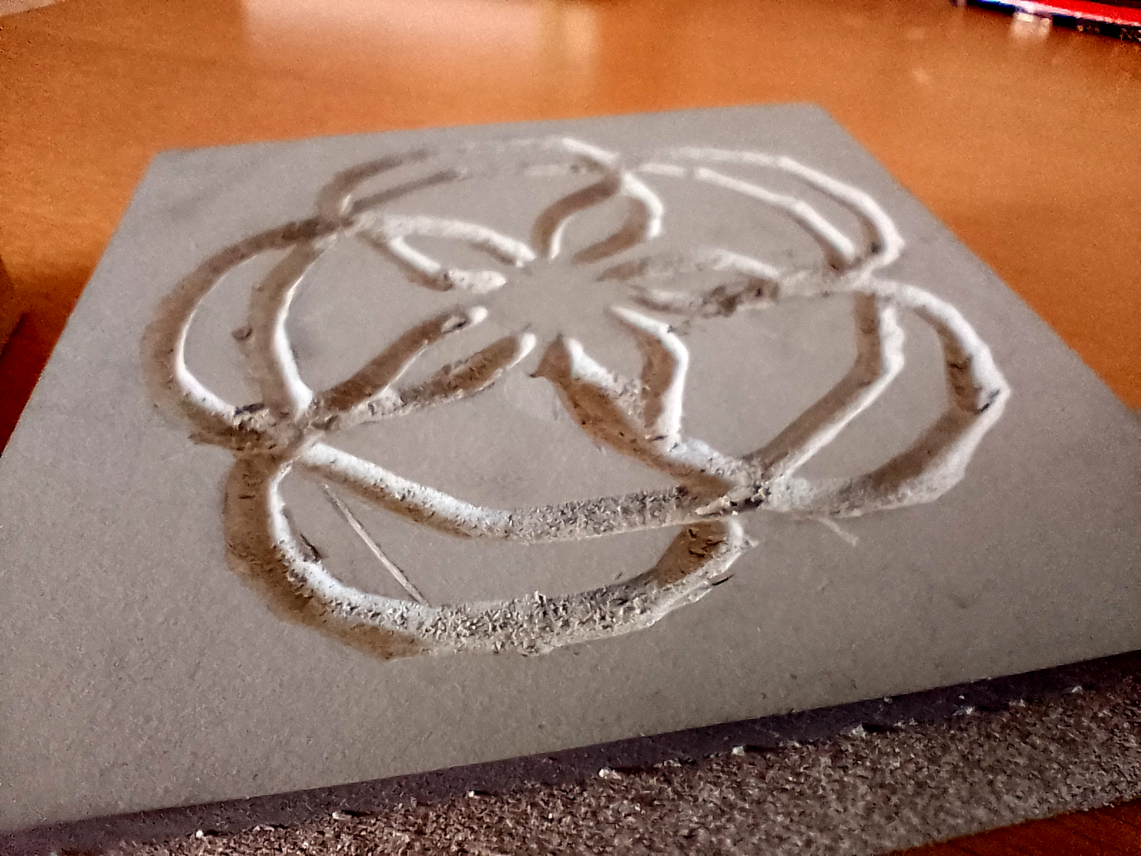
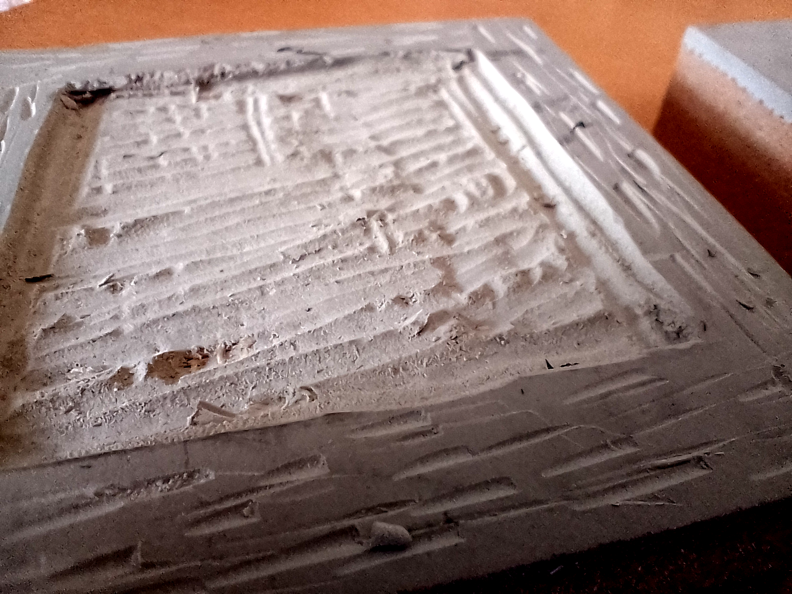
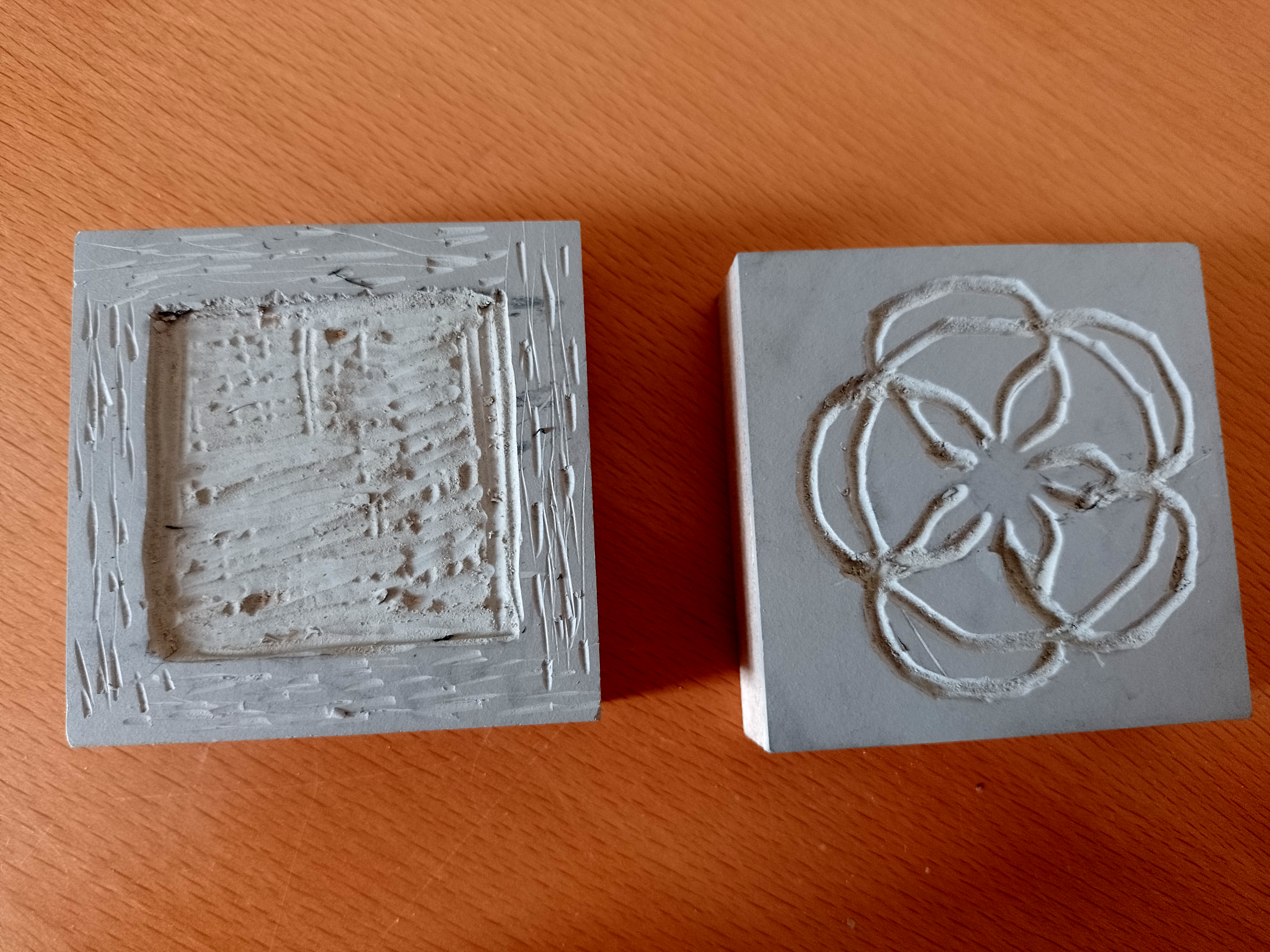
The final two linocut designs can be seen below.
Lino Printing
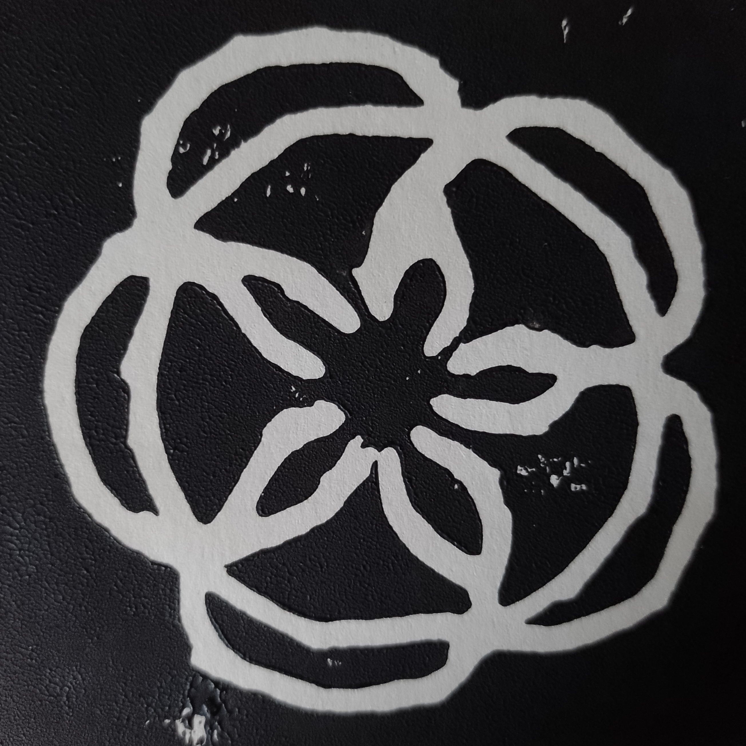
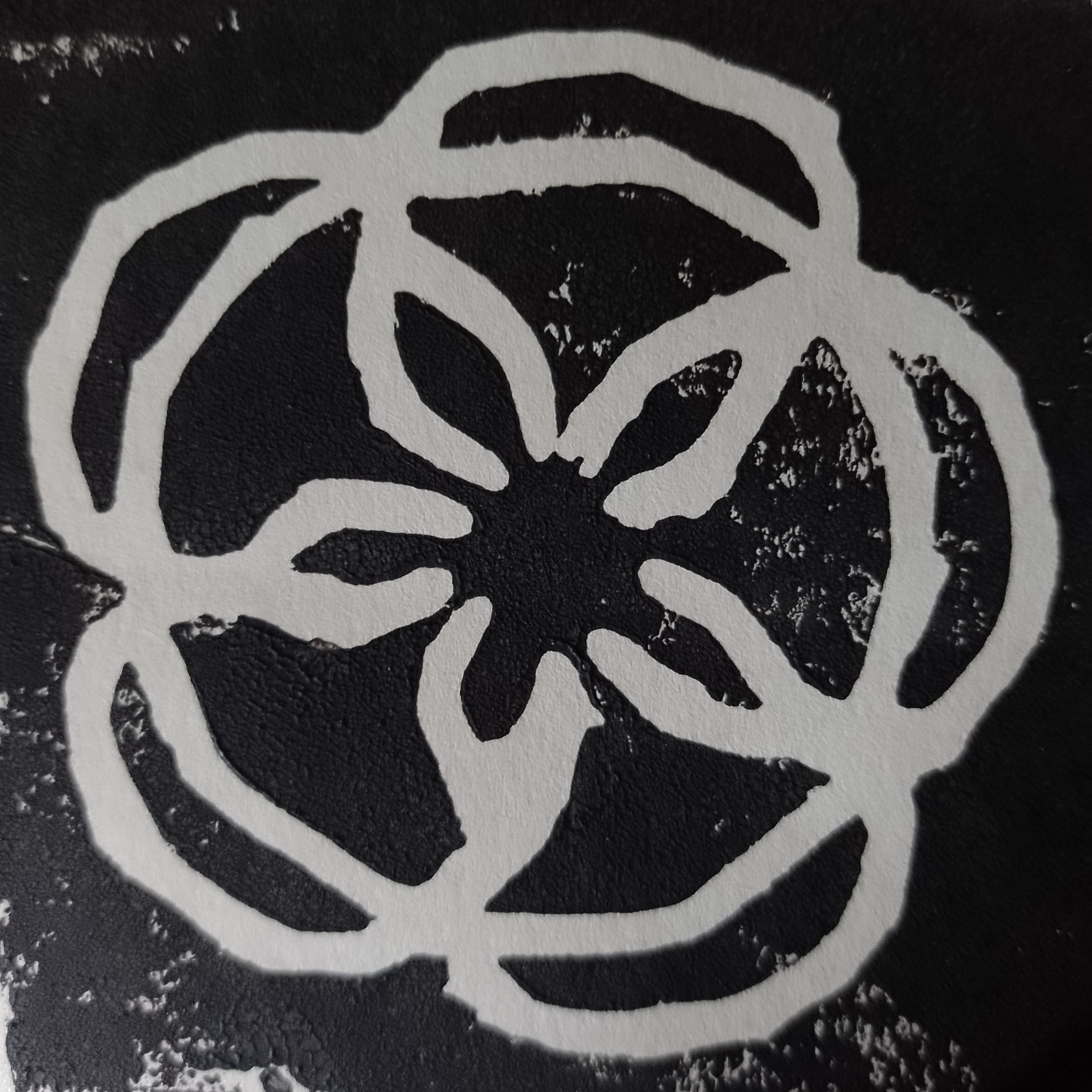
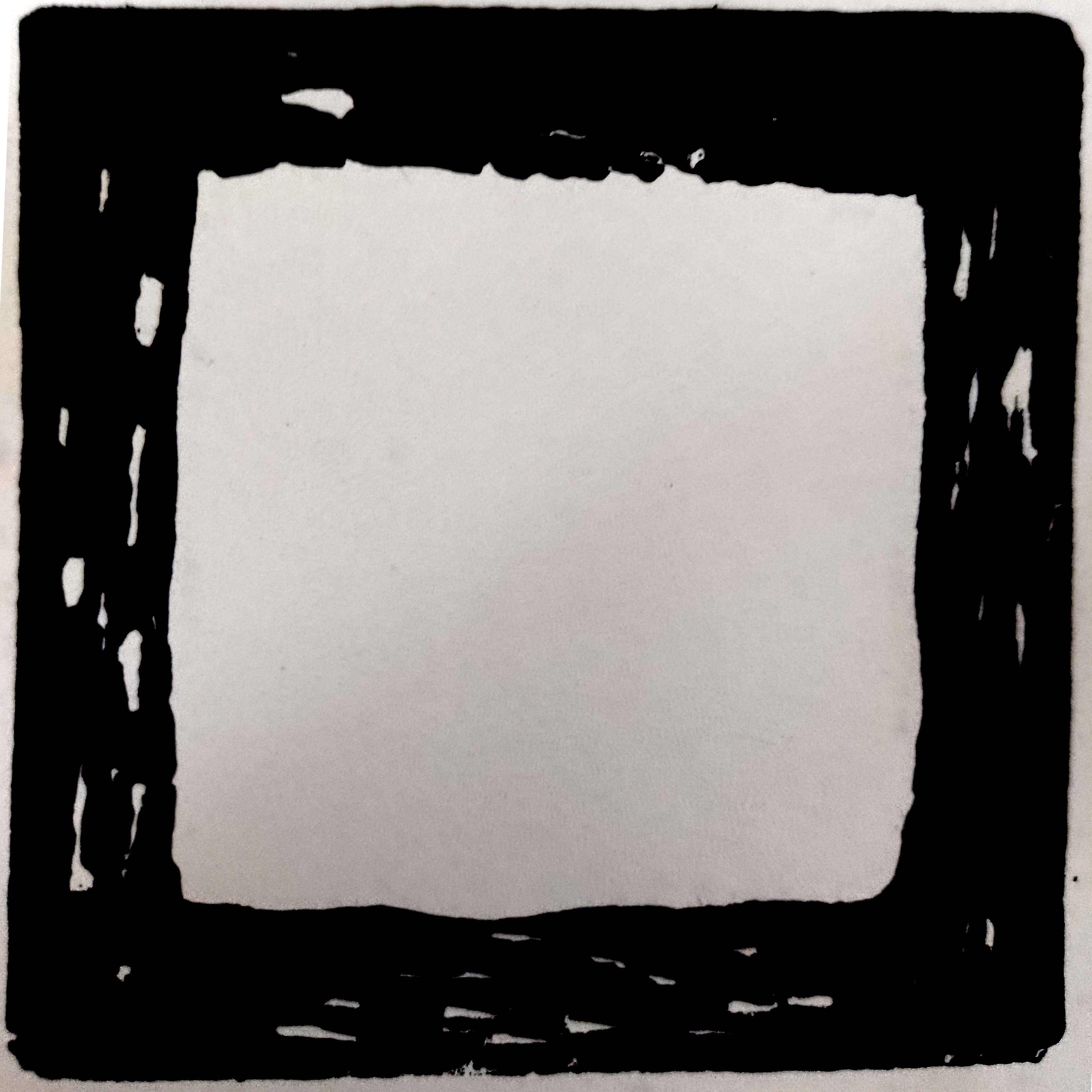
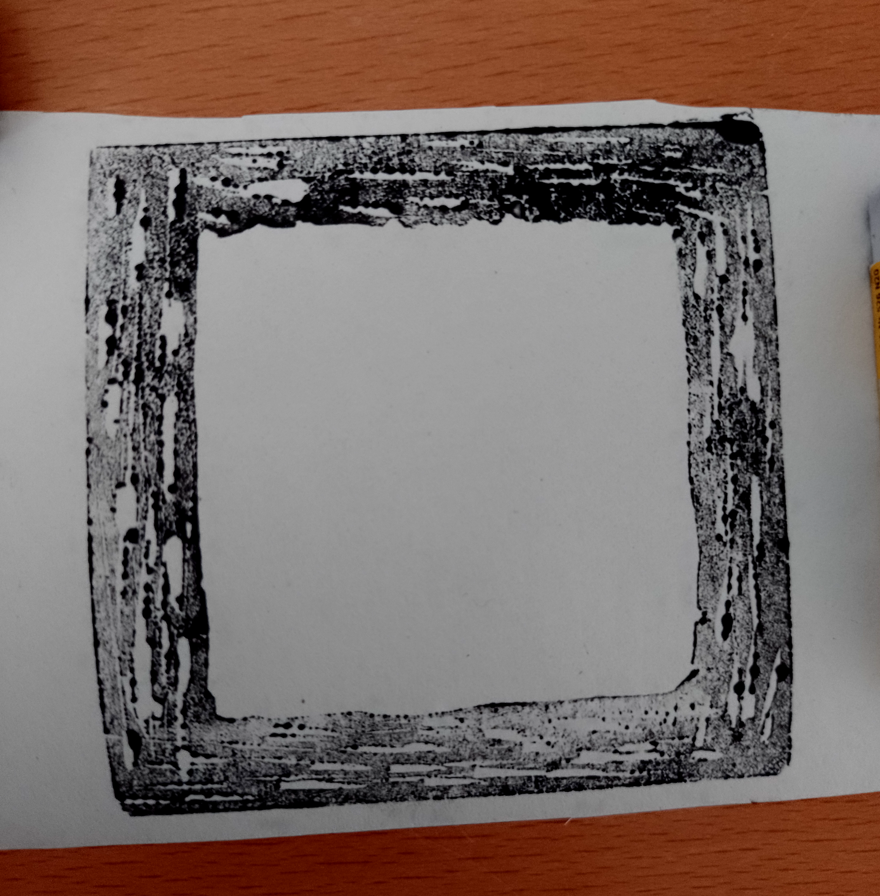
I inked up the linocuts and made several prints of the two designs. It was quite difficult to get the amount of ink on the lino just right so that all the raised areas were covered. However, in the case of the trellis, I preferred the prints that were more lightly inked as it added an ideal texture. Some of the prints can be seen below.


Moving into Photoshop
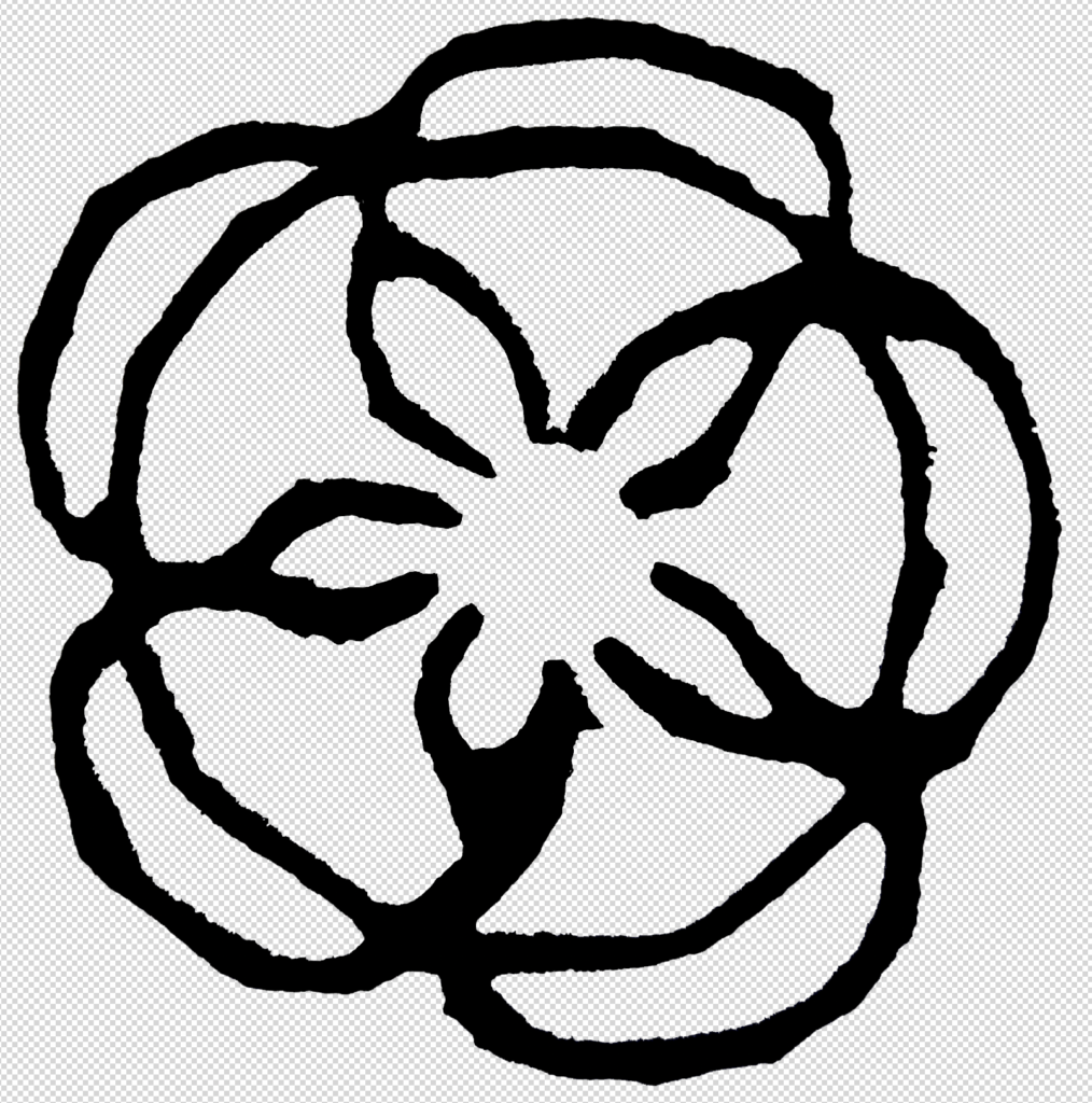
I decided to take a scan of the two best prints (below) and place these in Photoshop, which is another area I am gradually increasing my use of and improving my confidence with.
I worked on the flower design first, beginning by desaturating it.

I realised I could invert the colour so that the outlines of the flower became black against a white background. I also erased any erroneous marks.
I then made a selection of certain areas of the petals and filled it with colour.

Next I used a brush to join the inner edges of the petal so that I could select the spaces between these and remove the colour.

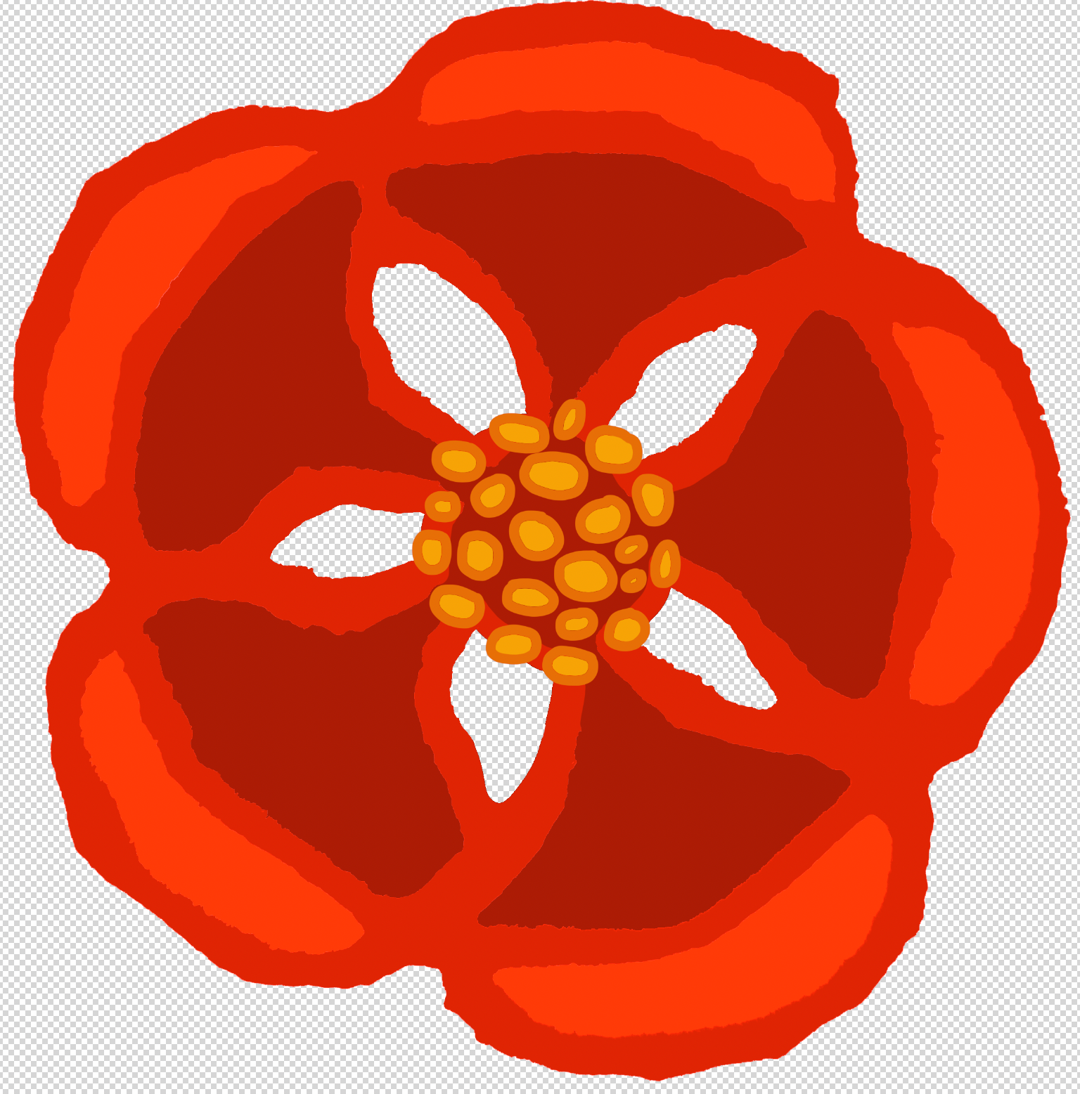
I added simplified detail to the centre of the flower and tried a few different combinations of shades of red.
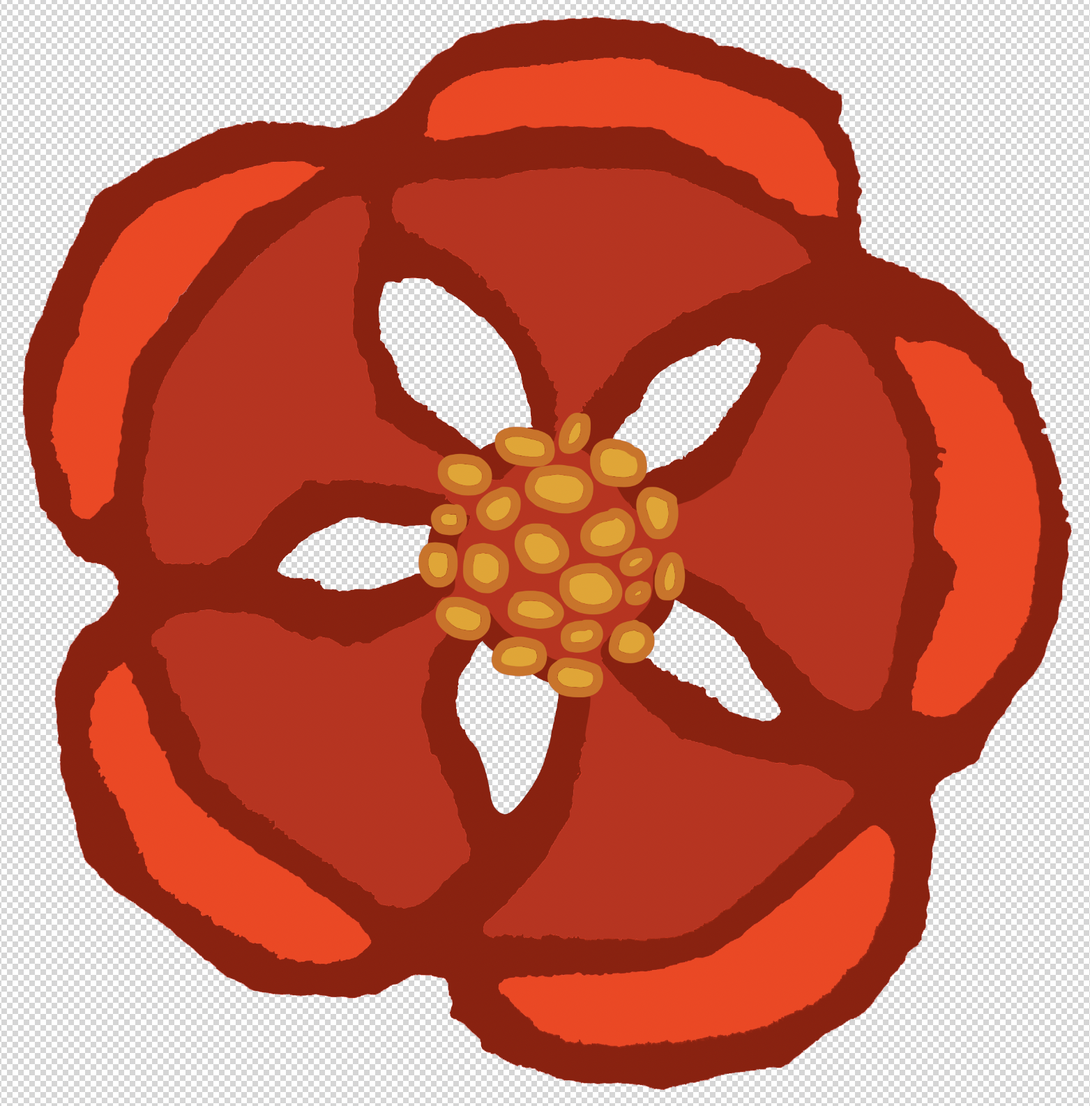
I opted for the version below.
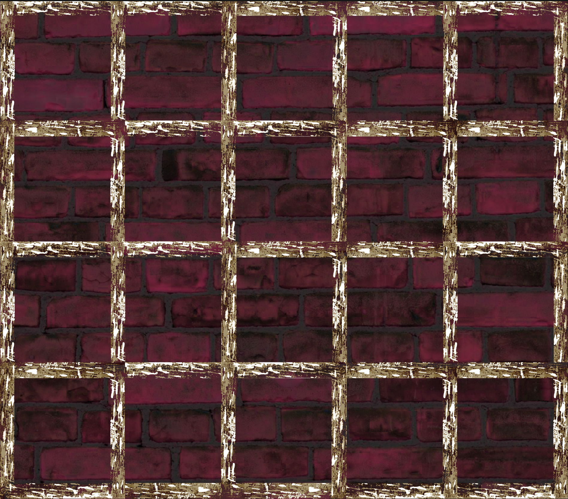
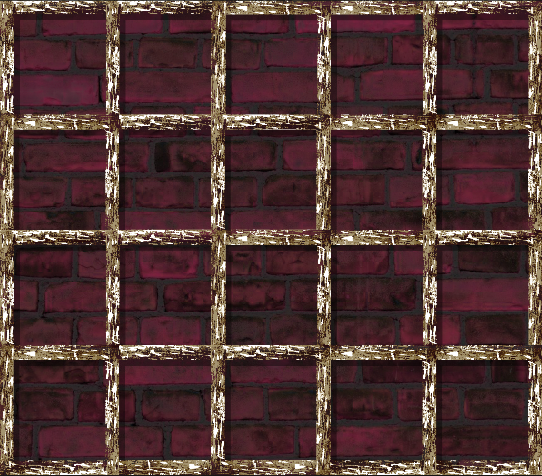
I moved on to the trellis, colourising the black to a more ‘wood-like’ hue of brown. I also decided to scan in a different trellis print which I could layer beneath the original, adding more texture detail.

Creating Composite in Photoshop
For this part of the exercise I only had vague idea in my head of what I wanted the final piece to look like, which is probably not the most ideal route. Occasionally I find that I work better just experimenting and seeing what the results are rather than always meticulously planning every step.
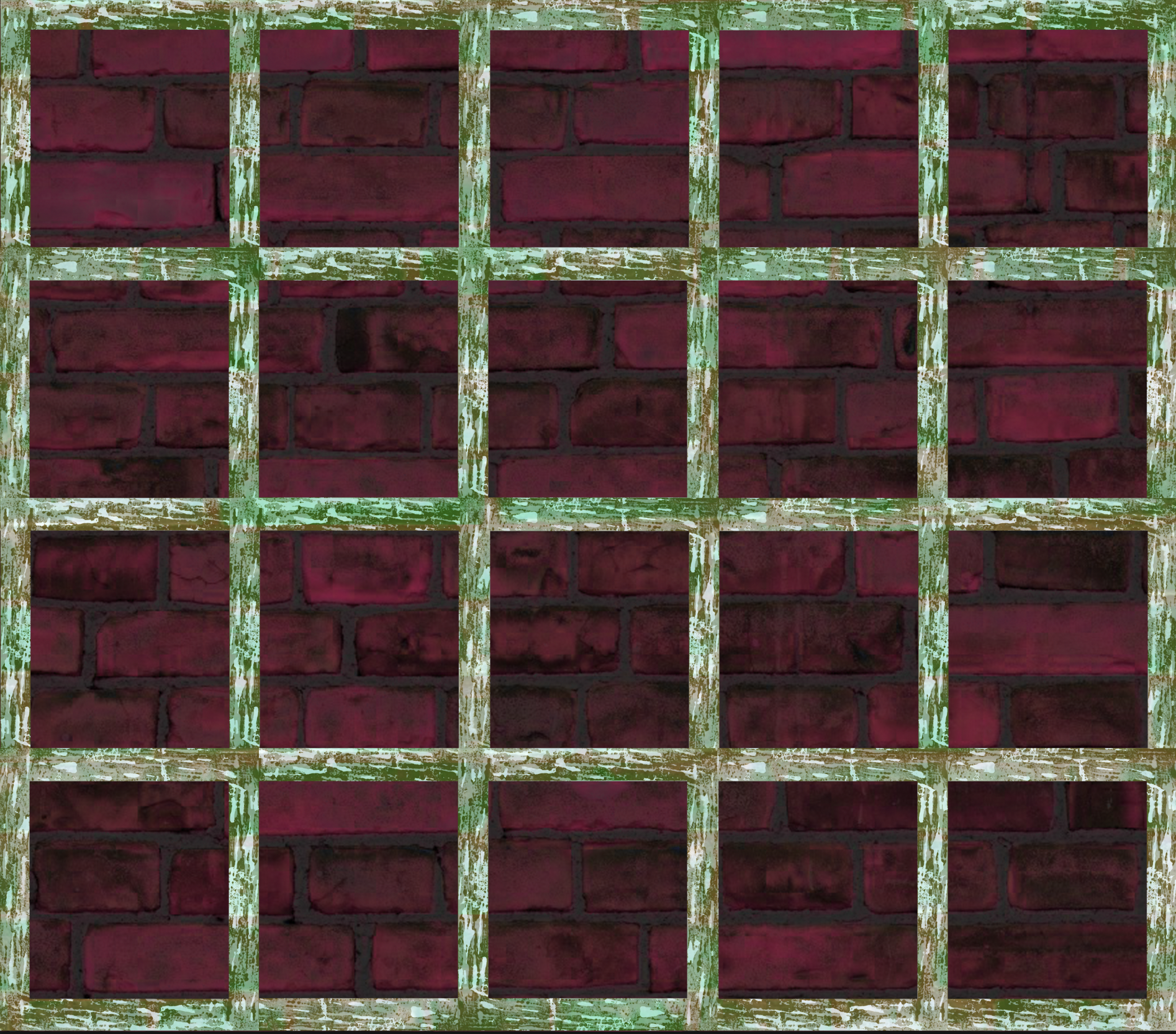
I wanted to have a go at creating a composite in Photoshop so that is what I decided to do. I created a square canvas and made several copies of the trellis square. I flipped this a few times to try an avoid obvious repetition, but I do not think this was very successful, if viewed closely.
I then added a brick wall texture to the background and played around some more with the blend modes and colourisation – I did not want the design to be particularly realistic so I just played with the different options.
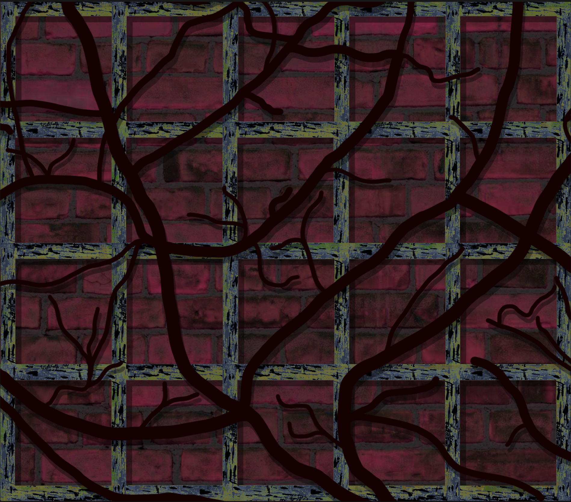
I made a copy of the trellis and moved this slightly across and down, along with darkening it and reducing the opacity, to create a shadow on the wall, adding some depth to the composition.
I continued to experiment with the colour of the trellis, settling on a more green hue to contrast with the reddish backdrop.
I then traced the lines of the branches of the plant (from the photo at top of write-up) using the brush. I kept this simple and bold. Once I was fairly happy with the section I layered this over the trellis.
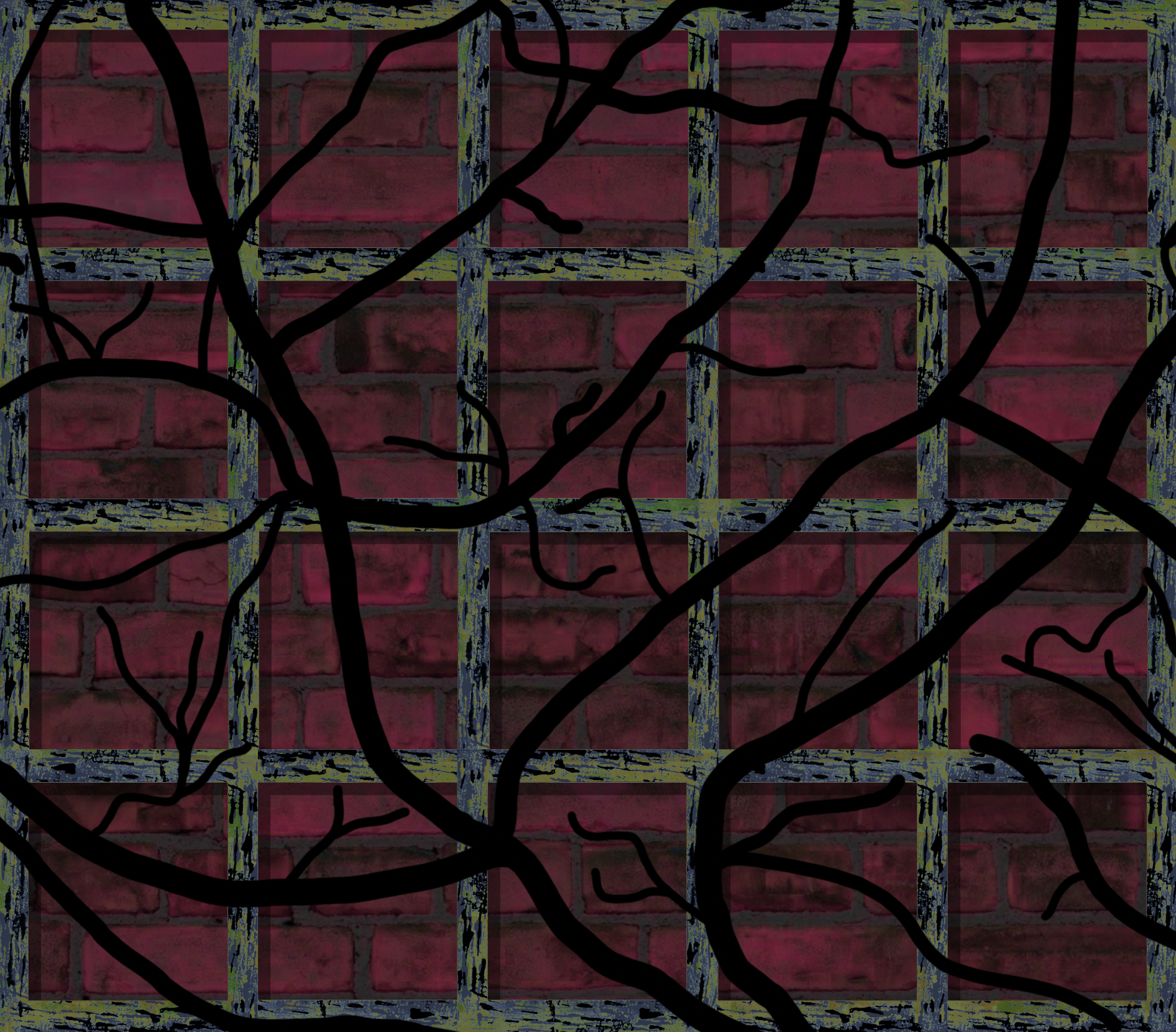
I added shadows behind the trellis.
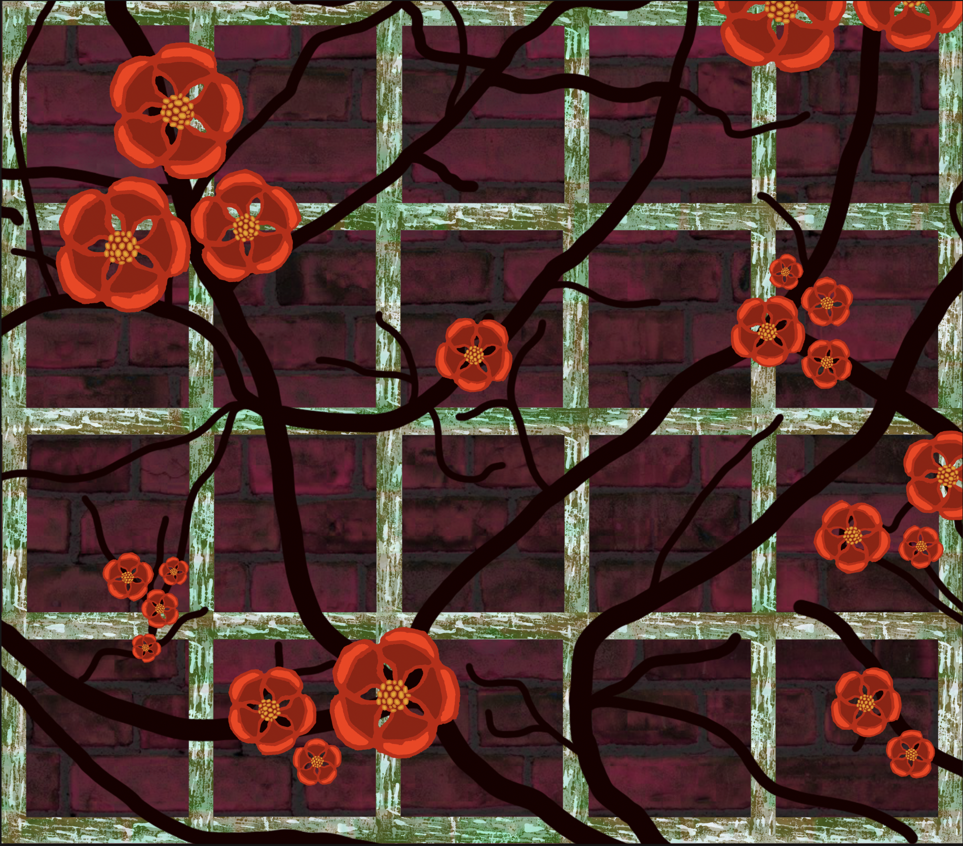
Finally, I added the some groups of the petals around the composition. As with the trellis, I did rotate the flowers, but it would definitely have been better if I had a range of different flower designs to include and therefore would avoid obvious repetition. I also continued playing with the blend modes of layers.
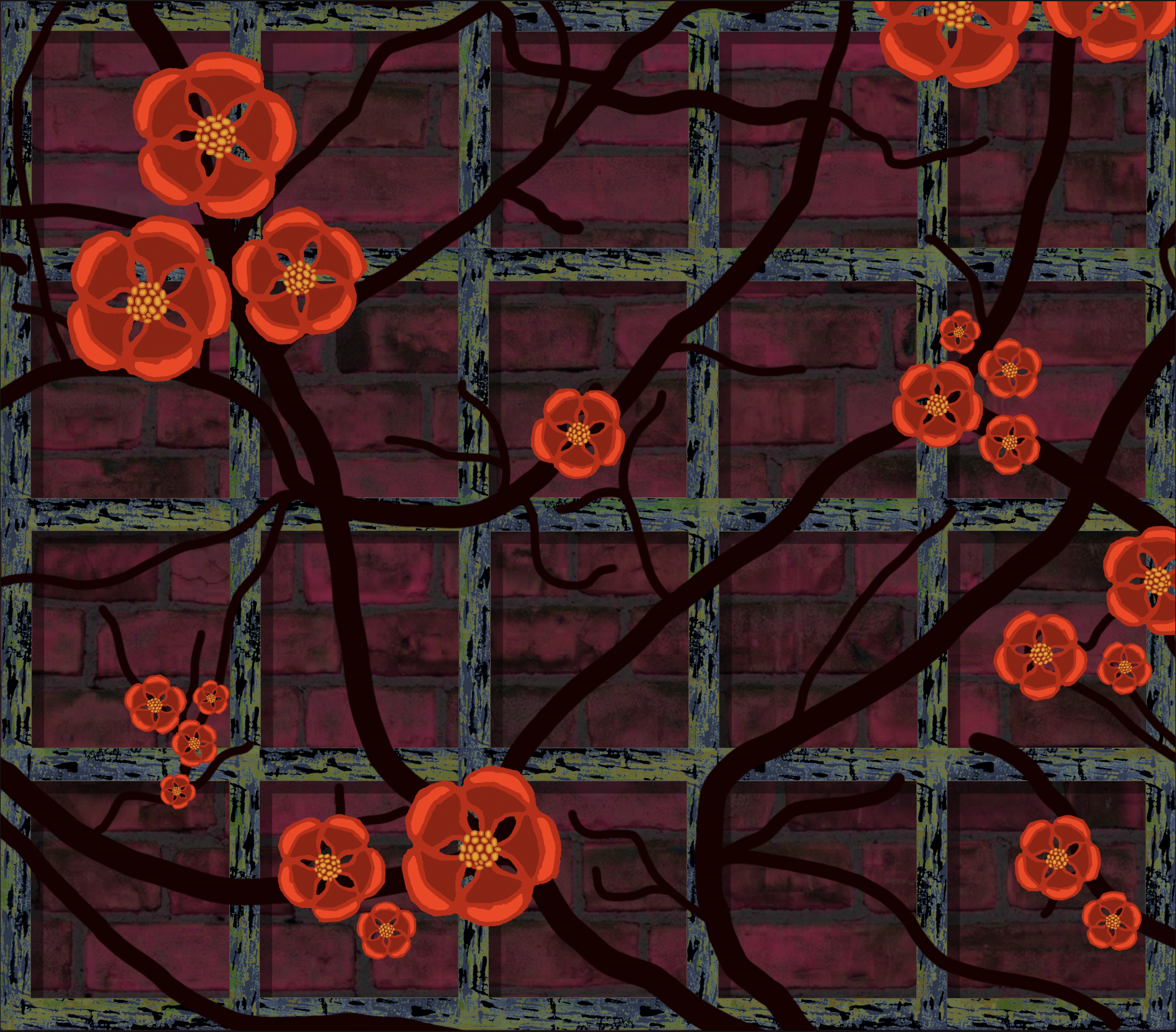
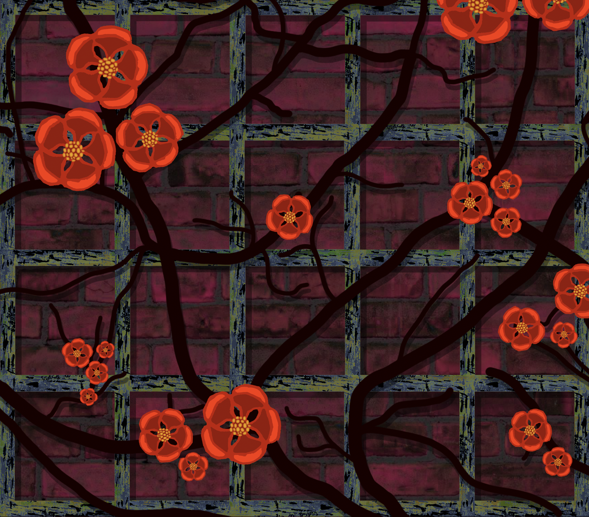
Final Image
The concluding addition that I made was to overlay the entire canvas (minus the flowers) with a texture, which I then adjusted the blend mode and opacity of. The final version of composite can be seen below.
Final Thoughts
Out of all the exercises in Part 2, this exercise was the one that I found to be the most enjoyable. I liked the contrast of the two tasks – the traditional, observational drawing to begin with before moving onto the more abstract, open option. I have been working to maintain a regular habit of observational sketching so I was keen to do this with the Japanese Quince.
As previously stated, I found it quite the challenge to replicate the sections of plant as true to life as possible – there was plenty of subtle detail and the overlapping of petals to contend with, both of which confounded me several times. I finished my attempts with an even greater respect for the botanical artists, such as those at Kew Gardens, that I had learnt about in the previous Research Point.
Overall I was quite pleased with the set of drawings that I produced. I am not sure how recognisable these are as being a specific plant, but I think they do look at least vaguely like the Japanese Quince.
Although I would normally like to have a set plan to follow, it was quite freeing to just have a vague notion of how I wanted the final piece for the second part of the exercise to turn out. I knew I wanted to have another go with linocut printing, so I am glad that I implemented this. I believe I am gradually becoming more confident using this media and, as previously stated, I will definitely look to continue to develop this, working on larger and more detailed prints.
I am also pleased that I have become less hesitant about using Photoshop and I like to combination of analogue and digital, as the former makes the artwork look less ‘perfect’, whilst the digital allows for an endless number of ways of enhancing this. I saw this exercise as an opportunity to experiment and become more familiar with the tools. I was particularly satisfied with the final appearance of the trellis, e.g, the texture and colour, (despite the repetition).
In terms of the final piece, I have already stated a few issues with regards to repetition, for example, but other areas that I feel could have been explored to improve the results include:
- using a long and narrow canvas rather than a square one, which would have boosted the impression of the trellis/plant being attached to a wall.
- experimenting with alternative brushes when painting the branches, for example, one that would allow the ends to taper off.
- developing the blending of the layers so these seems more seamless. Currently, when viewed up close, the layers appear fairly disjointed.
Despite these points, I was fairly happy with the final piece and feel it looks better viewed from a distance. I think the colours work well together and it has an unintentional, slightly creepy atmosphere about it. I am not sure whether it meets the brief’s requirements of ‘capturing the essence of the plant’ though…
Bibliography
Newling, R. (n.d.) Still Life Linocuts Gallery – Rachel Newling. Available at: https://www.rachelnewling.com/linocuts-still-life-rachel-newling-gallery-1 (Accessed 18 February 2023).