Throughout the course you have responded to lots of briefs in the form of exercises, research points and assignments. This final assignment offers you the opportunity to either undertake a self-directed project OR undertake a competition brief OR work with a client on a brief.
Hopefully this course has told you more about who you are as an illustrator, where your interests might lie and what suits your particular approach to illustration. This assignment will extend that exploration by giving you the opportunity to put it into practice. Before you start work in earnest, send your tutor a copy of your brief and a summary of how you propose to respond to it so that your tutor can check you are thinking along the right lines and that you are attempting something that will stretch you and show the assessors (if you choose to go down this route) and others what you can do.
Initial Thoughts and Outline of Idea
I opted for the self-directed project for this assignment. My choice was greatly influenced by the Critical Review I had just completed, in particular the work of Shaun Tan, so I would consider that to be the research element for this assignment.
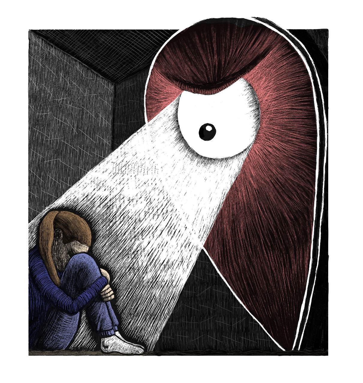
The brief I decided on required me to expand on a particular image from my submission for Assignment 4 – You Are Here. This was a self-reflective piece of work that was related to my personal experience at that time (sadly, I did not know then how much worse everything was going to get!). However, if the image is only offered without any explanatory text or just accompanied with the words ‘You Are Here’, it allows the viewer to make their own interpretations and potentially project their own experiences or feelings and, therefore, meaning onto the image.
The idea I had for this Assignment was to expand on this concept by producing a series of loosely linked, sequential images with the theme of You Are Here, using the same stylised character and marker in different situations, which could potentially then be collated into a book.
Sketches
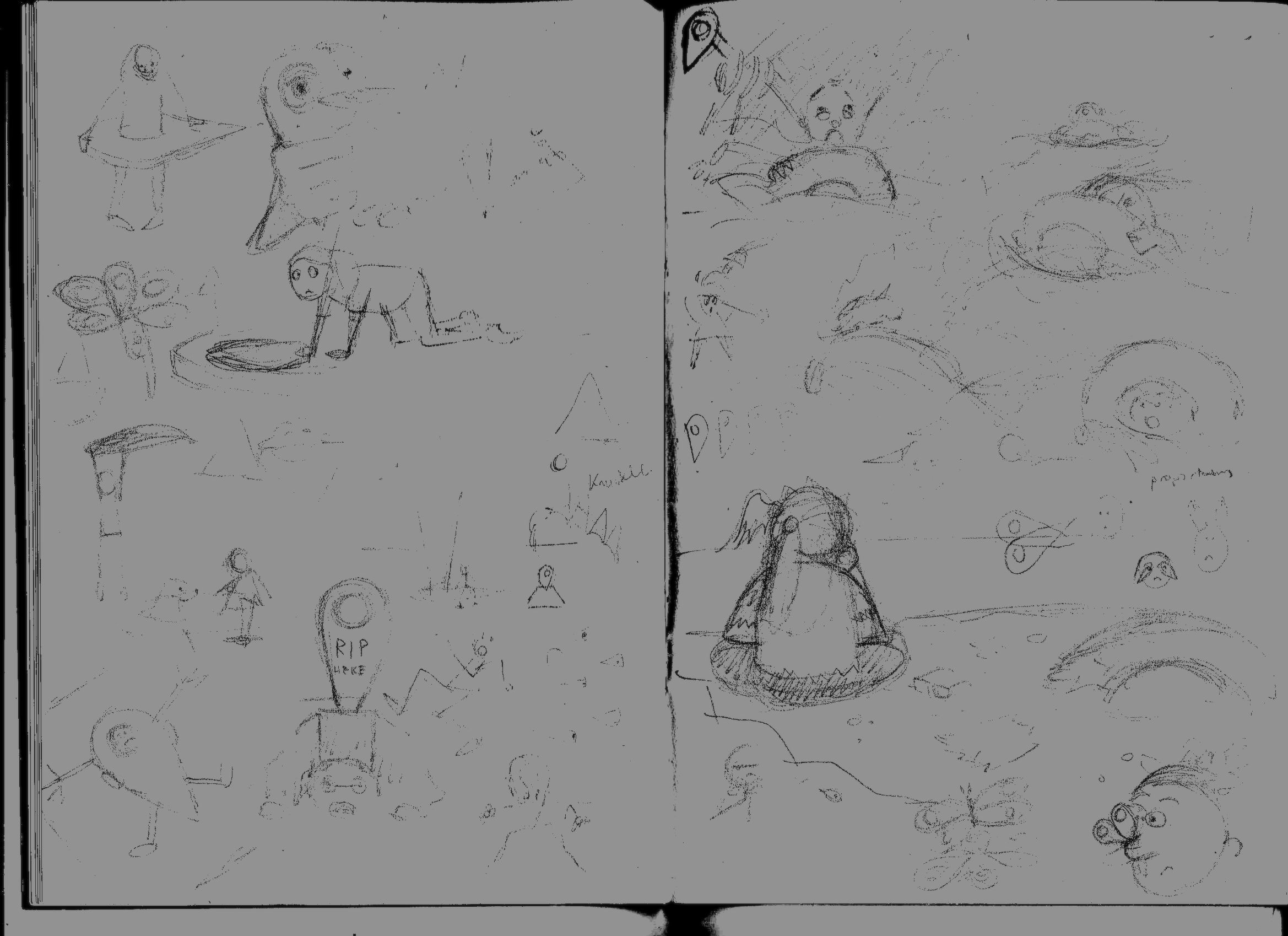
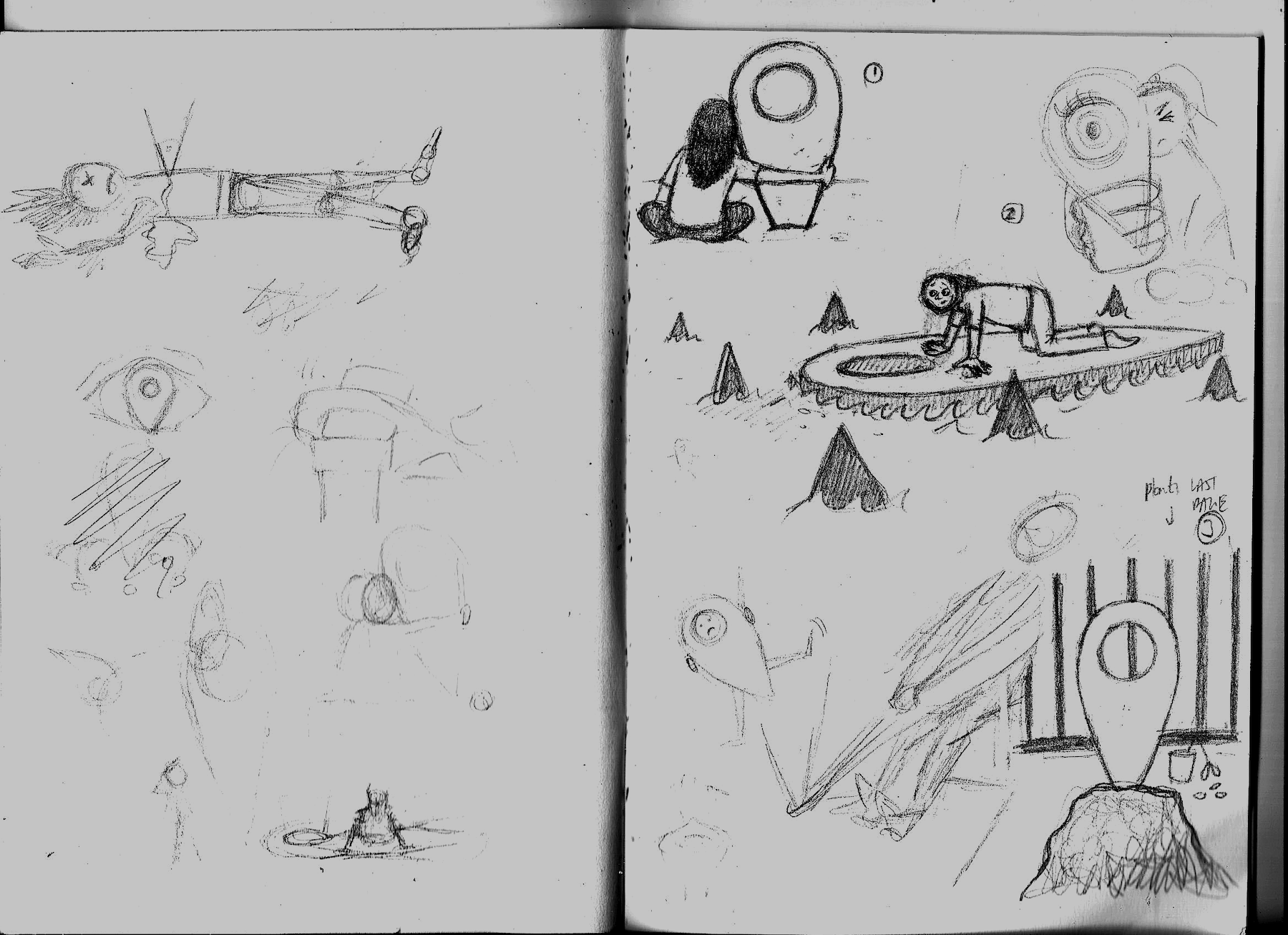
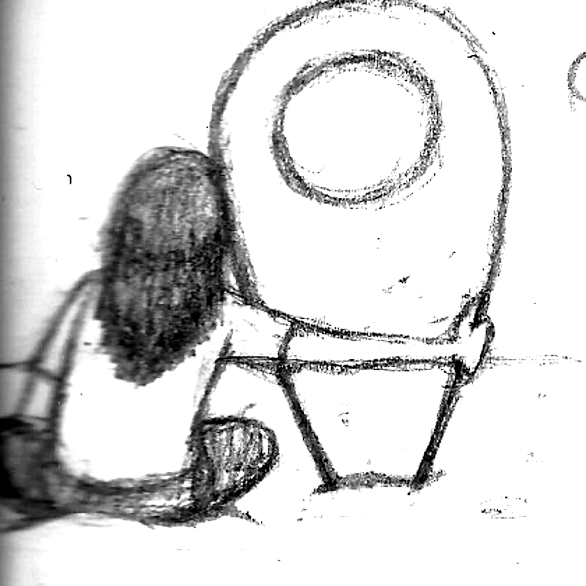
I spent some time sketching out possible scenarios for the character and marker. Some of these were more humorous than others. I hope it is possible to see these properly as some of the drawings did not scan very well.
Chosen Images
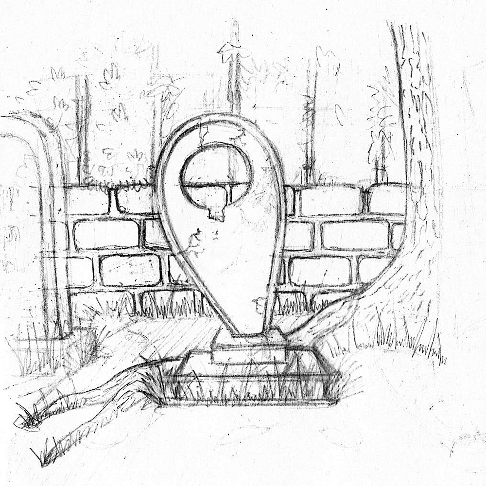
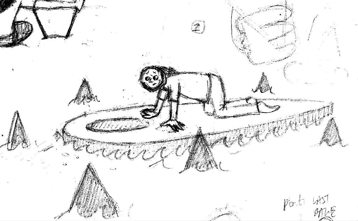
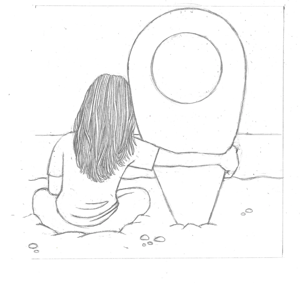
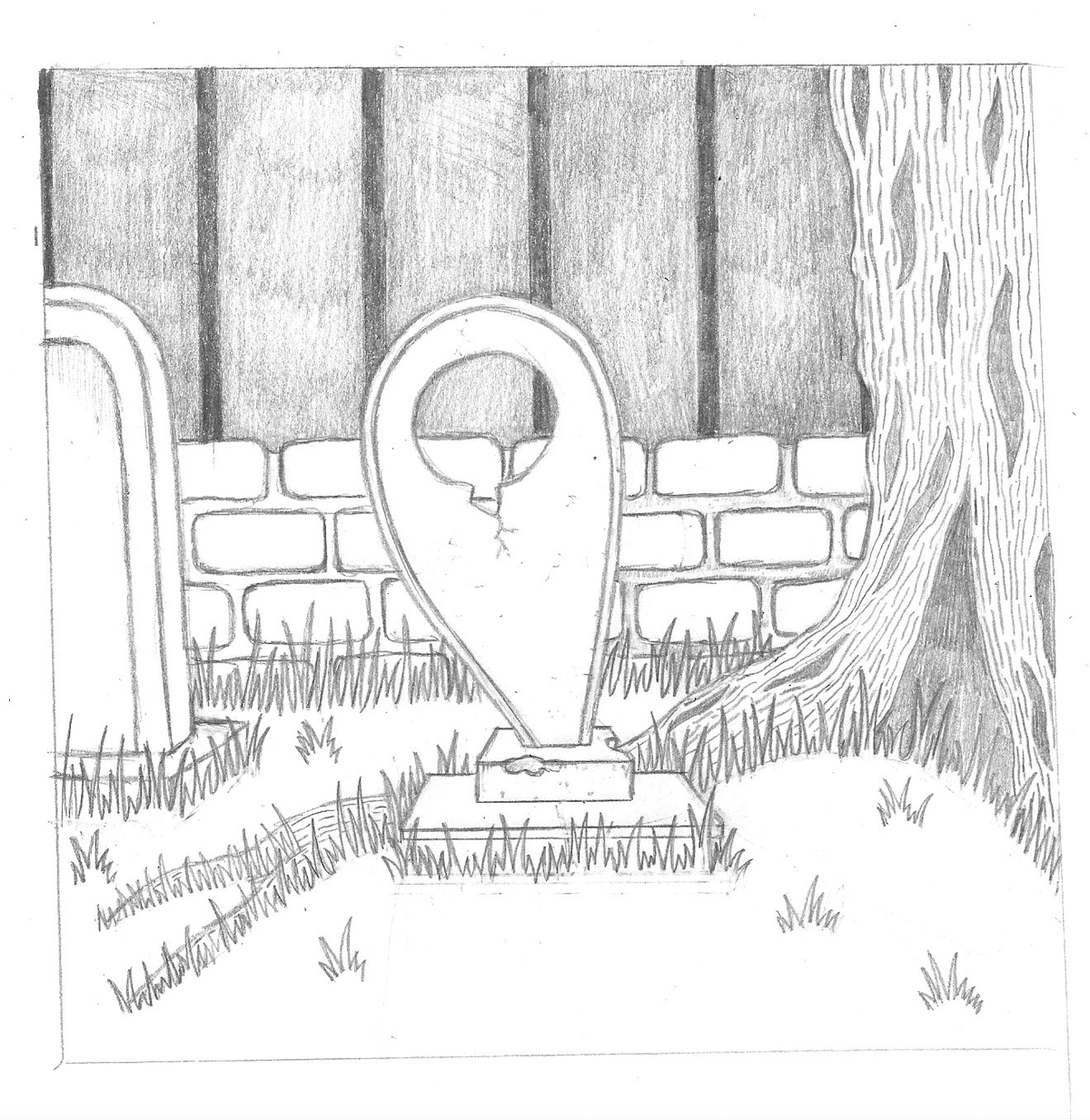
From the sketches above I selected three that I felt would fit quite well together in the series and should be developed further. I wanted the illustrations to be more serious in nature rather than have an overtly humorous tone, which is quite unusual for me. I tidied up the sketches and made some more decisive lines.
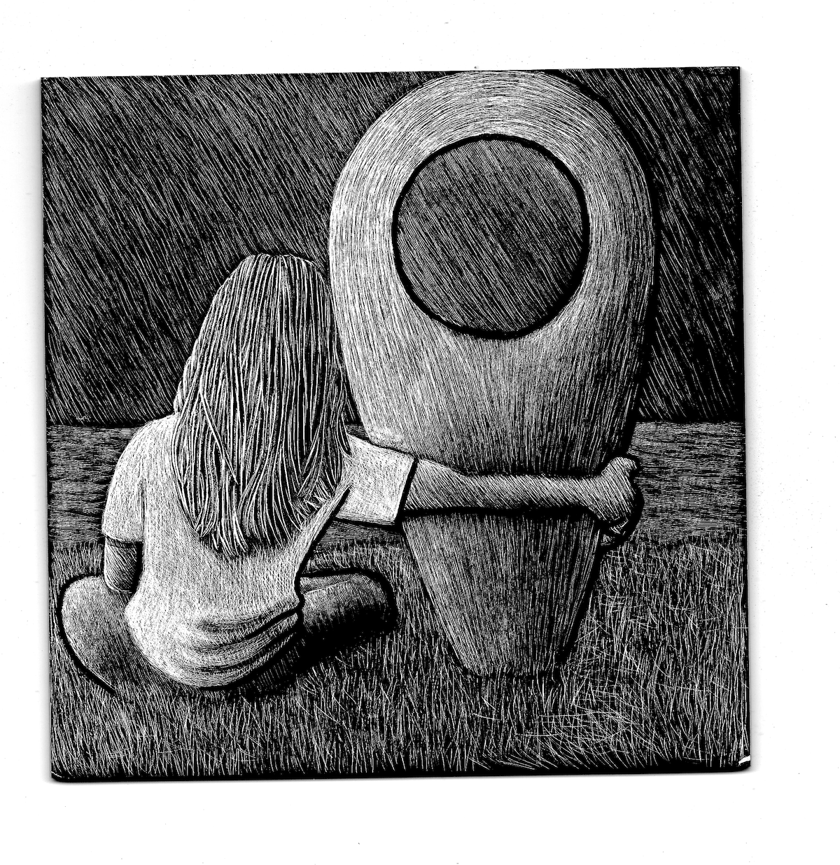
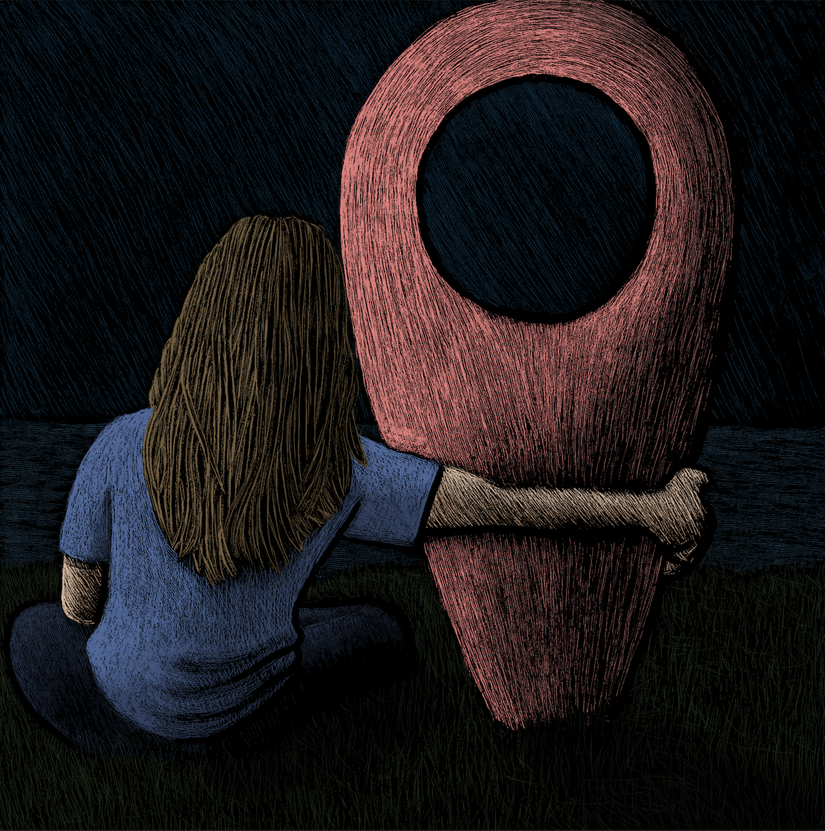
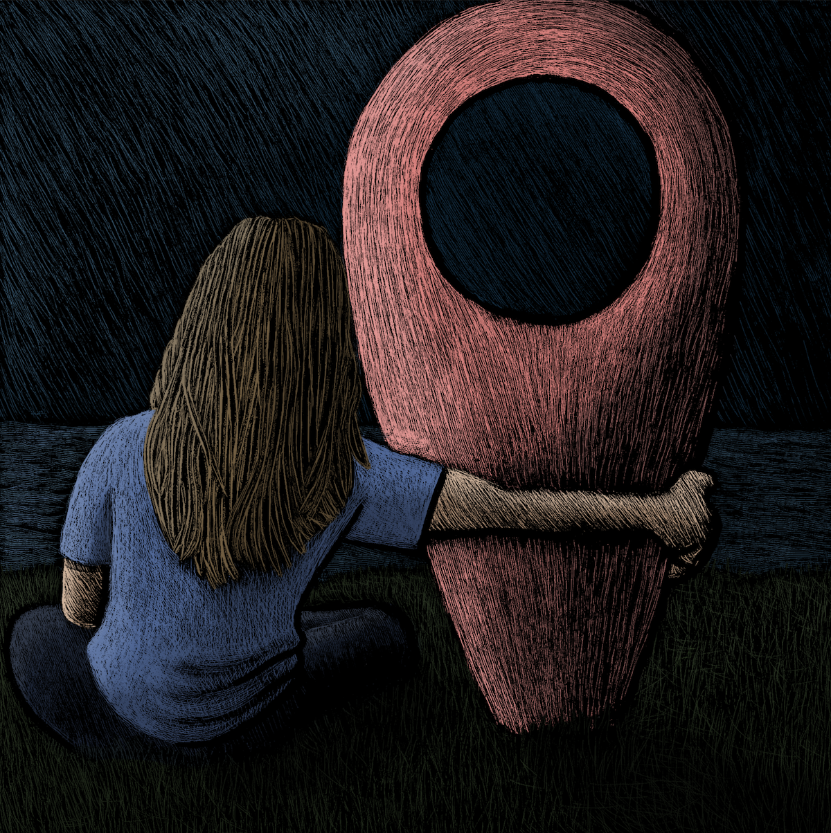
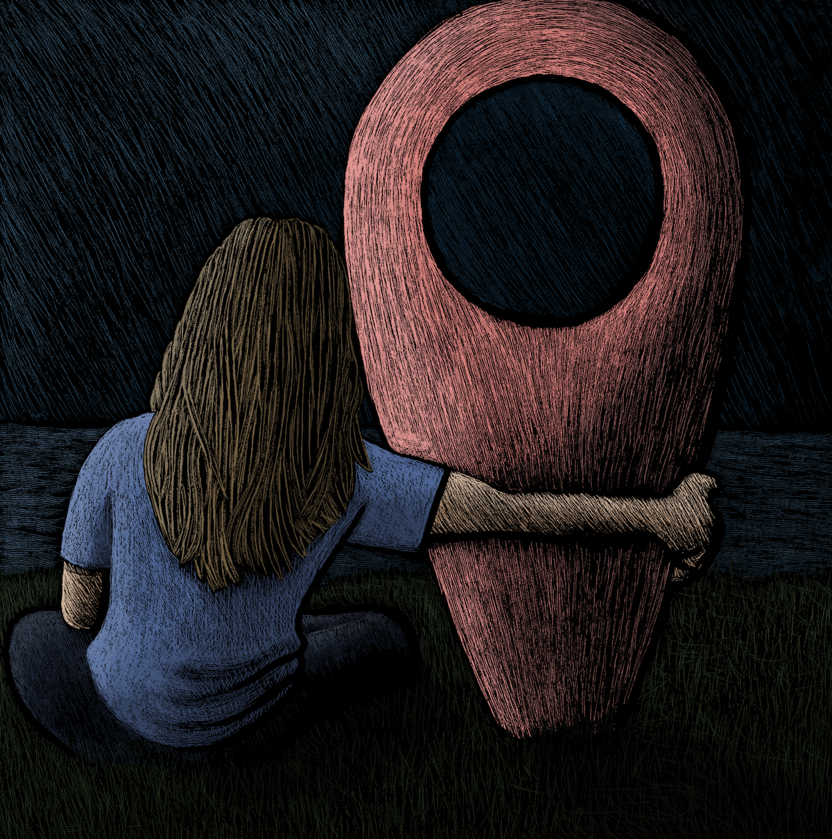
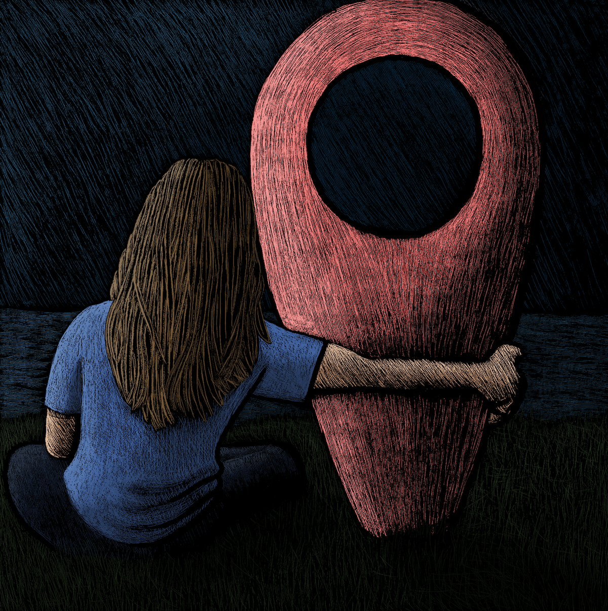
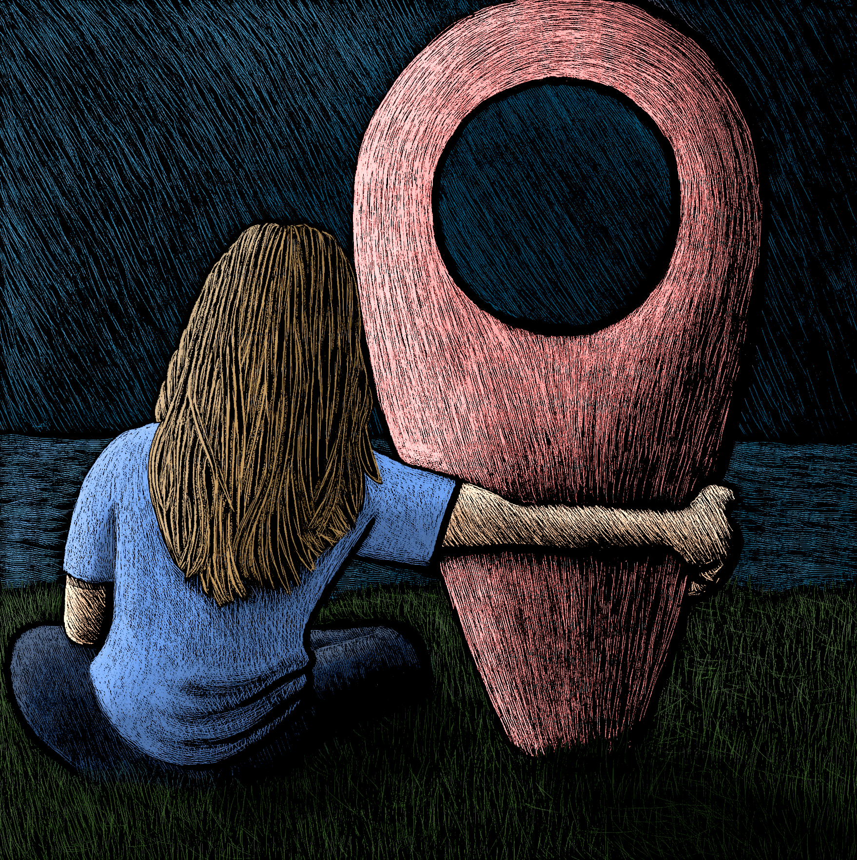
The first option would have the back view of the character with her arm around the marker, possibly sitting on a beach looking out at the sea, which I felt was quite a pensive image.
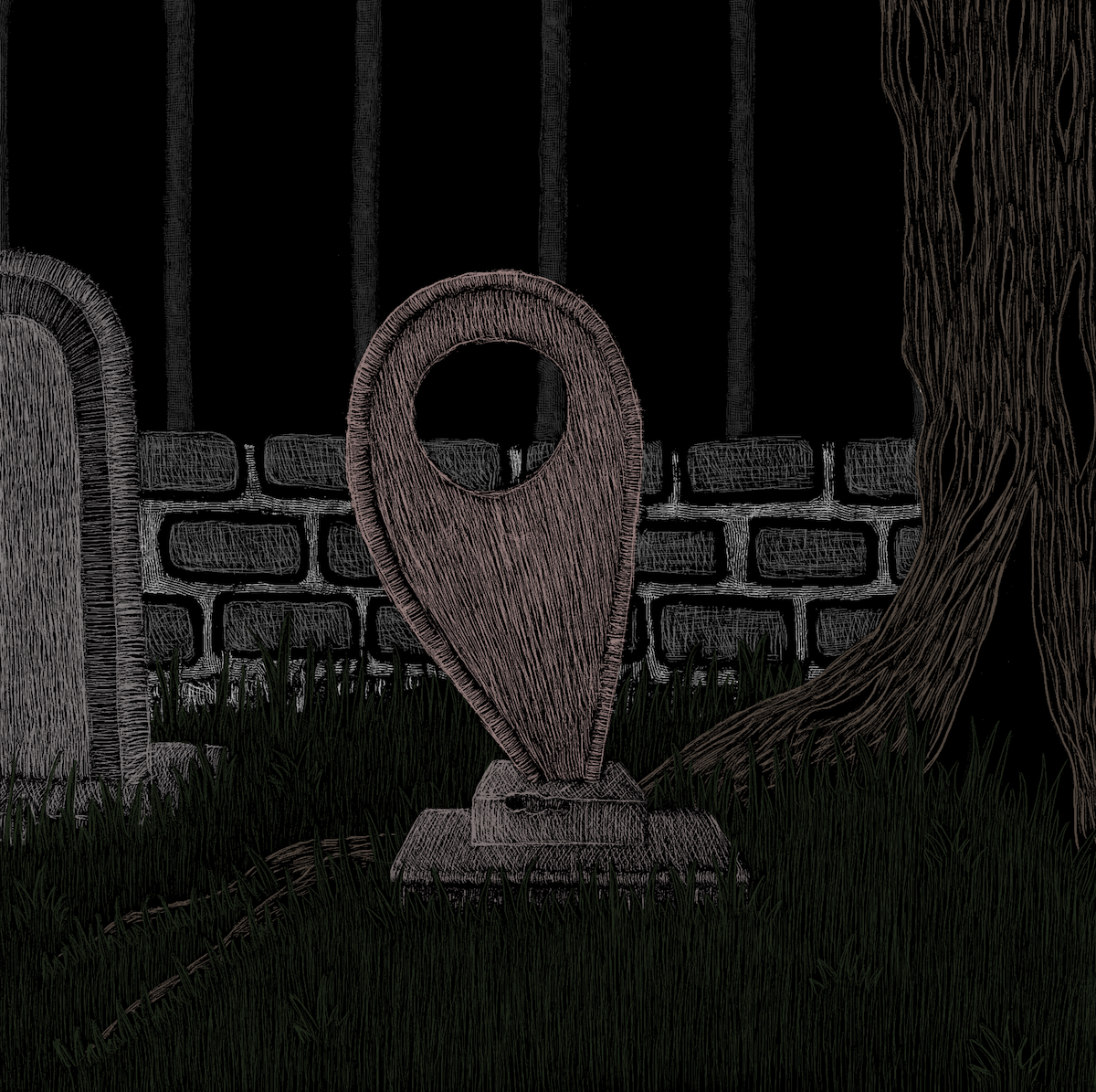
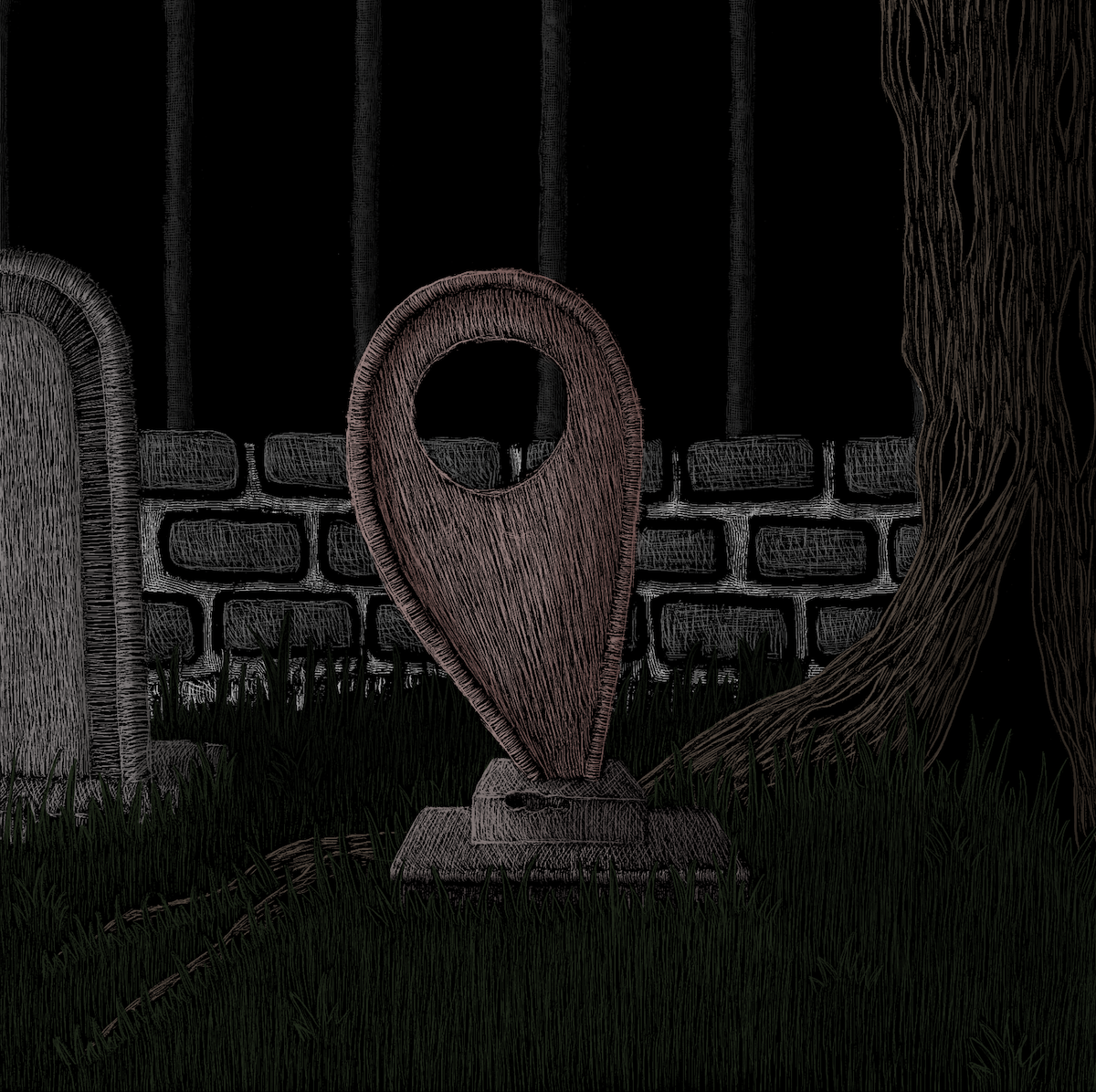
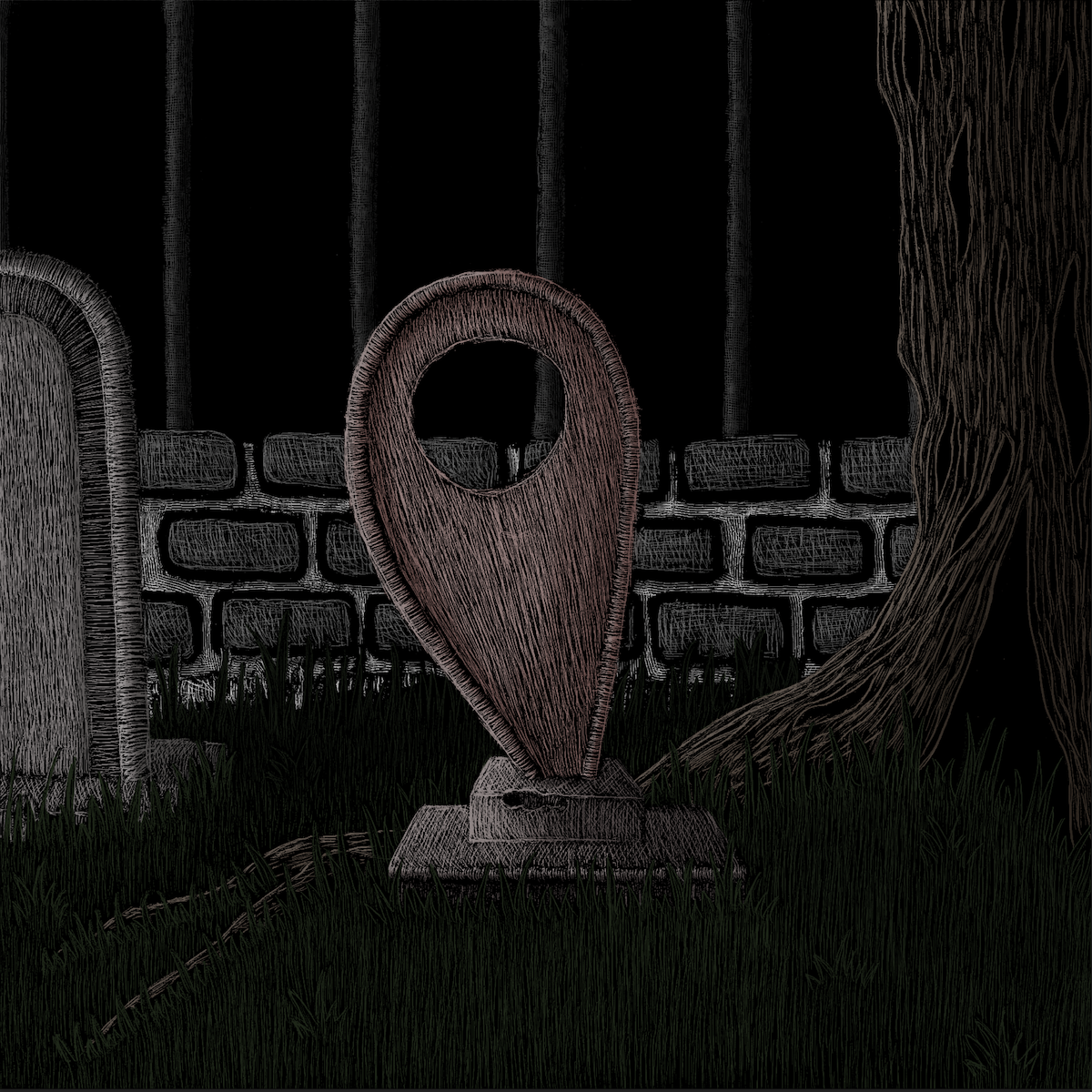
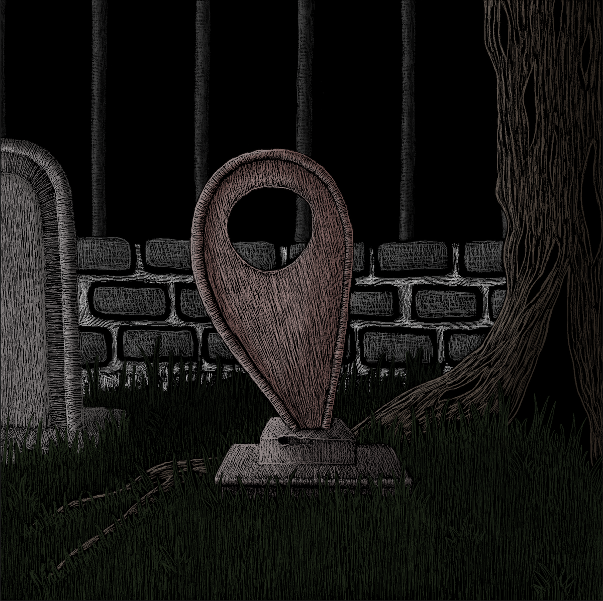
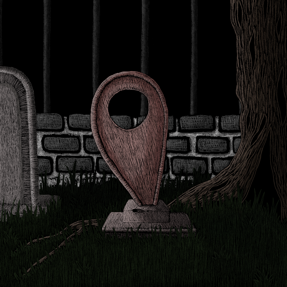
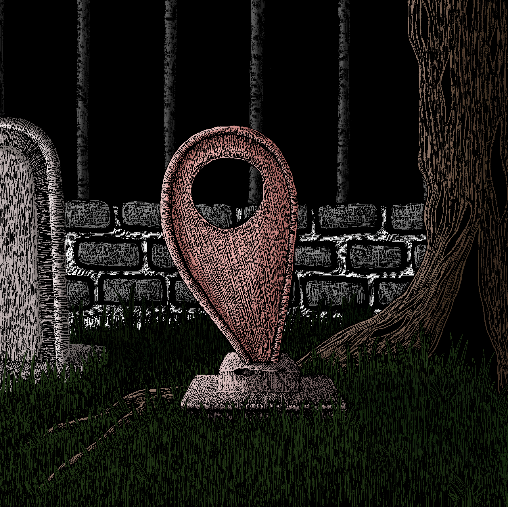
The second option, which I thought would be a good choice as the last page in the book for obvious reason, would have the marker as a gravestone.
Another option was to have the character crouching on the marker, using this as a raft in choppy waters, surrounded by the fins of sharks, which would be the tips of other markers (the same colour).
I would have liked to expand on all three of these options, but I decided to limit myself to two, with the possibility of doing the other one if time allowed. After some internal debate, I chose to develop the first two options.
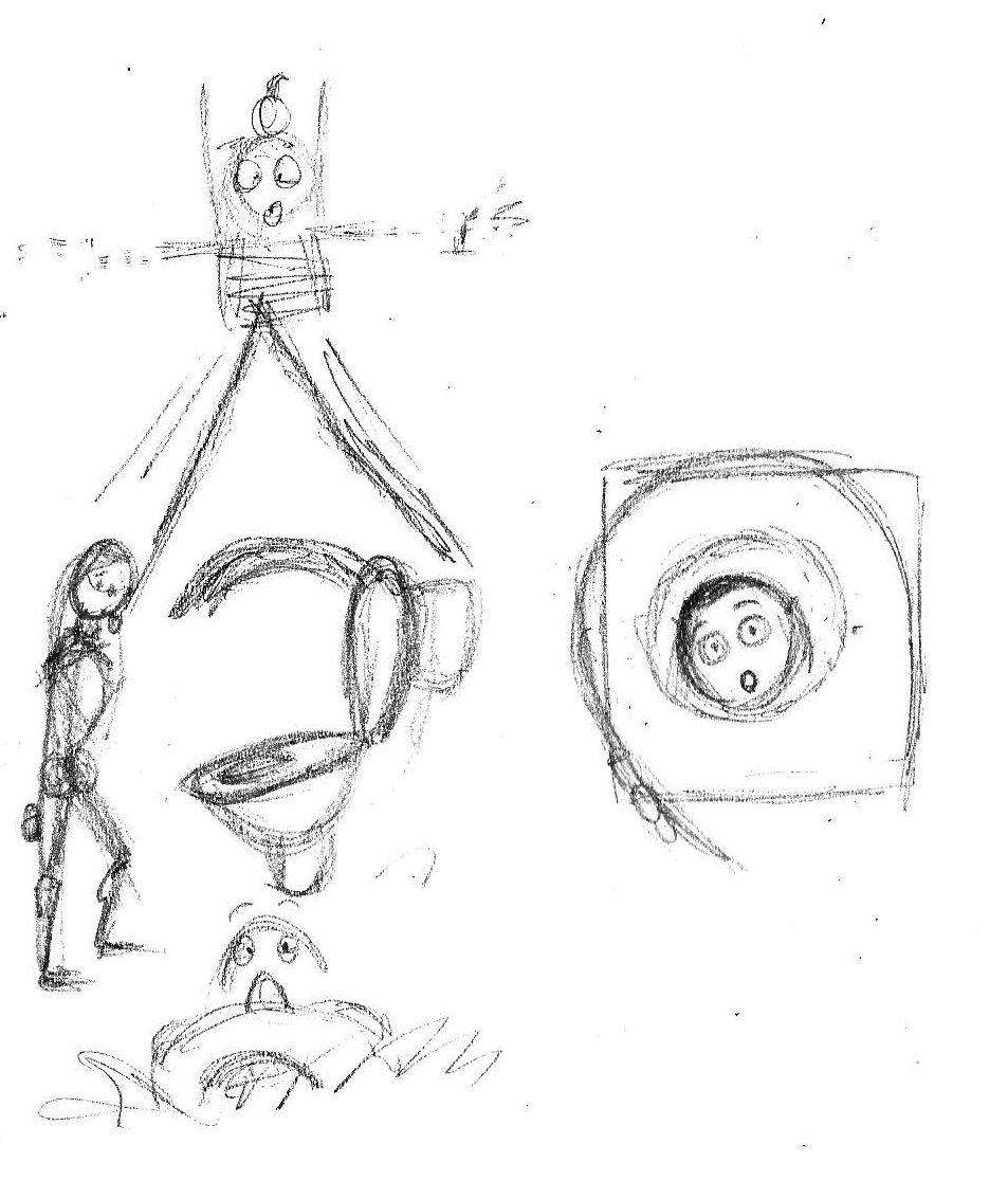
Cleaned Up Versions
Having decided on the two rough drawings to take forward, I printed a copy of each. I then placed these on a lightbox and used layout paper and pencil to produce cleaner versions, as shown below.
Scratchboard Versions
Once I was satisfied with the pencil drawings, I moved onto creating the scratchboard versions, which would serve as the outlines for the final illustrations. I secured a sheet of white carbon paper over the scratchboard and then lay the pencil drawing over this, again securing this in place. Next I proceeded to draw over the pencil lines (with a pencil), ensuring I pressed reasonably hard to ensure the white lines were applying to the scratchboard.
The results of this first stage can be seen below.
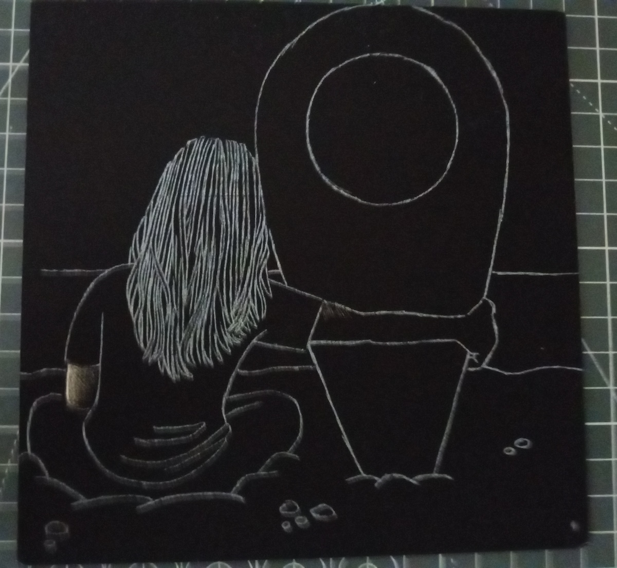
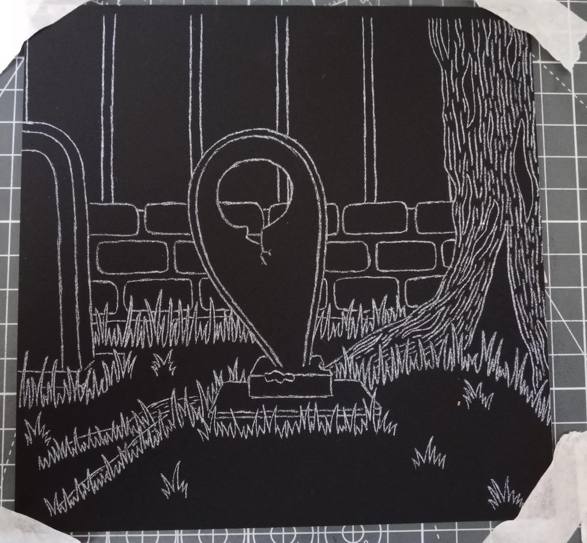
I then progressed onto filling in the scratchboards. I tried to use a variety of lines and considered value. I did have to resort to using a black marker pen a few times to cover up some ‘mistakes’. Initially I used some specific scratchboard tools to make the marks, but I found these really quite tricky to use, so instead I used a precision knife, which, although was still quite difficult to control, I found produced better, more detailed results.
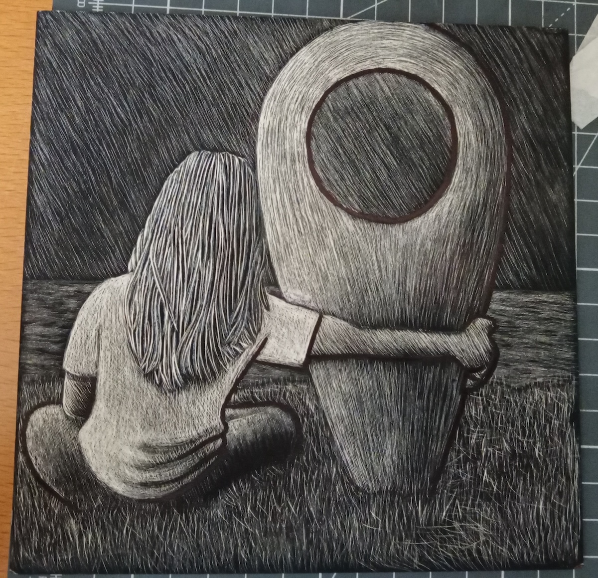
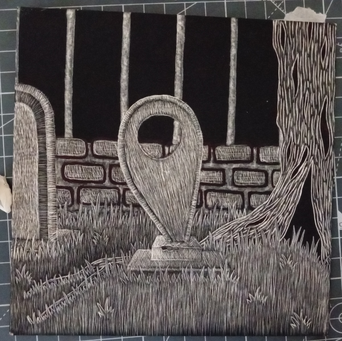
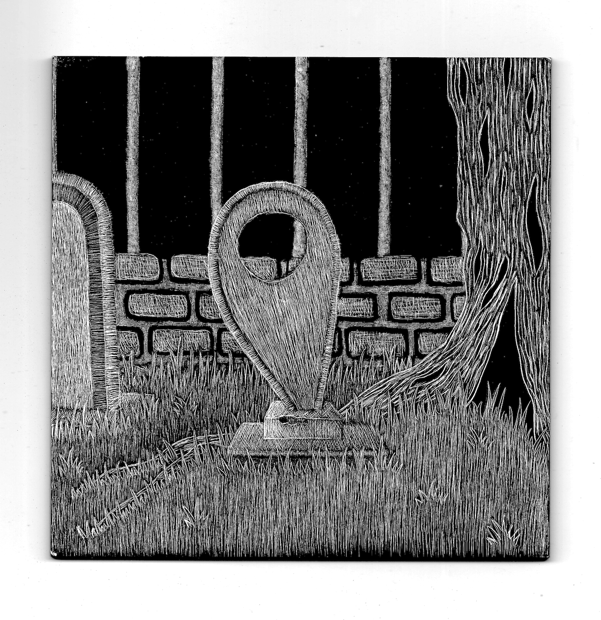
It took quite some time to reach a point by which I made myself be content with the scratchboard versions and move on. I scanned the images and manipulated these slightly, for example, so there was a stronger contrast of black and white.
Moving into Photoshop
At this stage I was able to move into Photoshop and start adding colour. After placing the image in Photoshop, I changed the blend mode to Multiply and locked this, which allowed me to add colour on a layer underneath without affecting the black outlines.
Firstly, I added local colour to the different sections of the illustration (creating separate layers for each main section, for example, a layer for the tree’s local colour).
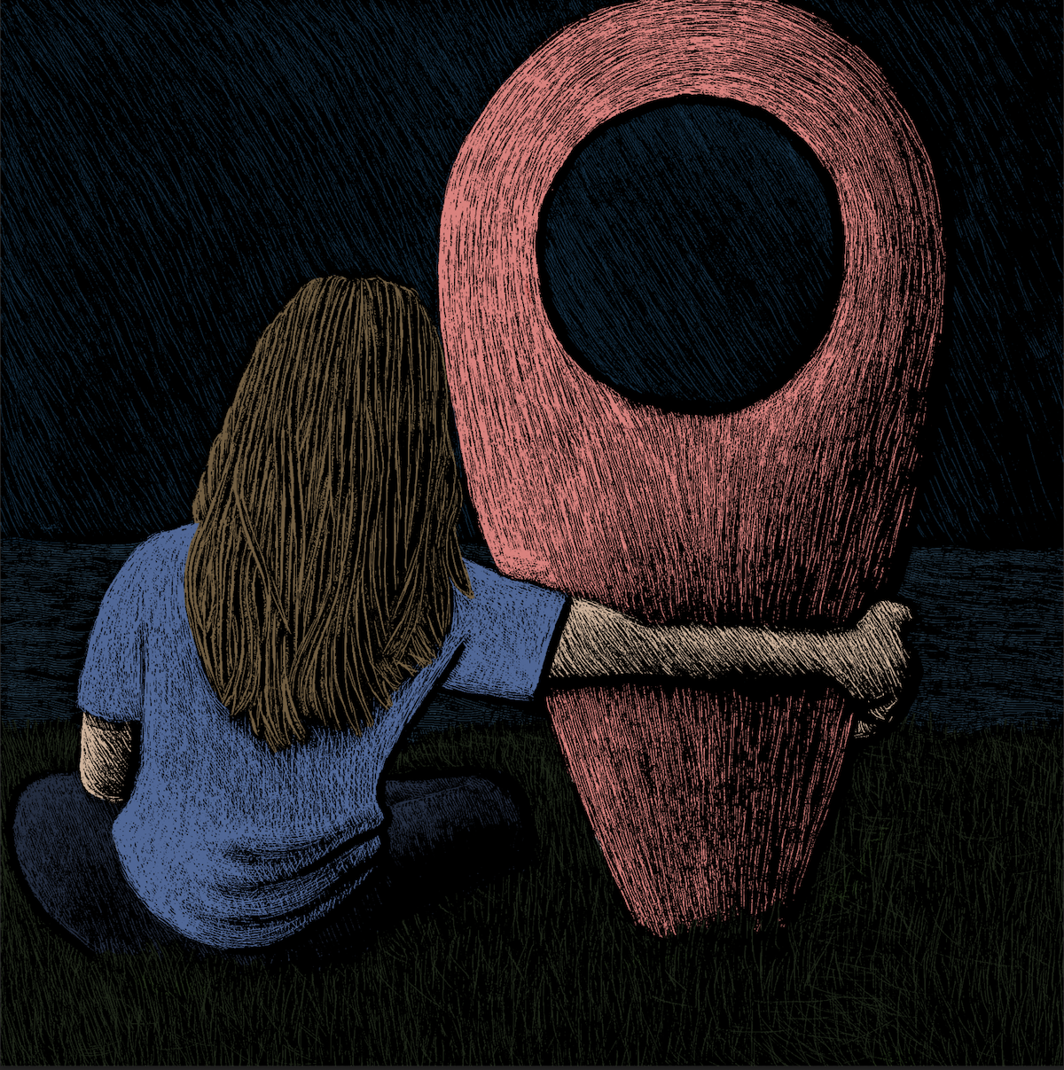
Next I added a layer for shadows, for which I reduced each local colour’s saturation and brightness but kept the same hue.
I then moved onto a layer for highlights, for which, conversely, I increased each local colour’s saturation and brightness but kept the same hue.
The next step was to create a layer above the others in which I could tidy up the black areas and lines.
Once I reached this point with the first image, I went through the same process with the second image. I made the colours for this illustration much less saturated to add to the overall mood.
At this point in the process I was quite happy with the two illustrations. I experimented with different blend modes and settled on Overlay for the first image and both Overlay and Multiply for the second. The opacity for these layers was set fairly low so as not to distort the colours too much.
Final Images
The final versions of each of the illustrations can be seen below.
(click on image for larger version, opens in new tab)
(click on image for larger version, opens in new tab)
Final Thoughts
Considering my current situation, I am pleased that I managed to produce something for the final assignment. Certainly, under normal circumstances, I would have liked to commit more time and thought to the work, but overall I am satisfied with the result.
As colour is something I generally avoid (due to my lack of confidence in its use) I liked my restrained, subdued application of it in this work, although the marker colour in the first illustration might be a bit too overpowering.
As mentioned at the beginning of this write-up, I was greatly influenced by the research that I undertook for the Critical Review. In particular, the philosophy and work of the artist/illustrator Shaun Tan, who I have been a fan of for quite some time, made a significant impact on me. I can relate to his preference for producing wordless images that invite the viewer to apply their own meaning and feelings. I can certainly appreciate Tan’s predilection to focus on the sadder and darker aspects of life.
Since completing the original You Are Here scratchboard illustration as part of Assignment 4 (shown at beginning of this write-up), I had felt that it was something that could be expanded on, so I am pleased that I managed to make a start on this. As briefly alluded to earlier, and after actually completed the two illustrations in this Assignment, I could definitely imagine having a series images in a book entitled You Are Here.
What went well…
- I was quite impressed with how I worked through all the different stages of producing the illustrations. I would even go as far as to state I felt confident in what I was doing! From the initial sketches through to working Photoshop, I worked efficiently and methodically without any notable catastrophes that I can recall.
- Although I usually would describe Photoshop as being overwhelming, I found that I was able to work quite well using it this time. I felt happier using layers and blend modes. I also made use of colour swatches, which is such an efficient and stress-reducing way to work with colours. I hope to continue to learn about using this software.
- In terms of colour usage, I was pleased that I managed to restrain the saturation levels. I also felt I had created a palette that was quite coherent and ‘felt right’ for what I wanted to achieve in terms of the mood and atmosphere for the illustrations. I plan on continuing to develop my confidence using colour effectively.
- I thought that the scratchboard versions of the illustrations were an improvement compared to the one from Assignment 4, for example, in terms of mark-making and overall composition. I found it very challenging to work with the tools to produce the lines, but it definitely helped changing to the knife instead.
- In terms of drawing, I was perhaps most pleased with my attempt at drawing hair and the bark on the tree. I think what I managed to produce suits the overall style of the illustrations and it took me quite some time to do.
- Finally, I feel there is a great deal of potential to expand this idea further. I would have liked to had the time to work on the third illustration. It was a bit lighter in tone (arguably not for the character though…) and so it would have been good to add this into the mix of illustrations to show a range of ideas.
What could be improved…
- In terms of the meeting the requirements for this Assignment, I have most likely failed as I did not write out a proper brief. This was partly because I felt under pressure to come up with an idea quickly and it was already formed in my head, so writing a brief seemed unnecessary as it would not really have helped me to get on with the work and taken up valuable time. Even under normal circumstances, I could not imagine writing a brief for myself as I just do not work this way. In terms of completing work for others, I would definitely want to be supplied with some form of a brief (and the more closed the brief, the better).
- On reflection, I would have preferred to have made the marks neater on the scratchboard versions. The marks directly above the upper arm of the character in the first illustration, for example, should be neater in the pink area of the marker. The top of the marker also got cut off in this illustration when I was using the carbon copy paper. In Photoshop, I would like to have cleaned up the black areas of the hair, grass and tree to a higher standard.
- Again, the main factor that impacted my input in this assignment, (and increasingly affected the amount of effort I could put into the exercises prior to it) was the very limited amount of time and motivation I was able to commit. Although I do feel slightly disappointed, relatively speaking, the course was quite insignificant in terms of importance compared to what has been happening, so I am just happy to have managed to finally complete all of the work for this Unit.
After Tutor Feedback
Following the feedback received for this Assignment in the Tutor Report, I strongly agreed that the final two images appeared quite dark and this made it difficult to see the details. I, therefore, took my tutor’s advice and tried adjusting the levels to lighten the images. I felt this definitely improved the visibility of the details, but it also made the images appear less saturated. Although I did not want overly saturated images, they appeared slightly too drained of colour, so I added another adjustment layer – Hue/Saturation – and slightly increased the saturation level.
The final results can be seen below. The improvement in visibility is more noticeable when the images are enlarged.
(click on image for larger version, opens in new tab)
(click on image for larger version, opens in new tab)