Identify a palette of no more than three colours that could work in combination. Remember that black and white are also colours. Pick colours that work well together, provide some contrast and can be used as dark, mid and light tones.
Use this palette to illustrate five domestic items beginning with the same letters of the alphabet. Try the same exercise using only two colours.
Initial Thoughts
On first appearances this exercise was not one that appealed to me. I find the application of colour quite intimidating, but I have been trying to understand the basics and become more aware of the use of colour by artists and illustrators. I began this exercise by looking at some examples in which a very limited palette has been used to consider the reasoning and impact this has.
Research
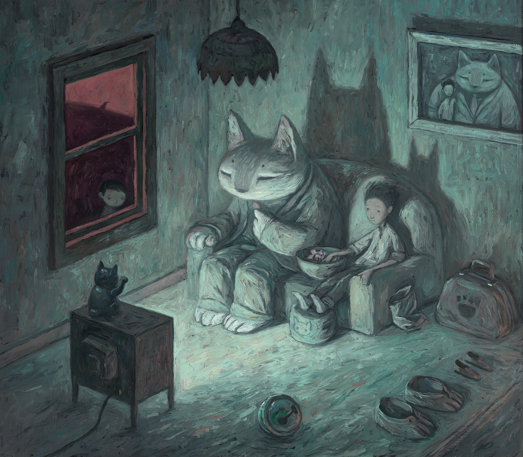
Every time I see another piece of work by Shaun Tan, my admiration and awe of his skills increases. The example below is taken from Tan’s website and he appears to only use three colours – red, green and white. It is fascinating to spot how often complementary colours are used once you become aware of these. I believe Tan may have painted an under-layer of red under the green areas and vice versa. Rather than using black for the darker areas, I think these have been created by mixing red and green, which allows them to blend in better within the illustration. The contrast of the red and green is quite subtle apart from the red window area, which hints at danger (particularly with the small boy looking forlornly through it) in opposition to the calmness inside the room. I particularly like the slippers/shoes.
Yuko Shimizu has created several illustrations with limited colour palettes, particularly using red and green. Sometimes the use of complementary colours can be visually jarring as they appear to vibrate, which is not always the desired effect, but Shimizu uses fairly subdued reds and greens of similar value, which prevents this.
In the example below I particularly like the outlines being in a darker shade of the fill colour, which I felt looks more sophisticated and less harsh than if black had been used.
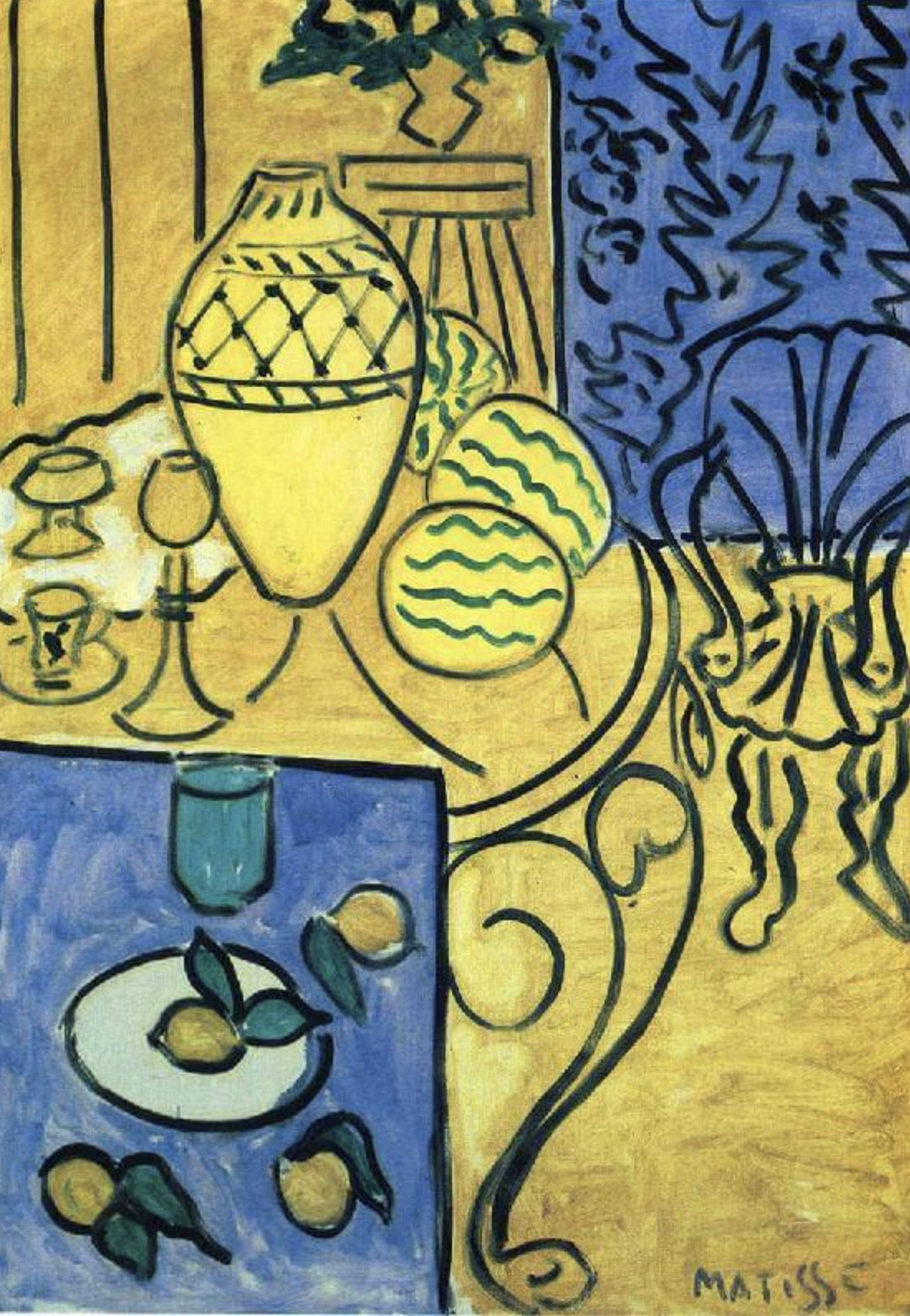
In the painting below, Matisse appears to have limited his palette to blue and yellow (of a similar value), which he has then mixed to make the green. White has also been used to lighten certain area that caught my eye first when looking at the painting. The dark outlines have a green-blue tinge to them so I do not think they are pure black. The placement of the different colours in the painting balances the overall composition.
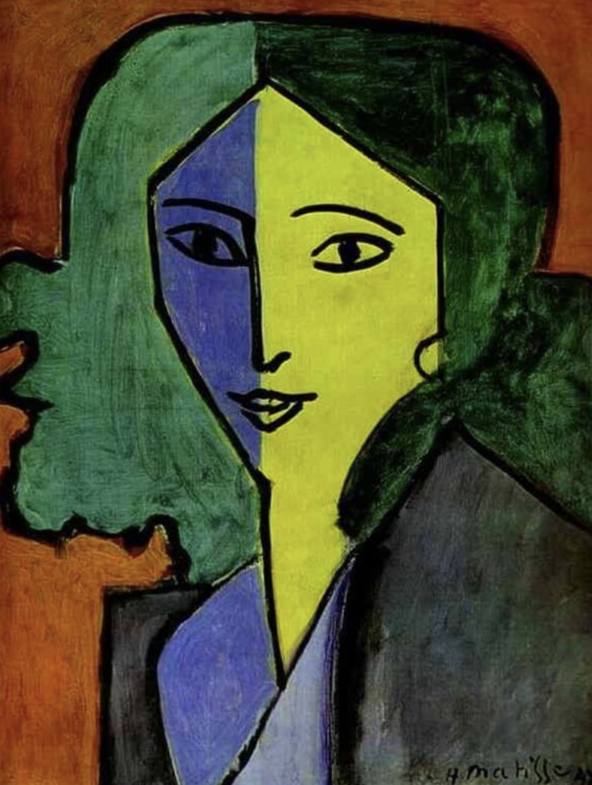
The dominant colours used in Matisse’s painting below are green, blue and red. The blue side of the face, which I think indicates shadow, has a purple hint to it. The green side of the face, in light, has a yellow hint to it. Purple and yellow are complementary colours and therefore the two sides zing off one another, which makes the right side of the face pop out of the composition. It is also possible to see that the darker paint has been applied on top. I thought it was interesting how Matisse had reversed the expected areas of shadow and light for the hair, which seems to balance out the overall head, and then has not indicated any shadow/light on the body area.
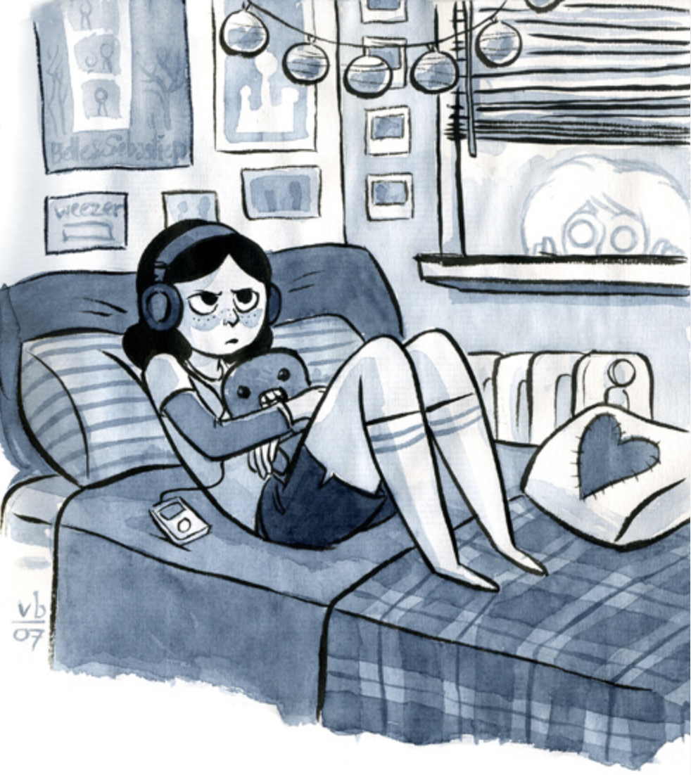
In the illustration below, Vera Brosgol has limited her palette to blue-purple ink, with black outlines and the white of the paper. Brosgol has varied the shades of the colour by adding water for thinner application on lighter areas whilst using ink from the pot for the darkest areas. I really like this technique and it is well-suited to the genre of graphic fiction. I think it prevents colour from dominating the illustrations when the stories being communicated are just as important (and it is probably cheaper to print).
In the illustration below Laurence Whitely has limited his palette to shades of blue and white. He has focused on creating strong contrasts of light and shadow whilst also creating depth by making the medal in the foreground dominant and bright. The building in the background recedes, as it is coloured using darker shades of blue, but is important within the illustration for communicating the overall narrative. The strong highlights on the hand indicate a bright spotlight being directed onto it from the left of the composition. The use of the blue in this illustration suggests it is a nighttime scene.

Source: Laurence Whitely.
Whitely has used a similar palette, consisting of blues and white, for the illustration below, but this time to colour transitions are more subtle. A sense of depth is implied by the receding mountain range, indicated by lighter tones of blue and Whitely has also used scale for the same effect with the wall on the left of the composition growing smaller in size and less detailed as it moves backwards. Scale is also an indicator of distance when looking at the size of the tea cups in comparison with the buildings, trees and so on in the distance. The use of colour is used to indicated shadow and highlights and the blue also suggests a sense of calm.
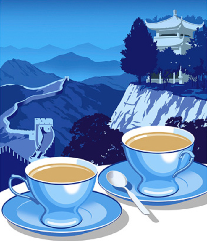
Source: Laurence Whitely.
In the example below, Rian Hughes has used colour to split different scenes in a comic. The top panels are various shade of orange, whilst the bottom two panels are coloured in green/blues. I think this is a very effective way of using colour, whilst still keeping to a monotone colour palette. It is more impactful than if the bottom two panels were in kept the same colour as those in the ones above. As seen in Whitley’s illustrations, Hughes has used the shades of the colour to indicate depth and shadows.

Source: Rian Hughes.
In the illustration of London below, Anna-Louise Felstead has limited her palette to mainly blue, grey and white, along with black outlines. The addition of a strong red to the three buses makes them really stand out. The colour has been loosely applied, which blends in with the sketchy line style.

Source: Anna-Louise Felstead.
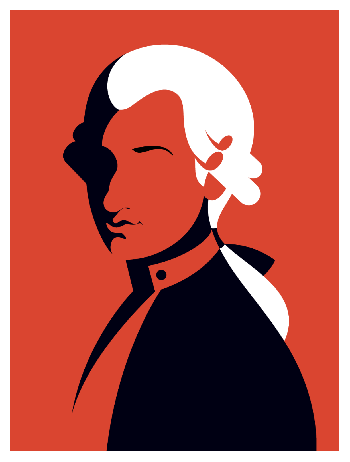
Malika Favre uses very restricted palettes in her graphic, vector illustrations. She creates strong contrasts of areas of light and shadow. In the example below Favre uses just red, black and white arranged in simple shapes, yet manages to create an instantly recognisable portrait.
Three Colour Palette Illustrations
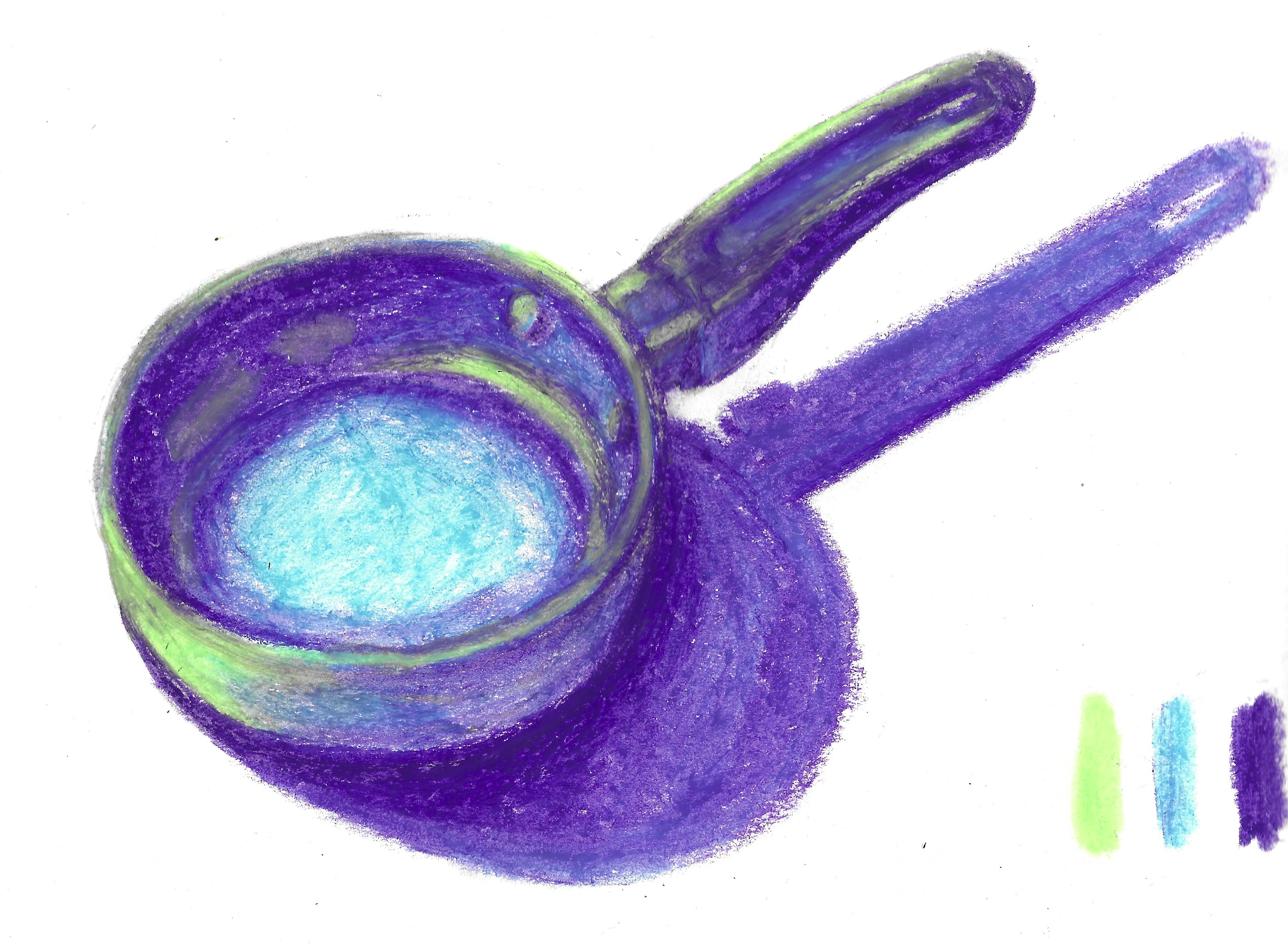
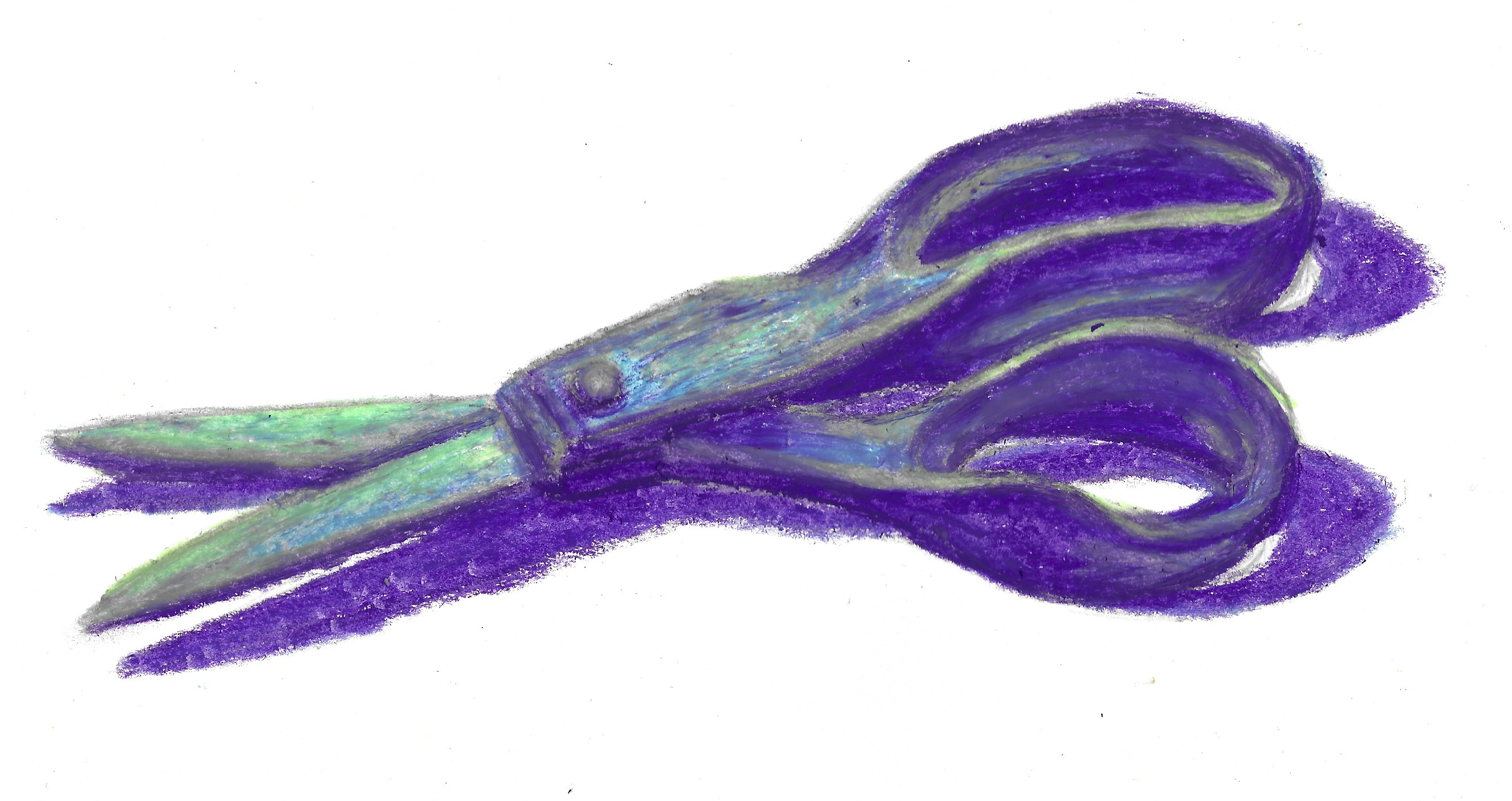
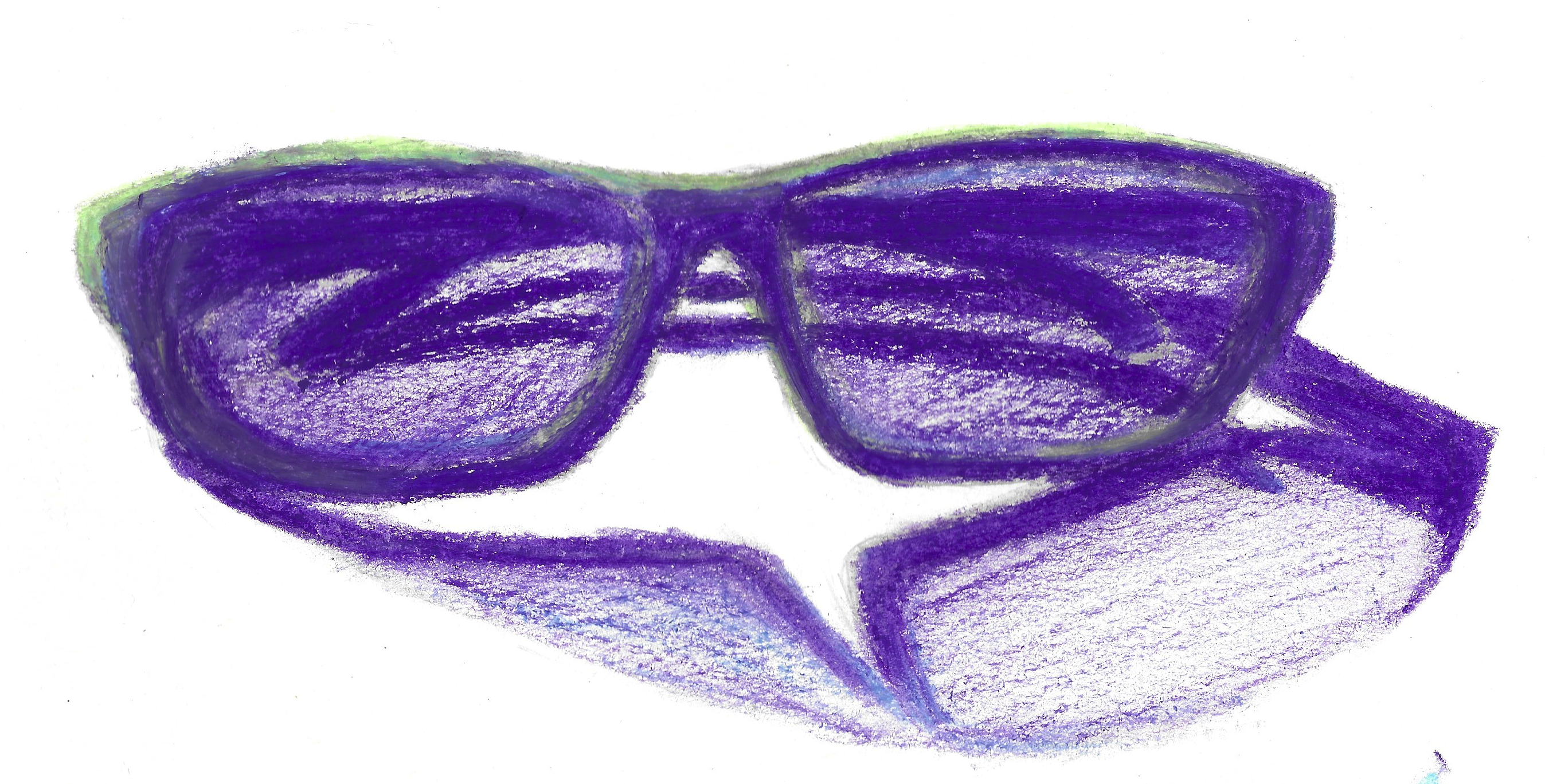
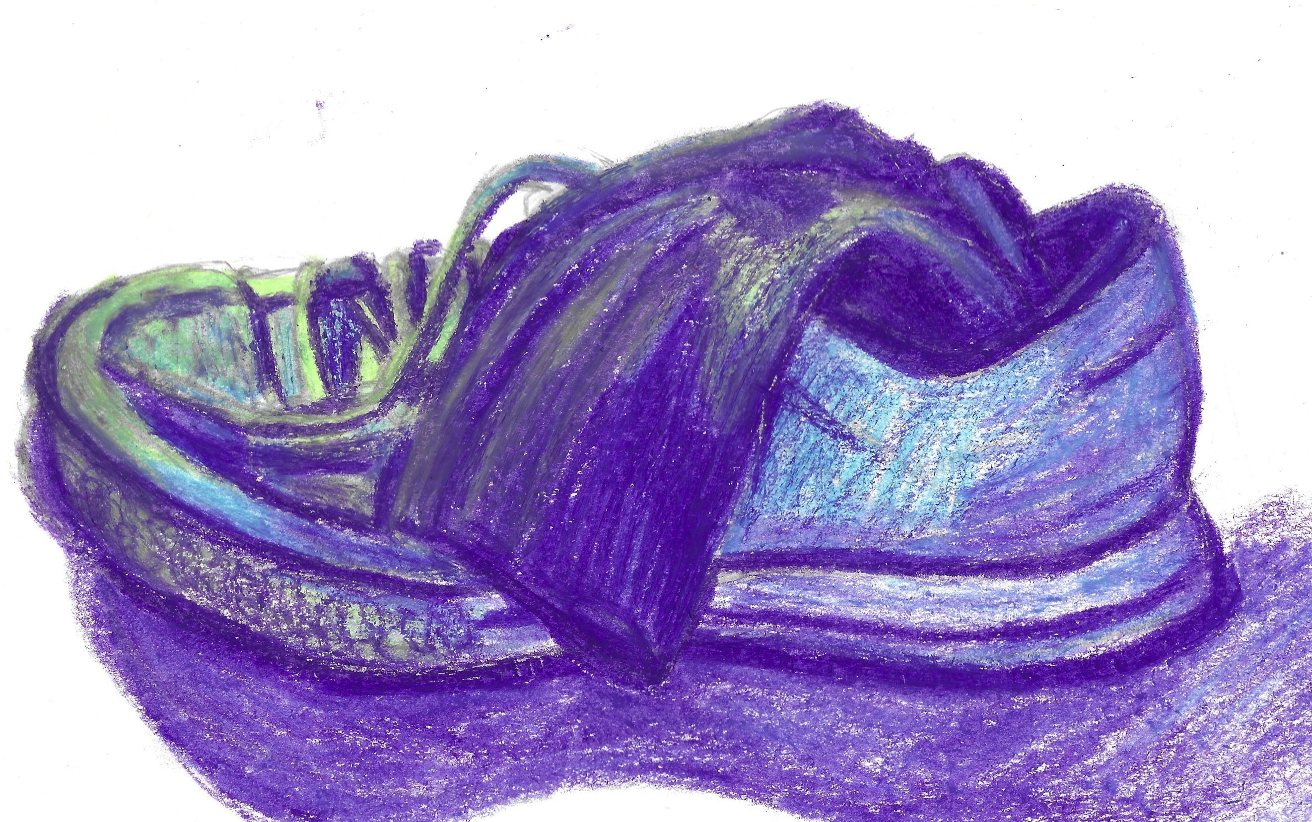
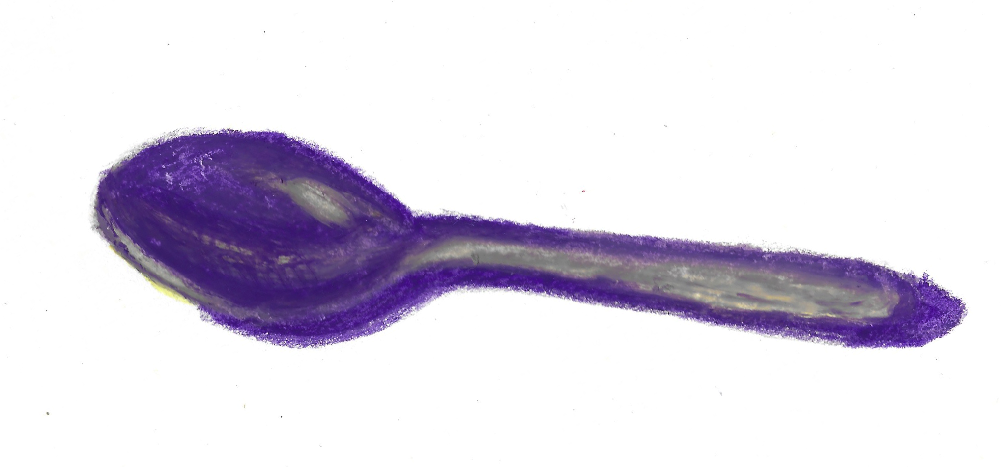
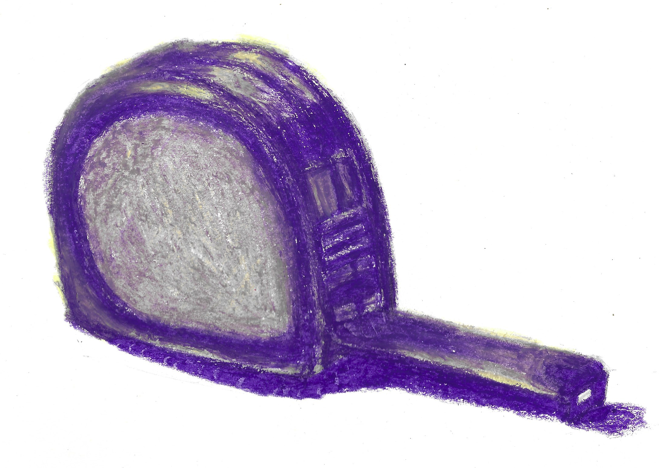
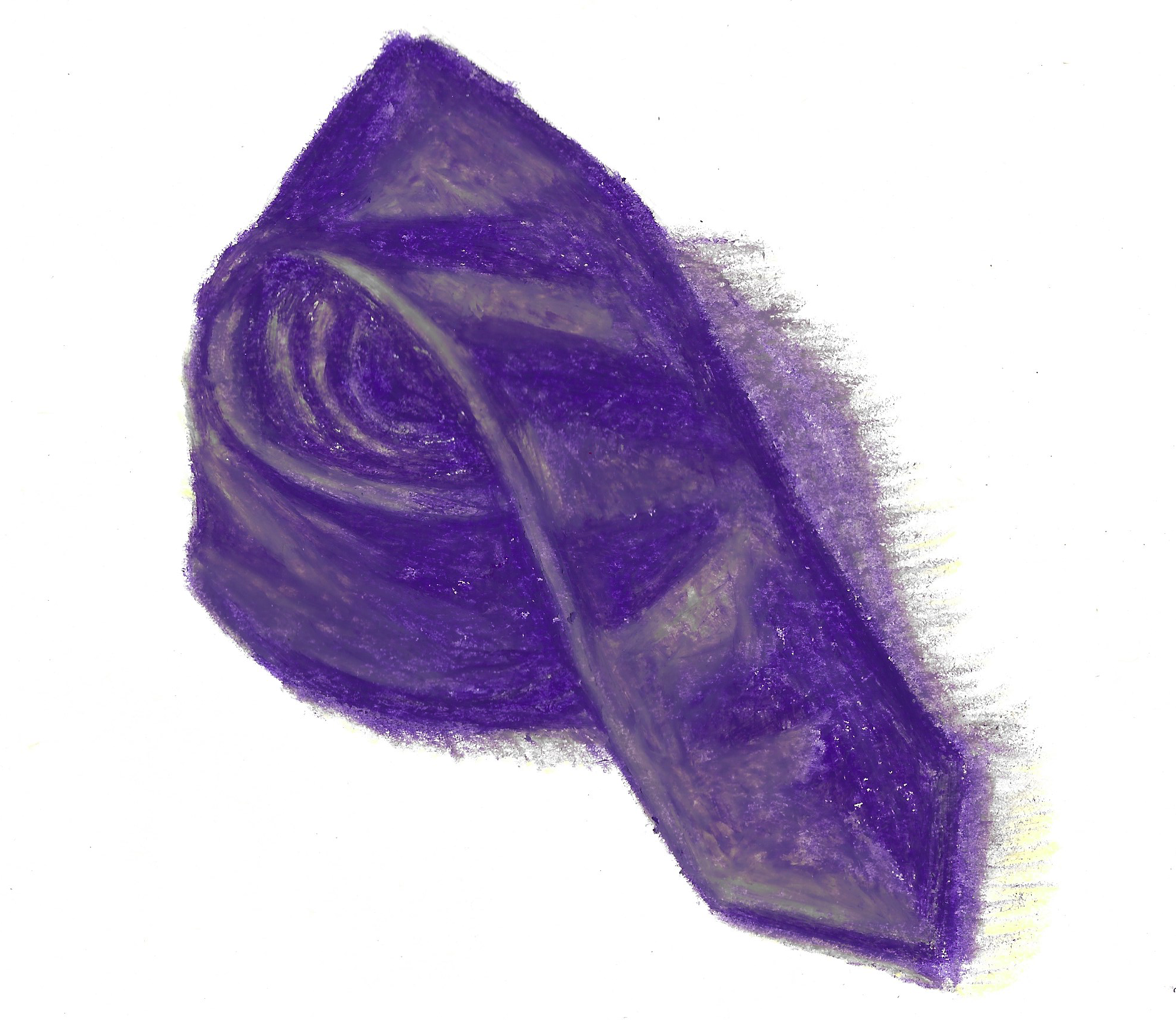
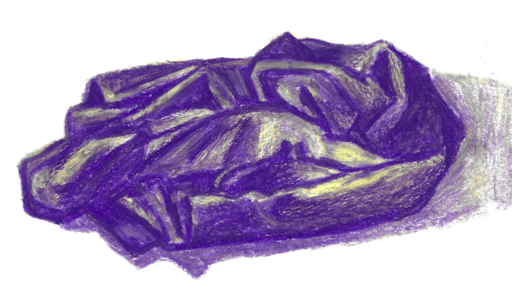
Once I reached a point where I could no longer procrastinate about attempting my own set of limited palette illustrations. I decided on five domestic items starting with the letter S: saucepan, scissors, sunglasses, shoe and sock.
In the past I have generally found reference photos online to draw from, but I want to use more real-life objects instead as I did for this exercise. I set up the objects on my desk with a light pointing at them from the left.
My next decision was with regards to what media to use. Previously I have really only used coloured pencils for colour exercises, but I decided to really get out of my comfort zone and use oil pastels! I then tried various colour combinations and, after some contemplation, settled on an analogous colour scheme as these seemed less intimidating. I selected a purple for dark tones, a blue for mid tones and a light green for lighter tones/highlights.
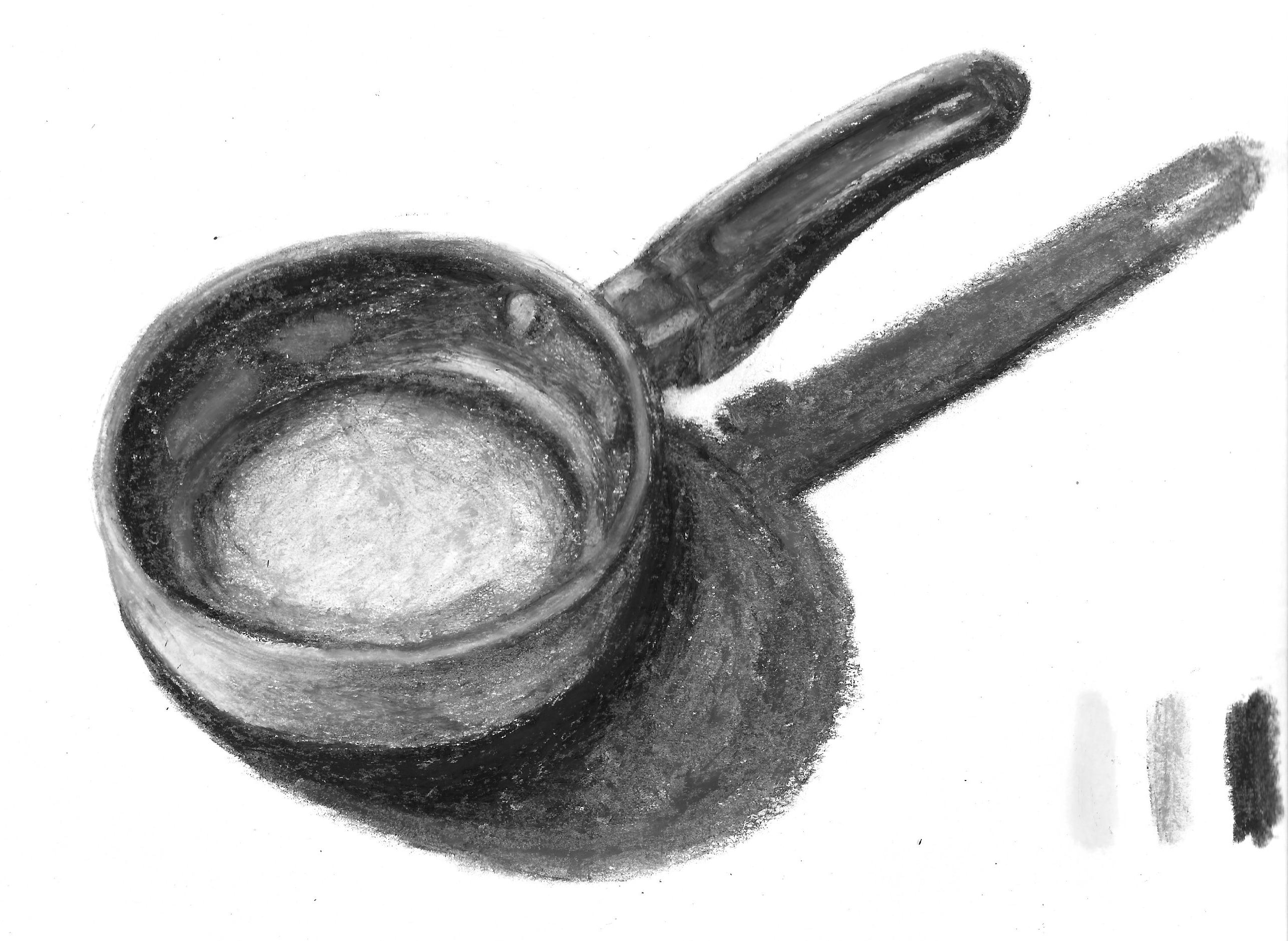
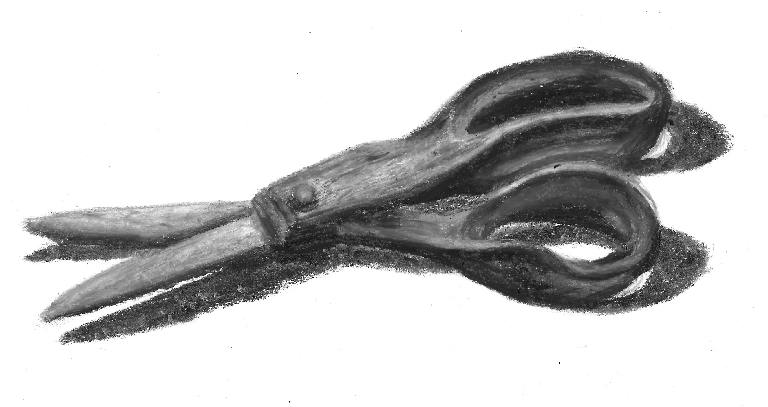
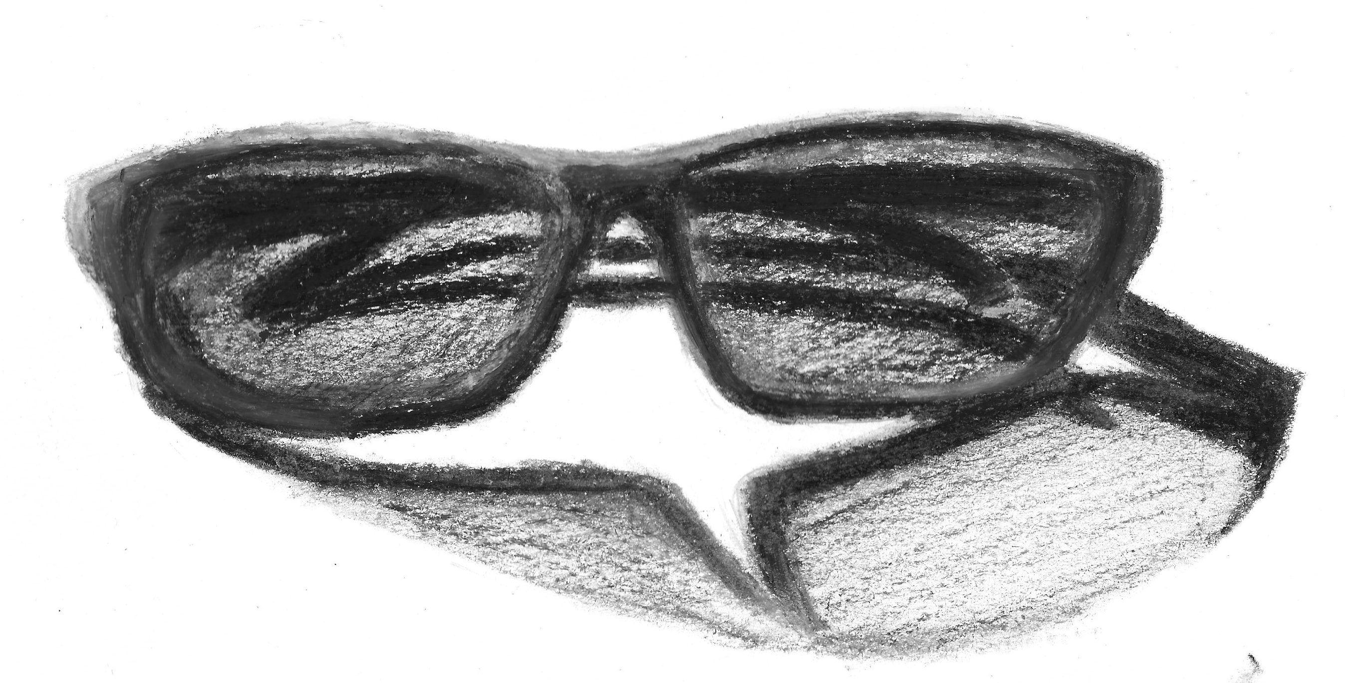
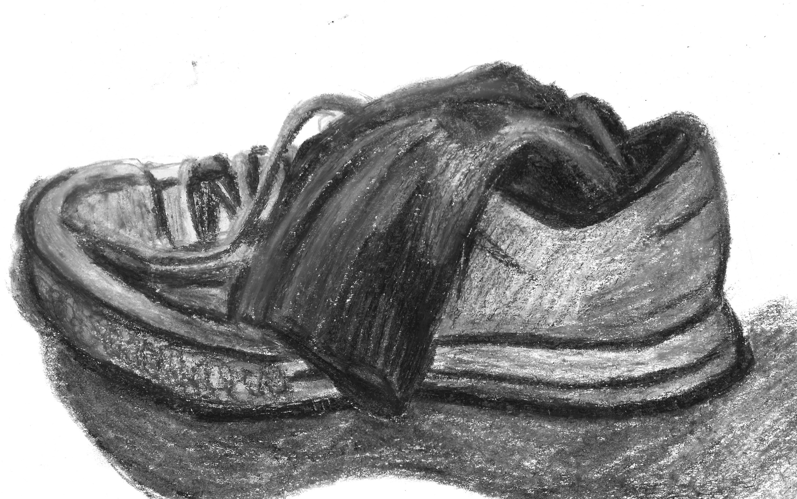
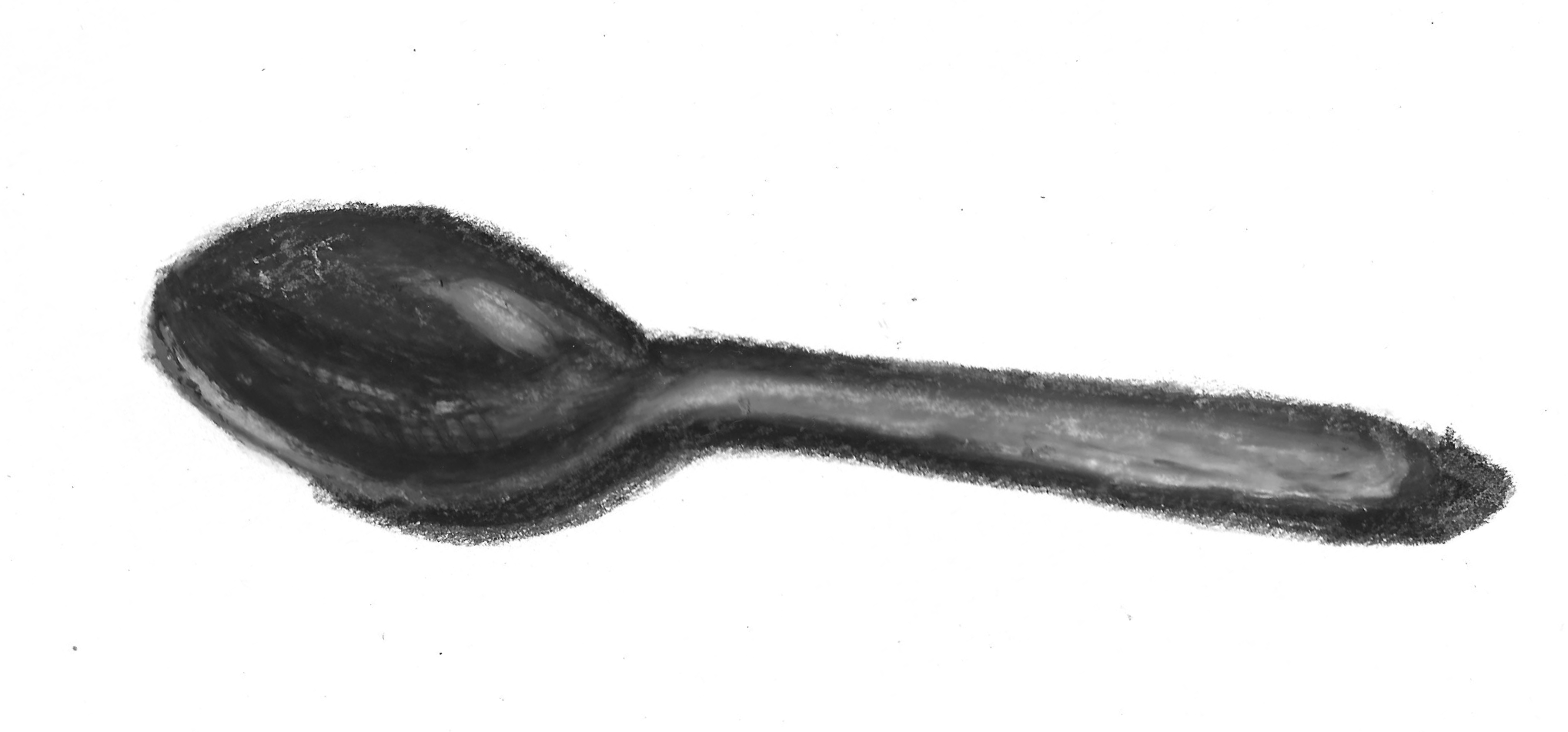
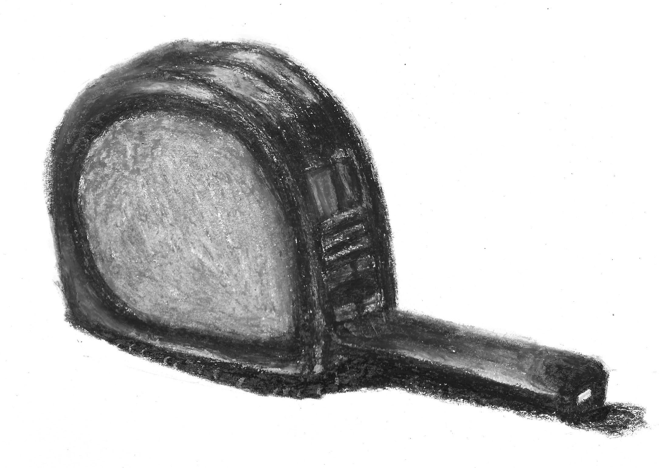
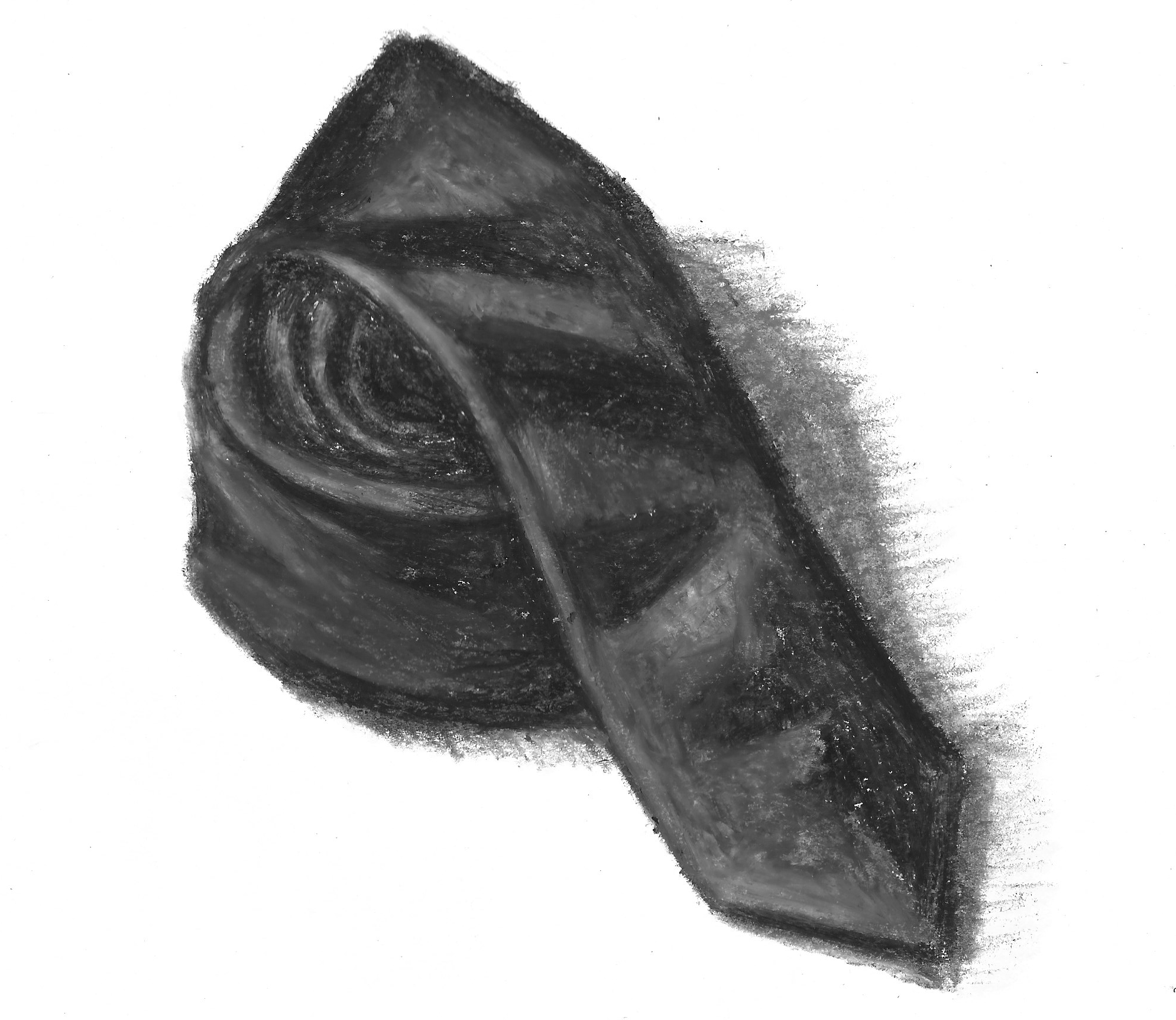
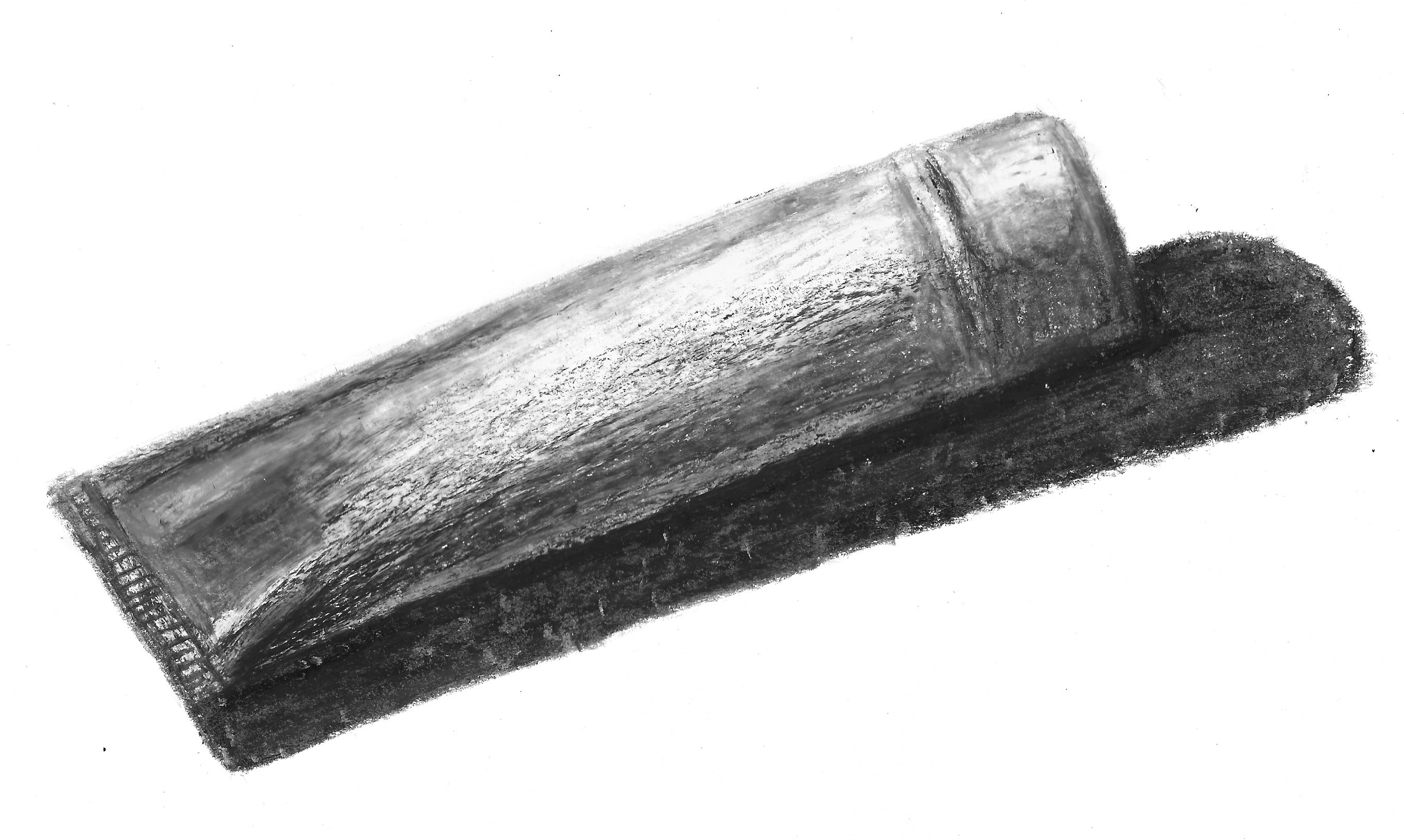
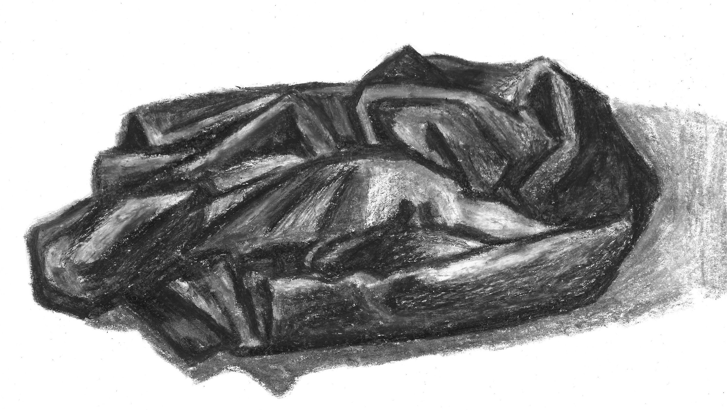
I began each illustration with a rough pencil sketch of the objects and then put down the darker areas in purple before gradually adding the other tones on and around these. At the start of each one I felt quite despondant, but after spending time building up layers of colour I was actually quite pleased with the results, which can be seen below. I felt most positive about the illustrations of the saucepan and scissors. When I had finished I scanned each one onto my computer and reduced the saturation so I could see the tonal version (shown below) and assess how well I had conveyed light and dark without the distraction of colour.
(click on image for larger version, opens in new tab)
(click on image for larger version, opens in new tab)
(click on image for larger version, opens in new tab)
(click on image for larger version, opens in new tab)
(click on image for larger version, opens in new tab)
(click on image for larger version, opens in new tab)
(click on image for larger version, opens in new tab)
(click on image for larger version, opens in new tab)
Two Colour Palette Illustrations
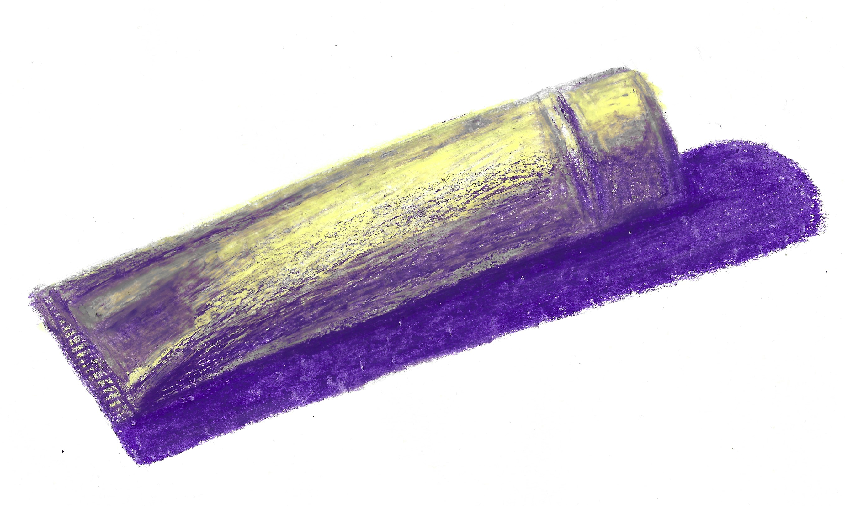
I felt more positive about the exercise at this point so I moved onto the next task of using a two colour palette. I decided on a different set of five objects, this time beginning with the letter T: teaspoon, tape measure, tie, toothpaste tube and t-shirt.
I chose to use the same purple from the previous illustrations along with a very light yellow, as I thought these would create a good contrast of dark and light tones. I found these illustrations much harder than those using three colours and it was difficult to differentiate areas of shadows/highlights without the colours blending too much without intention – perhaps it would have been better to try a different media, such as paint.
Again, once I had scanned the illustrations onto my computer, I desaturated them to see how well I had managed to create contrast.
(click on image for larger version, opens in new tab)
(click on image for larger version, opens in new tab)
(click on image for larger version, opens in new tab)
(click on image for larger version, opens in new tab)
(click on image for larger version, opens in new tab)
(click on image for larger version, opens in new tab)
(click on image for larger version, opens in new tab)
(click on image for larger version, opens in new tab)
(click on image for larger version, opens in new tab)
(click on image for larger version, opens in new tab)
Final Thoughts
I enjoyed this exercise much more than I had expected to. I believe it has given me more confidence to use colour, I just need to keep practising and experimenting. I liked using colour to portray tones rather than the actual hues of an object.
This exercise has confirmed that I need to persevere with an illustration even when it looks ‘poor’ at the start as I can build on these foundations and the end result generally ends up at least fairly respectable. Nowadays I try to use constructive criticism for my work, such as pointing out what areas I could improve on, what worked well and what I have learnt during the process, rather than simply disregarding it straight away.
I think it would help to create bigger illustrations for exercises such as these. I tend to work on a very small scale or similar to that of the object I am drawing. If I had worked on a larger scale when using oil pastels, there would have been more space to work on the details. This would also apply to any future work where I may use paints.
As previously stated I preferred the three colour illustrations to the two colour ones, but I found the whole exercise, including the research at the beginning, to be very valuable and it will have an influence on my work as I continue on my studies.
Bibliography
Artists & Illustrators (2011) Colour Theory in Art. Available at: https://www.artistsandillustrators.co.uk/how-to/art-theory/colour-theory-in-art/ (Accessed 28 October 2022).
Artists & Illustrators (2016) How to Choose your Colour Palette. Available at: https://www.artistsandillustrators.co.uk/how-to/watercolour/how-to-choose-your-colour-palette/ (Accessed 28 October 2022).
Brosgol, V. (n.d.) verabee. Available at: https://www.verabee.com (Accessed 28 October 2022).
Edward Hopper and his paintings (n.d.) Edward Hopper: 100 Famous Paintings Analysis, Complete Works, & Bio. Available at: https://www.edwardhopper.net (Accessed 28 October 2022).
Favre, M. (n.d.). Malika Favre. Available at: https://www.malikafavre.com (Accessed 28 October 2022).
Felstead, A-L. (n.d.) Anna-Louise Felstead Artist. Available at: https://alfelstead.com (Accessed 28 October 2022).
Henri Matisse and his paintings (n.d.) Henri Matisse: 100 Famous Paintings Analysis, Complete Works, & Bio. Available at: https://www.henrimatisse.org (Accessed 28 October 2022).
Hughes, R. (2020) Rian Hughes. Available at: https://www.rianhughes.com/featured (Accessed 28 October 2022).
Male, A. (2007). Illustration: A Theoretical & Contextual Perspective. Switzerland: AVA Publishing SA.
MoMA Learning (n.d.) Vincent van Gogh. The Starry Night. 1889. Available at: https://www.moma.org/learn/moma_learning/vincent-van-gogh-the-starry-night-1889/ (Accessed 28 October 2022).
Sherin, A (2012). Design Elements: Color Fundamentals. Beverly, Massachusetts: Rockport Publishers.
Shimizu, Y. (n.d.) Yuko Shimizu – Award winning Japanese illustrator based in New York City and instructor at School of Visual Arts. Available at: https://yukoart.com (Accessed 28 October 2022).
Tan, S. (n.d.). shaun tan. Available at: https://www.shauntan.net (Accessed 28 October 2022).
Whitely, L. (2007). Laurence Whitely Design and Illustration. Available at: https://www.laurencewhiteley.com (Accessed 28 October 2022).
Wikipedia (n.d.) Picasso’s Blue Period. Available at: https://en.wikipedia.org/wiki/Picasso%27s_Blue_Period (Accessed 28 October 2022).
Wikipedia (n.d.) Picasso’s Rose Period. Available at: https://en.wikipedia.org/wiki/Picasso%27s_Rose_Period (Accessed 28 October 2022).