Creatively develop a range of ideas that explores how your illustrations or drawings would work within the context of street art. Think about what media you would use, the scale you would work at, where you would site your work and what it would be about.
Producing street art without permission can get you into trouble so, unless you have a place where you can work safely and legally, simply mock up your ideas.
Reflect on how the contexts you have chosen have changed the nature of your illustrations. What conversation has gone on between the work and the place?
Initial Thoughts
To begin this exercise, I spent far too long trying to think of a witty piece of street art that would make an important point about a particular issue. Of course, I was not able to come up with anything of the kind and, as mentioned in the previous Research Point, I am currently limited in my ability to get out and about due to to personal issues, so I was not able to visit many potential sites that might inspire a creative spark.
Therefore, based on the above, and the impending deadline for this unit, which I keep being reminded of, I made the executive decision to choose the view from my window as my canvas for this exercise.
Note: I am fortunate to live in a relatively ‘green’ area and I am well aware that there are many people who are not so lucky with their living arrangements, so I just wanted to state that I am in no way complaining (not seriously anyway).
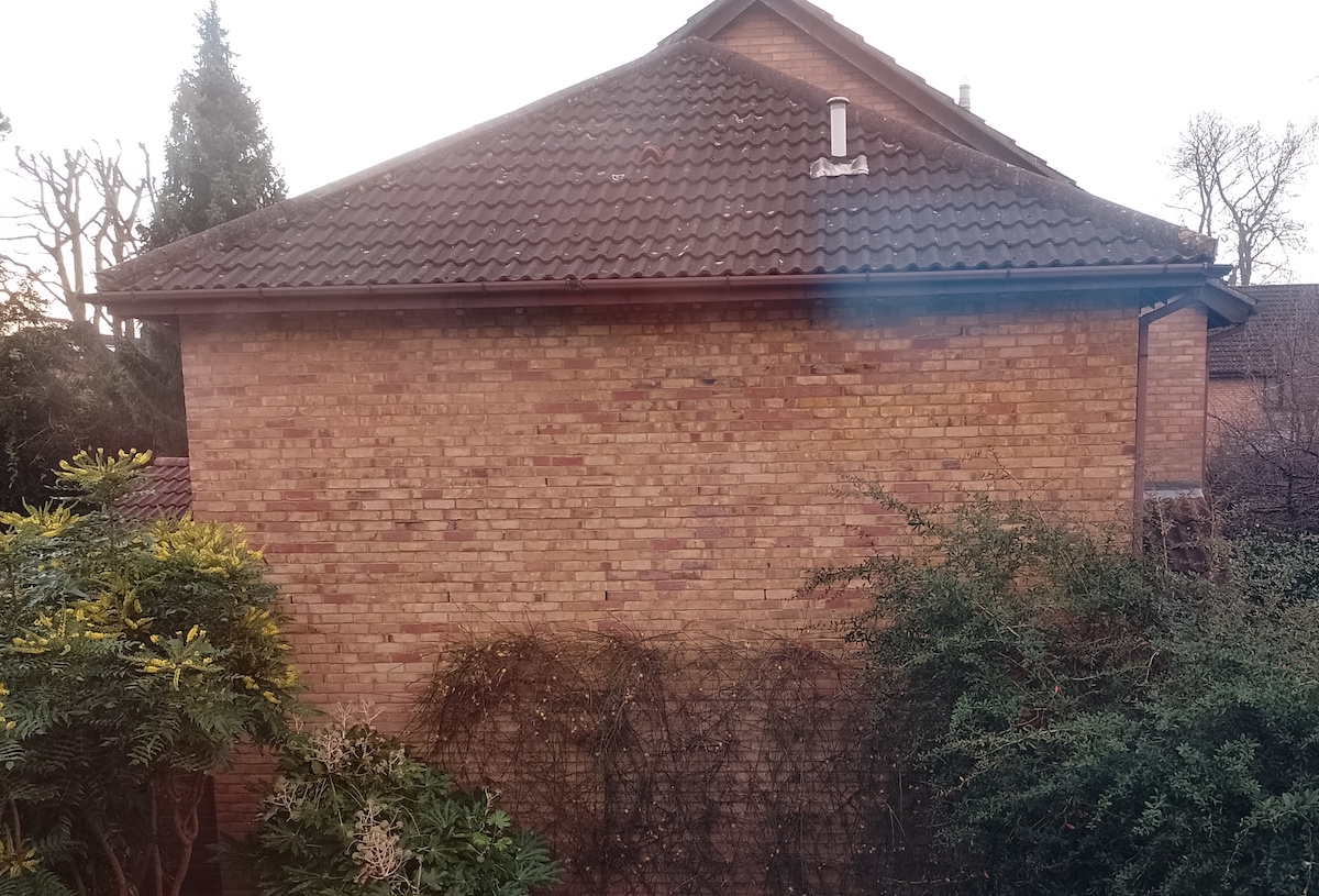
The Chosen Surface
If I could change one thing about the view from my window it would be the bare brick wall directly facing me. Unfortunately, we are not allowed to grow plants on it above a certain height in case these ‘damage the wall’.
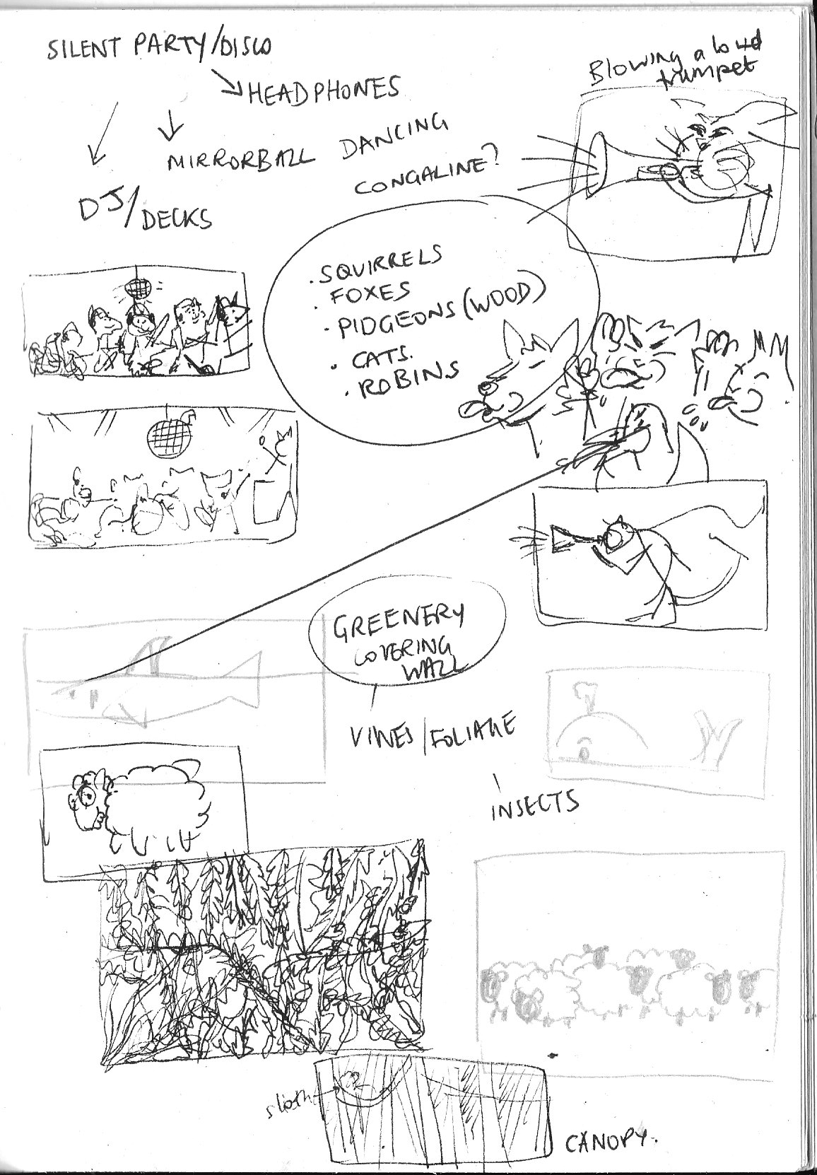
Ideas and Thumbnails
Now that I had identified the surface upon which I would hypothetically work on, I began contemplating a potential illustration that I would be happy to see everyday. Although I was impressed by all of the artists I had learned about in the Research Point that used their work to comment on societal issues and the like, I also discovered that there does not always need to be such meaning behind street art and, in fact, my two favourite artists – Roo and David Zinn – create work that is just plain fun and/or adds colour to an everyday, mundane setting.
I thought this approach would be best suited for the blank wall and so, keeping this in mind, I began sketching out a few very rough thumbnails. The first couple of ideas were based on the premise that, as my neighbours do not seem that keen on the local wildlife being in their garden, I would have a selection of animals holding a silent disco or blowing raspberries (I am not sure the latter would have gone down too well though…).
I then thought about the possibility of covering the wall with an illustration of plants, but I could not stay away from characters, so I then moved back to perhaps having a flock of sheep (or goats) that would keep the foliage below at a certain, ‘acceptable’ height.
(click on image for larger version, opens in new tab).
Although I was most keen on the ‘silent disco’ concept, there were two main issues that prevented me taking the idea further. Firstly, the image would have several different characters in it, which would take quite a bit of time to develop to a standard that I would find acceptable and I had to be realistic the remaining time I had left to complete this unit before the deadline. Expanding on this, the other main hindering factor would be trying to work out a composition that fits within the area and whether I would try to use perspective, again these would add to the amount of time it would take to complete the exercise.
The Chosen Idea
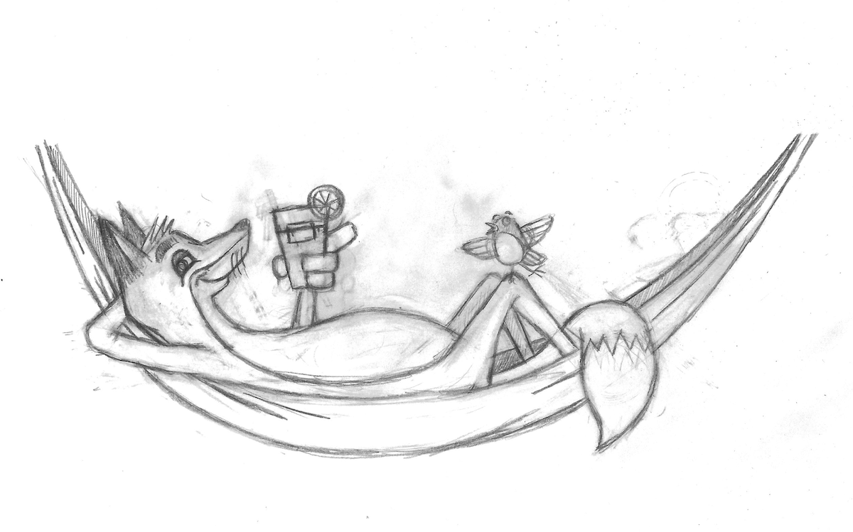
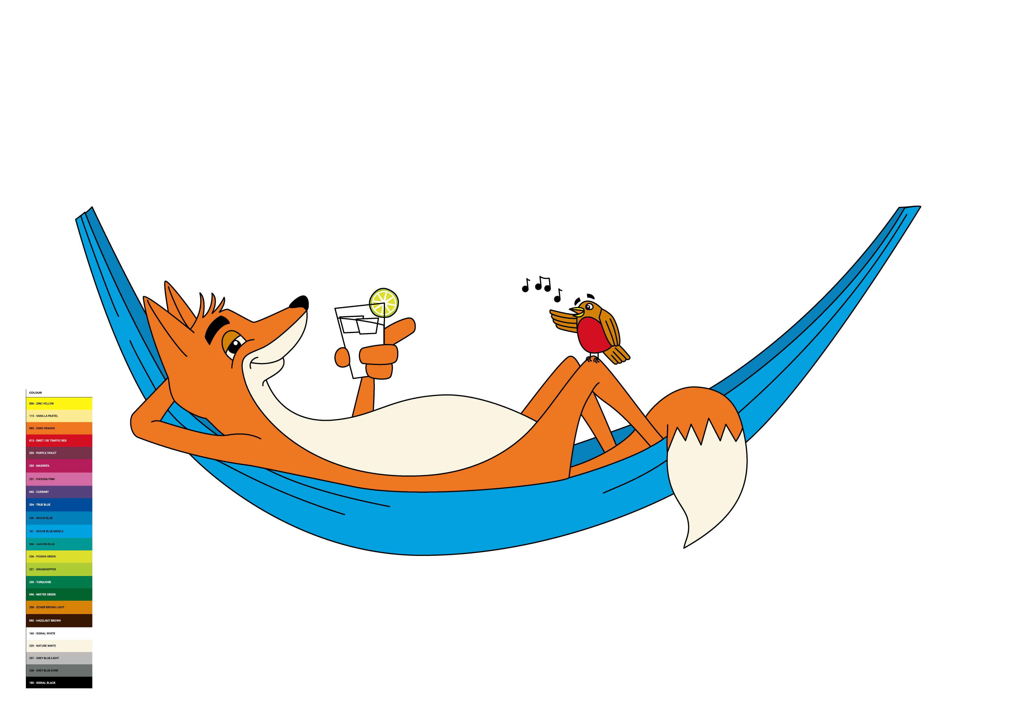
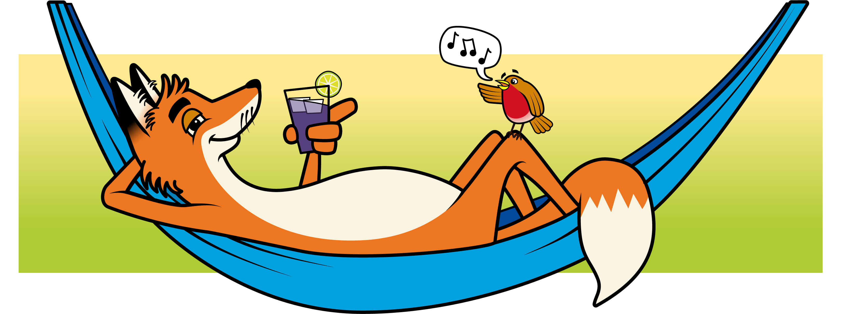
Based on the above, I decided to attempt a much simpler (and less pointed in its message), but equally appealing idea that I had devised. This one would have a very relaxed fox reclining in a hammock, sipping on a drink.
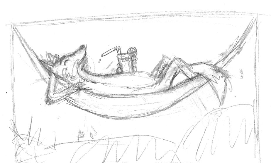
I was quite happy with my initial sketch and did another version using a fineliner. I added a robin, which I thought might be serenading the fox.
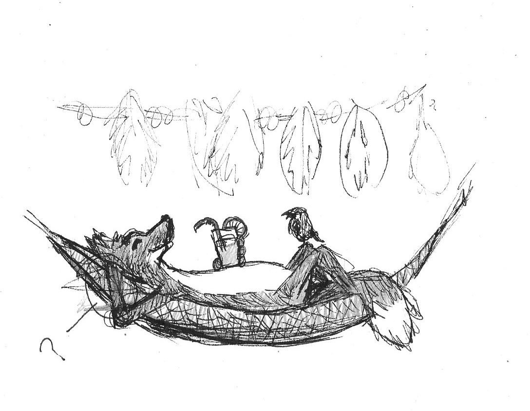
I was becoming more confident with the design and chose to take it forward. I drew a larger, slightly cleaner pencil version. I thought the expression on the fox had worked out really well and more or less as I intended, which made a change. I also found the flow of the image to work quite well in terms of leading the viewer’s eye in a circular fashion, starting with the fox’s face/nose, to the drink and his finger pointing towards the robin, before seeing the tail, which leads the eye back up the line of the hammock to the fox’s head.
Moving into Illustrator
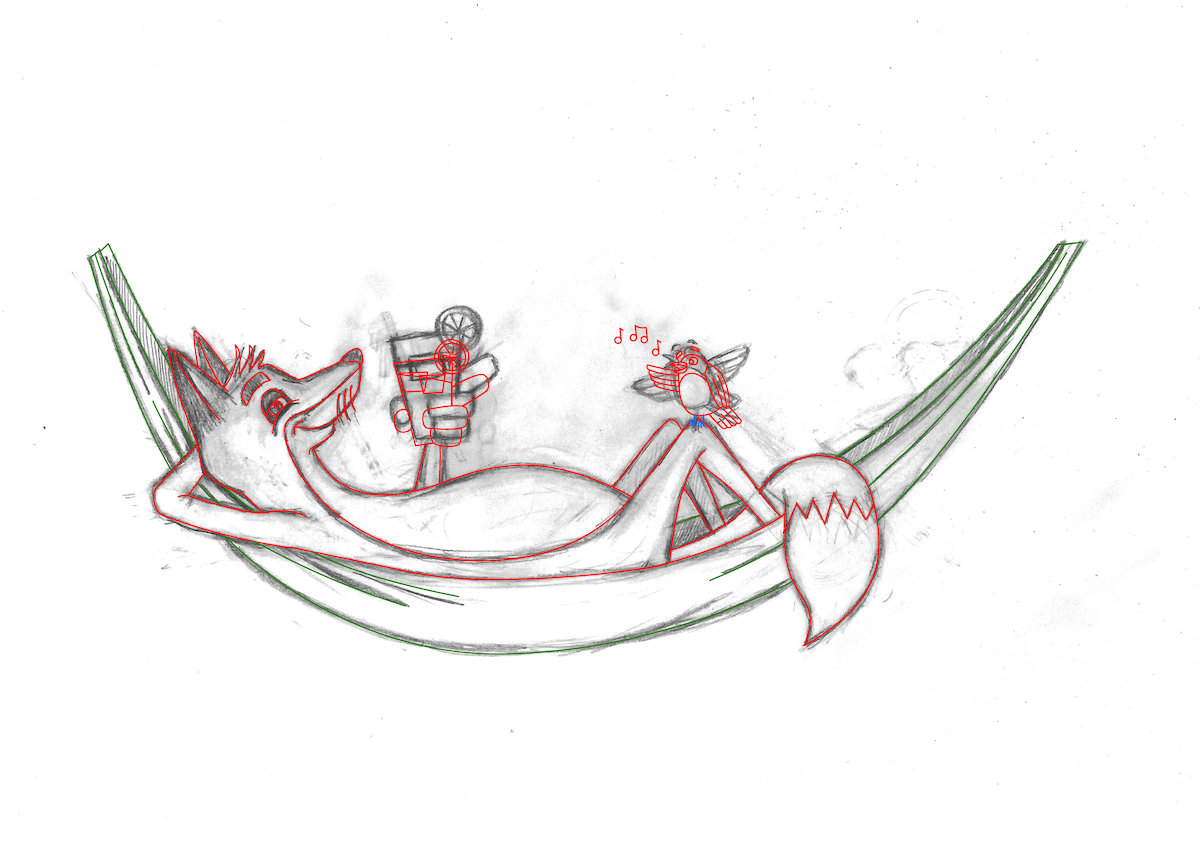
As I wanted to show the influence of Roo’s street art, I decided that Illustrator would be the best software to create a digital, vector-based version, which I could then place on a mocked-up version of the wall.
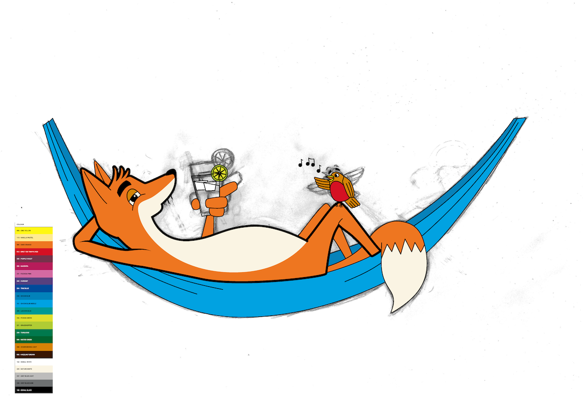
I scanned the pencil version into Illustrator and, on a separate layer, used the pen tool to draw the outlines. I find it easier to use coloured lines at first to differentiate between the separate parts.
(click on image for larger version, opens in new tab).
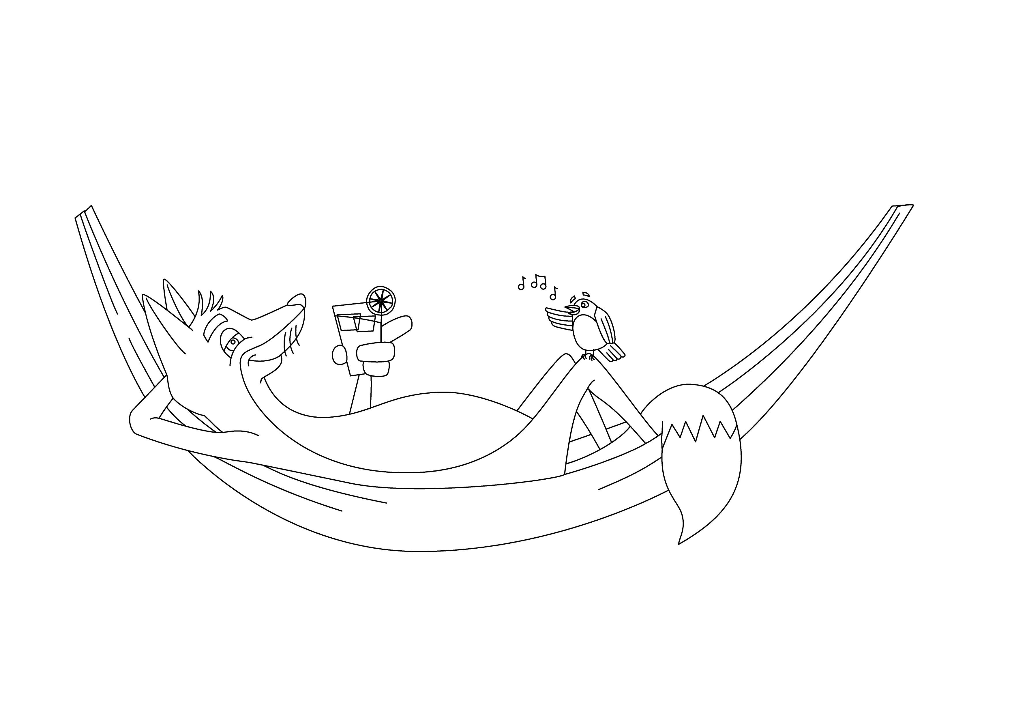
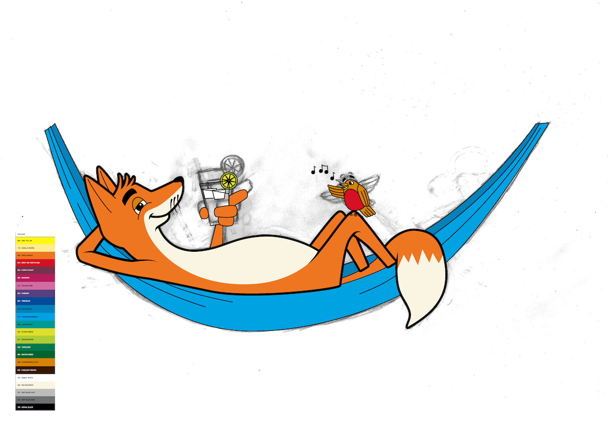
Once I was satisfied with the above, I hid the pencil drawing and changed the line colour to black.
(click on image for larger version, opens in new tab).
Adding Colour
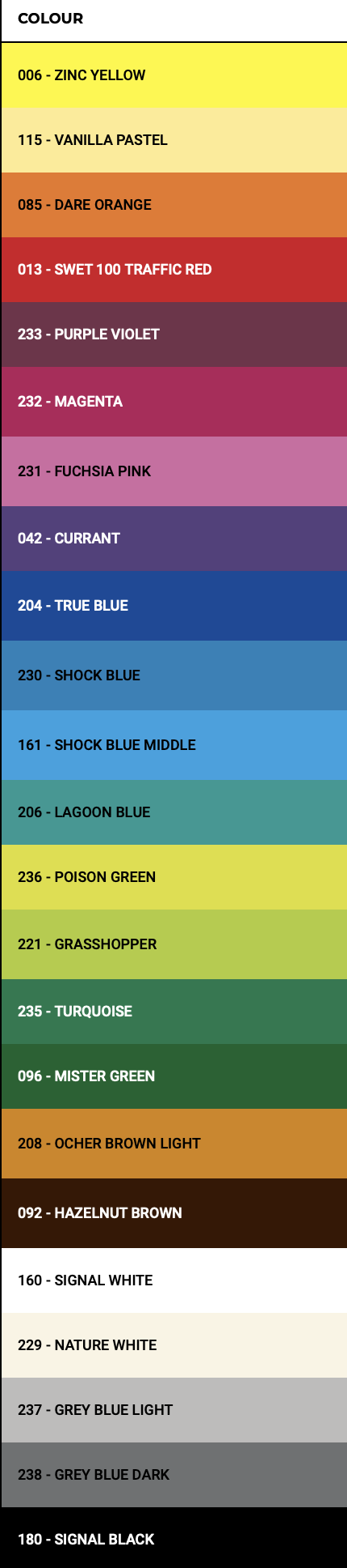
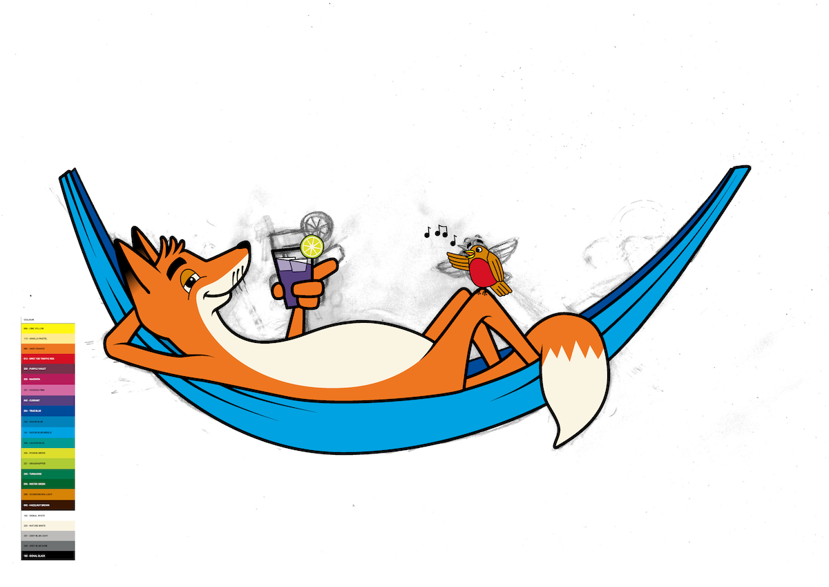
At this point I had to make decisions about adding colour (never one of my favourite aspects). I looked up different materials that street artists use and found a popular make called Molotow. I opted for their range of One4All Acrylic Spray Paint as my weapon of choice.
Fortunately, the colour range is available on the website, so I was able to take a screenshot of this and place it next to my illustration. I was note sure how I felt about having the restrictions in terms of colour availability, but considering my long-running aversion to using colour, this was most likely a positive as it prevented me procrastinating too much about what choices to make.
Using the colour picker in Illustrator, I gradually filled in different sections of the illustration. I did find that the limited colour variation meant that It was quite challenging when I wanted to, for example, make the far back leg slightly darker, as there was not a suitable colour available.
(click on image for larger version, opens in new tab).
This is usually the point where I become slightly unsure of how to further develop my vector illustrations. However, as I was using the style of Roo’s street art as the template for my work, I looked out how she uses varying line widths in her designs, which is much more visually interesting than keeping to a single width outline as in the image above. I decided to have a go at replicating this effect in my illustration.
Varying the Outline
Even at the early stage of the process, as shown below, the improvement to the image by varying line width was instantly apparent.
(click on image for larger version, opens in new tab).
As I was experimenting with the line width, I also began adding tapered ends to the lines so that these flowed rather than having a blunt ending.
(click on image for larger version, opens in new tab).
I then had to deal with the challenge of adding black to the rear of the fox’s ears. I did not want a sharp edge for this, so I opted for a gradient (I assumed a similar effect would be possible with spray paint).
(click on image for larger version, opens in new tab).
The Final Design
I referred back to some of Roo’s artwork to see how I might finish off the design, for example, in terms of adding a background. I went for a gentle green/yellow gradient and added a speech bubble for the robin. I also decided to have parts of the illustration breaking out of the background border as I felt this was more visually appealing. Finally, I added some tufts of fur around the fox’s ear and head, which I thought enhanced his charm.
I exported a copy of the design as a transparent PNG, which I could then take into Photoshop.
Mock-up of Street Art
I added the image of the wall and the illustration as separate layers in Photoshop. I opted for the Overlay blend mode for the design and after some experimentation, the final result can be seen below.
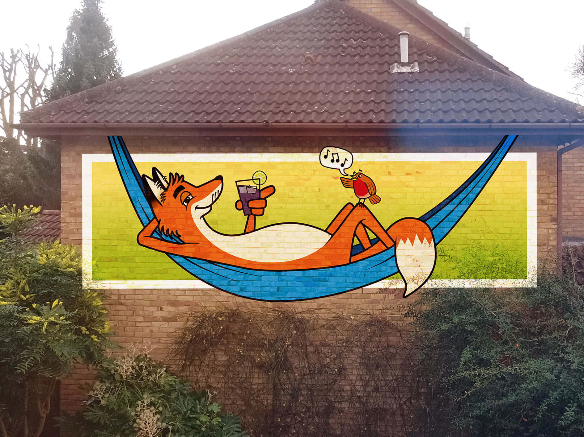
(click on image for larger version, opens in new tab).
It would have been better to have a higher quality photograph for the mock-up in terms of lighting and the perspective was also quite distorted, so I had to amend this as much as possible to resemble the correct proportions.
Final Thoughts
It is probably quite evident that I thoroughly enjoyed this exercise. Following on from a highly interesting Research Point, I felt quite positive upon starting, particularly once I had the idea of the fox to work on. It was quite refreshing to work on something that did not cause any major meltdowns or frustrations!
I would be relatively happy to have the image as the view out of my window – it’s certainly an improvement on the blank wall – although I am not sure my neighbours would be so happy about it.
What went well:
- I was particularly pleased with the design of the fox character. I thought I had managed to successfully portray the fox’s mood, demeanour and attitude.
- I liked being able to refer to work by the street artist Roo and trying to emulate her style. Hopefully I managed to do this to some degree.
- With reference to the above point, having the possibility of studying a ‘master’ led me to varying the line width, which I felt was the turning point in my illustration and helped to raise the standard of the final piece. This increase my confidence to experiment with different line styles in future projects.
- Having a limited colour palette meant I did not feel quite so overwhelmed by decision-making as I could not dither too much when making choices. I liked the bright, saturated range of colours which was perfect for the cartoon style of illustration I was aiming for. I thought my choices complimented one another in most parts and there were not any clashes.
- As discussed earlier in the exercise, I felt the flow of the image was visually pleasing and guided the viewer’s eye around the composition nicely.
What could be improved:
- Although I was very happy with the design of the fox, I was less inclined towards to robin as I always find drawing birds to be a real challenge. I felt the final version was definitely an improvement on the earlier incarnations, but I was not convinced by the wings or the colouring of the belly. A particular issue I had was with the robin’s legs. As there was not a suitable brown colour, the one I chose was very dark, which meant the detail of the feet got lost in the black outlines.
- The only real part of the fox design that I would like to have altered would be his bottom as it appears to end rather abruptly behind the back legs and it, perhaps, would have been better to round this off as it went into the tail.
- On reflection I am unsure whether I met the requirements of the brief in terms of developing a ‘range of ideas’, but I felt I did the best I could have done given the availability of ‘real-world’ surfaces I was able to access at that point in time.
- I was relatively happy with the choices of colour that I made, but it would have been good to try adding some variations of tone and thus give some volume to the illustration, as demonstrated in some of Roo’s art, but I would have needed access to a wider range of colours.
- If I had more time to work on this exercise I would like to have attempted designing a signature ‘tag’ which I could have added to the bottom right of the composition, as it currently looks rather empty.
Bibliography
ArtByRoo (n.d.) ArtByRoo – Roo’s street art gallery and shop. Available at: https://www.artbyroo.com (Accessed 5 November 2023).
Molotow UK (2020) Molotow UK Home Page. Available at: https://www.molotow.co.uk (Accessed 6 November 2023).