Produce a series of black and white illustrations in response to a popular fairy story or folk tale of your choice. Your illustrations will sit alongside the text to enhance the reading experience.
Think about the best point(s) in the narrative to place your illustrations. Your illustrations need to bring the characters, locations and plot of the story to life. But you don’t have to do all of this in one illustration, so think about introducing different aspects across a range of illustrations. Make the most of the dramatic qualities of black and white.
Reflect on how successfully your images connect to your chosen text.
Research
I began this exercise by looking at some examples of black and white book illustrations.
The first was by Jim Kay for the 2011 book A Monster Calls by Patrick Ness. The illustrations perfectly suit the mood of the story, which is quite dark, threatening and sad. I thought it was interesting that Kay stated that he prefers to start with a black canvas and pull the white out from it – I believe these illustrations were created using black ink. I am almost certain that the illustrations are kept separate from the text, but it has been a while since I read the book.
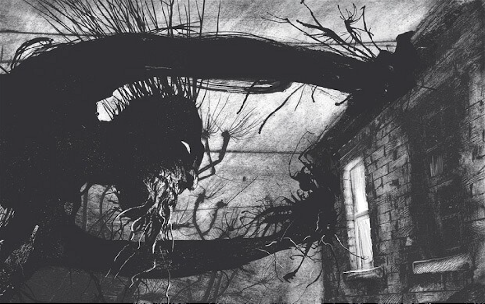
Source: The Guardian.
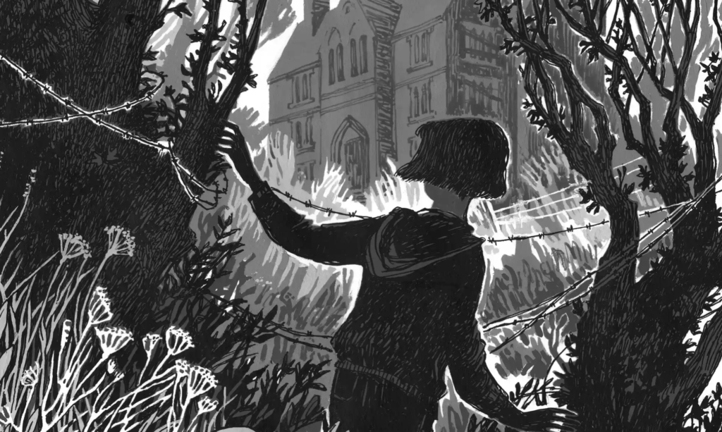
The next example I selected was Thornhill (2017), written and illustrated by Pam Smy, which I discovered and researched during the Graphic Fiction unit. Technically, they are not strictly black and white as she does use grey in a layering process. Similarly to Jim Kay, Smy’s illustrations are often quite dark with selective areas of white highlighted, creating atmospheric scenes. The illustrations are distributed as double page spreads throughout the book separate from the text, highlighting key moments.
The final example I found was a selection of books written and designed by Ruth Bradford for The Little Black and White Book Project. The high contrast style of these illustrations is designed to be visually stimulating for first time readers as it does not overwhelm them with colours. I like the simplified silhouette, graphic style and the illustrations are very bold. Due to the intended age group, there is very little text within the books, but this is well suited to the simplified artwork.
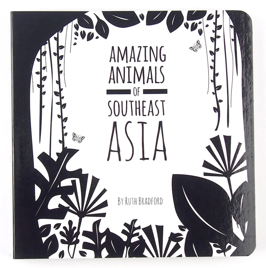
Source: The Little Black and White Book Project.
Considering Materials
Alongside attempting to select a story I would use for this exercise, which was quite a long-winded process as I could not make a decision, I decided to consider what materials I would employ. Initially I was planning on using the technique of cross-hatching, inspired by Edward Gorey and David Roberts, but then I was more drawn to lino-printing as I have tried this a couple of times and it appeals to me. To confound me further I then discovered scratchboard, which had me hooked at first sight! Compared to lino-printing, I was impressed by the amount of detail that can be achieved with this technique. I also was attracted by the subtractive method and made a surprisingly quick decision to buy a few boards and a selection of tools.
Scratchboard Artists
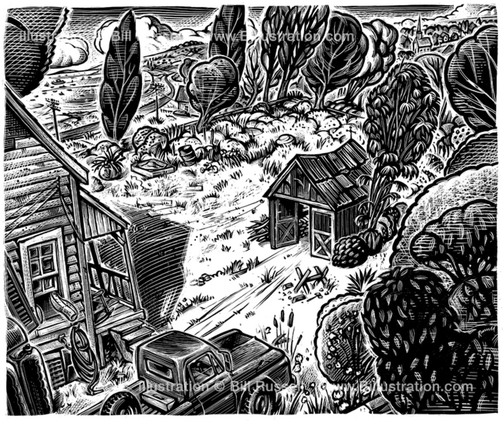
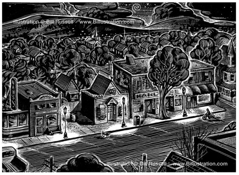
I became slightly obsessed with looking at examples of scratchboard, growing both more intimated and enthusiastic as I went. Perhaps the most influential practitioner I found was Bill Russell. I really liked the style of his illustrations, he is clearly extremely skilled at the technique, using a range of different marks and the contrast of black and white to produce bold, detailed and dynamic work – I began to recognise his personal style.
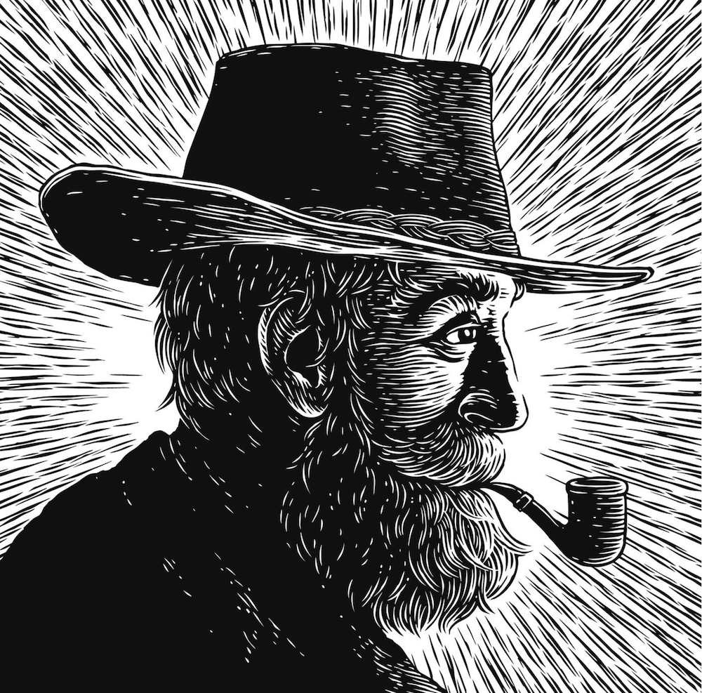
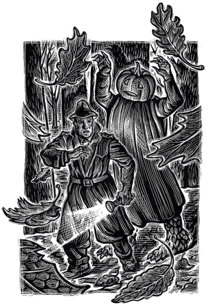
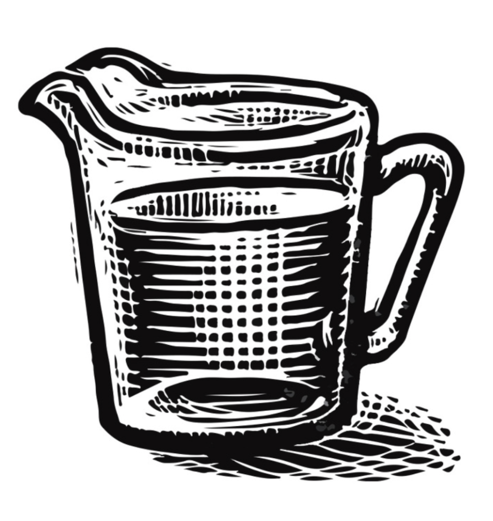
Even the simple measuring jug, below, has been given personality and character by Russell’s handiwork.
The other artist that stood out as equally impressive to me was David G Klein. I liked the range of illustrations that Klein produces, but, as with Russell, he still has a recognisable personal style.
The illustration below shows how Klein is able to contrast a more stylistic, graphic style as demonstrated in the example above, with a more realistic style.
I was convinced that working with scratchboard would be an excellent way to produce black and white illustrations for story in the genre required.
Selecting a Short Story
After far too much deliberation , I settled on Aesop Fables as the source material for my illustrations, partly because I was keen to depict animals as I thought that fur would be perfect for the scratchboard technique. Eventually, I selected The Lion and the Mouse as I thought it was quite a good length with enough material to produce ideas for a few illustrations.
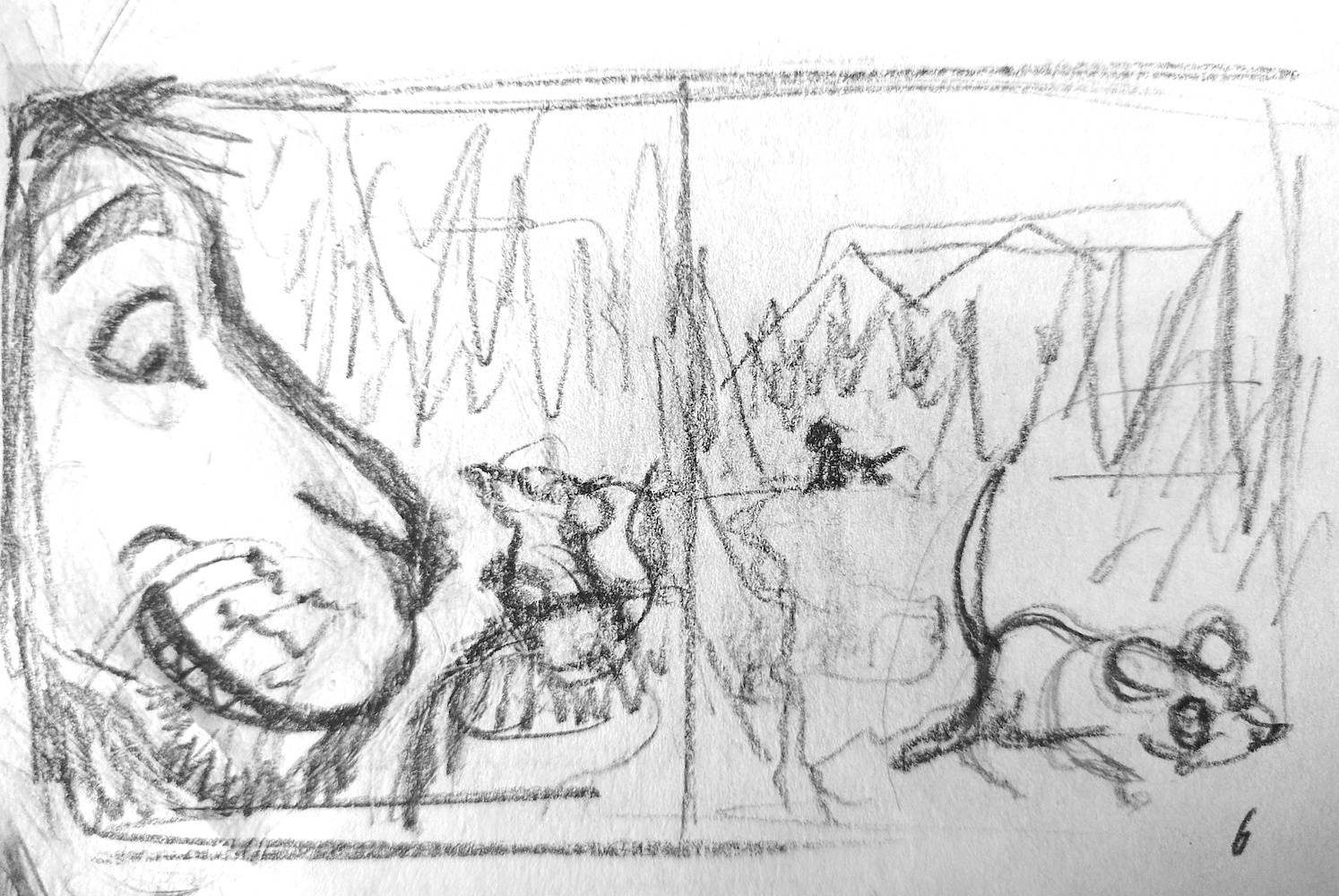
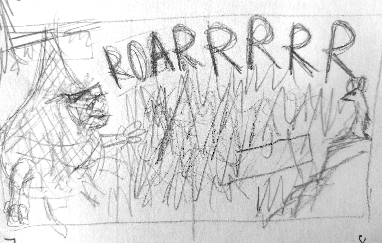
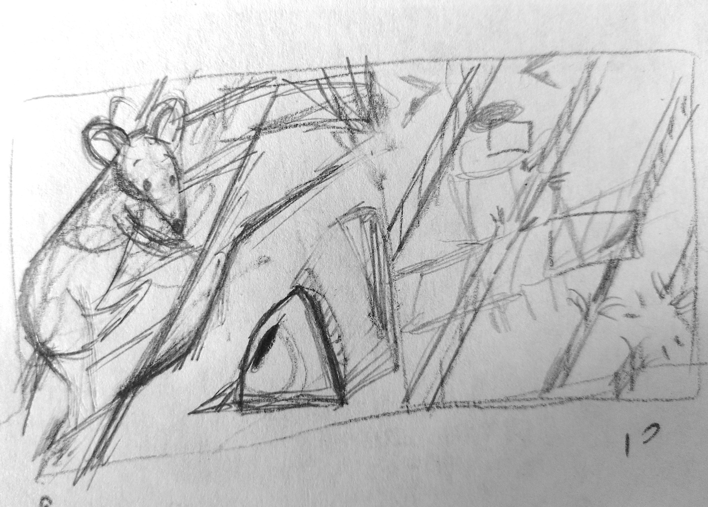
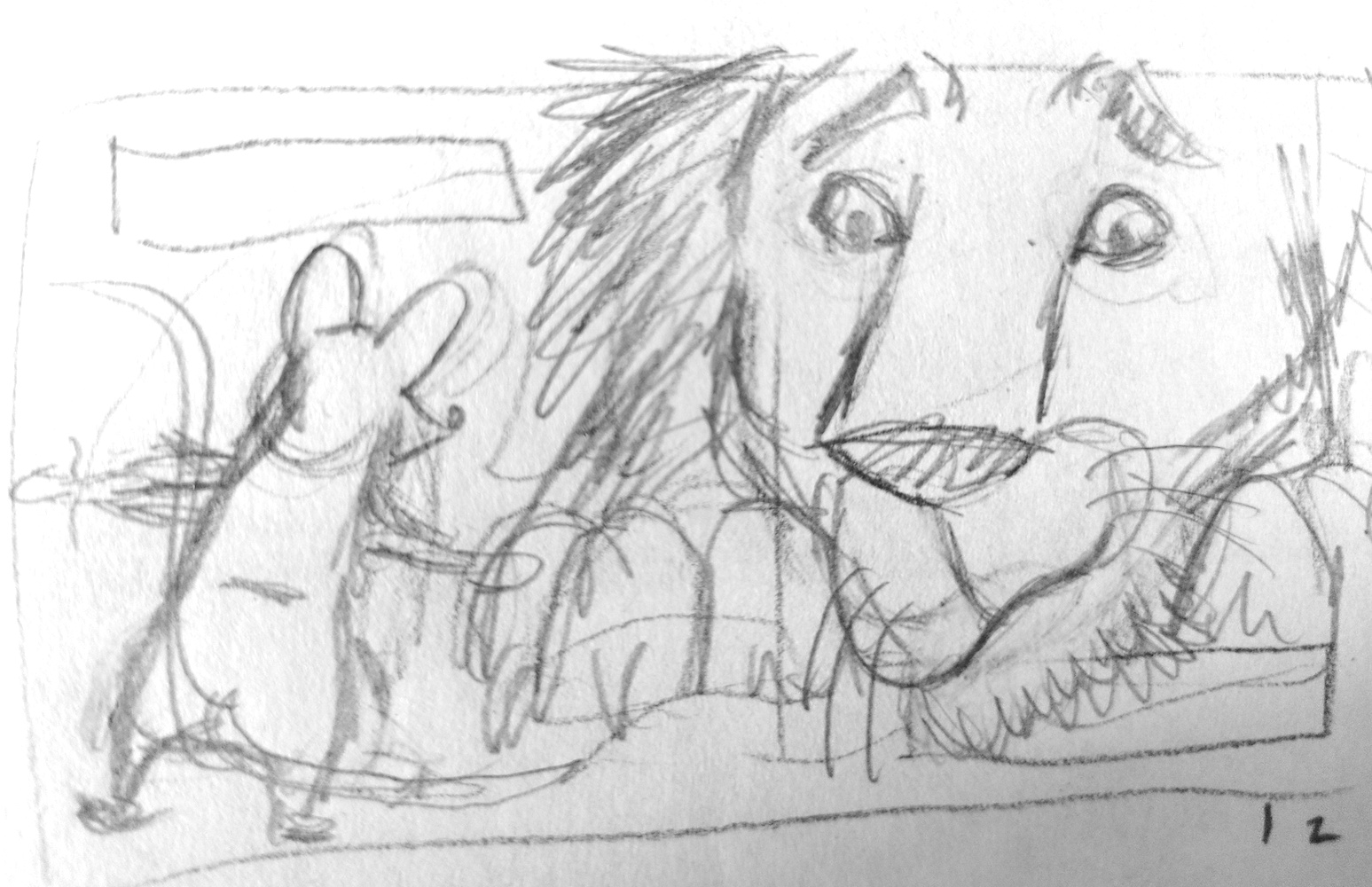
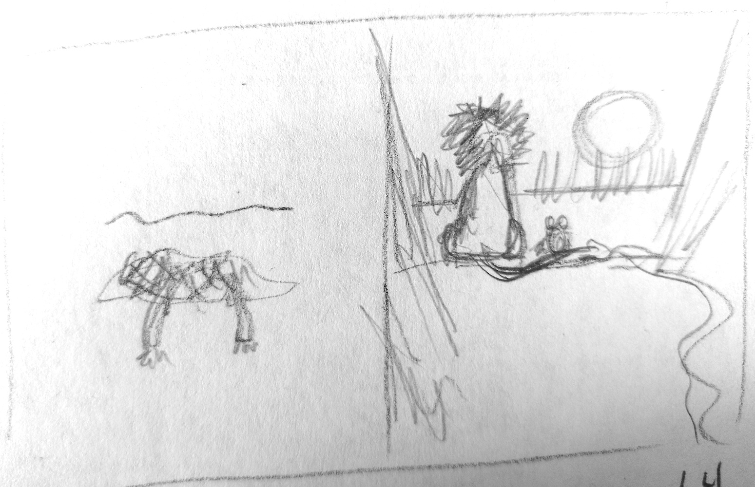
Thumbnails
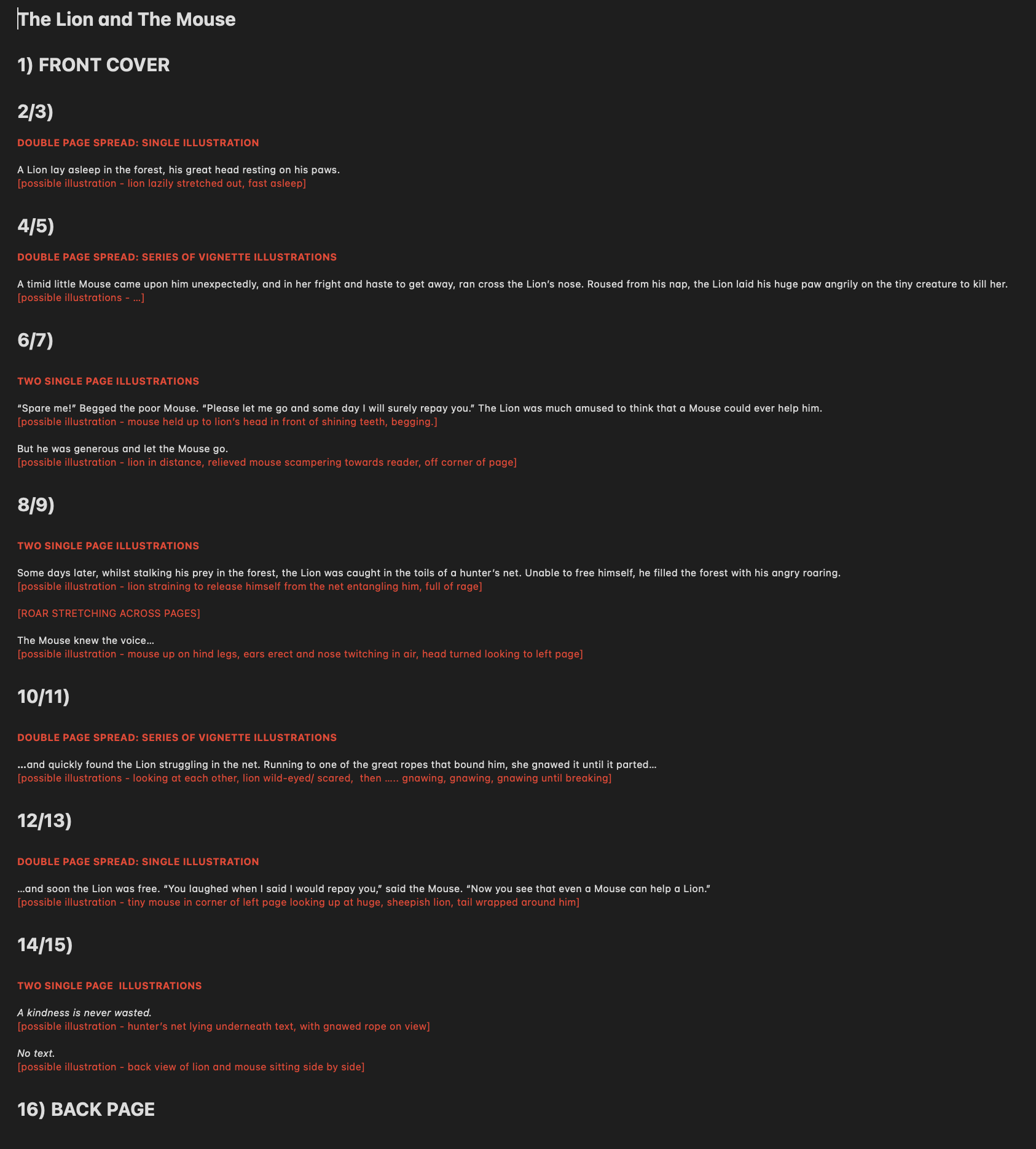
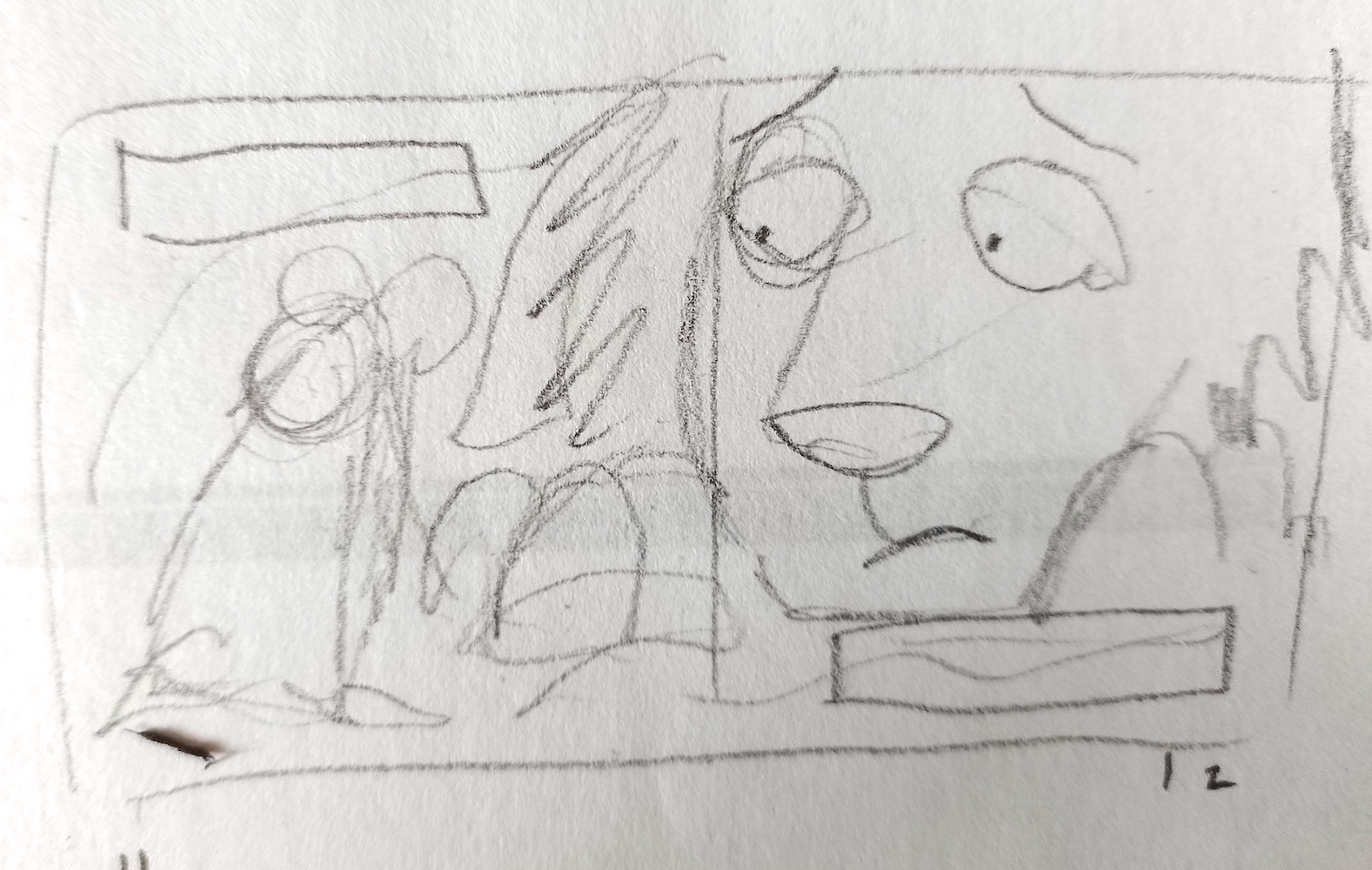
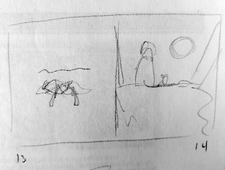
I decided to plan my designs on the basis that the story would be in the format of a 16 page illustrated book (including the front and back covers, the illustrations for which I did not consider). I worked out how the text would be divided across the pages, noting down any particular thoughts about possible illustrations.
Building on this concept, I proceeded to work on some very rough draft thumbnails. I had purchased 20x20cm square scratchboards, which meant I would need to work within square dimensions.
First Drafts
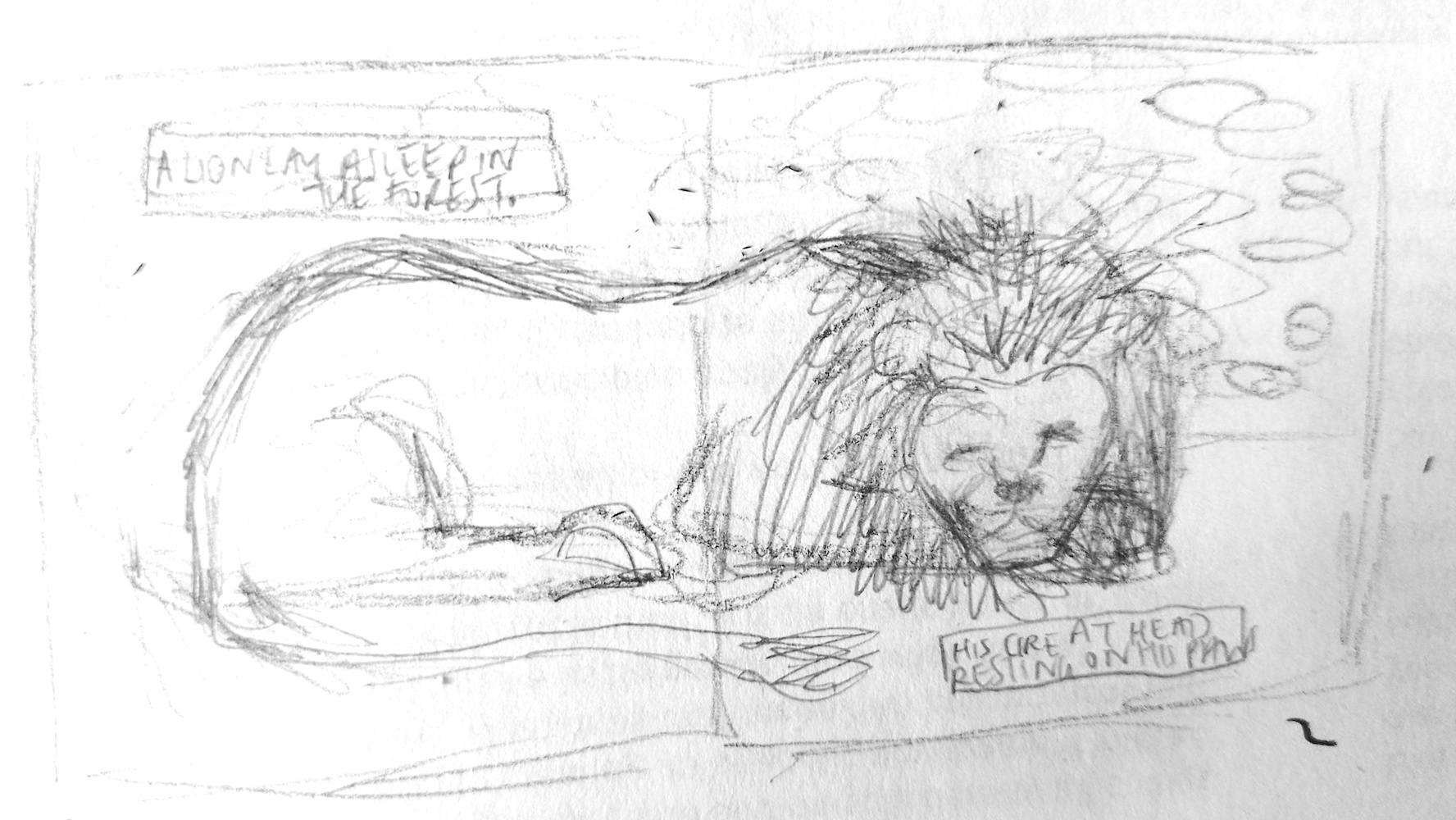
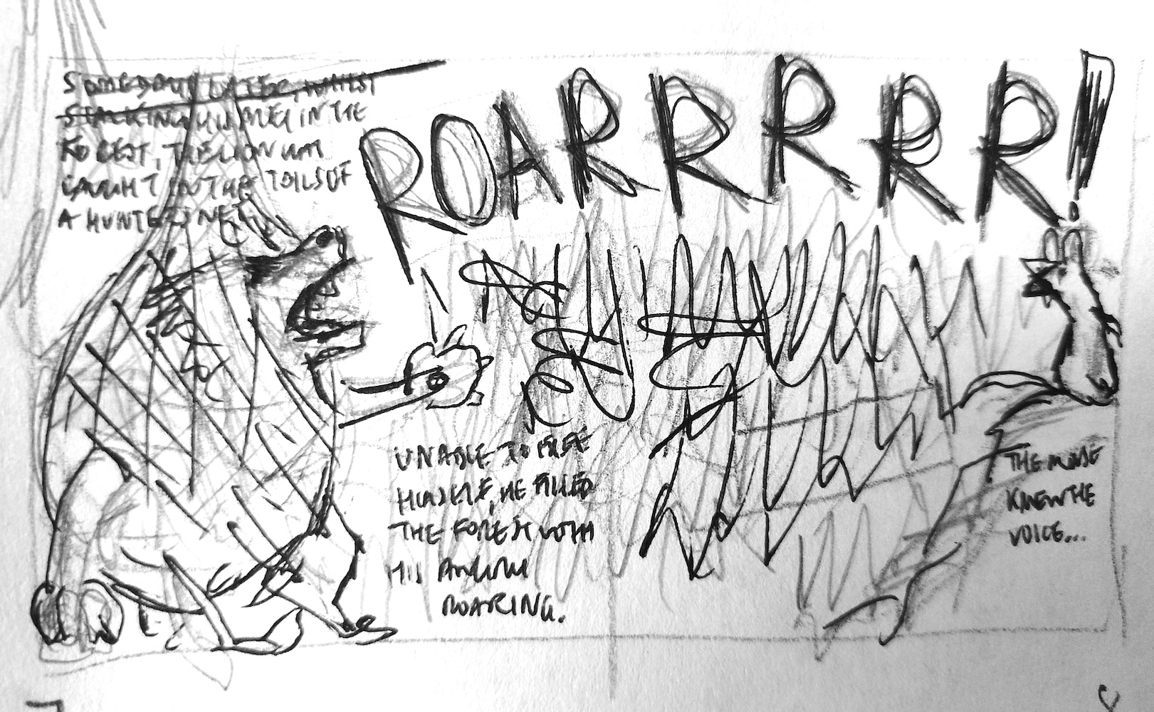
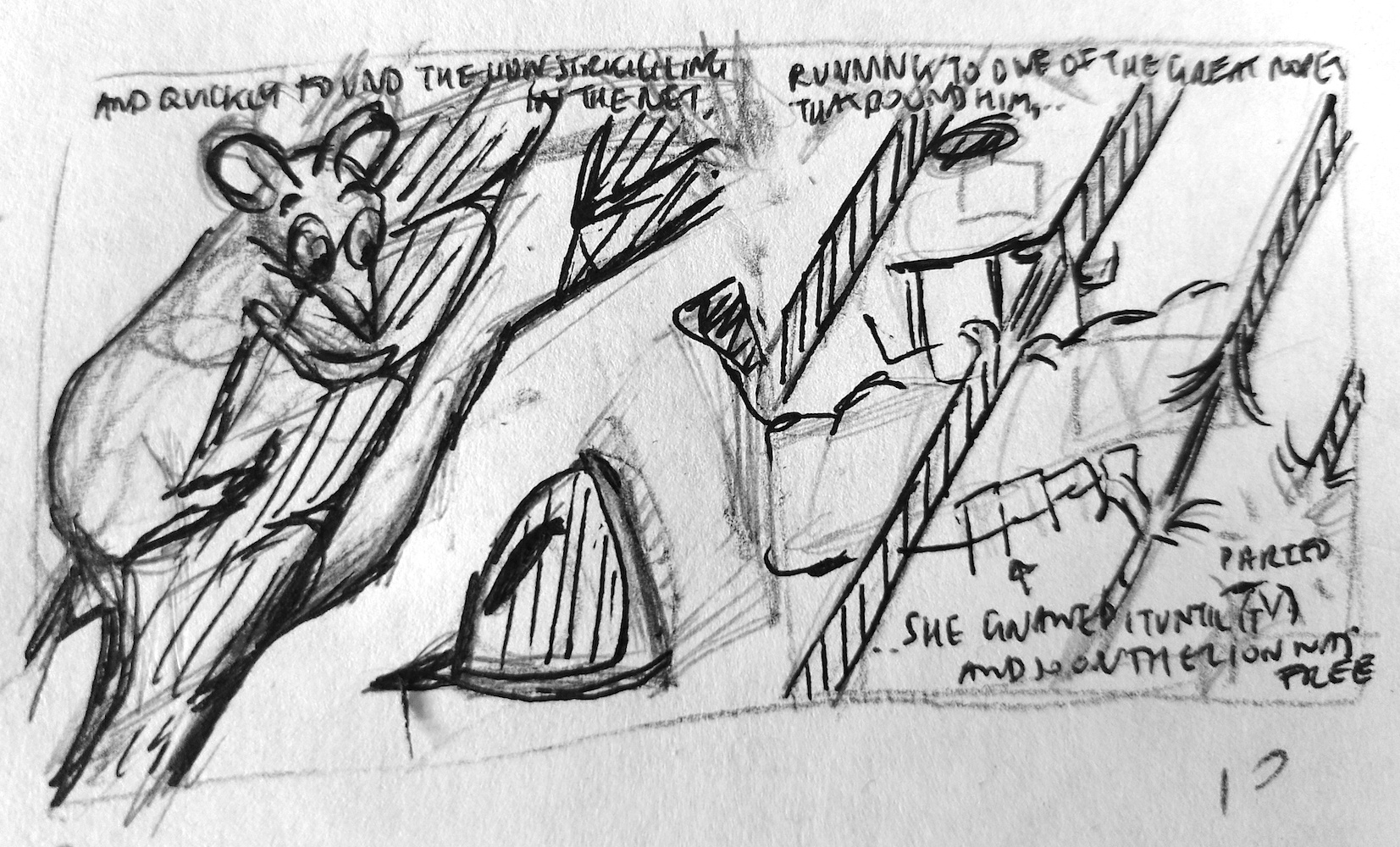
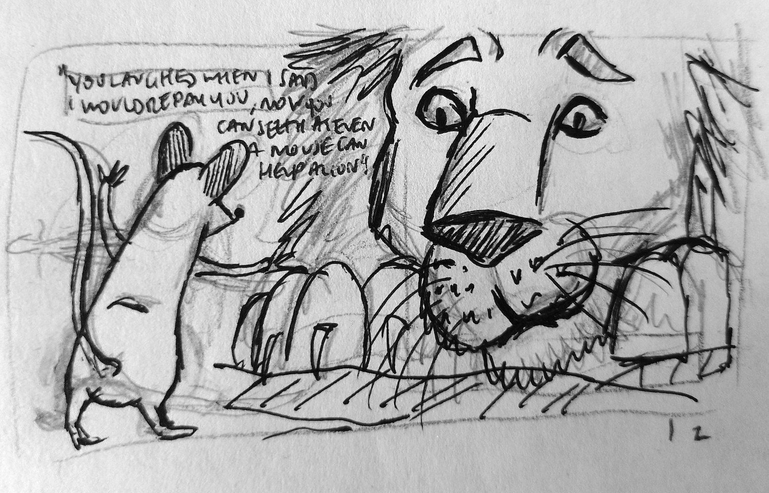
At this stage, I wanted to just get some ideas down in visual form.
(click on image for larger version, opens in new tab).
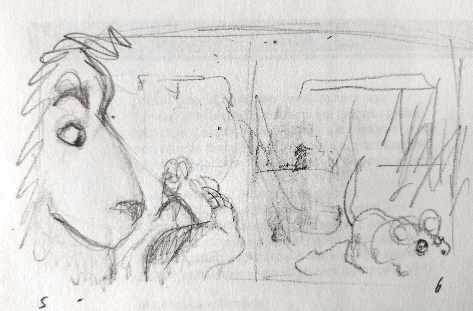
I could not think of any possibilities for the next pages at this point, so they were currently blank!
(click on image for larger version, opens in new tab).
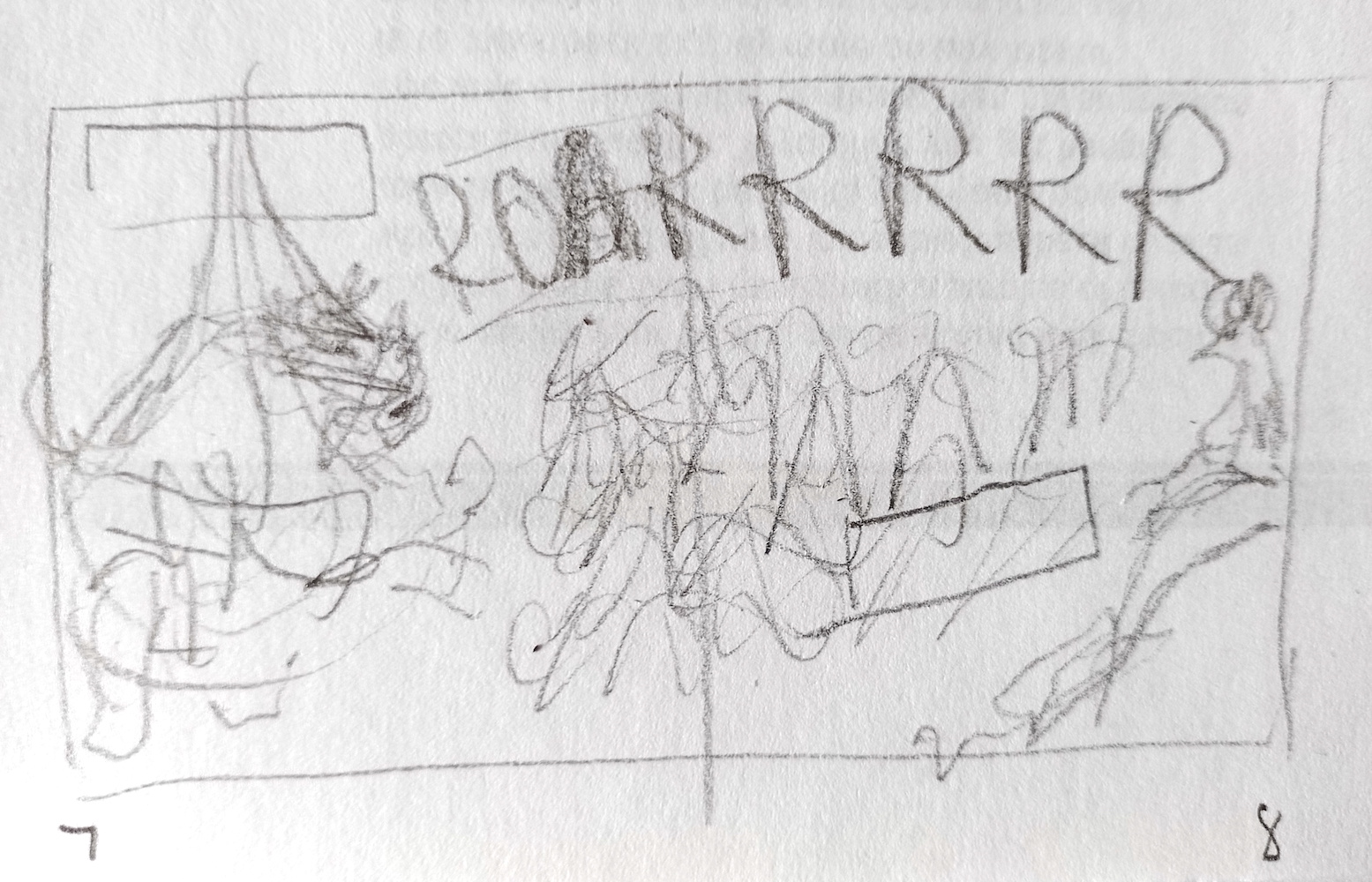
The ideas returned…
(click on image for larger version, opens in new tab).
(click on image for larger version, opens in new tab).
(click on image for larger version, opens in new tab).
(click on image for larger version, opens in new tab).
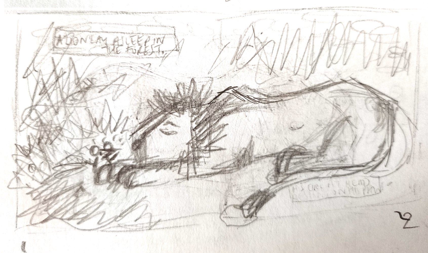
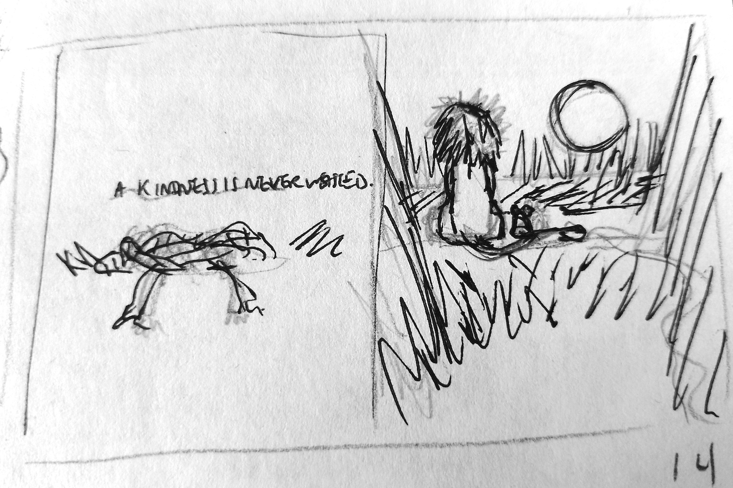
I thought it would be good to have the last double page spread as having the quote ‘A kindness is never wasted’ alongside an illustration of backs of the Lion and the Mouse, sitting side by side.
(click on image for larger version, opens in new tab).
This process took quite some time and was not done in order, ideas would suddenly come to me, which I quickly scribbled down.
Second Drafts
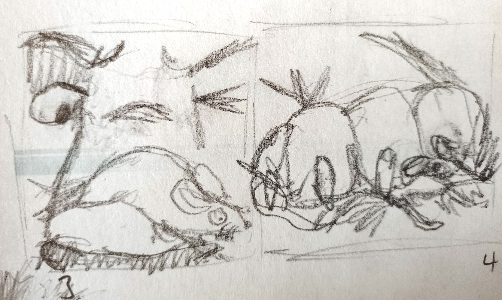
I moved on to drawing slightly more concise thumbnails.
(click on image for larger version, opens in new tab).
(click on image for larger version, opens in new tab).
(click on image for larger version, opens in new tab).
(click on image for larger version, opens in new tab).
(click on image for larger version, opens in new tab).
(click on image for larger version, opens in new tab).
(click on image for larger version, opens in new tab).
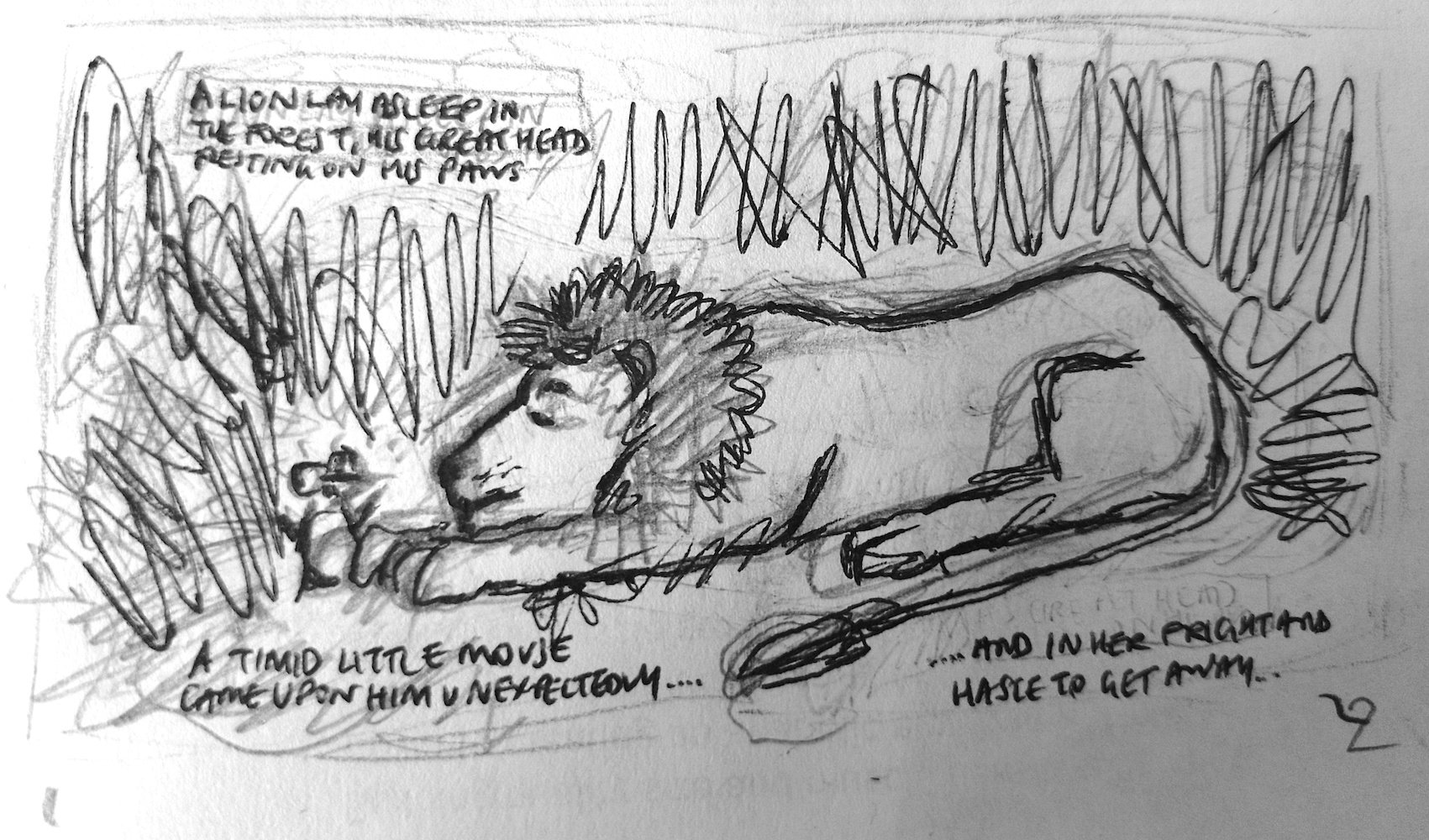
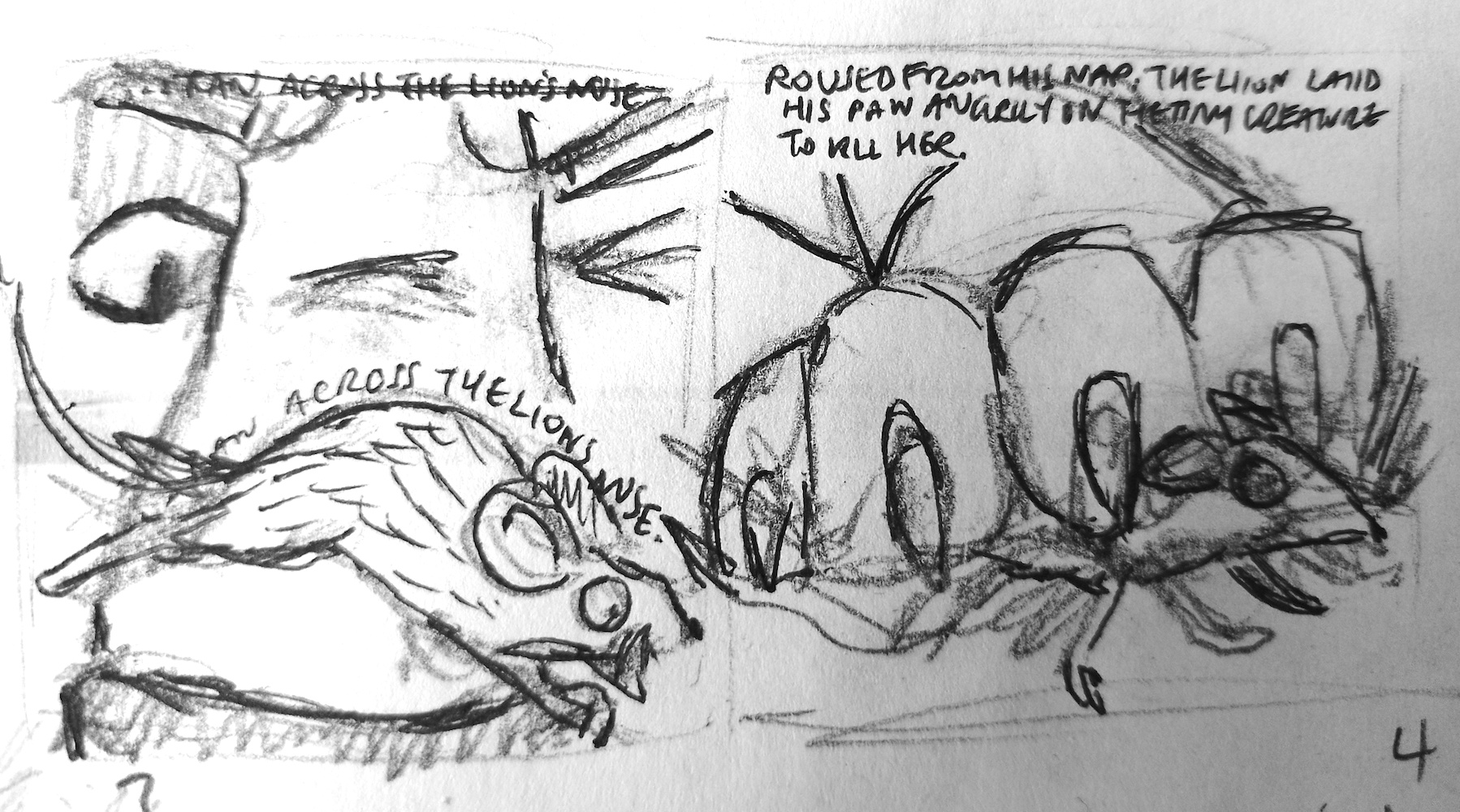
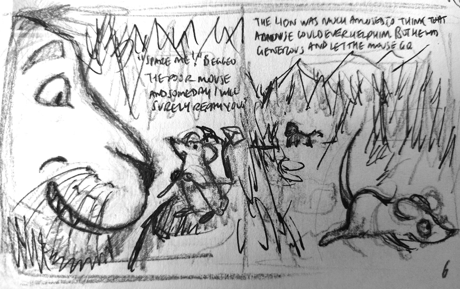
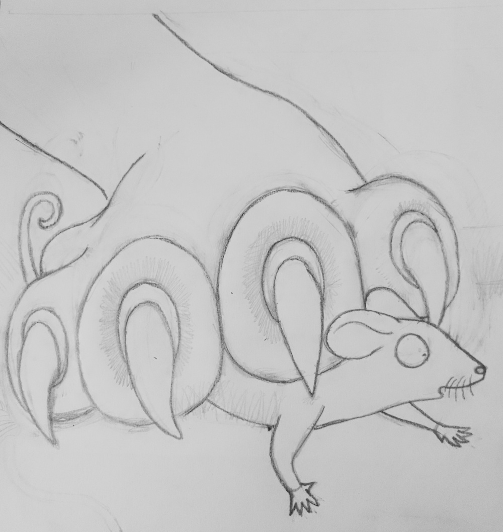
Third Drafts
I used a fineliner for the third drafts, to clarify the lines more.
(click on image for larger version, opens in new tab).
(click on image for larger version, opens in new tab).
(click on image for larger version, opens in new tab).
(click on image for larger version, opens in new tab).
(click on image for larger version, opens in new tab).
(click on image for larger version, opens in new tab).
(click on image for larger version, opens in new tab).
I had attempted to consider how I would incorporate text within the images, but I was still unsure how best to do this, for example, should I just have the text on a separate page or try to interweave it within the illustrations? I thought that the nature of scratchboard would make it quite difficult to include text within the illustrations. For now I put this dilemma to one side and chose to make a start as I had spent quite some time on this exercise already.
Experimenting with Scratchboard
I used the first scratchboard to experiment using the tools and what type of marks I could make. I also watched some online tutorials, which were helpful.
(click on image for larger version, opens in new tab).
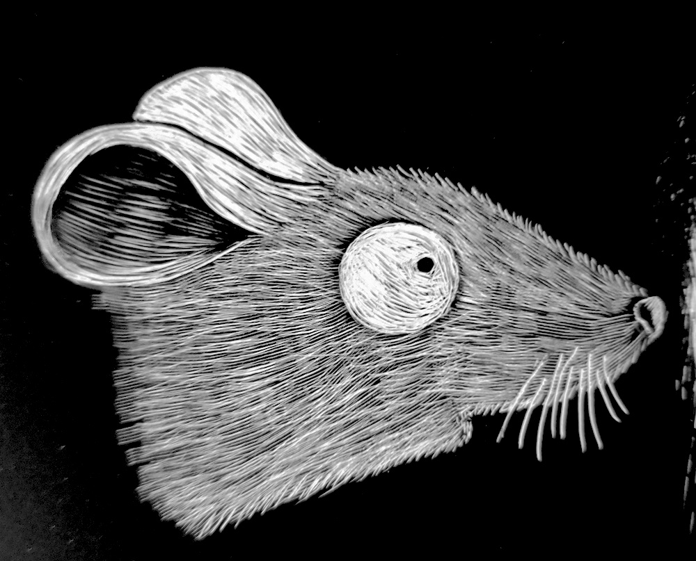
My first attempt at scratching out the Mouse can be seen below. I built the layers up gradually and tried to differentiate between each area.
(click on image for larger version, opens in new tab).
Preparing the Scratchboards
I decided to work on two illustrations and, depending on how long these took, give myself the option of producing another one. The two I opted for were those (currently) on pages 3 and 4 .
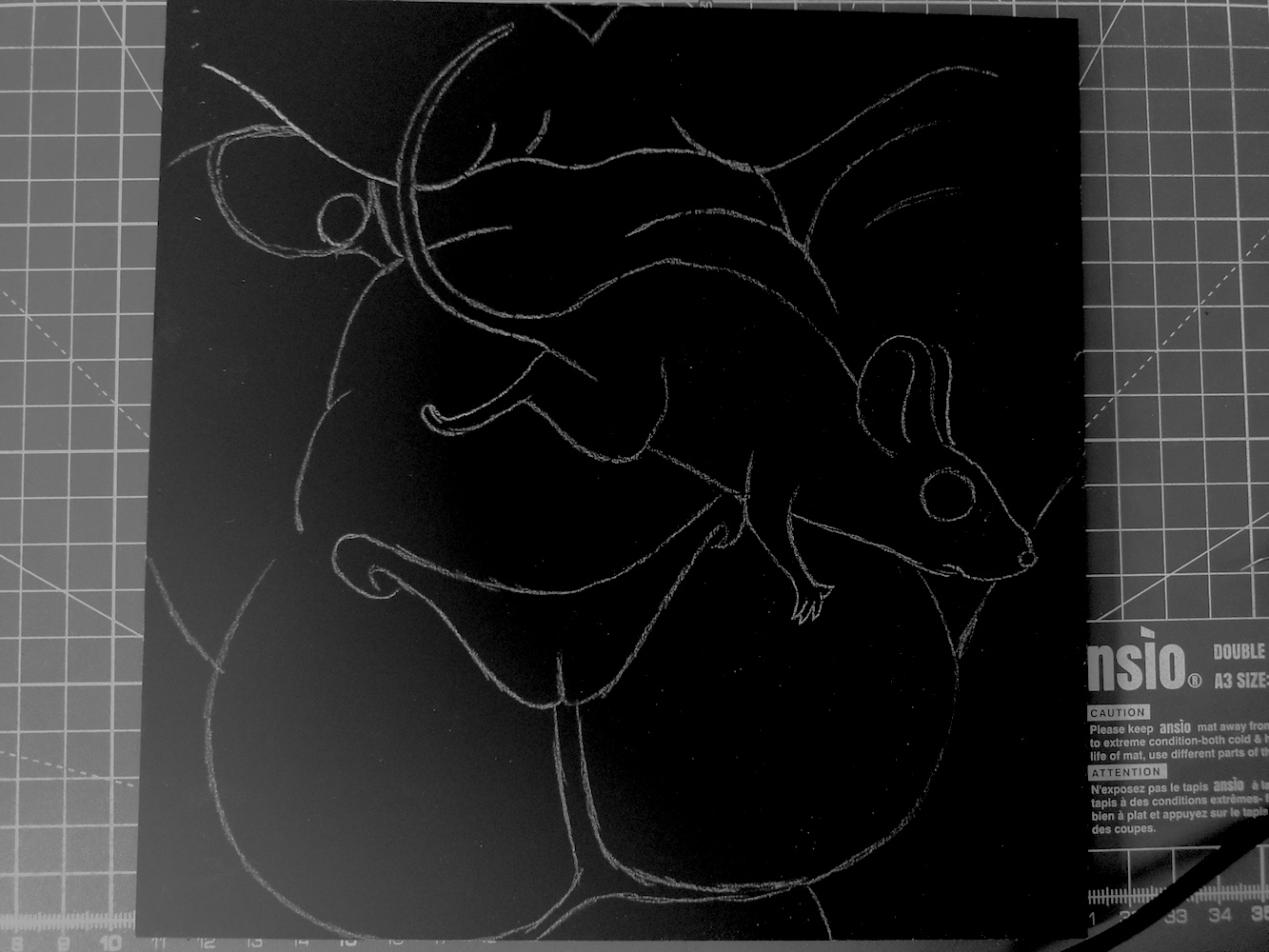
I scaled up the thumbnails and, via a light-box, used these as templates to produce cleanish pencil versions. This involved a great amount of erasing and head-spinning!

Next, I used white carbon copy paper and placed this over the scratchboard square. I laid the pencil drawing on top, making sure it was in the correct position, before going over the outlines again with pencil, pressing fairly hard. The results of this can be seen below.
(click on image for larger version, opens in new tab).
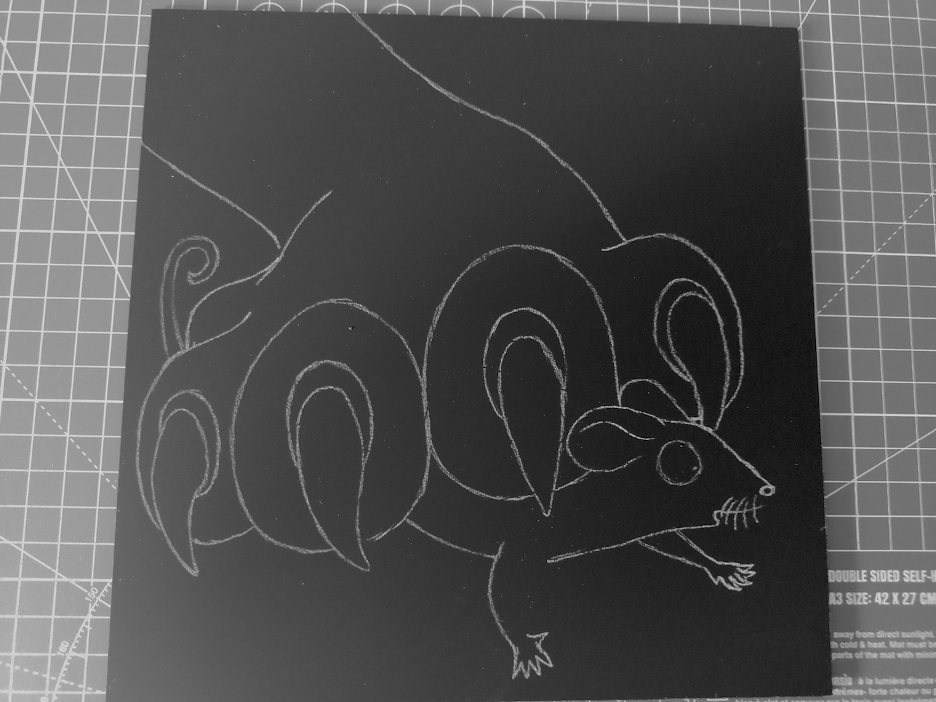
(click on image for larger version, opens in new tab).
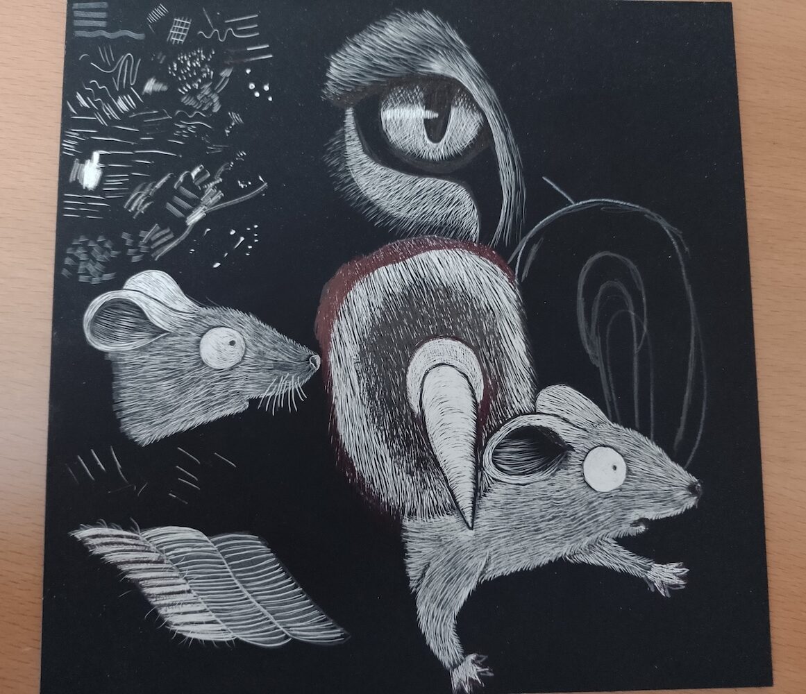
The Illustrations
I am not sure how many hours in total I spent on these two illustrations, but it seemed to be quite a slow, long process! Although it is possible to use a black fineliner to ‘erase’ any small errors, it was really challenging to see each area in the context of the whole illustration, so I was never really sure if it was going in the right direction in terms of the overall effect. I also found it difficult to differentiate the surfaces so that there would be some contrast, although I kept in mind that I could build up layers to make them lighter. On top of that, I had to try and make sure the Lion and Mouse were recognisable!
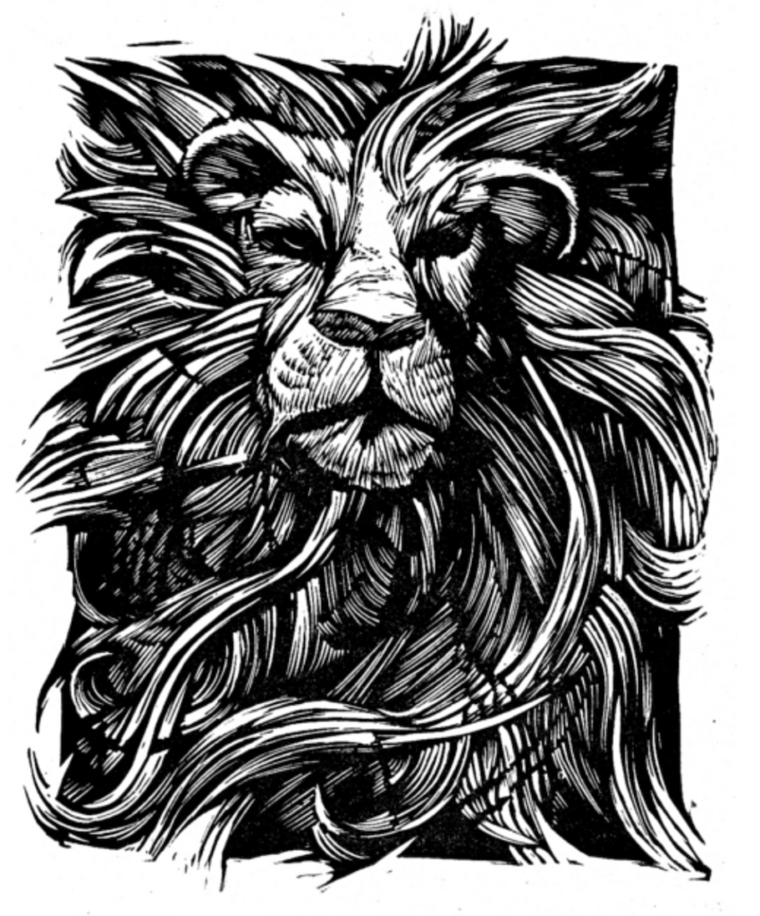
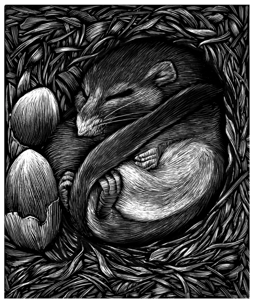
The final two scratchboard illustrations can be seen below.
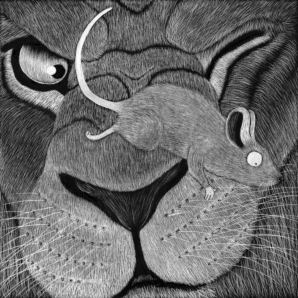
(click on image for larger version, opens in new tab).
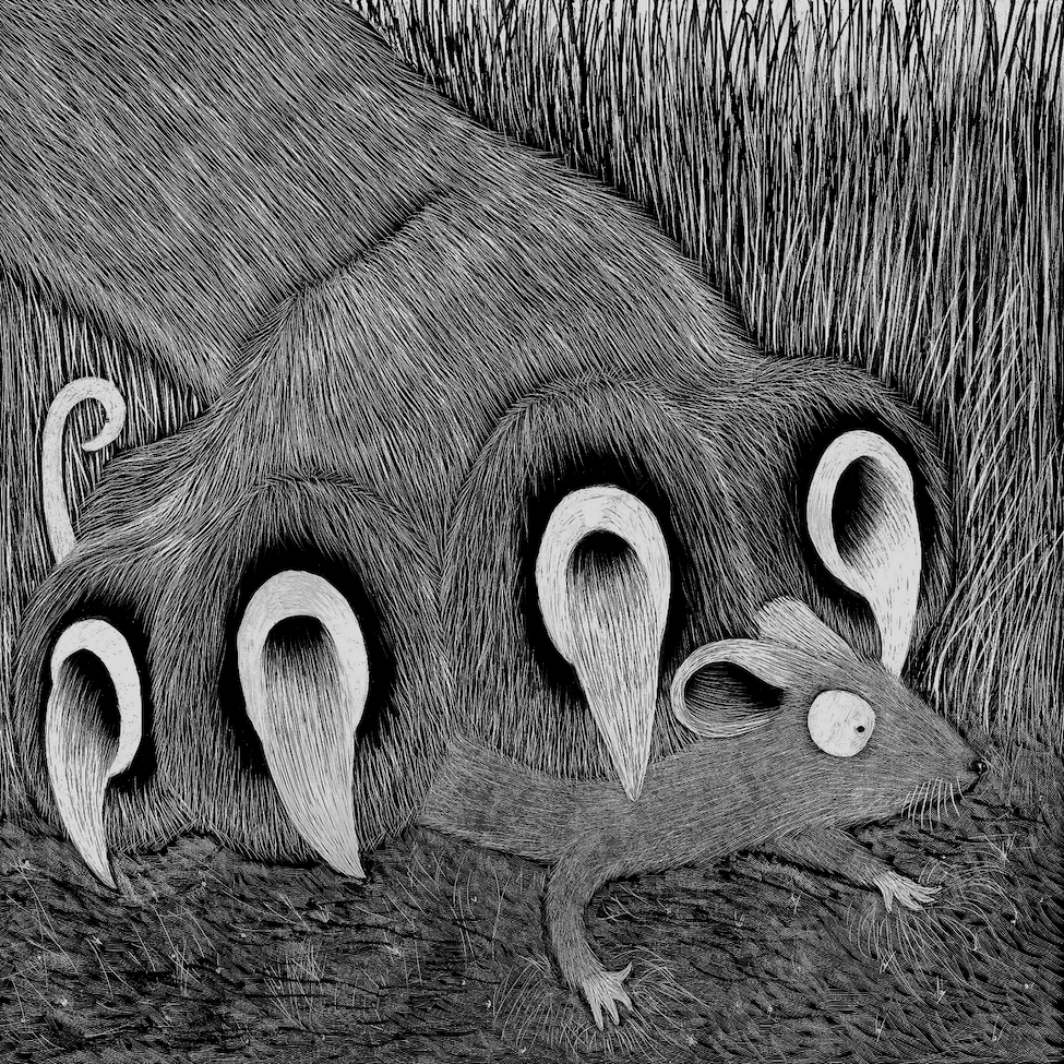
(click on image for larger version, opens in new tab).
Adding the Text
Once I had reached this point, I scanned the illustrations in to my computer so I could develop the final layout of the pages, alongside the text from the story. I also wanted to see if I could somehow incorporate the text within the illustrations.
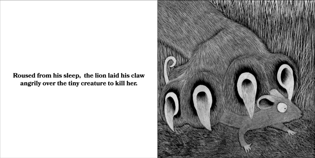
To begin with, unlike my initial plan, I placed the image and the associated text on adjacent pages, as shown below. I thought these worked quite well and I liked that the illustrations filled the entire page.
(click on image for larger version, opens in new tab).
(click on image for larger version, opens in new tab).
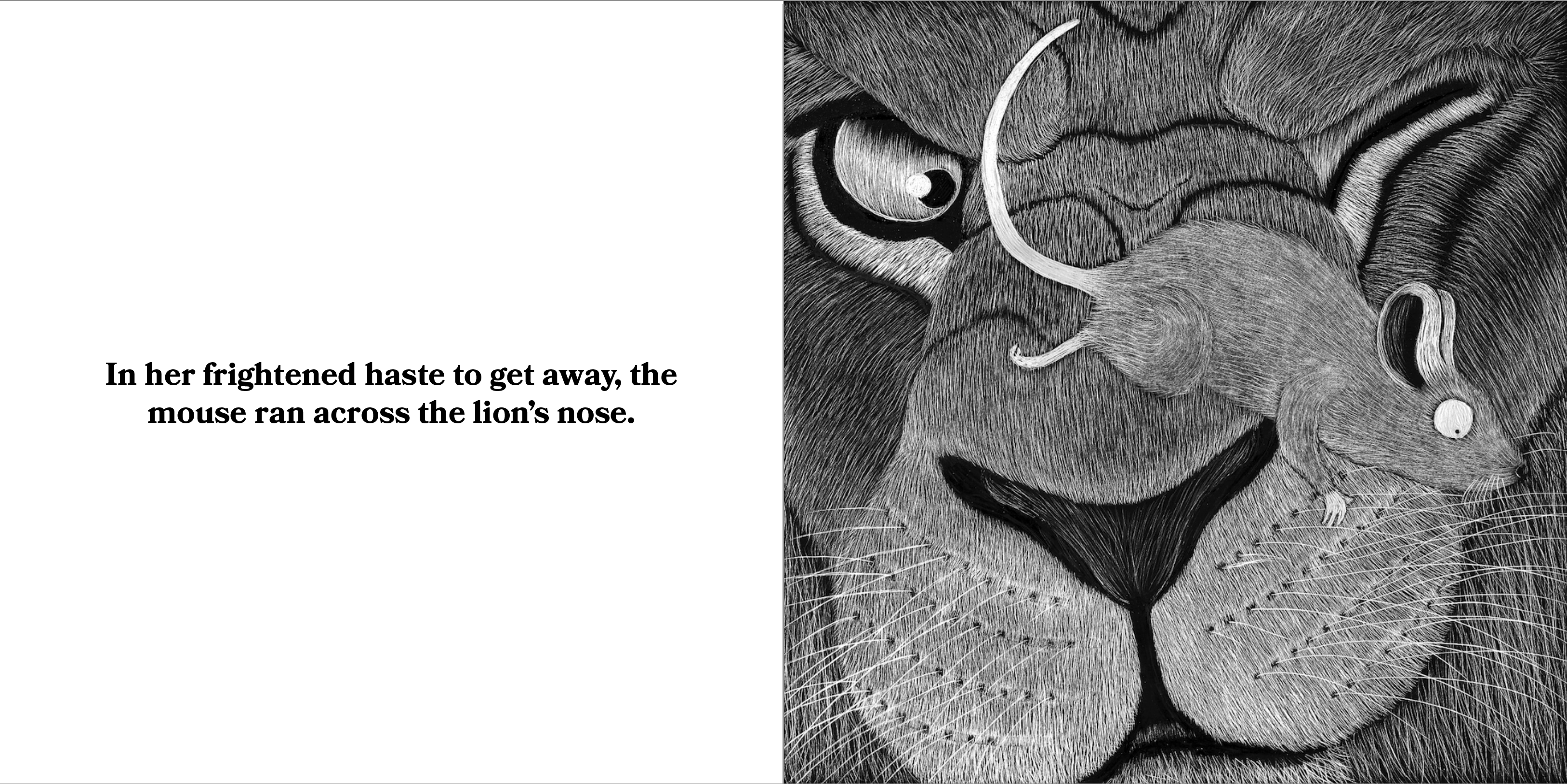
I then experimented with trying to integrate at least some of the words into the illustrations. In the first one I used the curve tool to draw a path following the shape of the Mouse. I then placed the text ‘the Mouse ran across the Lion’s nose’ along this path. Initially the text was solid white and it looked acceptable, but disconnected. I tested some of the blend modes thus creating a less contrasting block of text and one that felt more like to was part of the illustration. Although legibility was very important, I was still going to be keeping the full text on the adjacent page, so I felt permitted to prioritise the visual aspect. I still did not feel the combination worked that well, but decided to move onto the next one.
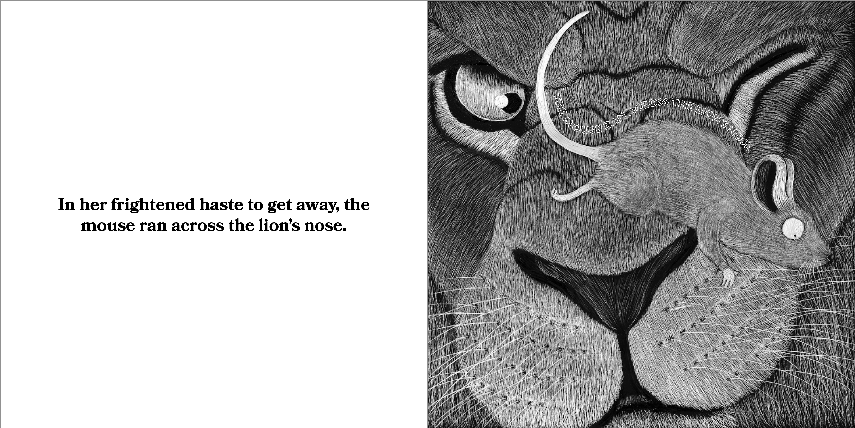
(click on image for larger version, opens in new tab).
For the second illustration, I followed a similar process by creating a path using the curve tool and then adding a selection of the text that followed the line of the Lion’s paw. I thought this worked quite well. I found a blend mode that resulted in the text looking like it was nestled within the fur. I then added the words ‘to kill her’ under the Mouse and found a blend mode that made it look like the words were within the soil/surface. I thought the text in the fur was quite successful and this page was better overall compared to the previous one.
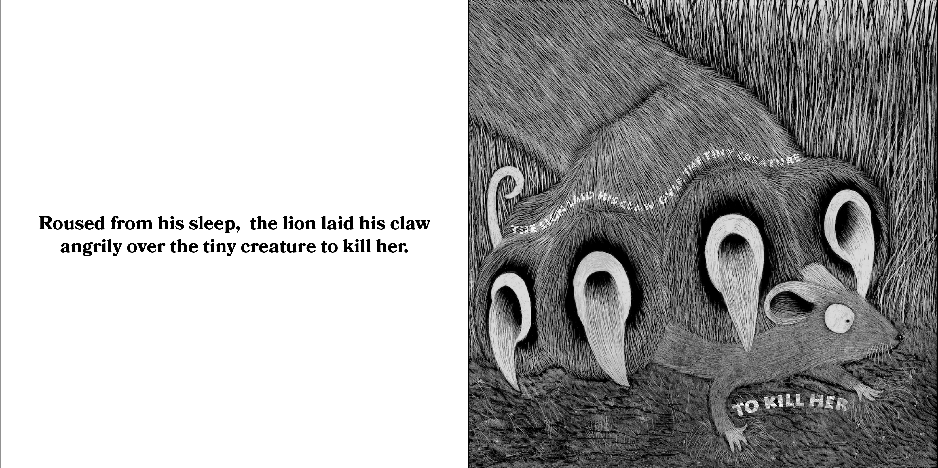
(click on image for larger version, opens in new tab).
Final Thoughts
It would have been good to create another illustration for this exercise, but working with the scratchboard was very time-consuming, so I was satisfied that by producing two finished pieces I had demonstrated my intentions for the style of illustration for the entire story.
I am not sure I met the requirements of the Brief in terms of successfully combining the images with the text, although it seemed reasonable to have the text on an adjacent page to the full size illustrations. I also thought that using a square format for the pages was effective.
One of the most challenging aspects of this exercise was deciding on what story to work from – it must be apparent by now that I am not very good at making decisions – and then trying to work out how to divide the words onto separate pages. Perhaps the most significant outcome from this exercise was being introduced to scratchboard. I unquestionably intend on using this method again and developing my skills further, such as experimenting with adding colour. I think it would be particularly well suited to the graphic fiction genre.
Bibliography
creepy crawlers ltd. (n.d.) creepy crawlers ltd. the creative home of jim kay and louise clark. Available at: https://creepyscrawlers.com (Accessed 16 May 2023).
Klein, D. G. (n.d.) David G Klein illustration portfolios. Available at: https://illoz.com/kleinart/portfolios/ (Accessed 16 May 2023).
Library of Congress (n.d.) Aesop Fables. Available at: https://read.gov/aesop/001.html (Accessed 15 May 2023).
Russell, B. (n.d.) The All Things Bill Store. Available at: https://allthingsbill.com (Accessed 16 May 2023).
Richard Solomon (n.d.) Mark Summers, Scratchboard Artist. Available at: https://richardsolomon.com/artists/mark-summers/#narrative (Accessed 16 May 2023).
Russell Williams, I. (2017) Children’s books roundup: the best new picture books and novels. Available at: https://www.theguardian.com/books/2017/aug/26/childrens-books-roundup (Accessed 15 May 2023).
Smy, P. (2018) Pam Smy. Available at: https://www.pamsmy.com (Accessed 15 May 2023).
The Guardian (2012) How we made A Monster Calls. Available at: https://www.theguardian.com/childrens-books-site/2012/jun/14/a-monster-calls-patrick-ness-jim-kay (Accessed 15 May 2023).
The Little Black & White Book Project (2023) No pressure sensory play – The Little Black & White Book Project. Available at: https://blackandwhitebookproject.com (Accessed 15 May 2023).
Wikipedia (n.d.) Scratchboard. Available at: https://en.wikipedia.org/wiki/Scratchboard (Accessed 16 May 2023).